Inspiration
Imagine two power companies building new transmission lines just a few miles apart, at the same time, without knowing what the other is planning.
That is exactly the kind of problem we wanted to tackle.
Georgia Power and Dominion Energy South Carolina operate on opposite sides of the Savannah River. Both have major transmission projects planned, but their planning documents are spread across separate reports, making it difficult to see where their projects might overlap.
When utilities plan independently, they can end up duplicating construction efforts, missing opportunities to share resources, and spending money that could have been saved through coordination.
In 2024, FERC issued Order No. 1920, highlighting the importance of long-term transmission planning and coordination.
We wanted to take that idea a step further and answer a simple question using actual public data:
Where are these two utilities planning nearby construction, and what could they save by coordinating?
That became GridLock.
What it does
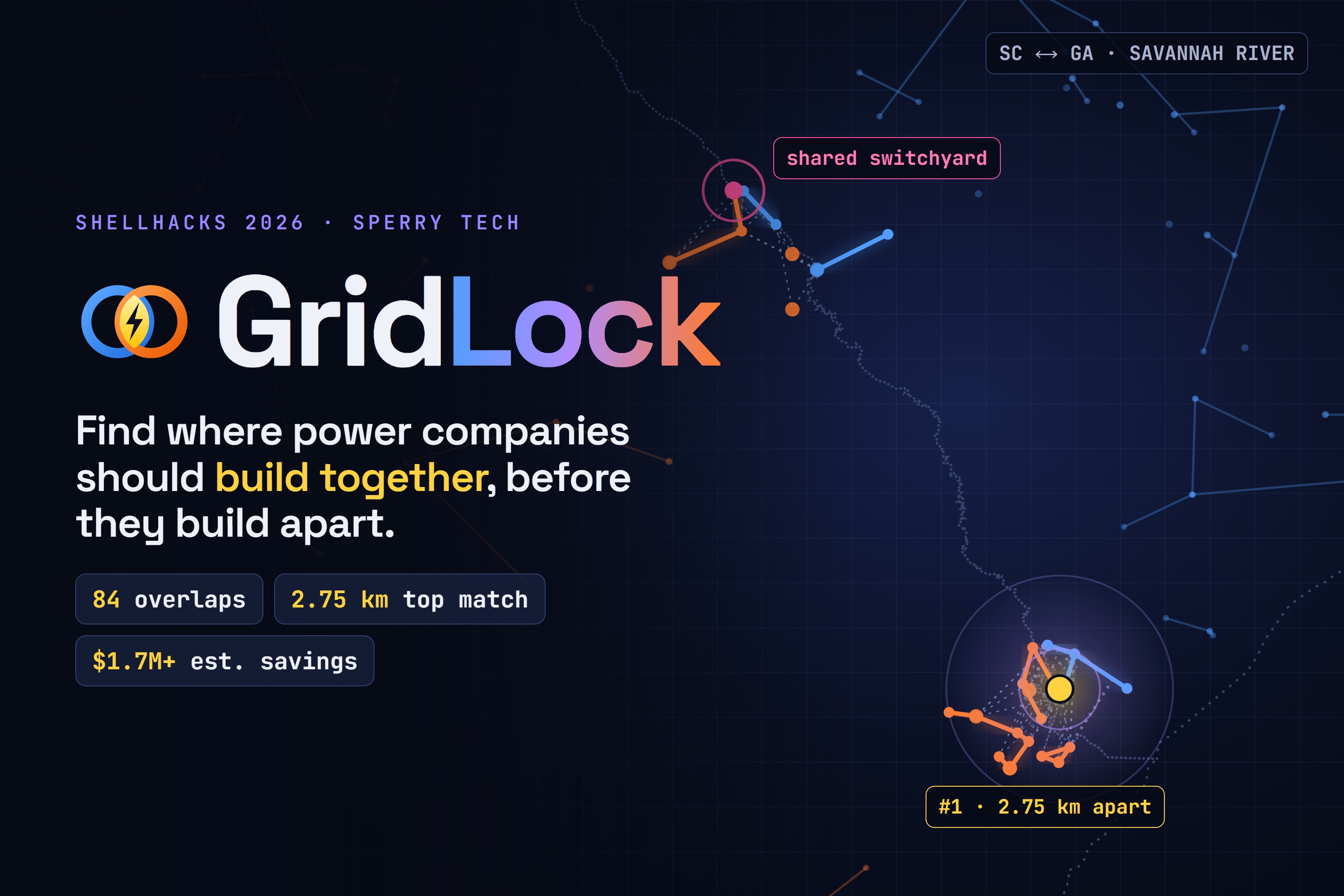
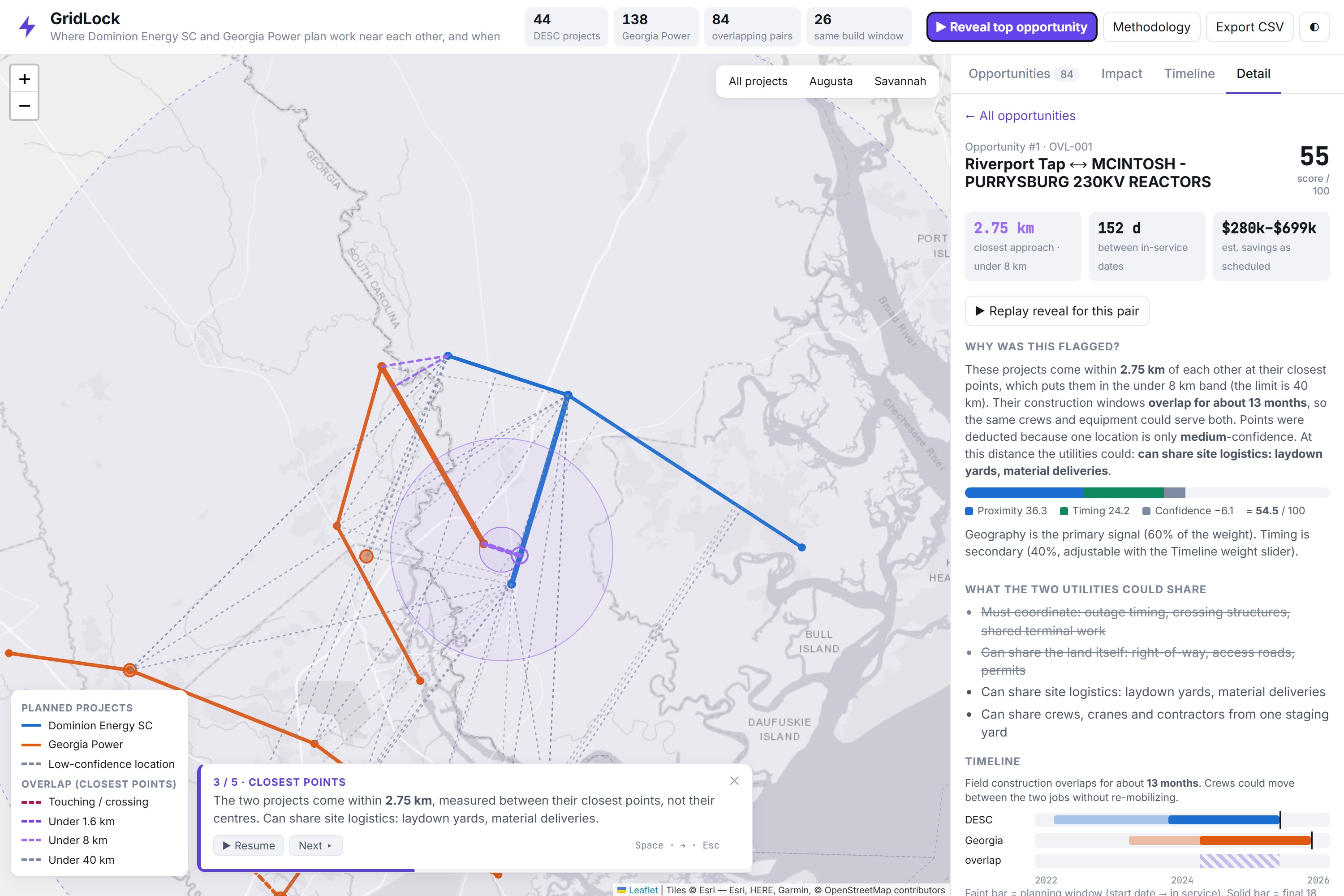
GridLock takes public transmission planning documents from two utilities and turns them into one interactive map that makes potential coordination opportunities easier to find, understand, and evaluate.
Instead of digging through hundreds of pages of PDFs and manually comparing project locations, users can see projects, their proximity, construction timelines, and potential savings in one place.
- Reads the plans: Extracts all 44 Dominion Energy South Carolina projects and 208 Georgia ITS projects (138 of them Georgia Power's) directly from public PDFs.
- Maps every project: Locates named substations and maps transmission project connections.
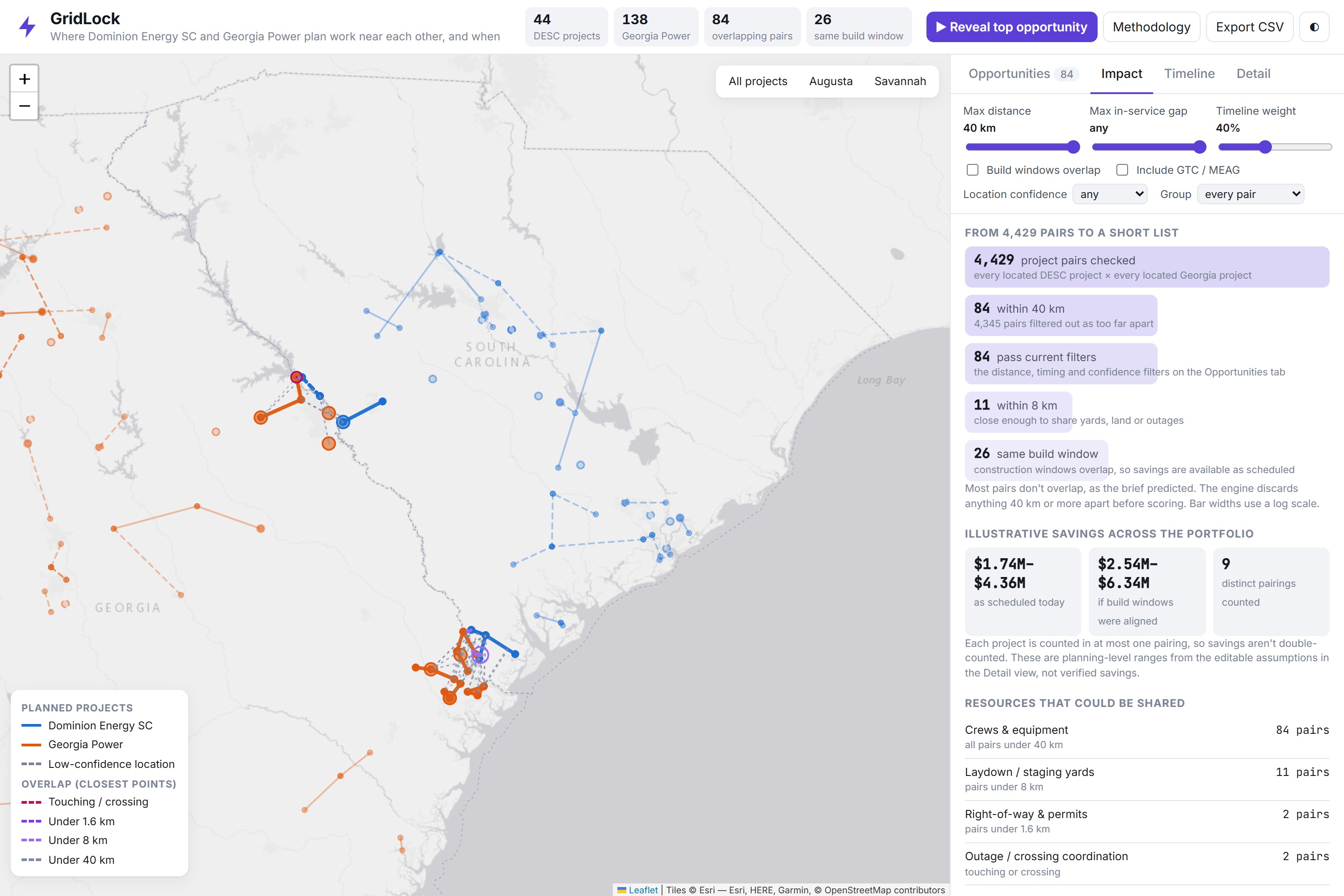
- Finds real overlaps: Measures the closest points between project geometries instead of simply comparing their centers. Projects within 40 km are flagged as potential coordination opportunities.
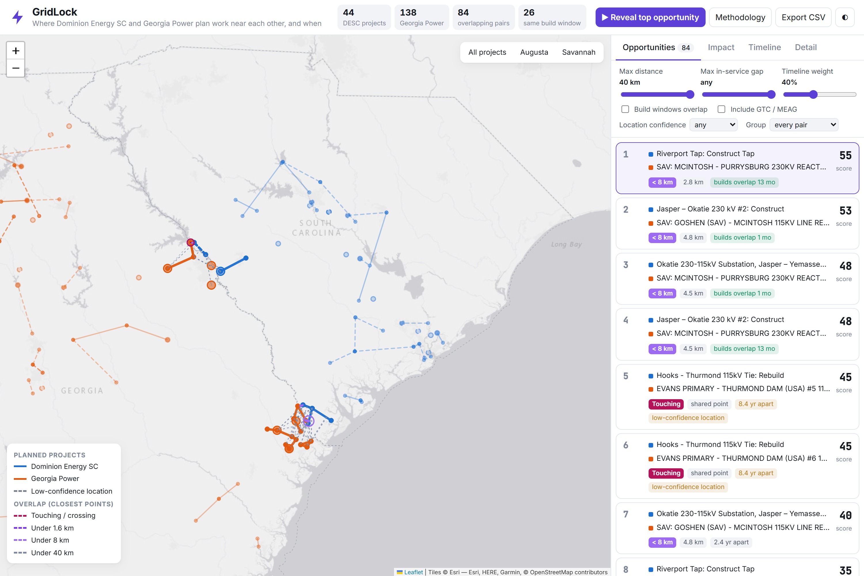
- Ranks opportunities: Groups matches by distance (touching, < 1.6 km, < 8 km, and < 40 km), with overlapping construction windows used as an additional signal.
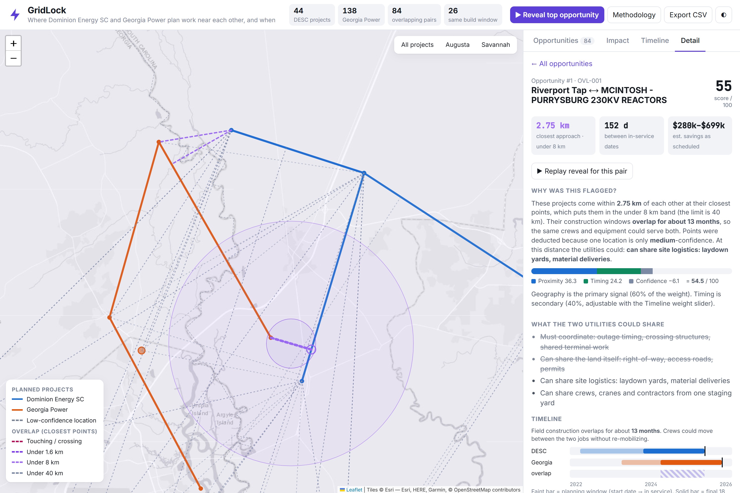
- Explains every match: Shows why a project was flagged, provides a score breakdown, and links directly to the original PDF page.
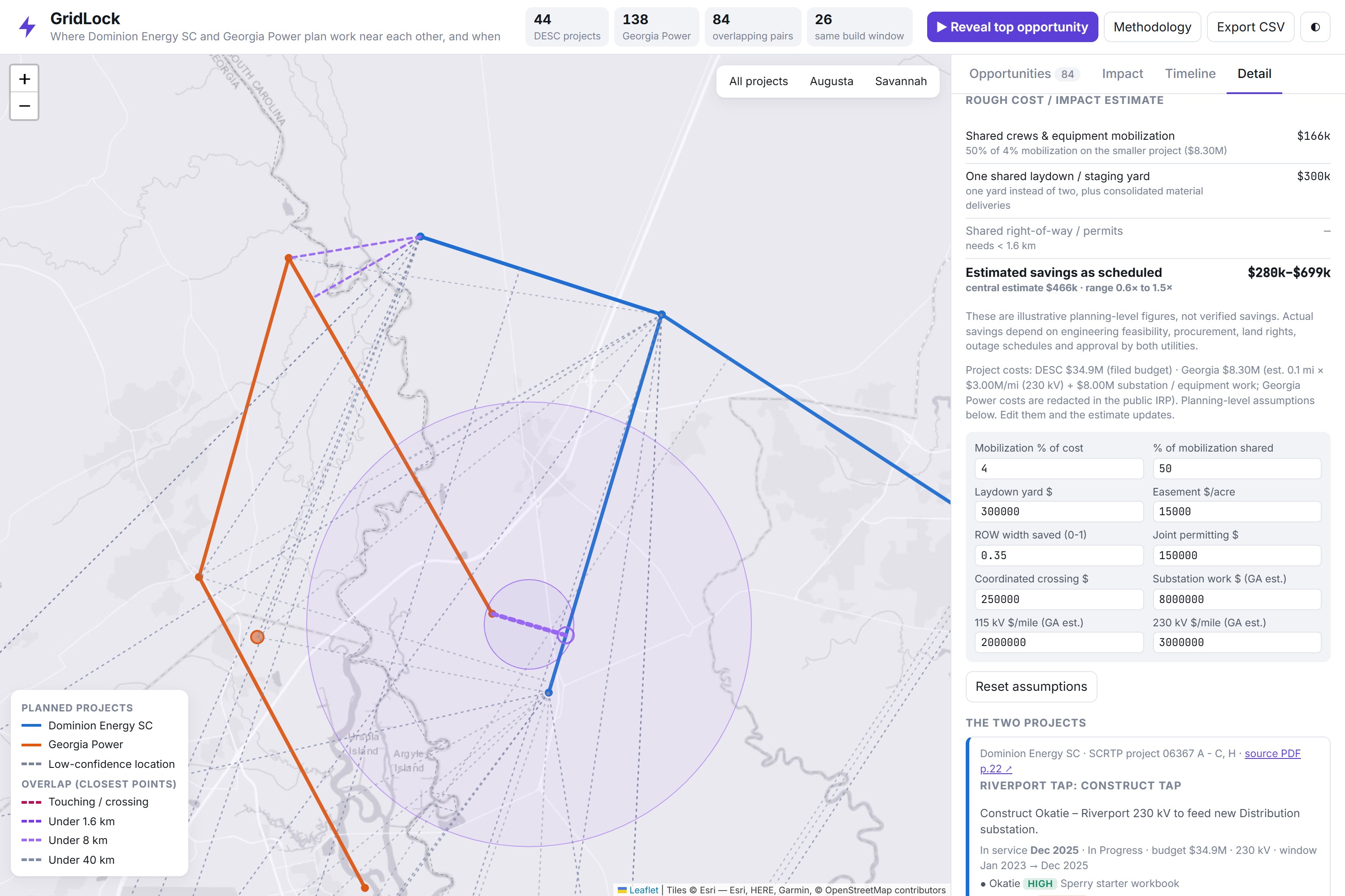
- Estimates potential savings: Calculates possible savings from sharing construction crews, staging areas, right-of-way, and outage windows using editable assumptions.
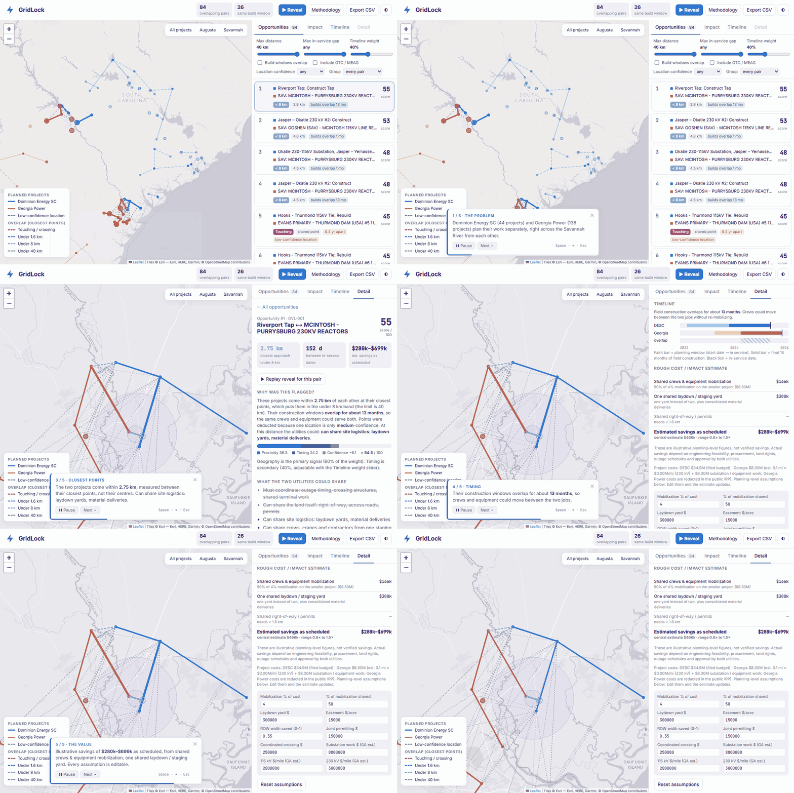
- Guided Reveal: Includes a five-step animated walkthrough of the top opportunity, making the findings easier to present to decision-makers.
What we found
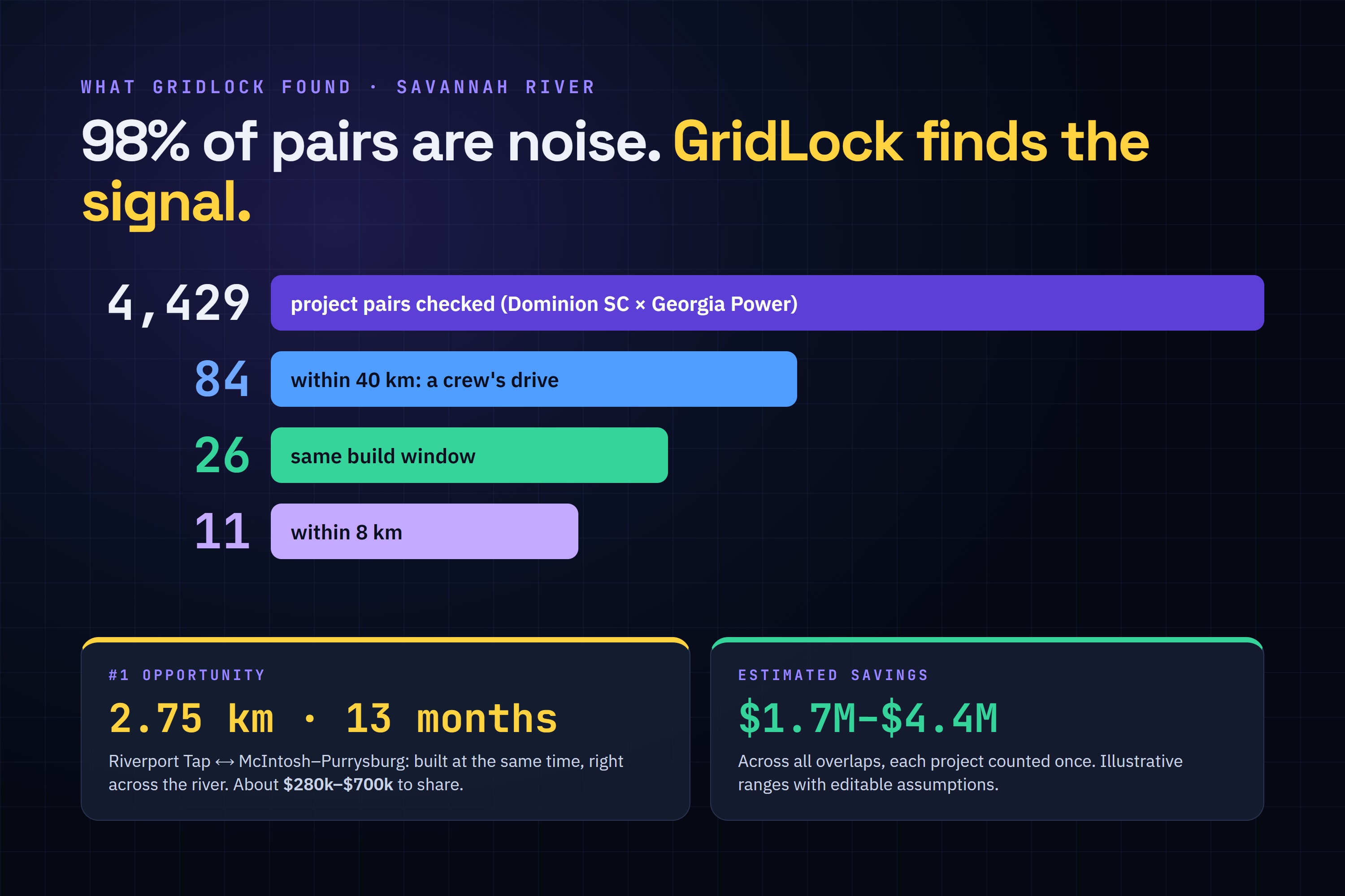
We compared 4,429 project pairs between Dominion Energy South Carolina and Georgia Power.
Only 84 pairs were within 40 km, and just 26 had overlapping construction windows.
One of our most interesting findings was the potential coordination opportunity between Dominion Energy South Carolina's Riverport tap project in Hardeeville, SC, and Georgia Power's McIntosh–Purrysburg tie across the Savannah River.
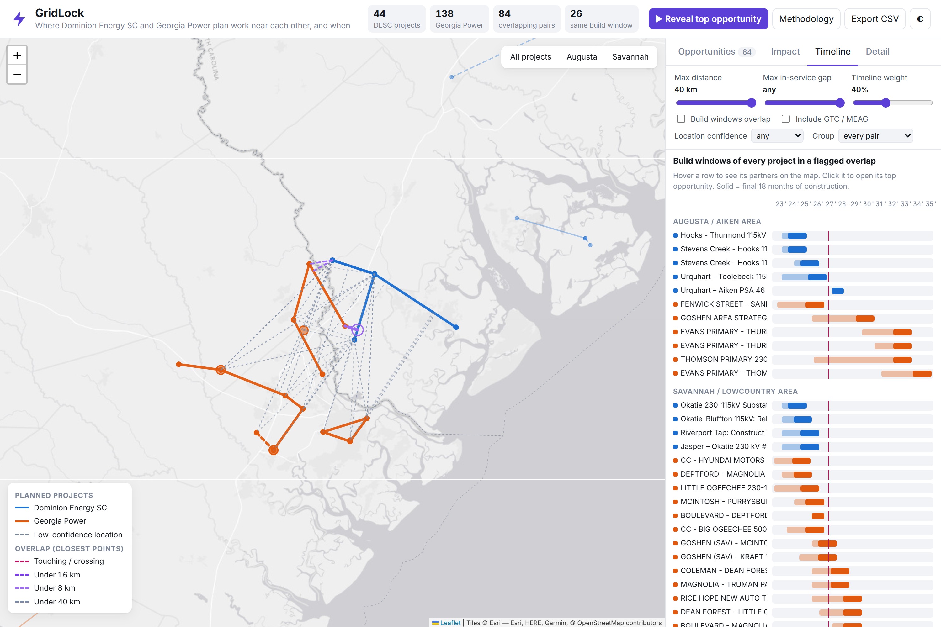
The projects are approximately 2.75 km apart and are under construction during the same period for roughly 13 months.
Based on our adjustable cost assumptions, coordinating certain construction resources could represent an estimated $280,000–$700,000 in potential savings.
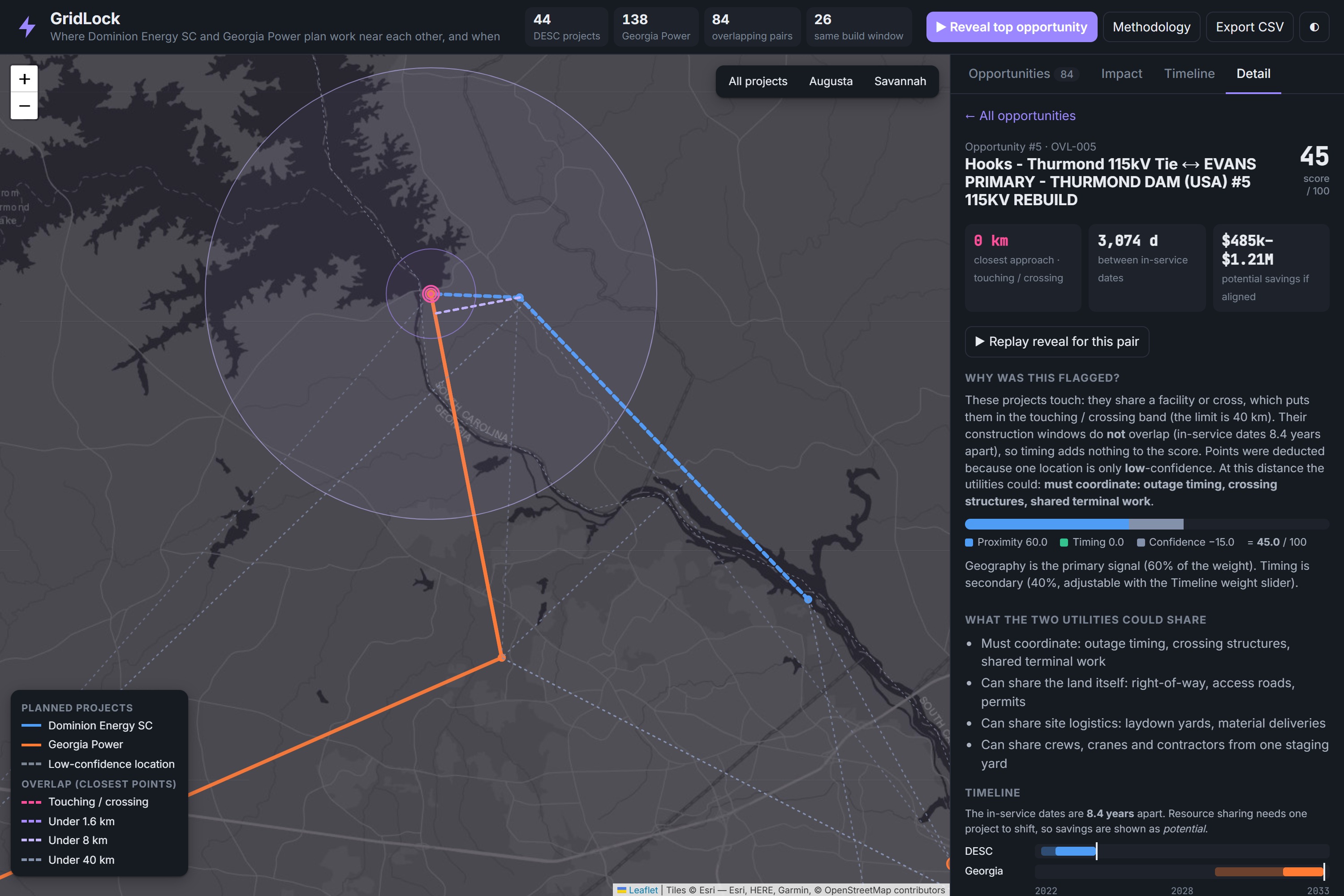
We also identified an interesting opportunity near Augusta: two rebuild projects connect to the same Thurmond Dam switchyard, but their schedules are approximately 8.4 years apart.
While that timing makes immediate coordination less likely, it raises an important question: could earlier planning help utilities align future work?
These are the kinds of connections that are difficult to spot when planning documents are viewed separately.
How we built it
1. Data pipeline (Python)
We started with public planning documents from Dominion Energy South Carolina and Georgia Power.
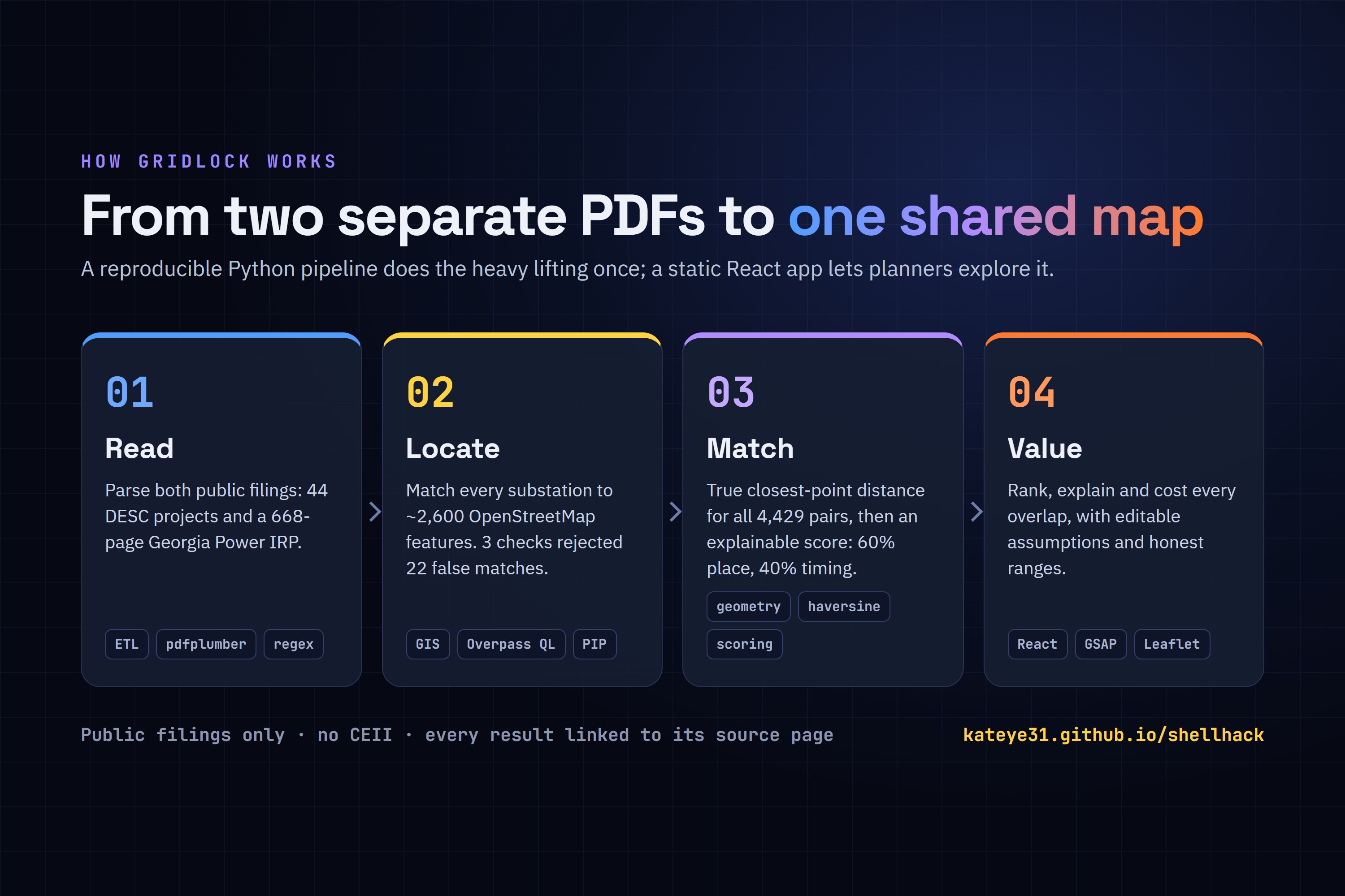
Using Python and pdfplumber, we extracted project information from the DESC project sheets and Georgia Power's 668-page Integrated Resource Plan.
For Georgia Power, we connected the ten-year project table to each project's detailed description page to retrieve additional information, including construction start dates, need dates, and project descriptions.
This gave us a structured dataset to work with instead of manually searching through PDFs.
2. Geocoding
One of our biggest challenges was that the planning documents provided project names, not geographic coordinates.
For example, Okatie–Bluffton 115kV tells us which substations a project connects, but not where those substations are located.
We broke project names into endpoints and matched them against approximately 2,600 substations and power plants from OpenStreetMap using the Overpass API.
When a location could not be confidently identified, we used Nominatim and manually verified coordinates using cited sources.
Each location receives a high, medium, or low confidence label so users can see how reliable the underlying geographic information is.
3. Overlap engine
We didn't want GridLock to simply compare the centers of two projects.
That approach can miss important opportunities, especially when a long transmission line passes close to another utility's substation.
Instead, we calculate the minimum distance between the actual project geometries:
$$ d(A,B) = \min_{a \in A,\; b \in B} \lVert a-b \rVert $$
We use segment-to-segment geometry in a local projected coordinate system to calculate the closest points between lines and locations.
This allows us to identify potential overlaps based on where projects actually run, rather than relying on rough center-to-center distances.
4. Transparent scoring
We wanted users to understand why a project was flagged instead of receiving a mysterious score.
GridLock uses geographic proximity as its primary signal and construction timing as a secondary factor.
$$ \text{score} = \text{geo} \times \big((1-w) + w \cdot \text{timing}\big) \times \text{confidence} $$
- Geography: Scores decrease across distance tiers.
- Timing: Receives a higher value when construction windows overlap and gradually decreases when projects are scheduled further apart.
- Confidence: Accounts for the reliability of the underlying location data.
- Weight: Users can adjust how much timing affects the score (default 40%).
Every match includes a score breakdown and explanation, allowing users to understand how the result was calculated.
5. Cost model
We built a cost model around the resources utilities might be able to share.
Depending on the distance between projects, this includes:
- Construction crew mobilization
- Equipment and staging areas
- Right-of-way opportunities
- Outage coordination
We only count savings mechanisms that make sense for each distance tier.
For example, right-of-way savings are based on the portion of transmission routes that actually run alongside each other, rather than assuming two nearby projects share an entire corridor.
Since actual savings depend on engineering decisions, land rights, approvals, and other factors, GridLock presents estimates as a 0.6×–1.5× range with editable assumptions.
We also account for overlapping opportunities across the portfolio to avoid counting the same potential savings multiple times.
6. Frontend (React + Vite)
We used React, Vite, Leaflet, and GSAP to build an interactive experience that feels more like a planning tool than a static research dashboard.
The map allows users to explore project locations and connections, while GSAP powers the animations throughout the experience.
During the Reveal, project connectors draw themselves, distance rings expand, and key numbers count up as the opportunity is introduced.
Users can pause, skip, and track their progress through the walkthrough.
We also built the application into a single self-contained HTML file that can be opened offline with a double-click.
Challenges we ran into
The PDFs didn't tell us where anything was. The project documents listed names, not coordinates. Turning something like
HOOKS – THURMOND 115KV TIEinto a reliable location on a map was one of the hardest parts of the project.Our first matches were completely wrong. An Atlanta project called Grady–West End was initially matched to a substation in Florida and a neighborhood in Columbia, SC. We added state-boundary validation, planning-zone distance checks, and line-length sanity checks against stated project mileage. Together, these checks rejected 22 incorrect endpoints.
Even substations with the same name caused problems. Georgia Power has two substations named Goshen, one near Savannah and another near Augusta. The planning documents distinguish them using a
(SAV)suffix, which we had to explicitly account for in our matching logic.Some of the data simply wasn't available. Some substations, including DESC's Hooks, were missing from public mapping datasets. Georgia Power's project costs were also redacted. Rather than pretending we had exact information, we estimated missing values using available project descriptions and clearly labeled those estimates.
We didn't want to pretend our savings numbers were guaranteed. Actual construction savings depend on engineering, land rights, approvals, and whether utilities can realistically coordinate their work. Instead of displaying one overly precise number, we built an adjustable model that shows a range and explains the assumptions behind it.
Accomplishments that we're proud of
- Built an end-to-end pipeline that turns raw regulatory PDFs into a ranked, explainable list of coordination opportunities, reproducible with one command.
- Found opportunities that aligned with the sponsor's reference matches while also identifying Riverport–McIntosh as a higher-ranked opportunity that wasn't included in the starter set.
- Made every number traceable to its source, whether that's a PDF page, map feature, or editable assumption.
- Built an interactive map and guided walkthrough that make complex transmission planning data easier to explore and present.
- Created a self-contained application that works offline, making it easy to demonstrate without relying on a live deployment.
What we learned
The biggest lesson was that real-world data is messy.
The distance calculations were relatively straightforward. Making sure the locations were correct, identifying duplicate names, handling missing information, and validating the results took much more effort.
We also learned how much the method of comparison matters. Measuring the closest points between projects instead of their centers can completely change which opportunities get identified.
Beyond the technical work, we gained a better understanding of transmission planning, Integrated Resource Plans, SERTP, right-of-way, and why coordinating infrastructure projects across state lines can be difficult.
Most importantly, we learned that building a useful tool isn't just about getting an answer. It's about making sure people can understand where that answer came from and decide what to do with it.
What's next for GridLock
- More accurate transmission routes: Replace straight-line approximations with actual line geometries wherever public GIS data is available, including sources such as the HIFLD transmission layer.
- More utilities: Expand beyond Georgia Power and Dominion Energy South Carolina to include other utilities in the SERTP planning region, such as Santee Cooper, Duke Energy, and Georgia Transmission Corporation.
- Automatically updated data: Build a process to retrieve and process new public filings each planning cycle so the map stays current.
Our goal is to make GridLock a tool that helps utilities see the bigger picture, identify opportunities earlier, and make better-informed decisions about how infrastructure gets built.
Because when two utilities are building near each other, they shouldn't have to discover that opportunity after the money is already spent.
Built With
- css3
- esri
- geojson
- gis
- gsap
- html5
- javascript
- leaflet.js
- node.js
- nominatim
- openstreetmap
- overpass-api
- pdfplumber
- puppeteer
- python
- react
- vite

Log in or sign up for Devpost to join the conversation.