-
-
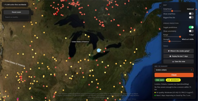
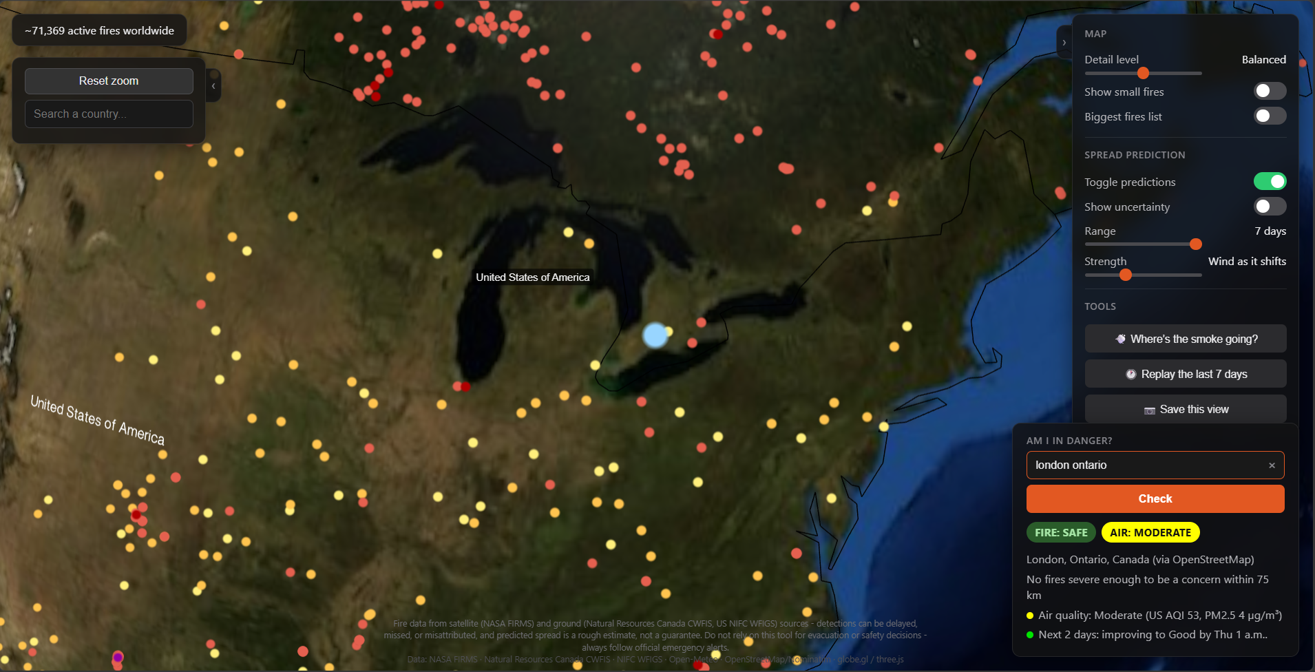
London Ontario "Am I in Danger?" check with projected air quality.
-
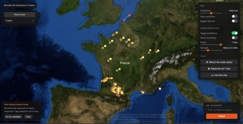
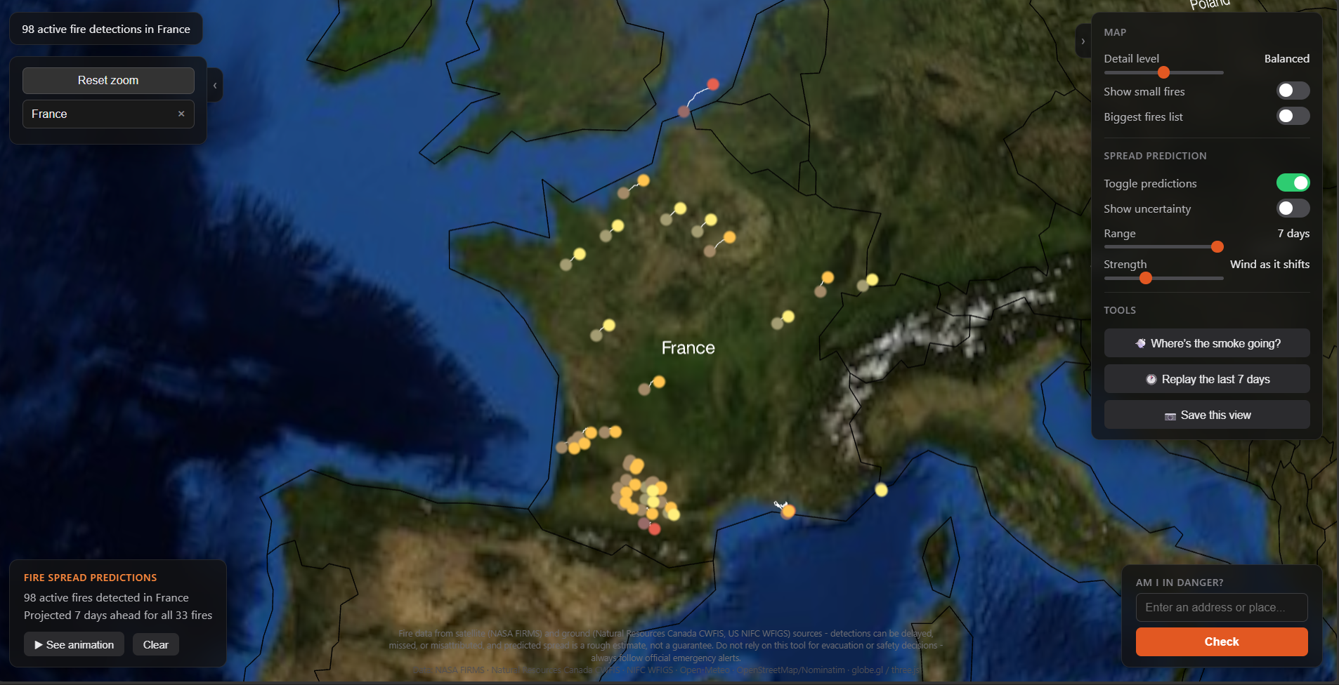
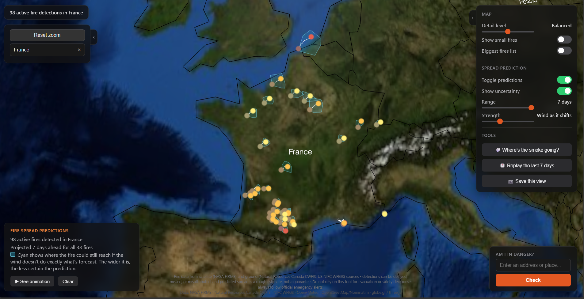
France prediction, with wind only prediction enabled.
-
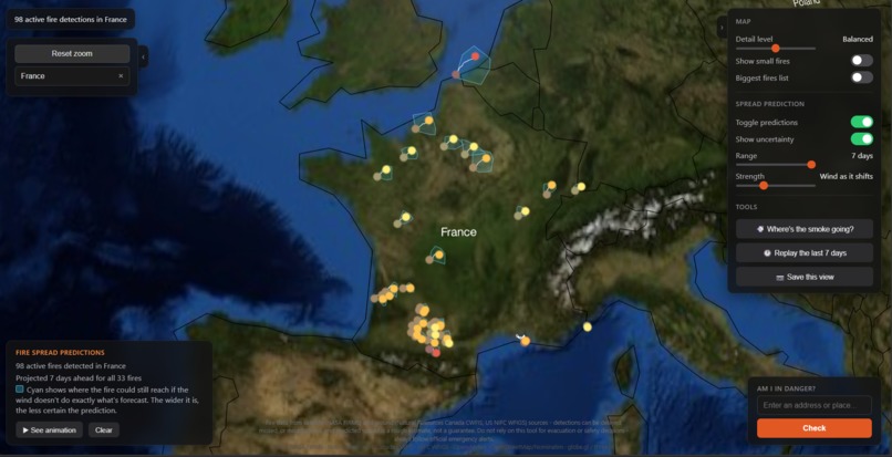
Wind only France prediction, with uncertainty enabled.
-
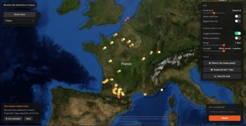
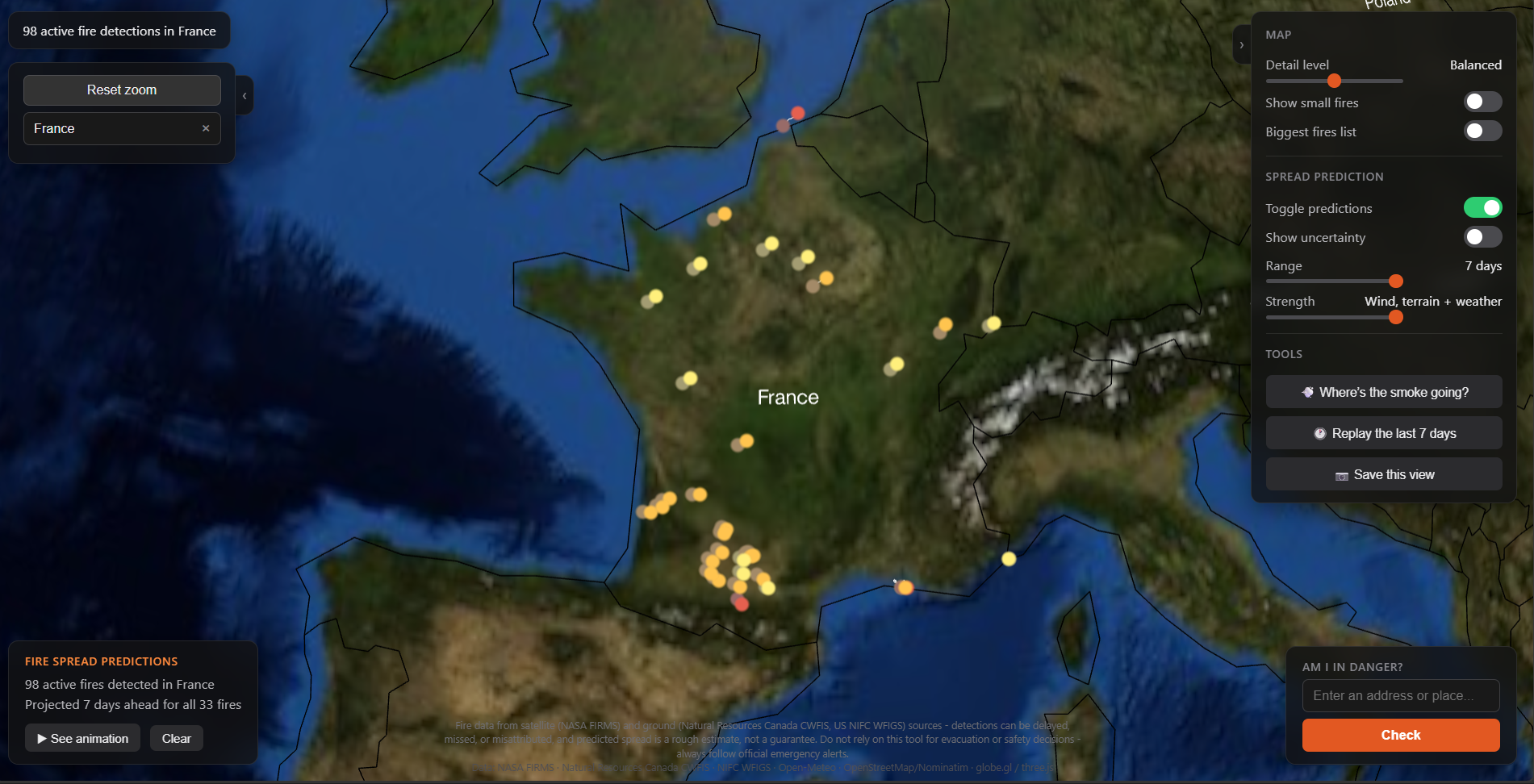
France prediction with maximum accuracy.
-
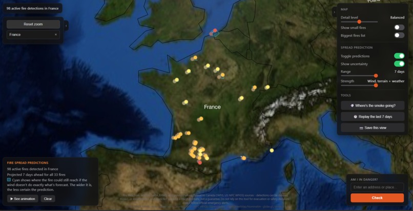
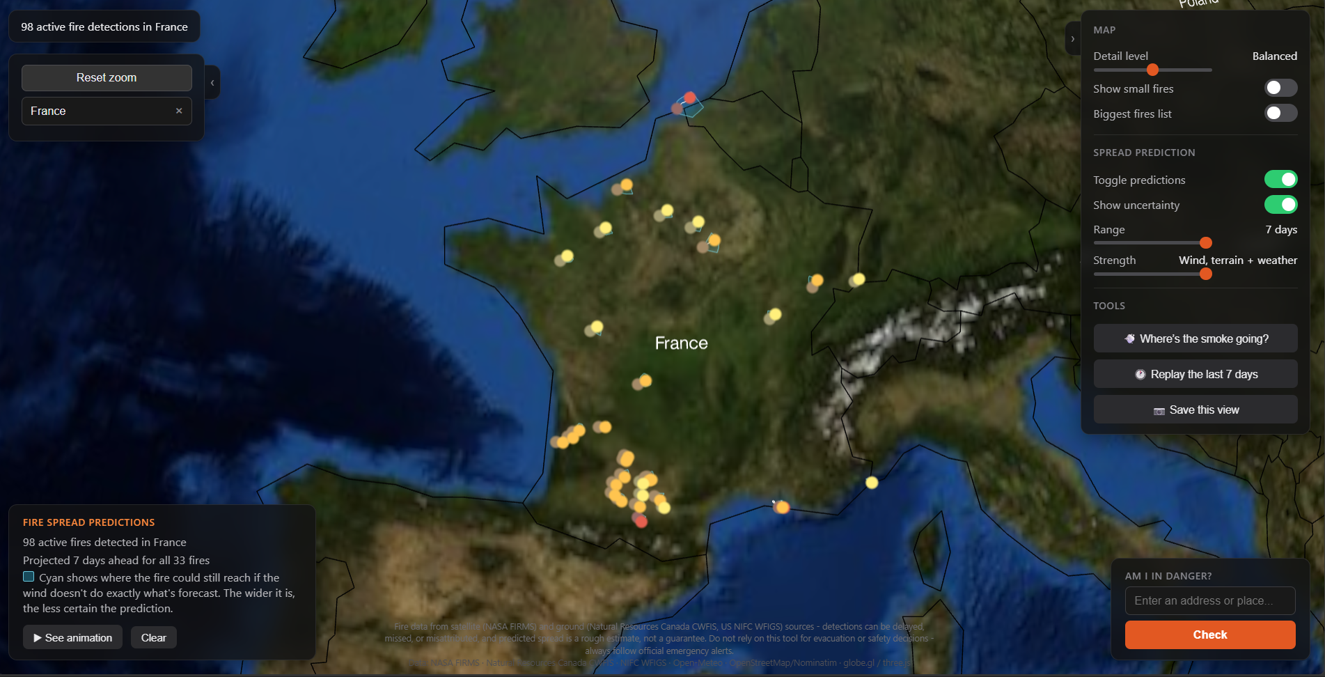
France prediction with maximum accuracy and uncertainty enabled.
-
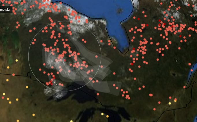
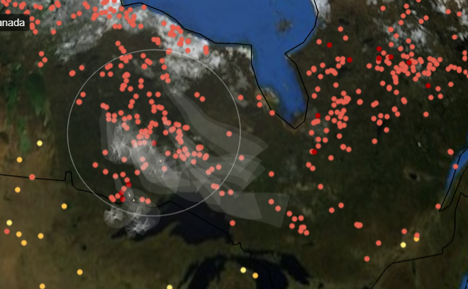
Pume of smoke from "Where's the smoke going?"
Downwind
Inspiration
Nearly every wildfire map answers one question: what is burning right now? That is the easy half, and it has already been built many times.
The questions people actually ask during a fire season are harder. Where is it going? Am I in danger? And the one almost nothing answers: is the air where I live about to become unbreathable?
That last question is the reason this project exists. The overwhelming majority of people a wildfire harms never see flame. They breathe smoke that has travelled hundreds of kilometres, arriving in cities with no fire anywhere near them, while every distance-based tool on their phone reports that they are perfectly safe. I wanted one screen that answers all three questions, and I named it after the one that nothing else answers.
What it does
- A live 3D globe of every active fire on Earth, refreshed every 10 minutes from three NASA satellites plus Canada's ground crews. Each marker is coloured by how much heat the satellite actually measured coming off the fire, so a small brush fire and a megafire never look the same.
- Fire spread prediction. Search a country and the 500 most intense fires in it get projected forward. A slider controls how much the projection accounts for: current wind only, or wind that shifts hour by hour, or terrain that speeds fire downhill and slows it uphill, or all of that plus humidity, temperature and rainfall.
- Uncertainty you can see. A single projected line quietly claims the forecast is exact, and forecasts never are. Switch this on and the projection runs 32 more times per fire, each one nudging the wind within the range the forecast could plausibly be wrong by (Using the Monte Carlo algorithm). The area all those attempts cover gets shaded in cyan. A narrow shape means the wind agrees with itself and the projection is worth trusting. A wide one means it could genuinely go several ways.
- "Am I in danger?" Type an address and get a Safe, Watch or Danger verdict, based on the fires near you and where they are predicted to go, with the nearest real threat's distance and how long it would take to arrive. Air quality gets a second badge next to the first, so the answer can read FIRE: SAFE and AIR: UNHEALTHY at the same time. That combination is the exact situation most people downwind are in, and it is the reason the badge exists. Underneath it, the next two days: smoke arrives on a schedule, so air that is clean at noon can be unhealthy by evening, and a snapshot tells someone deciding whether to go out this evening nothing at all. The line only speaks up when the category actually changes, so it reads "worsening to Unhealthy for sensitive groups around Fri 3 PM" or "improving to Good by Fri 5 AM" rather than reciting hourly numbers.
- Smoke forecasting. Draw a circle anywhere and it finds every fire inside it, takes a real air quality reading at the worst of them, and follows the forecast wind to work out where that smoke goes over the next 48 hours. The plume is drawn dark where the air would be genuinely dangerous and fades out where the smoke has thinned back to normal, so you can see the shape of it rather than read a number.
- A 7-day replay. A single day of fire detections is a scatter of dots. Play the same region day by day and you watch the fire front actually move across the ground.
Also included: a leaderboard of the biggest fires burning right now, details on any fire you click, an animation that plays the prediction forward, country search that filters on real borders rather than a rectangle, and image export that saves straight to the camera roll on a phone.
How I built it
Backend: FastAPI in Python. It keeps the whole world's fire data, roughly 500,000 detections, in memory and refreshes it on a timer. Every request is then a search through memory rather than a fresh call out to NASA, which is what makes dragging the globe feel instant.
Frontend: one self-contained HTML file. Three.js and globe.gl draw the globe, and the prediction maths, the smoke model and the rendering all live in that same file. No build step and no framework, which on a project this size meant every hour went into the actual problem. Every fire on screen is drawn in a single batched operation rather than as thousands of separate objects, which is why tens of thousands of them stay smooth on a phone.
Data: NASA FIRMS for satellite detections, Natural Resources Canada CWFIS for fires confirmed by crews on the ground, Open-Meteo for wind, terrain and air quality, and OpenStreetMap Nominatim for turning an address into coordinates.
Hosting: Render's free tier. Its 512 MB memory ceiling shaped a genuinely large share of the engineering decisions in this project.
Mobile: below 820px the panels collapse into buttons you tap to open. The JavaScript checks that same 820px figure rather than keeping its own, so the layout and the code can never disagree about what counts as mobile. Saving an image hands the file to the phone's own share sheet, because that is where "Save Image" lives.
Challenges I ran into
The fires a satellite cannot see are the big ones. Satellites spot fires by looking down and detecting heat. A large, established fire makes so much smoke that it covers its own hottest point, so the bigger and more serious a fire gets, the better it hides. My 7-day replay used satellite data only, and playing back Canada showed fires apparently dying down over the week when they were in fact getting worse.
The fix came from Canada's ground crews. Natural Resources Canada publishes every agency-reported fire with a start and end timestamp attached, which means you can ask what was confirmed burning on a specific past day instead of only seeing today's list. Adding that in, ground reports turned out to account for 86 to 92% of all fire activity in eastern Canada. The satellite-only replay had been showing under a fifth of what was really happening.
Then it turned out to be wrong a second time. Canada publishes the same fires through two separate feeds, and the one with the timestamps stops being updated partway through a fire for several provinces. Manitoba gave it away: 112 fires on the live map, 3 in the replay. It now reads both feeds and merges them.
A rate limit that had nothing to do with me. Predictions kept dying with 429 Too Many Requests from the weather service. I assumed I was asking too often, so I slowed down, then added randomness so retries would not collide, then forced every request to wait its turn. It kept failing. The logs eventually showed requests backing off for over a minute and still being refused, which meant this was not a brief spike I could wait out.
The problem was where my requests came from rather than how many I sent. My traffic sits far below the published limits, and the identical requests from my own computer were never refused, even when I pushed harder than the live site ever gets pushed. Render's free tier sends outbound traffic through addresses shared with other customers, and the weather service counts requests per address. My own pacing was never the lever. So I stopped trying to prevent it and made it survivable instead: if a reading cannot be fetched, that point borrows the nearest one that worked. A prediction always returns something now, which is why an outage would be invisible rather than fatal.
Half of Siberia did not exist. Searching "Russia" returned almost nothing, and some of the largest fires on the planet were coming back as being in no country at all.
Working out whether a point sits inside a country means testing it against the country's outline, and that test treats longitude as a straight line from -180 to +180. Russia crosses the point where those two ends meet. On a globe that is one continuous border. On a straight line it is a country torn in half with a gap through the middle, so the test was checking fires against a shape with a hole in it. Nothing ever crashed, because a wrong answer is not an error. Russia now returns 98,309 detections.
The obvious one-line fix turned out to be worse than the bug. It put New Delhi in Mexico and a stretch of open Pacific in Uganda, so I checked the real fix against 16 specific locations and a sweep of all 176 countries before trusting it.
Four out-of-memory restarts on a 512 MB server. Three were the same mistake in three different places: storing the finished, uncompressed version of a response instead of the compressed bytes actually sent.
The fourth was more interesting. I profiled it expecting a leak and found none. Almost all the memory was the fire data itself, and the reason was strings. Splitting a line of text gives every row its own separate copy of every value, so half a million fires were each holding a private copy of a date, even though there were only seven different dates between them. Pointing them all at one shared copy took the dataset from 171 MB to 112 MB, and the peak from 450 MB down to 327 MB.
Two phone bugs that a desktop never shows. Three.js renders at whatever pixel density the screen reports. On a laptop that is fine. On a phone claiming three times the density, it is drawing roughly nine times as many pixels as it needs to, for extra sharpness nobody can see on a sphere that size. Capping it was the single biggest improvement to how smoothly the globe drags anywhere in the app.
The second took longer to find. The camera controls ship with no zoom limit, so a fast pinch could push the camera straight through the surface of the globe. Once it was inside, the screen went completely black with nothing to explain why. Neither bug can happen on a desktop: a mouse wheel cannot zoom fast enough for the first, and an ordinary display never pays for the second.
A 29-second first load. Rather than guess, I timed every stage separately. Everyone assumes the slow part of handling 455,000 fires is grouping them together, and that turned out to be 10% of it. The real cost was a general-purpose converter doing unnecessary work on data that was already in the right shape, plus one expensive request whose entire job was to display a single number, running at the same time as the map load and starving it. First load is now 0.39 seconds, and the globe is interactive in under one.
Accomplishments I am proud of
I built the tool that says my own model is not good enough. validate_predictions.py rewinds to a past day, re-runs the projection using the wind that actually blew, and checks it against the fires that really did appear afterwards.
The hard part is scoring it fairly. Imagine guessing where someone in a packed stadium will be in an hour. Guess almost anywhere and you land within a few metres of somebody, so being close to a person proves nothing. Fires cluster the same way. Drop a projected marker anywhere near an active region and some real fire will show up near it.
So the script compares against the laziest forecast available: assume the fire does not move at all. If wind, terrain and weather cannot beat standing still, they are not earning their place.
They did not beat it.
Then the more interesting question: does fire actually grow the way the wind is blowing? For each fire I measured the direction the new detections appeared in and compared it against the wind direction. If fire grew randomly in all directions, that angle would average around 90 degrees, so 90 is the number that means no relationship at all. It came out between 36 and 61, which is a strong relationship. It was also pointing the wrong way. New fire was appearing on the upwind side.
That says something about the satellite rather than about fire. Smoke blows downwind and sits between the satellite and the ground, so downwind fires are the ones the satellite cannot see. The fire is almost certainly spreading downwind exactly as expected. The detections proving it are hidden underneath its own smoke.
Which means the data I was grading against has a hole in it, in precisely the place the model makes its prediction. Had I tuned the model until that score improved, I would have been teaching it to predict fire spreading upwind, making it genuinely worse in order to match a flaw in the camera. Settling this properly needs fire perimeters mapped from the ground rather than heat detections from orbit.
I would rather ship that finding than quietly adjust a number until the graph looked better.
Every health number in the app is either real or missing. Wind, terrain and elevation all fall back to an estimate when a provider fails, because a slightly wrong wind direction only misaims a drawing on a globe. Air quality has no fallback anywhere in the code. If the figure is not available, the line and the badge disappear rather than guess, because that is a number somebody might make a decision on.
What I learned
- A wrong answer is not an error. The bugs that lasted longest here were the quiet ones: half a country missing from a search, a replay under-reporting an entire fire season, a green SAFE badge sitting above unbreathable air. Not one of them crashed. Every one needed a person to look at the output and think that it seemed off.
- Check the instrument before optimising against it. Three separate times a "slow" result turned out to be the tool I was measuring with rather than the thing I was measuring.
- Ask the API instead of guessing at it. Two assumptions about NASA's history endpoint were settled in under a minute by sending it one request each. One of them was wrong, and it would have become a silent, entirely plausible-looking data bug.
- The fastest work is the work that never happens while someone is waiting. The biggest speed win in the project came from noticing that an expensive result did not depend on the request at all, so it could be built in the background ahead of time.
What's next
Make the ground-confirmed data work outside Canada. This is the biggest single limit on the project. Canada publishes every agency-reported fire as an open feed with timestamps, which is why the Canadian replay is trustworthy and the rest of the world's is satellite-only, including blind spots. The United States publishes comparable data through the National Interagency Fire Center, and Europe through EFFIS, so the next step is one adapter per source that normalises them into the same shape the Canadian feed already fills. Australia is harder, because fire reporting there is state by state rather than national. Every country added removes the smoke blind spot from that country's map.
Replace the spread heuristic with a real fire behaviour model. What ships today is a demo-grade approximation: wind speed and direction, biased by slope and damped by humidity and rain. It has no concept of what is actually burning. The established science here is the Rothermel surface spread equations and the tools built on them, and they need something this project does not have yet, which is fuel data: what vegetation is on the ground, how dense it is, and how dry it is right now. The United States publishes fuel maps through LANDFIRE. Globally that data is patchy, so the honest version of this feature is probably excellent in a few countries and unavailable elsewhere, and it should say which one you are looking at.
Validate against mapped fire perimeters. The perimeters that agencies and aircraft map directly are not affected by the smoke blind spot that ruins satellite detections as a scoring target. Until the model is graded against those, nobody can say whether it is any good, including me.
Alerts. Save an address, and get told when smoke is projected to reach it. Everything needed for this already exists in the app, and it turns a thing you remember to check into a thing that tells you.
Crowd-sourced fire reporting with accounts. Scoped, then deliberately deferred. Reports from the public need moderation and proper access control before anyone should trust them, and doing that badly is worse than not doing it.
Smaller things worth doing. Shareable links that encode the current view, so a plume can be sent to someone rather than described. A longer history archive than 7 days, which NASA's endpoint makes awkward but not impossible. A filter for detection age, so you can separate what is burning now from what burned yesterday.
Built With
- css3
- cwfis
- fastapi
- geojson
- globe.gl
- html5
- javascript
- nasa-firms
- nominatim
- open-meteo
- openstreetmap
- python
- render
- three.js
- uvicorn
- webgl


Log in or sign up for Devpost to join the conversation.