-
-
Homepage
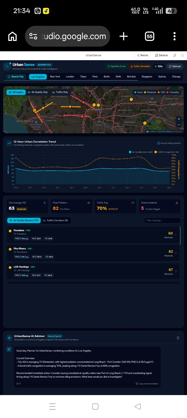
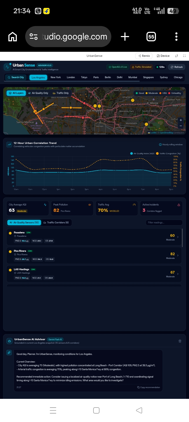
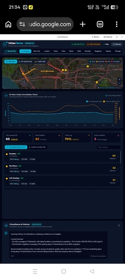
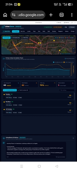
About UrbanSense
An AI-powered smart city advisor for air quality and traffic — built so planners get specific, data-grounded advice, not generic “plant more trees†slogans.
What inspired us
Most city dashboards stop at a number. AQI 168. Congestion 74%. A red blob on a map. Then the planner is left alone with a spreadsheet and a public that wants to know what happens next.
We kept running into the same gap: air and traffic are already measured, but they are rarely *argued with*. Chatbots will happily invent a street that does not exist. Official portals bury PM2.5 under five clicks. And in cities like Lucknow — where we started this build — the worst air and the worst junctions are often a few kilometres apart, and nobody is holding those two pictures in the same frame.
UrbanSense came from a simple bet:
If you put the live snapshot on screen and in the model’s context window, the assistant cannot hide behind generic advice.
We wanted something a planner could open in two or three clicks: pick a city, see the map, ask “Which streets should we reroute traffic from?†and get an answer that names Hazratganj, cites PM2.5, and proposes a peak-hour diversion — or honestly says the data does not support a claim.
That last part mattered as much as the first. A city tool that hallucinates a sensor is worse than no tool.
What we learned
1. Air quality is a join, not a feed
OpenAQ v3 is not “give me Delhi PM2.5.†It is a graph: locations have sensors, sensors have parameters, and latest is keyed by sensor id. You do not get a tidy {pm25, pm10, no2, o3} object; you assemble one.
Parameter ids we actually used:
| Pollutant | OpenAQ id | Typical unit |
|---|---|---|
| PM10 | 1 | µg/m³ |
| PM2.5 | 2 | µg/m³ |
| NO₂ | 7 | µg/m³ or ppm |
| O₃ | 10 | µg/m³ or ppm |
Unit conversion is not cosmetic. A 0.03 ppm NO₂ reading looks “fine†until you remember:
$$ c_{\mu g/m^3} \approx c_{ppm} \times 1880 \quad (\mathrm{NO}_2,\; 25^\circ\mathrm{C}) $$
Miss that factor and the advisor will tell you the air is clean while the kerbside is not.
2. AQI is a piecewise linear story
We report US EPA AQI so colours mean the same thing in Lucknow and Los Angeles. For a concentration $C$ that falls in breakpoint $[C_{low}, C_{high}]$ with index range $[I_{low}, I_{high}]$:
$$ I = \frac{I_{high} - I_{low}}{C_{high} - C_{low}}\,(C - C_{low}) + I_{low} $$
City AQI is not an average. It is the max of the pollutant sub-indices — because the public breathes the worst thing in the mix, not the mean.
For recommendations we still compare raw PM2.5 to health guidelines, not only AQI. WHO’s 24-hour PM2.5 guideline is $15\,\mu\mathrm{g}\,m^{-3}$; India’s CPCB 24-hour standard is $60\,\mu\mathrm{g}\,m^{-3}$. A station at $62\,\mu\mathrm{g}\,m^{-3}$ is “about $4\times$ WHO†and only just over CPCB. That ratio is what a planner can act on:
$$ \rho = \frac{C_{\mathrm{PM2.5}}}{C_{\mathrm{WHO}}} $$
If $\rho \approx 2$, the assistant should say so, and name the station.
3. Traffic has a clock
Congestion is not a random number. A believable model needs a diurnal prior: morning peak, midday plateau, evening spike, night collapse. We treat local hour $h$ as a multiplier $r(h)$ on a corridor’s structural “rushiness,†then add noise that refreshes on a 45-second tick so the map feels live without pretending to be a loop detector.
$$ \mathrm{congestion} = \mathrm{clip}\bigl(32 \cdot r(h) \cdot r_{\mathrm{corridor}} \cdot \varepsilon,\; 8,\; 98\bigr) $$
Speed follows, inversely. Incidents are rare on free-flow links and much more likely above ~70% congestion. That single rule produces corridors that look like cities we know — Silk Board, ITO, Marylebone Road — without a traffic API.
4. LLMs are only as honest as their prompt and their JSON
The Gemini system instruction is strict: no invented locations, no invented numbers, cite the snapshot, admit simulated traffic. We still learned that the model will embellish if the snapshot is vague. So the snapshot is boring on purpose: station name, µg/m³, AQI, congestion %, incident flag. Every chat turn ships the full current JSON, not a summary. If OpenAQ is down, the payload says "source": "simulated" and the prompt forbids calling it live.
Without a Gemini key the app does not die. A local advisor walks the same JSON with the same rules. That was a product lesson: demo integrity beats a spinner.
How we built it
UrbanSense is a single-page app with a tiny Python proxy — no login, no framework build step, one session.
┌─────────────────────────────────────────────────────────â”
│  Dashboard (Leaflet + Chart.js)     │  Advisor chat     │
│  AQI pins · traffic polylines       │  chips + Gemini   │
└──────────────┬──────────────────────┴─────────┬─────────┘
               │ snapshot JSON                  │
               â–¼                                â–¼
     OpenAQ v3 (or model)              Gemini 2.0 Flash
     Simulated corridors               (or local advisor)
Stack
- Vanilla HTML / CSS / JS modules — fast to load, easy to read, no bundler.
- Leaflet + Carto Dark tiles — night-city map that runs without a billed Maps key.
- Chart.js — 12-hour AQI trend (API history when we have it; a diurnal reconstruction when we only have “nowâ€).
- OpenAQ v3 via
X-API-Key, proxied so the browser does not fight CORS. - Gemini (
gemini-2.0-flash, falling back to 2.5 Flash) with the planner system prompt. - Python
ThreadingHTTPServer— static files +/api/openaq/*+/api/gemini.
Data contract. Everything the UI shows is also what the model sees:
{
  "city": { "name": "Lucknow", "guidelines": "CPCB" },
  "airQuality": { "source": "openaq|simulated", "stations": [/* pm25, aqi, … */] },
  "traffic": { "source": "simulated", "segments": [/* congestion, incident */] }
}
Cities in the first cut: Lucknow (default), Delhi, Mumbai, Bengaluru, London, New York, Los Angeles, Paris — each with named stations and named corridors, not anonymous lat/lng.
UX rules we refused to break
- Simulated data is labelled Simulated — badge, popup, chat, snapshot.
- Keys live in
localStorageonly; the app is fully usable at zero config. - Three clicks: city → dashboard → question.
- Answers should be 3–6 sentences and 1–3 concrete actions: reroute, retune a signal, issue an advisory — or “the snapshot does not support that.â€
Challenges we faced
Live traffic is a myth for a weekend build
There is no universal, free, per-street congestion API that covers Lucknow and Paris. We could have faked GPS traces and hoped nobody noticed. Instead we leaned into honesty: a seeded, time-of-day model, clearly marked, good enough to ask “is there a link between traffic and pollution in this snapshot?†The link is colocated names and coincident peaks — not a regression. The advisor is told not to pretend otherwise.
OpenAQ v3 is real infrastructure
v3 requires a key. Latest values do not always include the parameter name. Some cities have stations with no recent PM/NO₂/O₃. We treated every failure mode as a product path: if the join is empty, fall back to a modeled field and say so in the chrome. The worst outcome was a blank map; the second-worst was a map that looked live when it was not.
Maps without AI Studio’s magic key
The original brief assumed Google Maps JavaScript with a studio-injected key. In this environment that hook does not exist, and a billed Maps key is a non-starter for a demo. Dark Carto tiles on Leaflet got us the night-city aesthetic and custom AQI/traffic markers without a credit card. We would still plug Google Maps in if a key appeared — the layer model is the same: pins by AQI, polylines by congestion.
Grounding is a systems problem, not a prompt problem
A beautiful system prompt is not enough. If you only send the last user sentence, Gemini will “remember†a street from training data. If you send a 40 kB dump and no rules, it will narrate. The working combination was:
- snapshot JSON every turn
- “do not invent†in the system instruction
- a local advisor that cannot invent, as fallback
- UI copy that never upgrades “modeled†to “sensorâ€
Making AQI comparable without lying
Indian planners think in CPCB; global literature thinks in WHO; US AQI colours are what the public recognises on a map. We compute EPA AQI for the chrome, and we cite both µg/m³ guidelines in the advice for Indian cities. The math is simple; the politics of which number you put in bold is not. We put the concentration in bold and the standard in the same sentence.
Keeping the whole thing fast
Eight OpenAQ latest calls, a chart, a map, and a chat panel on one screen. Parallel fetches, a 45 s traffic tick that does not refetch OpenAQ, and a refresh button for when you actually want new air. The dashboard had to feel like an operations room, not a research notebook.
What we would do next
- Historical OpenAQ hourly series instead of reconstructed trends.
- A real (even delayed) traffic source where one exists, still labelled by provenance.
- Ward-level population overlay so “unhealthy for sensitive groups†becomes a count of people, not a colour.
- An intervention log: “we retimed Polytechnic Crossing at 17:40†— so tomorrow’s chat can score the action against the next snapshot.
Until then, UrbanSense is a small insistence: show the city, name the street, cite the micrograms, and do not invent the rest.

Log in or sign up for Devpost to join the conversation.