-
-
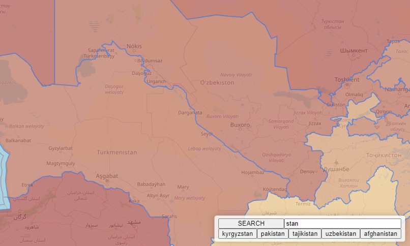
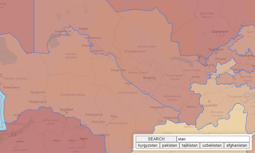
Searching for Stan
-

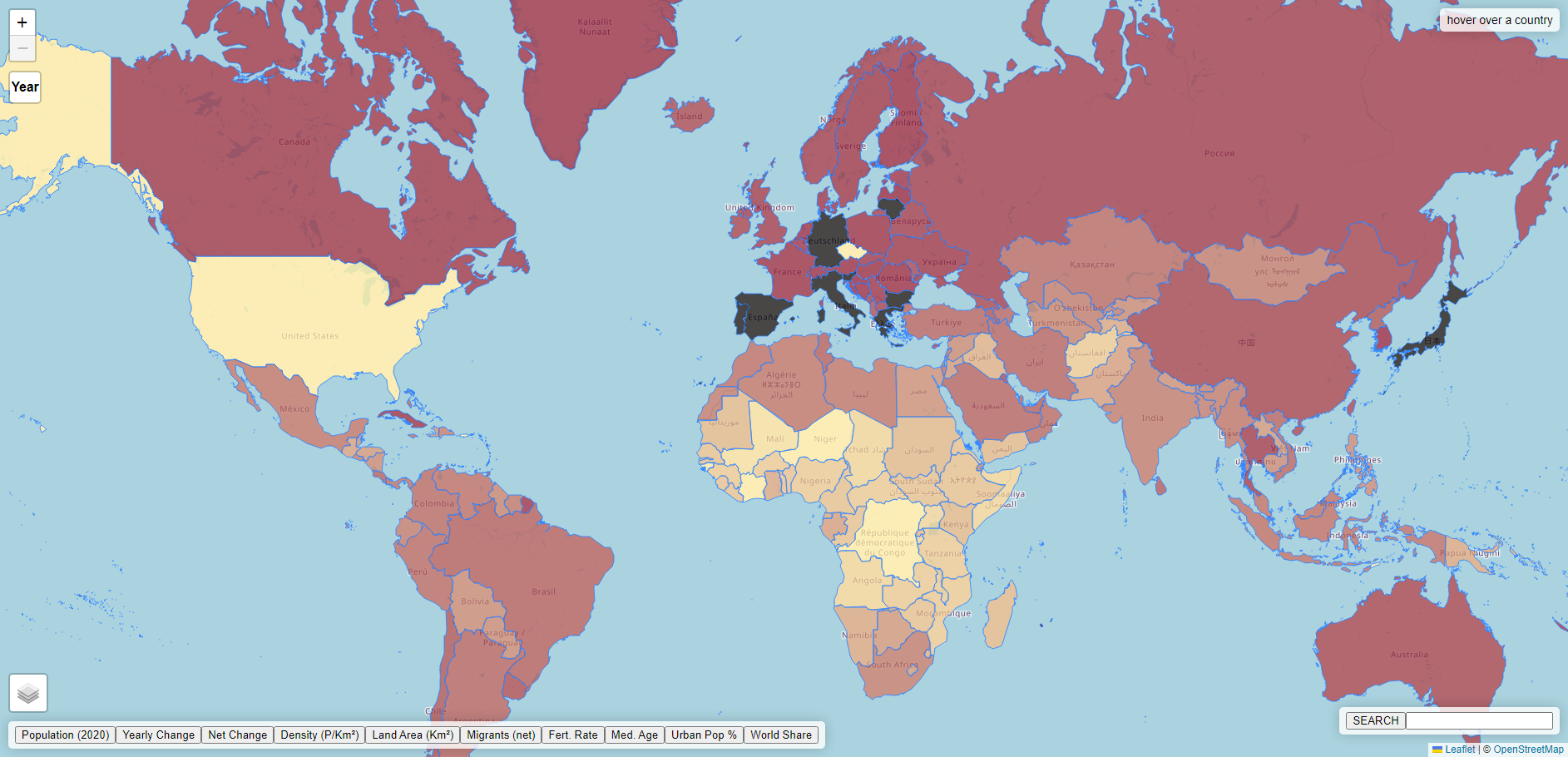
Median Age
Inspiration
We took "Hack the Map" pretty literally, and we made a map. Taking into account the ideas of traveling and experiencing the world, we considered how maps can visually represent data in useful ways.
What it does
Our project displays data about countries on a map of the world. It can display statistics about any country, search for and display a country close up, and represent a statistic with color variation.
How we built it
We used the leaflet.js framework and openstreetmap data to display the base map. We also used geoJSON data to represent the shapes of the countries and various data sources for our data representations.
Challenges we ran into
We struggled with poor quality data that hampered our ability to display as many different visualization as we wanted to.
Accomplishments that we're proud of
Our program's ability to display data with gradation of color is one achievement we're particularly proud of, as our program is able to generate this color variation between any two color values, not just with fixed colors.
What we learned
We learned more about implementing frameworks such as leaflet.js and building around the limitations and capabilities that they're built with.
What's next for Mapd
Our next step with Mapd would be building a broader interface around the map itself, as well as implementing the finals steps of our data importation feature, for which we already have basic functionality.

Log in or sign up for Devpost to join the conversation.