Inspiration
Deeply moved by actress Aria Mia Loberti’s story at the ELC Hackathon Launch Event, Anh was looking for ways to make makeup packaging more accessible, especially for people who are dealing with disabilities. The color-coding icons are inspired by the existing identi-button clothing identifiers, and ideas continue to develop as the team researched the topic.
What it does
The AccessiBeaulity Lipstick Packaging System aims to improve upon Estee Lauder’s current lipstick packaging and allow the product to be accessible by all possible users.
Traditional packaging is often similar regardless of the finishes and colors of the lipstick. The only way the users can differentiate the products is by actually looking at the products.
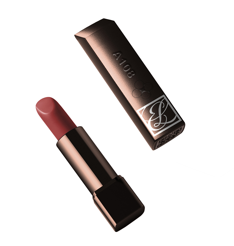
The current Estee Lauder lipstick design uses similar packaging for various finishes and colors, and the slight differences are usually visual cues. The lipstick label lacks information. The lipstick box is a darker color with no tactile cues, which could be a challenge for some people to independently identify. There are good features such as an edgy body that prevents rolling and allows standalone and a hollowed bottom where the color sticker is located.
Our design is user-centered, incorporating QR code technology into design improvements to help break barriers in the beauty industry.
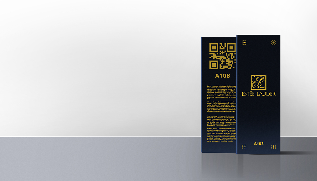
The QR code is located on the side of the box and at the bottom of the lipstick tube. Users can scan the product for information and ingredients on an accessible website. The QR code is visible and scannable from a distance, using an anti-glare clear sticker. Having the QR code can reduce the hassle of customers having to label the lipsticks after their purchase, especially for visually impaired users. The QR is placed at the slightly-hollow bottom using a clear, anti-glare sticker.
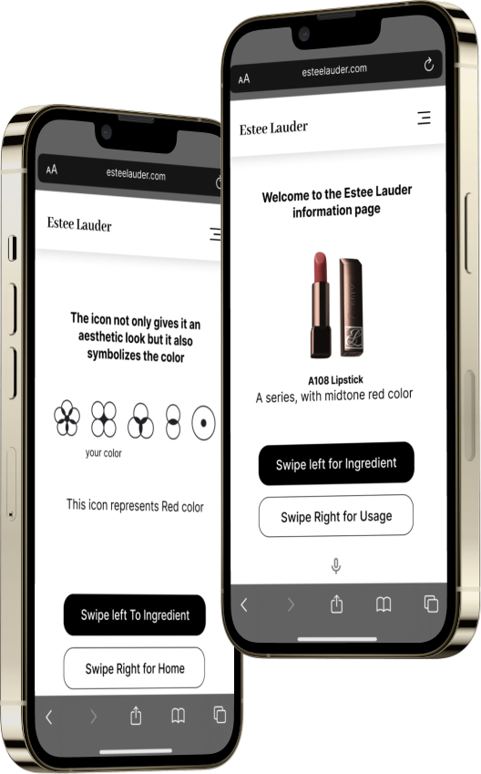
The link will take you to a user-friendly and accessible interface with features such as alternative texts, voiceover, vibration rhythms to identify, page-swiping, and more. When you land on the welcome page, if the sound is turned on, a voice will narrate the website, and you have the option to deactivate it. If your phone is silent, the welcome page will quickly vibrate your phone twice. The design allows users to easily navigate the interface with simple instructions. Page content includes lipstick descriptions, ingredients, and explanations of the color coding system. The website can also be voice-controlled with users saying “swipe left” or “swipe right” and the website will change on its own. The userflow has 5 tabs: home, product details, ingredients, color system explanation 1 and 2.
Our color coding system was inspired by the identi-button clothing identifiers. The symbols and numbers represent the color and undertone. The characters are engraved on the box and the lipstick tube. Our design is meant to be aesthetically pleasing, and meaningful.
Estee Lauder has 80 lipstick shades (in matte, creme, hi-lustre, crystal finishes) in identical lipstick tubes. We want to counteract that by emphasizing the individuality of each finish by using various materials for the tube to provide different textures when feeling. The matte lipstick tubes would feel brassy, the creme tubes would feel more like polished metal, the hi-lustre tubes would feel slightly velvety, and the crystal tubes would feel glossy and smooth.
We also placed a focus on the lipstick cap which is slightly slanted to help identify the direction of the lipstick. The cap aligns magnets in one area to ensure that the cap is always pointing in the direction to apply lipstick. When closing, it will make a “click” sound to notify.
How we built it
Anh came up with the new design, building upon Estee Lauder’s existing Pure Color lipstick design. We researched articles on issues people with disabilities deal with when using cosmetics, then we came up with our personal twists to existing accessible solutions. The QR code is a simple technology. The code would lead to an almost-always available webpage that gives details on the lipstick, such as color, ingredients, and explanations on our icons. The website makes sure to simplify user interactions, in which users only have to swipe left and right to get to a destination. The website follows the web accessibility standards. John uses Photoshop, Figma, Adobe Illustrator, and Blender to visualize the design.
Challenges we ran into
Aside from typical various time zones and schedule challenges, we also have other issues. We would come up with some really cool ideas then realize they would not work for our goals, so then it would be back to the drawing board. A lot of design challenges and how to make the technical solution… well, more technical. The QR technology is too simple, so we wanted to give users more independence when using the interface.
Accomplishments that we're proud of
We are proud to see the idea taking shape and improving as we progressed. We are also very glad that we were able to pull through despite the multiple challenges.
What we learned
Through this project, we learned valuable lessons on teamwork from different countries, and we also learned new skills and information from each other.
What's next for The AccessiBeaulity Design
We want to explore accessible design on other products like eye products (e.g., eyeshadow palette, eyeliner, mascara, etc.), other makeup and skincare products like foundation and moisturizer. After that, we also want to explore accessibility-driven product lines. For example, an eyeshadow palette that you can push up single plates after locating the color you want to use. Accessibility design opportunities are limitless. We want real people and real data to constantly improve the design.

Log in or sign up for Devpost to join the conversation.