-
-
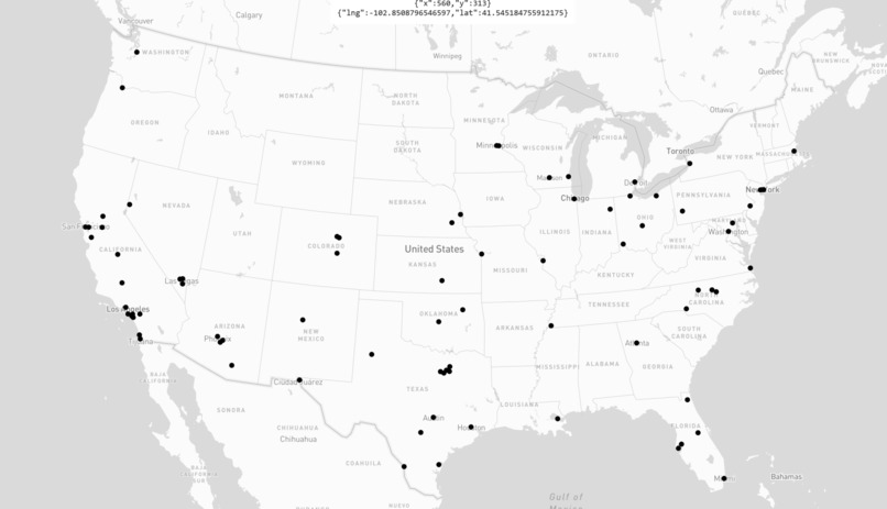
Initial simulation with stations
-
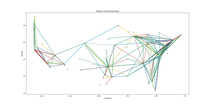
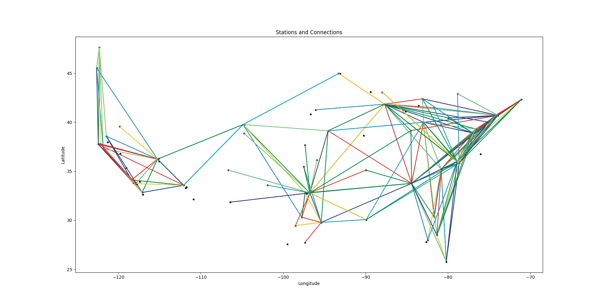
Station connections before manual trimming
-
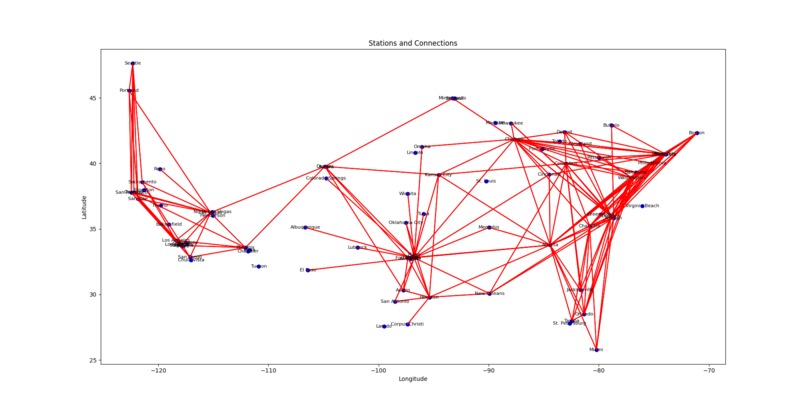
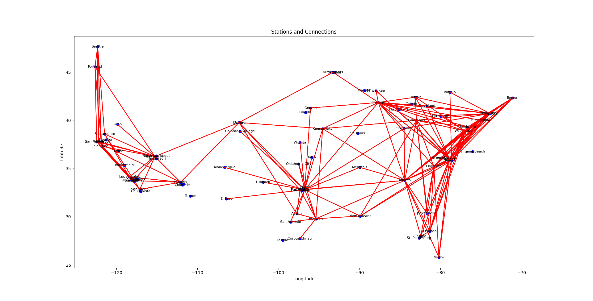
Early data representation of station connections
-
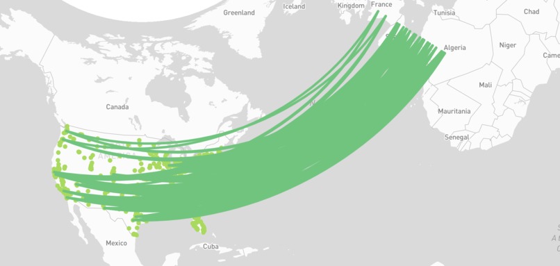
The Columbian Exchange: a failed attempted at connection formation
-

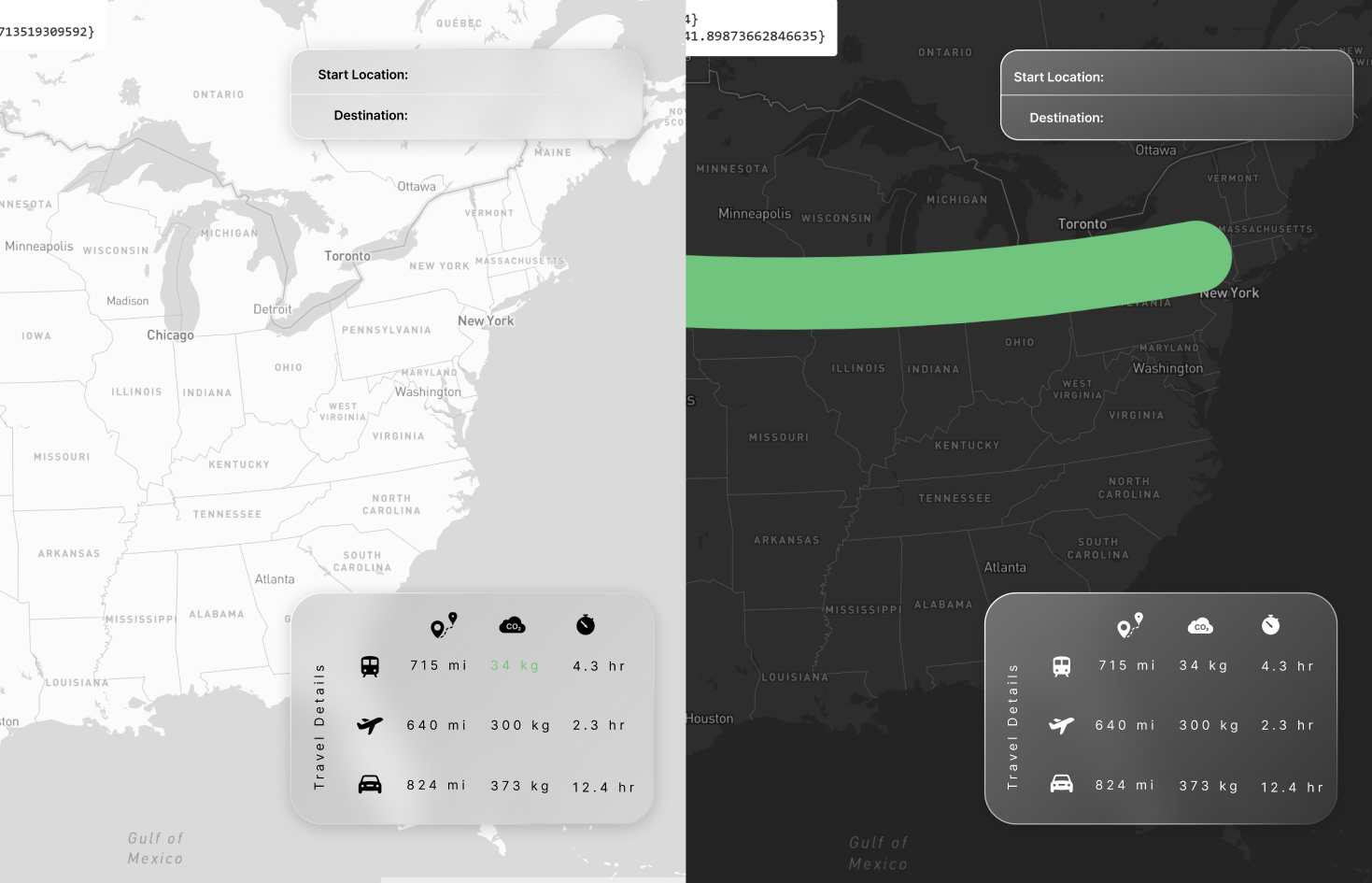
Light and Dark Version of UI if Completed
-
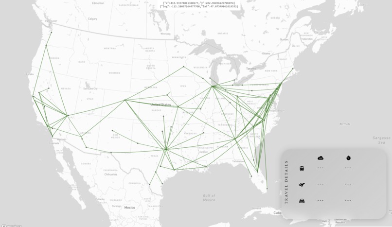
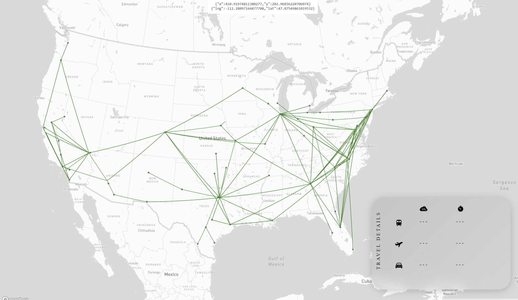
Final map with full routes and connections


Team Trains
Domestic travel in the United States is dominated by non-Eco-friendly airplanes and cars. But how would travel efficiency and carbon dioxide emissions be affected if the United States embraced high speed rail trains, the future of speedy, sustainable public transportation?
Inspiration
As members of Generation Z in the United States, we have long romanticized what a high-speed rail (HSR) system might look like. Watching videos of bullet trains in other established countries around the world, seeing Elon Musk's failed promises of building a Hyperloop, or Richard Branson's idea for his Hyperloop One created a dream of what a more efficient mode of transportation could do for the world's largest economy. Our goal is to show ourselves and others what this realistic dream could look like for domestic travelers, and how it could offset the United States' substantial carbon footprint.
What it does
Team Trains' website is an interactive data-driven simulation that shows users what their alternative, and more energy-efficient travel plans could look like with a systematic HSR.
We designed the site in a way that allows our users to easily decide and observe travel plans by factoring in their possible means of transportation, carbon emissions, time, and distance. Our hope is to highlight the inefficiencies within the United States transportation system while informing our users to the environmental contribution they could potentially by using an HSR.
How we built it
We believe a design centered around an immersive user experience brings the future of sustainable travel to life. We decided that an interactive map would offer users the opportunity to engage with their desired travel plans and visualize the effects of a HSR on their trip. Using html, css, javascript, and Mapbox GLJS API, we constructed a user-friendly data visualization of the HSR system. Due to the lack of coordination and inefficiency of the current US passenger train system, we decided to custom create a new rail system based off of successful train lines in Japan and China. Our methodology for deciding station placements relied on the population of cities and the total daily flight volumes that location experienced. Using python, pandas, matplotlib, numpy, and selenium, we scraped data from flight tracker sites and the US census to determine a minimum threshold of population and passengers required to warrant a HSR station in a city. With over 39,000 top population cities in our database, we narrowed down the number of stations to 70 cities that had a moderate population and high flight-volume (as demand for travel is better represented by inflow and outflow as opposed to standing population). We then formed rail connections between cities based on the density flight routes using machine learning as we believe the HSR would effectively replace flight in distances under 815 miles where HSR beat standard passenger aircraft in time and environmental efficiency.
Challenges we ran into
A major challenge we encountered was with our python algorithm that determined stations and the connections between them. We played with possible solutions such as Dijkstra's algorithm and branching off from hubs of the largest populations; however, we wanted to avoid bias in the selection process and rely on the data, and we eventually found a solution by incorporating flight data and selecting connections based on thresholds of demand that formed logical connections between high density stations.
With the sizable amount of data we were collecting and using, we attempted to use AWS to store our .csv files and make the project environment neater. That led to introducing React and Node.js to the project which became too time-consuming. We ultimately decided that it was not a top priority, and the introduction of project-defining technologies should be decided before the project. By re-prioritizing and dedicating our time to high-priority features, we were able to make the UI more interactive and visualize more data in our short deadline.
Another challenge we encountered was with Mapbox GLJS. Notably, it was the first time any off us used the API extensively and we found issues creating lines with its coordinate system and making the lines more interactive. After many attempts, we were able to develop an inspired solution from Mapbox API that addressed inter-activeness with a different feature in its API.
Accomplishments that we're proud of
We are extremely proud of the effort and dedication each of us has put in for this project. With an estimated collective 72 hours in under two days, we are excited to present the result of our hard work! Numerous hours has been devoted to research and data collection, and we are hopeful that the product will be a realistic representation of potential HSR travel lines that will inspire a more sustainable future in the travel industry.
What we learned
This was the first hackathon for all of us. It was amazing to experience the thrill, companionship, and mind-melting problem solving we experienced in the last few days. Not only was it our first hackathon, but we also introduced many new technologies to ourselves and each other! The fast-paced nature of this hackathon has transformed each of us into more capable programmers, presenters, and teammates. Through this project, we've discovered different considerations the travel industry use for new infrastructure developments, and the sustainability concerns behind constructing and using new HSR systems. In our own simulation, we have observed the positive impact on CO2 emissions that a more sustainable method of speedy transportation could deliver as opposed to planes and gasoline cars.
What's Next for Team Trains
In this simulation, accuracy is crucial for demonstrating the quantitative impact of HSR in United States domestic travel. To improve its accuracy, we aim to incorporate Google routes API data for a more accurate car-to-HSR comparison as well as a larger sample size of flight and current train data to fortify our station and connection algorithms. We also intend to improve the user experience by adding in a starting point to destination search box that suggests station locations for users to inspect in addition to the on-click system we have now. Additionally, we want to create a dark mode and lines with more accessibility features such as color-blind modes to allow for more users to engage with a sustainable future in travel. Improvements to the UI is crucial to the user experience, and we want to continue making improvements such as pitch changes and zooming into selected routes using Mapbox API. Behind-the-scenes we want to implement a developed, dynamic structure using React, Node.js, and AWS so that our data can be stored on a server as opposed on relative paths. A more dynamic site leads to less issues in the future and more flexibility in our future endeavors.


Log in or sign up for Devpost to join the conversation.