-
-
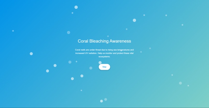
Opening page
-
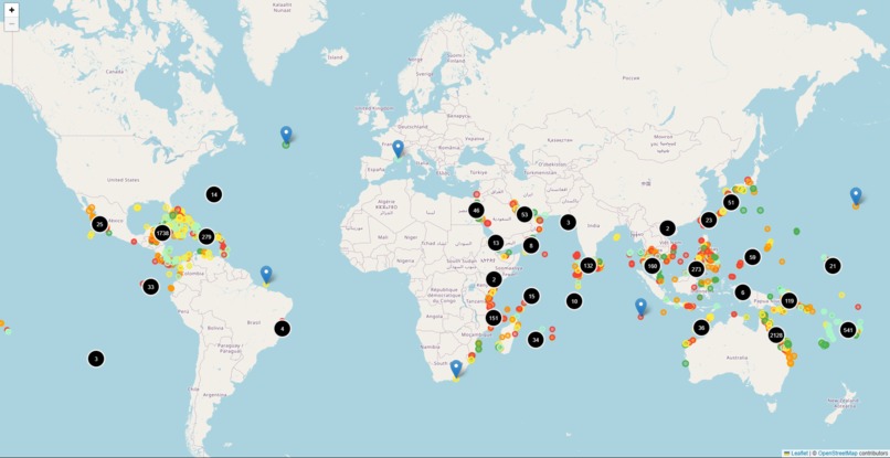
Map with nodes for coral reefs and their severity indicated by color coding
-
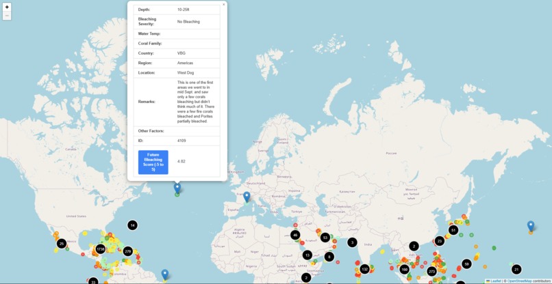
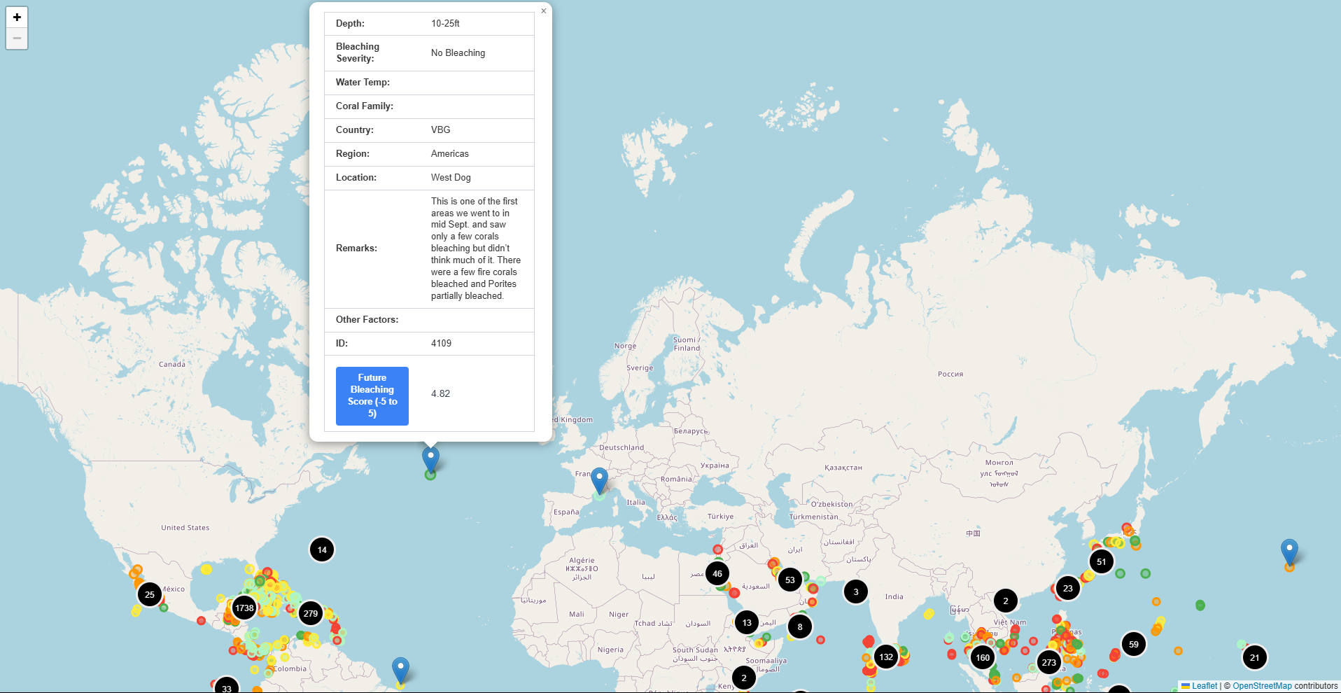
Data for a reef upon clicking a node

Inspiration
We have been inspired to create this as this is a topic that has been with us for a while. We are all interested in marine biology and aquatics, and we had noticed the problem of coral bleaching about a month ago. This hackathon has given us an opportunity to contribute to the battle against coral bleaching
What it does
Coralized visualizes the bleaching severity of coral reefs across the globe in an interactive and user-friendly manner. It also provides a method of quantifying the likeliness and severity of future bleaching/healing of the reefs.
How we built it
We built Coralized with the following stack:
- HTML/CSS/JS
- ReactJS
- ArcGIS
- Leaflet
Data:
- NOAA Public Data
- Mateomatics API
We utilized ArcGIS and NOAA public data to map the reefs and their bleaching levels, and used Mateomatic API to do analysis on past trends to predict a score for future bleaching/healings
Challenges we ran into
- Prediction model was hard to implement and think off
- Hard to optimize the performance with the map
- Extremely hard to get the data from NOAA and convert to GeoJSON
Accomplishments that we're proud of
- We got a working prediction model that seems to agree with the predictions of the NOAA
- A beautiful visual homepage and map
- Being able to use GeoJSON data and Leaflet for the first time (and with React)
What we learned
we learned the usefulness of GeoJSON, and the power of the ArcGIS tools. We also learned out to integrate maps into our websites. The vast amount of data given by NOAA is also fascinating.
What's next for Coralized
We plan to improve our model by fine-tuning it with ML as well as factoring other causes such as human contamination into the model. The performance could also be improves, as well as a fully built frontend with more information on the issue.


Log in or sign up for Devpost to join the conversation.