
Explore our collection of Shadcn Switch Components featuring modern, interactive toggle switch variants built with React, Next.js, TypeScript, Tailwind CSS, Base UI, and Radix UI.
These ready-to-use switch components help developers build settings pages, theme toggles, feature flags, preference panels, and interactive forms for modern web applications.
Here Are 5+ Types of Shadcn Switch Components
Switch Active Effect
A modern switch with a smooth active animation, perfect for settings pages and interactive controls.
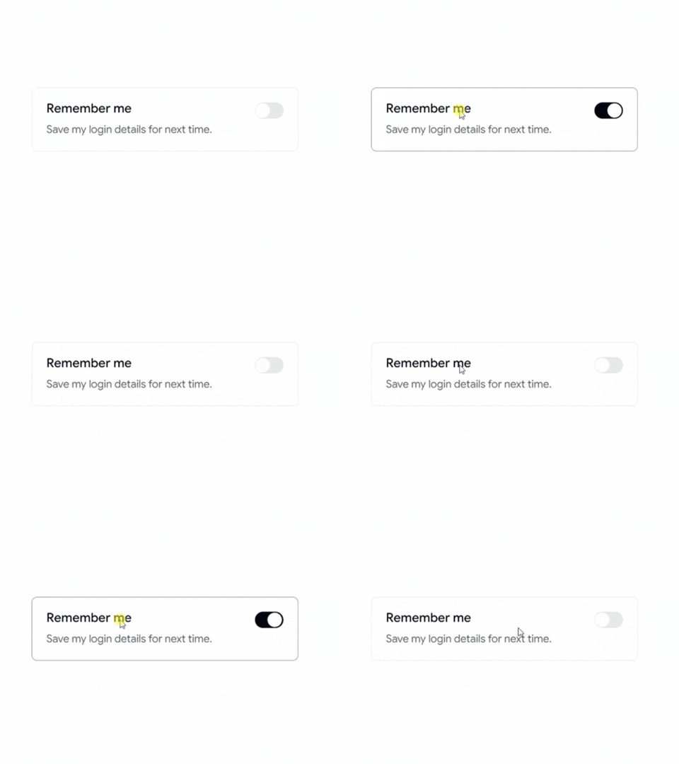
Switch With Icon
A switch featuring icons to clearly indicate enabled and disabled states.
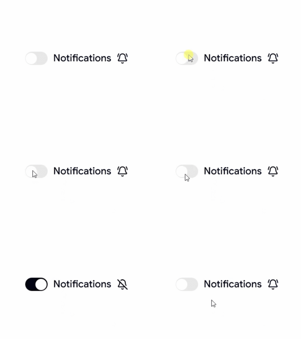
Switch Toggle Theme
A dark mode and light mode switch for modern websites and dashboards.
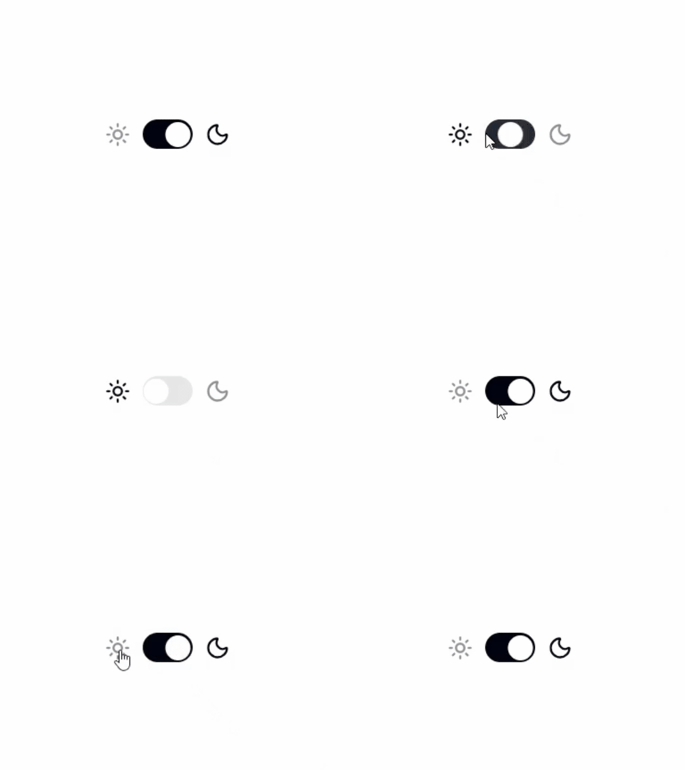
Switch With Description
A switch combined with descriptive text to provide additional context for each setting.

Switch With Label
A clean switch with labels, ideal for forms, preferences, and application settings.
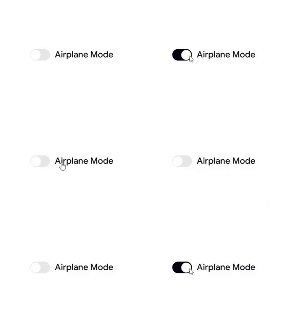
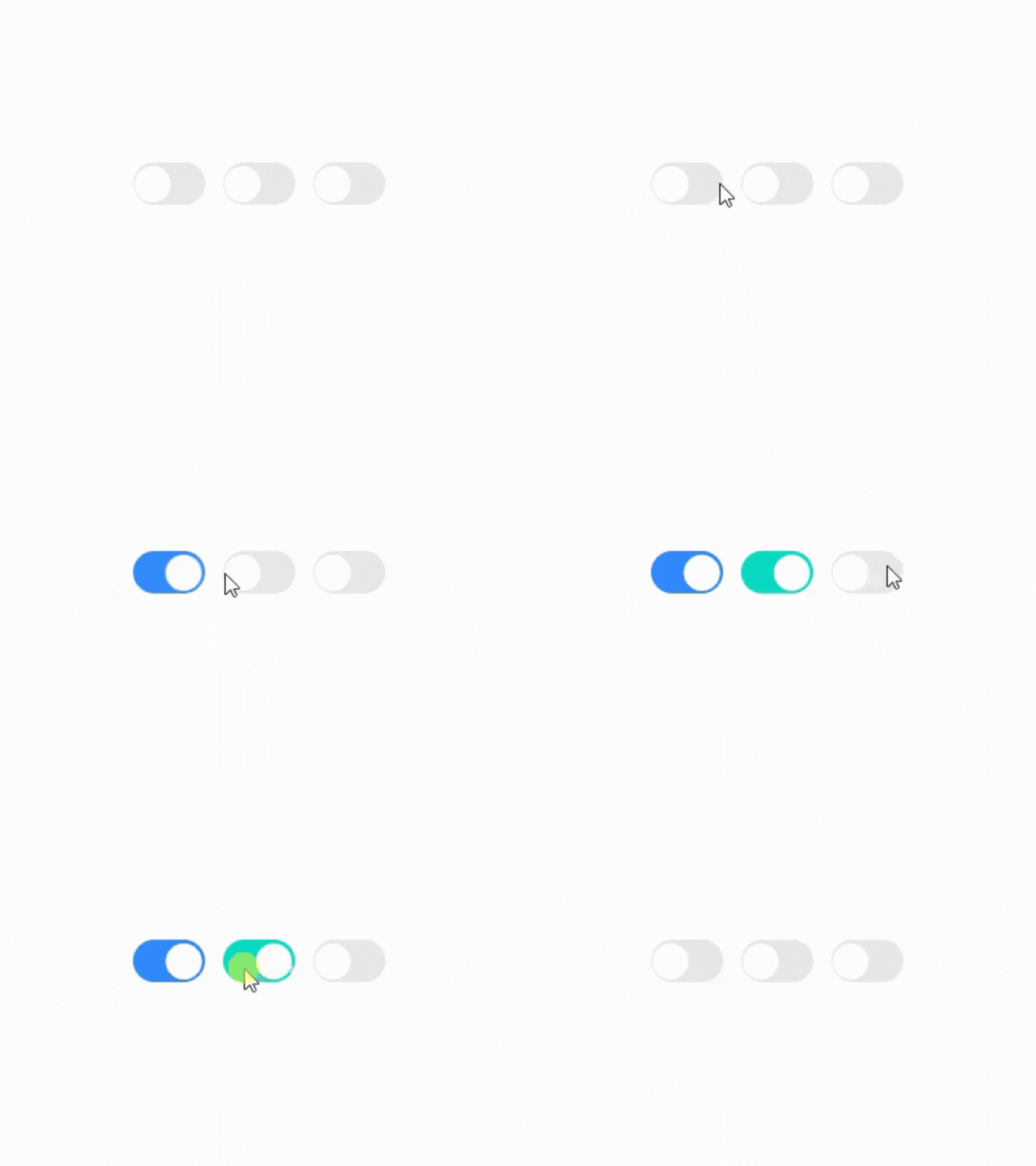
Switch Custom Colors
A customizable switch with different color variants to match your design system and branding.
Why Developers Use Shadcn Switch Components
Switch components provide a simple and intuitive way to enable or disable features, preferences, and settings without adding unnecessary complexity to the user interface.
Best For
- React Applications
- Next.js Projects
- Shadcn UI Websites
- SaaS Products
- Admin Dashboards
- User Settings Pages
- Dark Mode Toggles
- Feature Flags
- Preference Panels
- Modern Web Applications
Check out Shadcn Switch today
Log in or sign up for Devpost to join the conversation.