
Explore our collection of 10+ Shadcn Select Components built with React, Next.js, and Tailwind CSS. These fully customizable, production-ready select variants make it easy to build modern forms, filters, settings pages, dashboards, and user-friendly input experiences.
Here Are 10+ Types of Shadcn Select Components
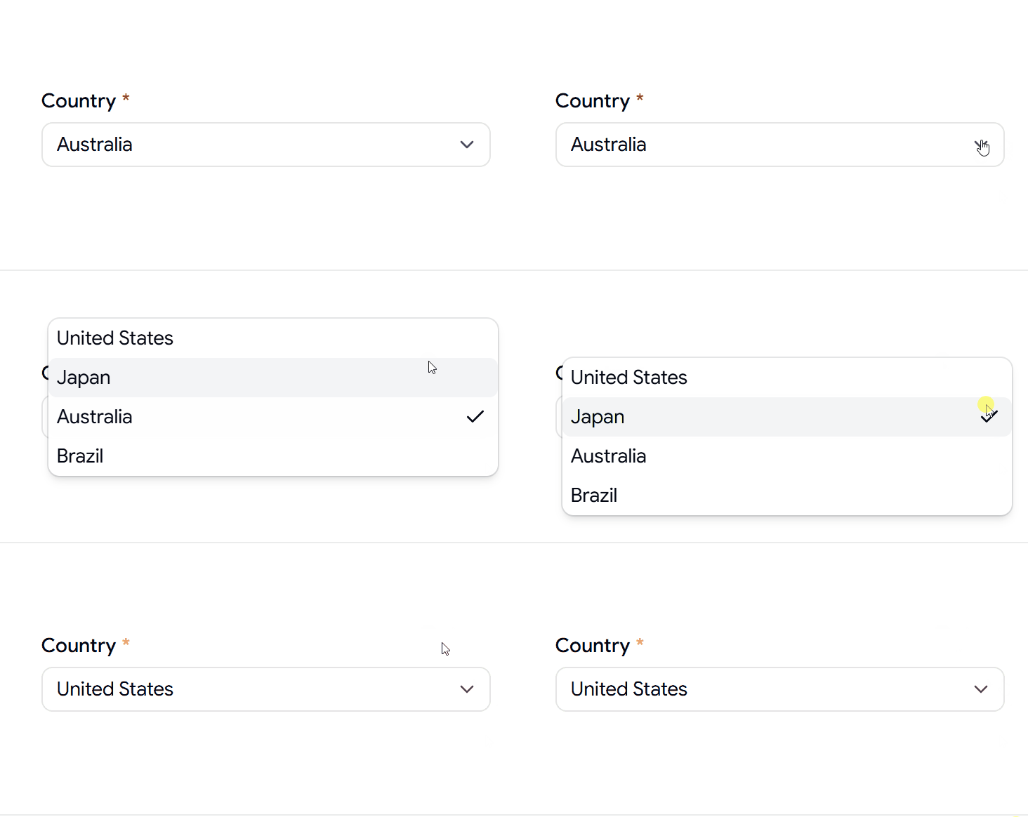
Required Select Component
A required select component with built-in validation for forms and user input workflows.
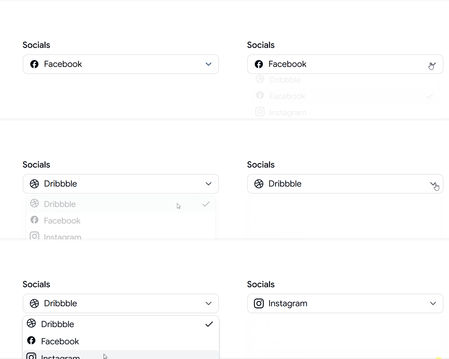
Select Component with Icon
A select component enhanced with icons, making options easier to identify and navigate.
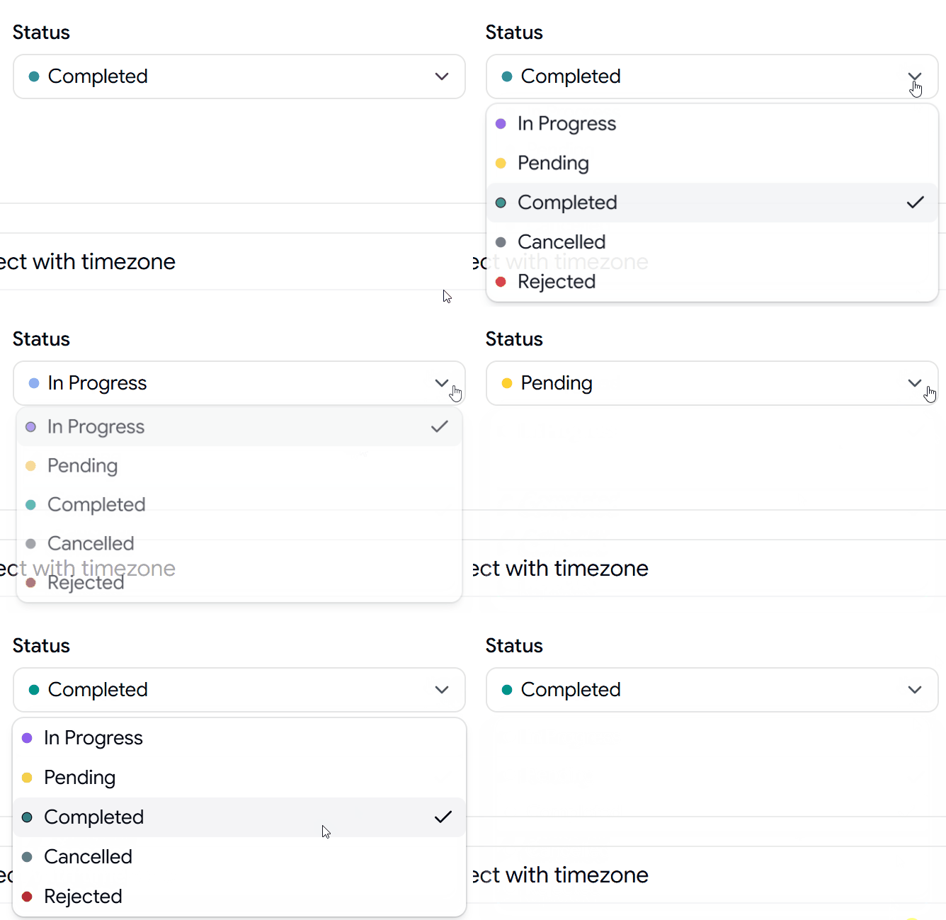
Status Select Component
A status selector perfect for workflows, task management systems, and project dashboards.
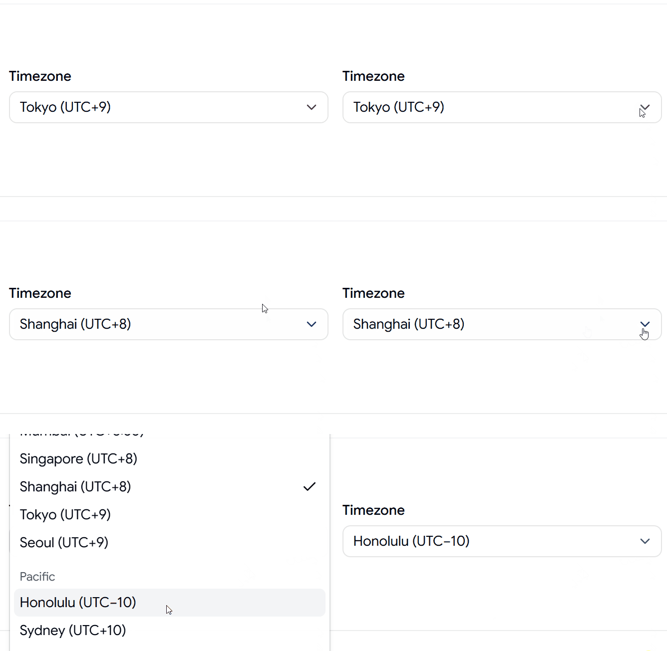
Timezone Select Component
A timezone selector designed for scheduling, booking systems, and global applications.
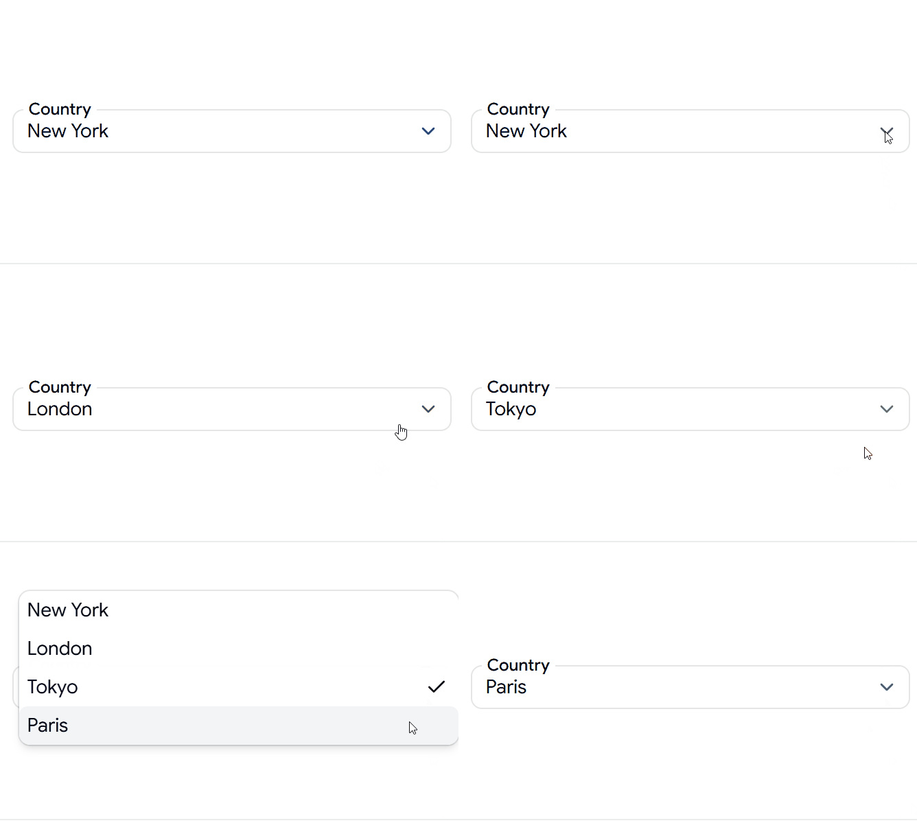
Select Component Overlapping Label
A modern select component featuring a floating label for cleaner form designs.
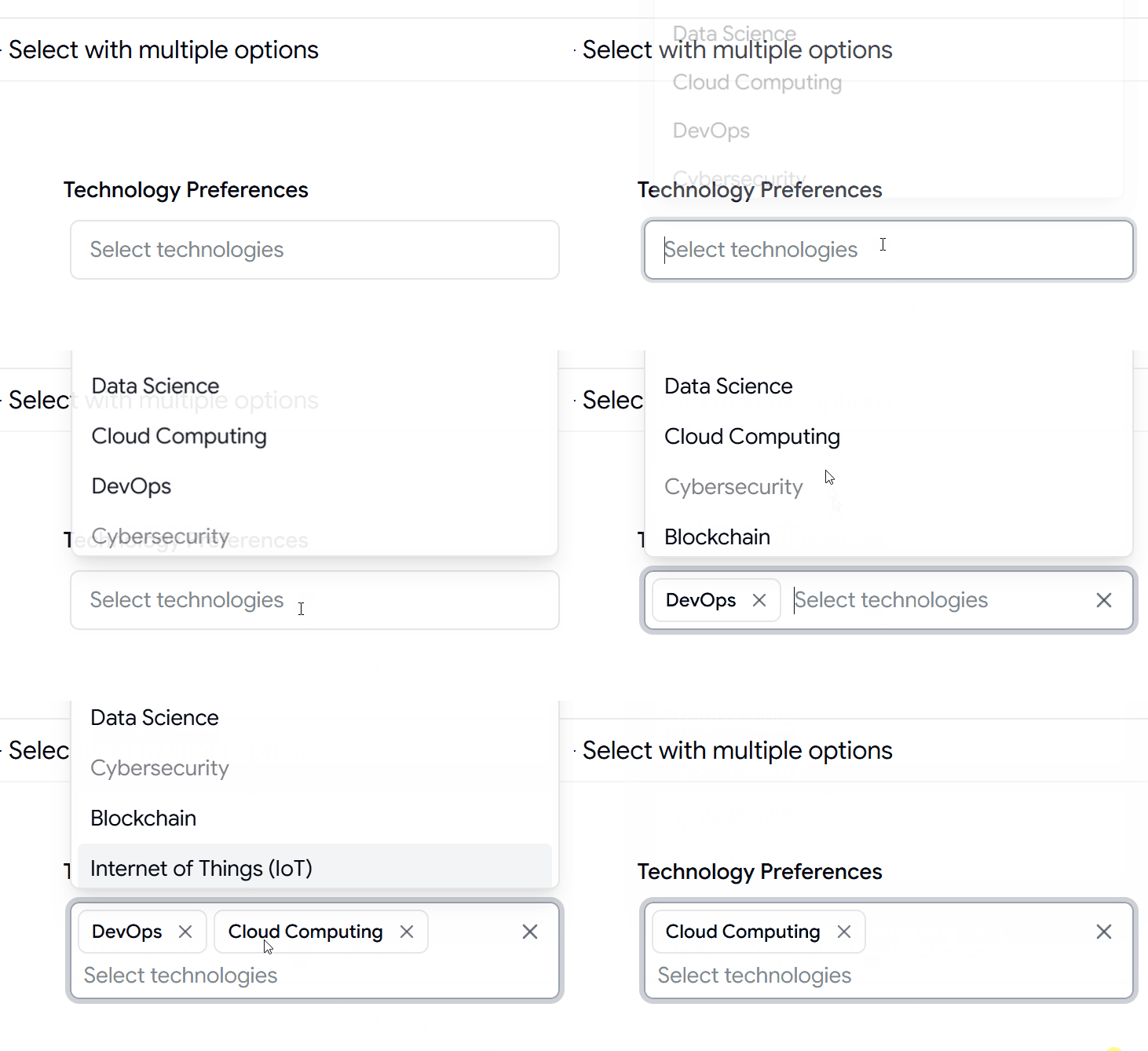
Select Component with Multiple Options
A multi-select component allowing users to choose multiple technologies, tags, or categories.
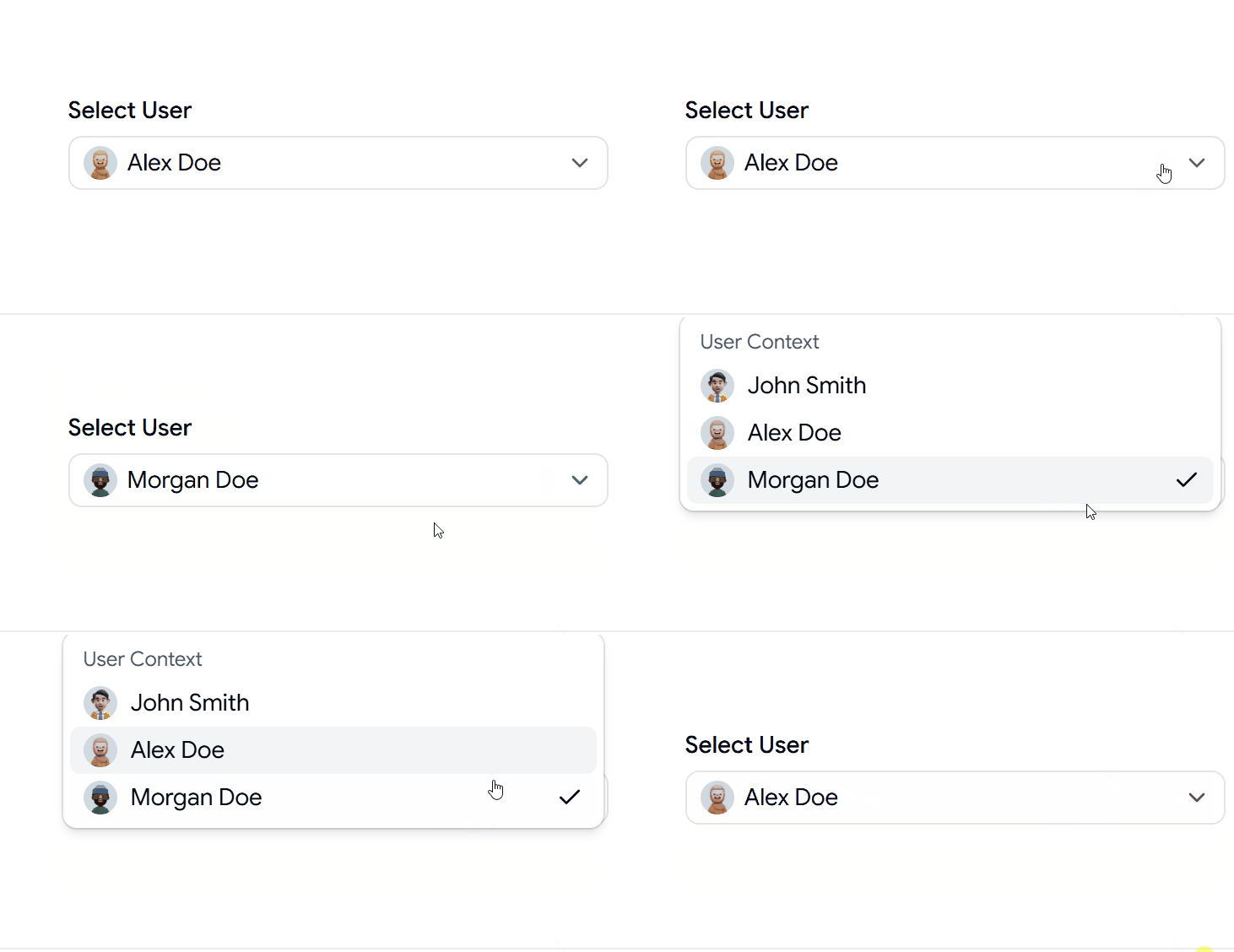
Avatars Select Component
A user-friendly select component displaying avatars alongside options for teams and user management.
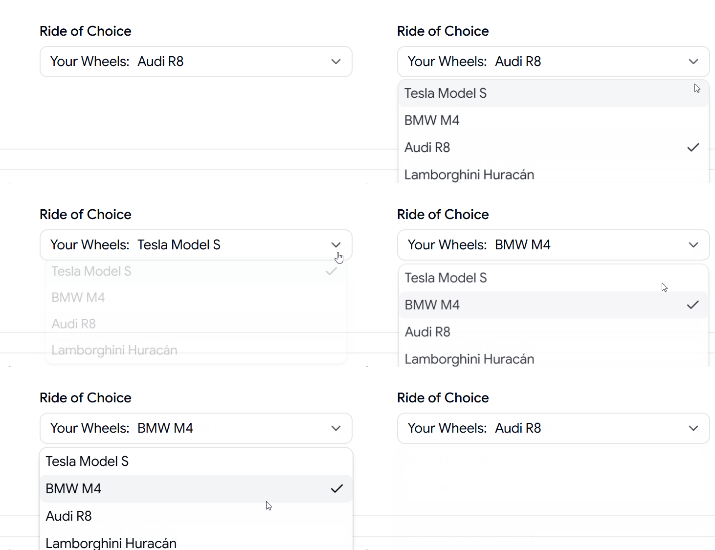
Leading Text Select Component
A select variant with leading text for improved context and option clarity.
Select Component with Separator
A structured select component using separators to organize large groups of options.
Why Developers Use Shadcn Select Components
- Create better form experiences
- Improve filtering and search interfaces
- Build modern settings panels
- Organize complex option lists
- Save development time with ready-to-use components
- Deliver consistent and accessible user experiences
Log in or sign up for Devpost to join the conversation.