
Explore our collection of Shadcn Checkbox Components featuring 10+ customizable and interactive checkbox variants built using React, Next.js, and Tailwind CSS. These ready-to-use Checkbox Components help developers create forms, settings panels, preference selectors, task managers, and user input experiences with ease.
Here Are 10+ Types of Shadcn Checkbox Components Included
Checkbox 01 – Checkbox with Sizes
A flexible checkbox component available in multiple sizes for different UI requirements and layouts

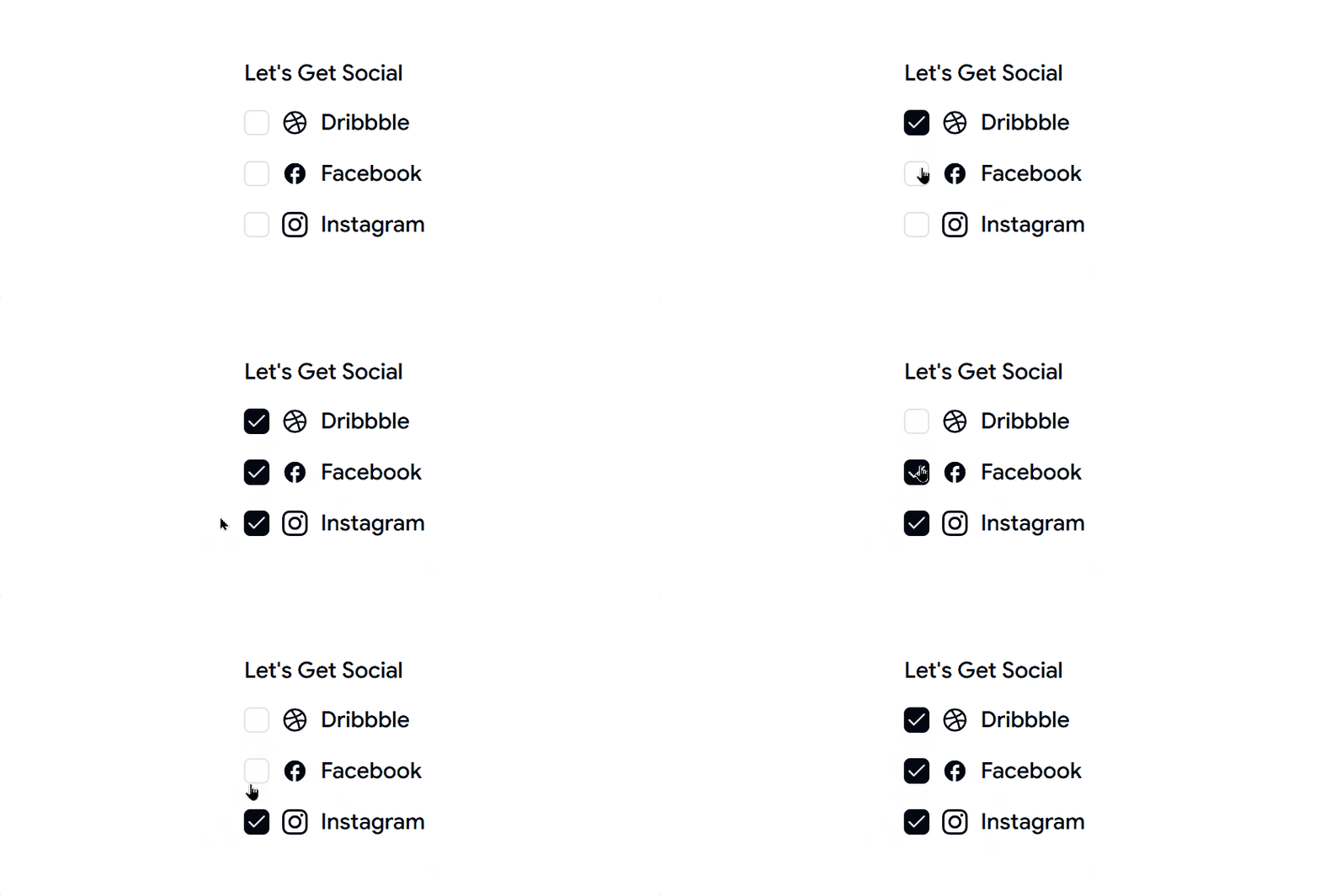
Checkbox 02 – Checkbox with Vertical Group
A vertically stacked checkbox group ideal for surveys, settings pages, and preference selection forms.
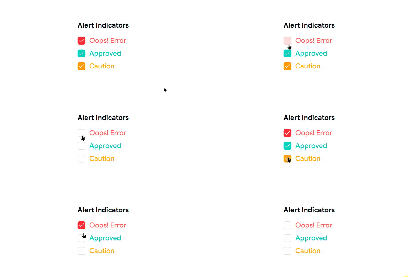
Checkbox 03 – Checkbox with Colors
A colorful checkbox variant designed to improve visibility and match custom design systems.
Checkbox 04 – Checkbox with Todo List
A task-focused checkbox component perfect for to-do lists, productivity tools, and project management applications.

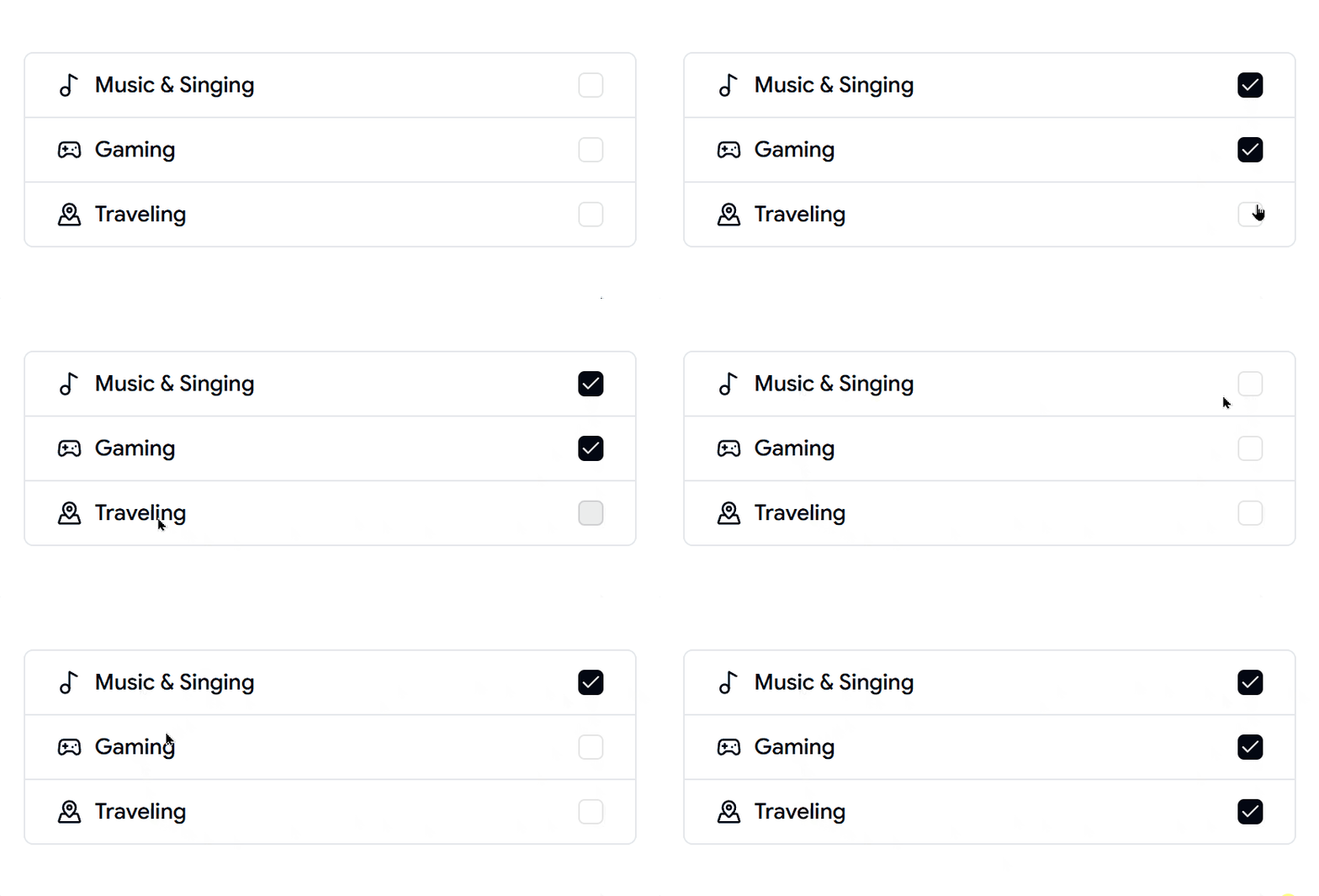
Checkbox 05 – Checkbox with List Group
A structured checkbox list designed for selecting multiple options within grouped content.
Checkbox 06 – Checkbox with Form
A form-integrated checkbox component ideal for newsletter subscriptions, terms acceptance, and user preferences.

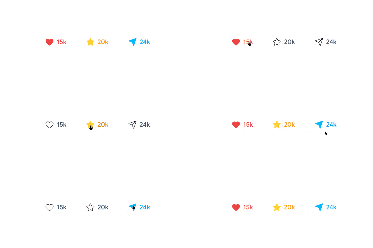
Checkbox 07 – Checkbox with Custom Icons
A visually enhanced checkbox featuring custom icons for a more engaging user experience.
Checkbox 08 – Checkbox with Dashed Border
A modern checkbox style with dashed borders, perfect for creative and contemporary interfaces.

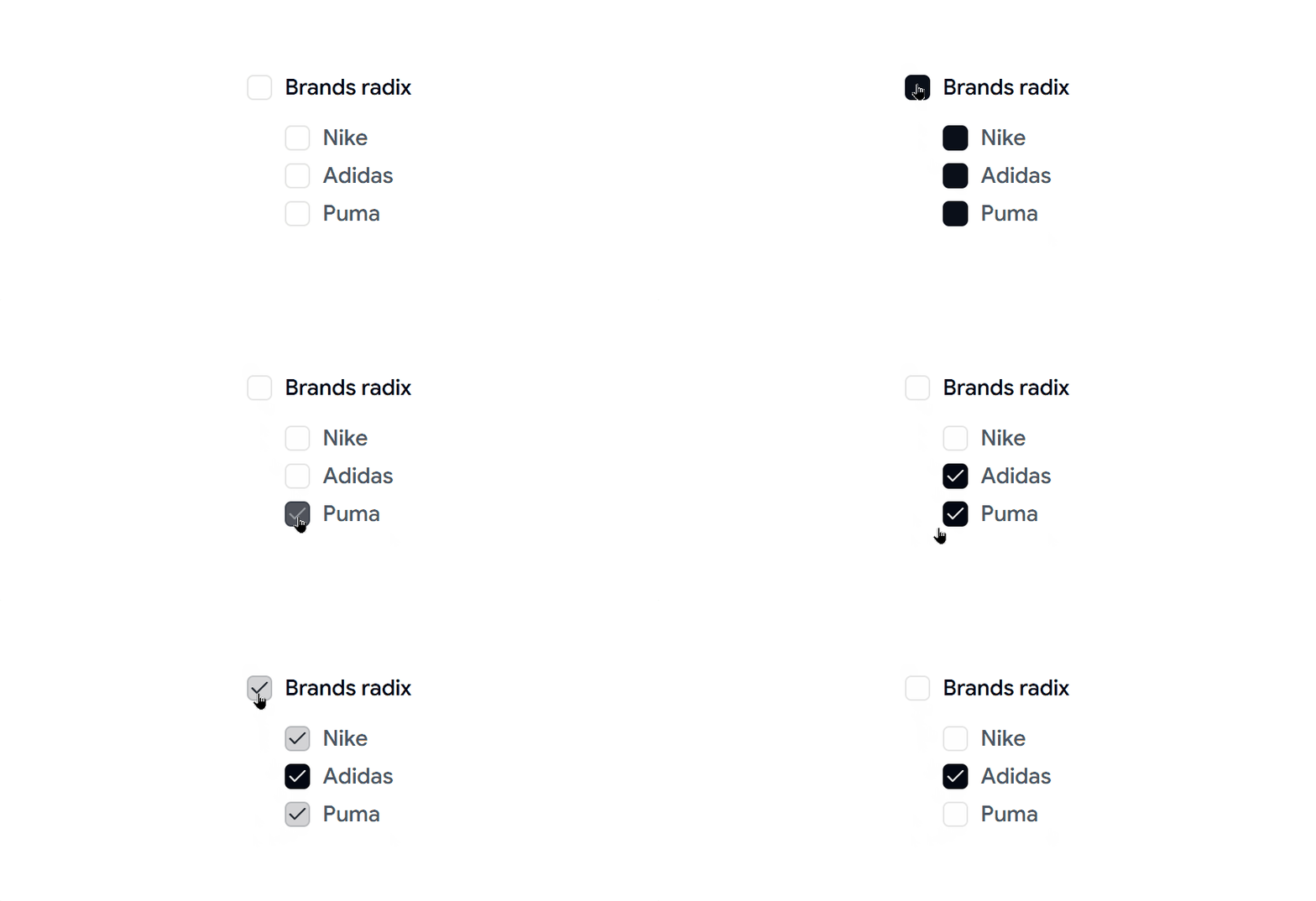
Checkbox 09 – Checkbox with Tree
A hierarchical checkbox component that supports nested selections for categories, permissions, and file structures.
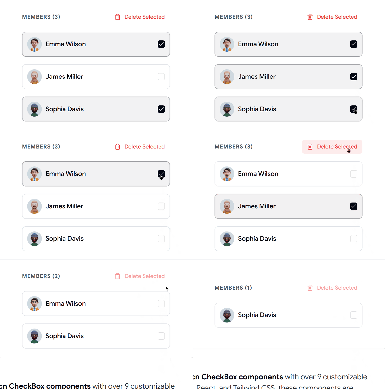
Checkbox 10 - Checkbox with avatar and group
This checkbox component shows user avatars with the checkbox. It can help users pick team members, assign tasks, or manage groups more easily.
Why Developers Use Shadcn Checkbox Components
- Create intuitive form experiences
- Build settings and preference panels
- Support multi-selection workflows
- Improve task management interfaces
- Enhance accessibility and usability
- Save development time with reusable components
Checkout Shadcn Checkbox Today.
Log in or sign up for Devpost to join the conversation.