-
-
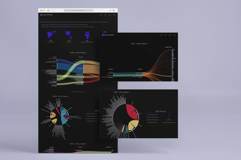
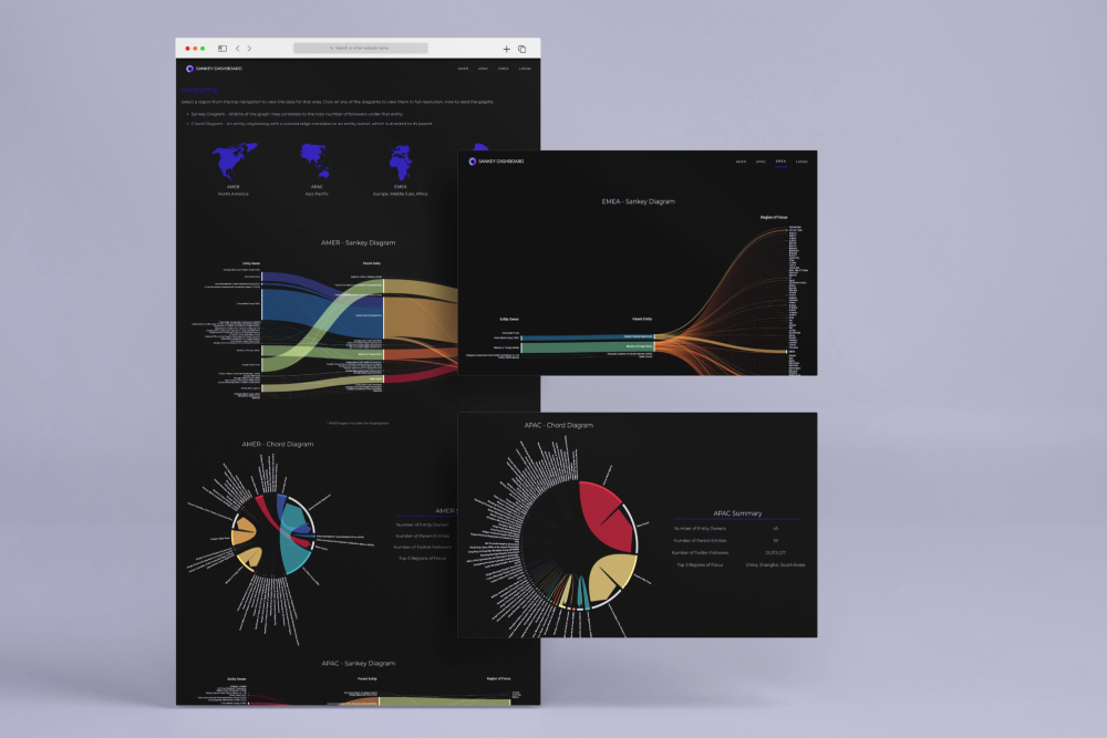
Dashboard Mockup
-
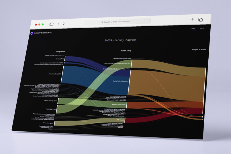
Sankey Diagram
-
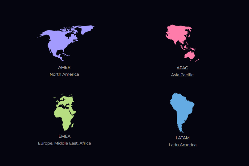
Region Breakdown


Inspiration
While browsing through different chart libraries, we discovered Sankey Diagrams, which were a visually striking and unique way of displaying data flows.
We decided to create a web dashboard of Sankey Diagrams for each global trade region. We complemented these with Chord Diagrams, as well as a table summarizing key metrics.
What it does
The Dashboard includes a Sankey Diagram, a Chord Diagram, and a Table Summary for each of the 4 major trade regions.
The Sankey Diagrams show which entity owners are operating in the area, who their parent owners are, and what are their region(s) of focus. The width of the lines correlates to the aggregate followers under that entity and represents the amount of influence they hold.
The Chord Diagrams show the scale of connections between account entity owners and parent entities.
The Table Summary lists important metrics for that respective region, including total entities, total follower count, and the top 3 regions of focus.
The purpose of the dashboard was to visualize the organizational structure and impact of Chinese social media entities. It allows users to easily notice trends and perform comparisons across the different regions.
How we built it
Data was first cleaned in Tableau. We then manually grouped the data into trade region categories and aggregated follower accounts under account entity owners. With this data, the charts were generated with an open-source web tool called RAWGraphs 2.0.
We exported the graphs as vectors, and customized them using Adobe Illustrator. A dashboard webpage was created to display the diagrams and data in a visually appealing format that would be easily accessible to users.
Challenges we ran into
We had planned on gathering more data, but ran into some troubles as there is no longer free access to the Twitter API, and web scraping proved to be difficult to execute due to time constraints.
We also spent longer than expected on the ideation phase, as we had a tough time determining our overall approach in data processing. This was due to limited information on the provided accounts and a lack of numerical data in the set.
Accomplishments that we're proud of
Creating a web hosted solution with a great front-end in such a short timeframe is a major accomplishment. We are also very proud of the eye catching diagrams that we were able to produce, and believe that they tell an interesting data story.
What we learned
Gained experience working with popular data tools, including Tableau and D3.js. We learned about the common methods for cleaning and correcting sets of data. We also gained valuable insight into foreign influencers on social media and their potential political impact.
What's next for Sankey Dashboard
For future work on the project, we would have liked to have shown the growth of state accounts over time. We would also include charts which show account activity, such as number of posts, views, and likes. We would need to obtain more data for this.
Built With
- adobe-illustrator
- excel
- figma
- raw-graphs
- tableau
- webflow


Log in or sign up for Devpost to join the conversation.