SafeTravel
Inspiration
Traveling should be exciting, not stressful. But most people rely on random blogs or outdated advice when figuring out if an area is safe. I wanted to fix that — to give travelers something clear and real-time they could actually trust.
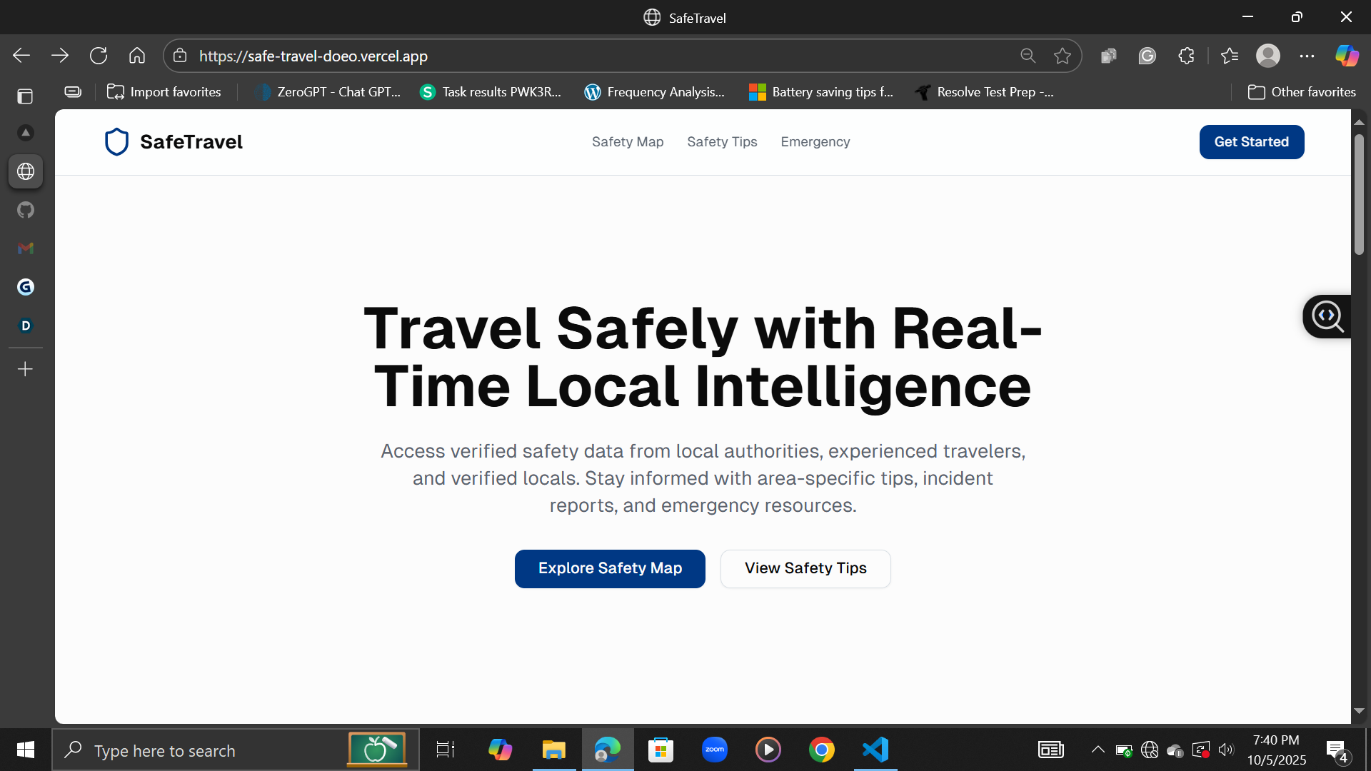
What it does
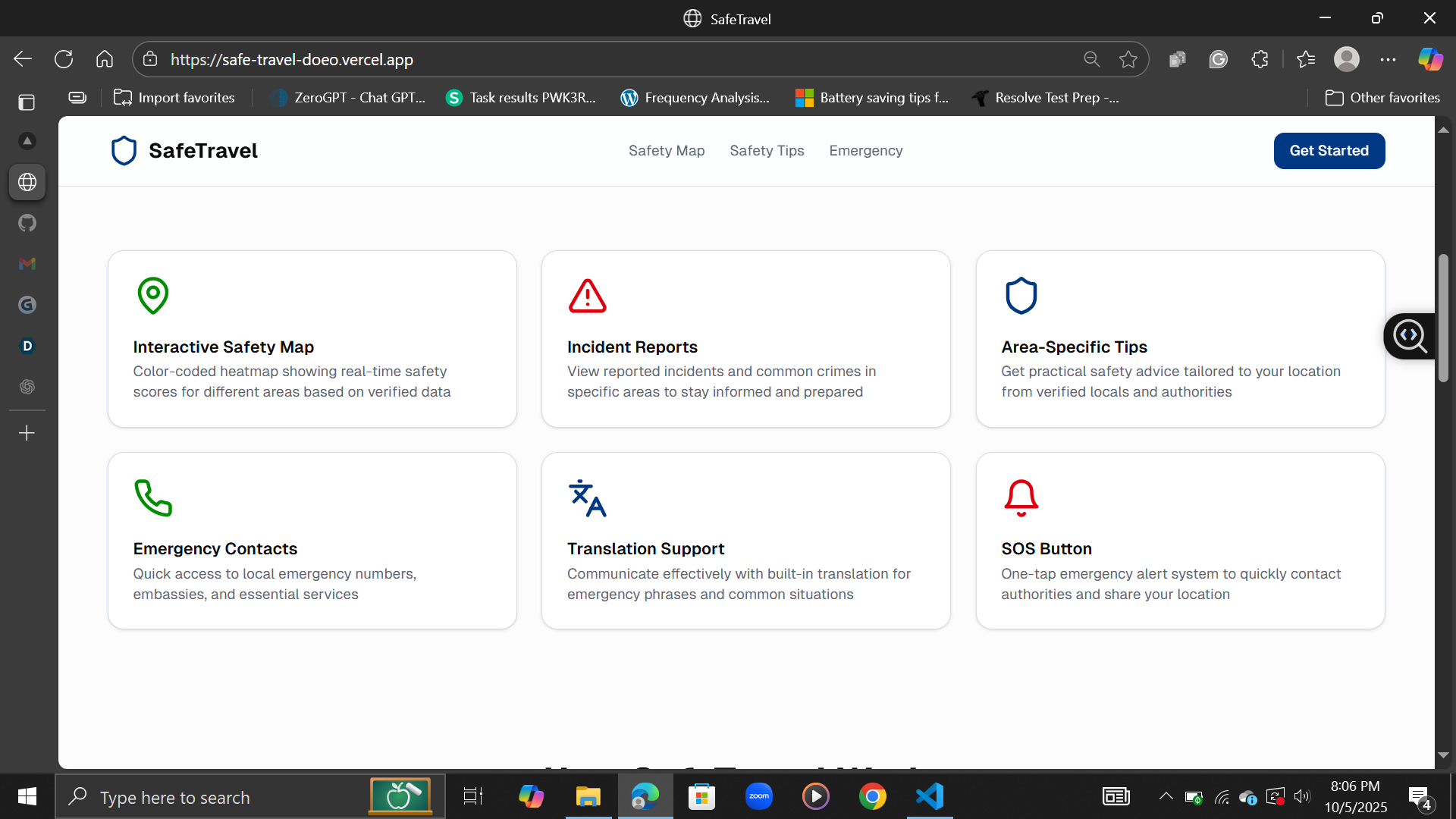
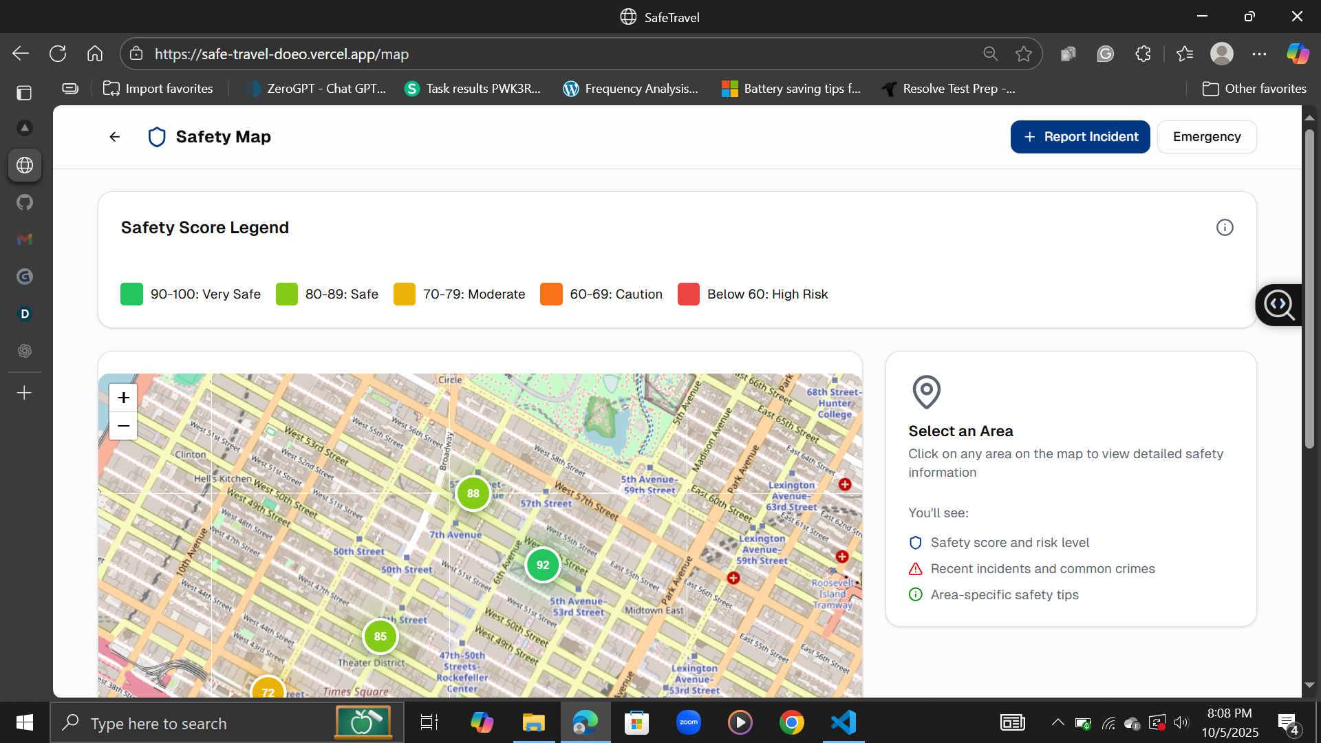
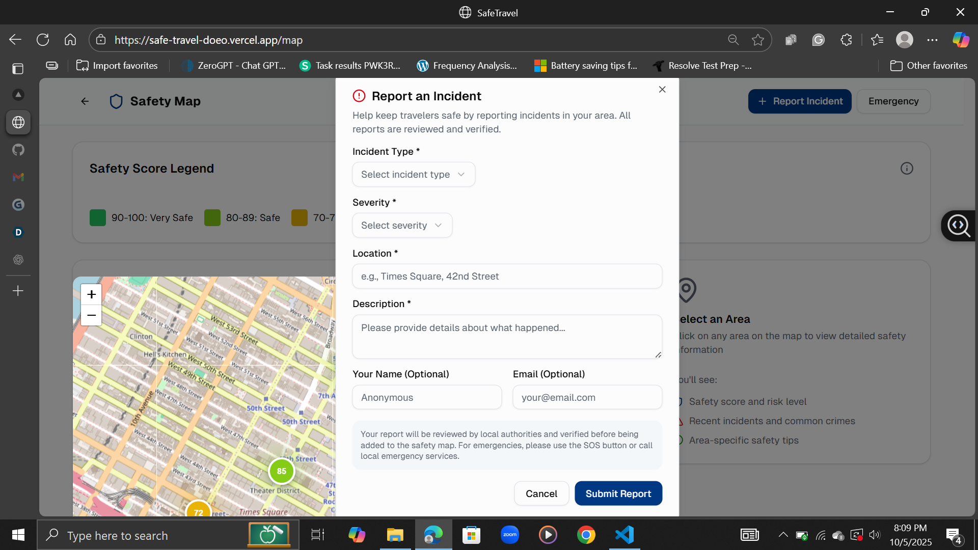
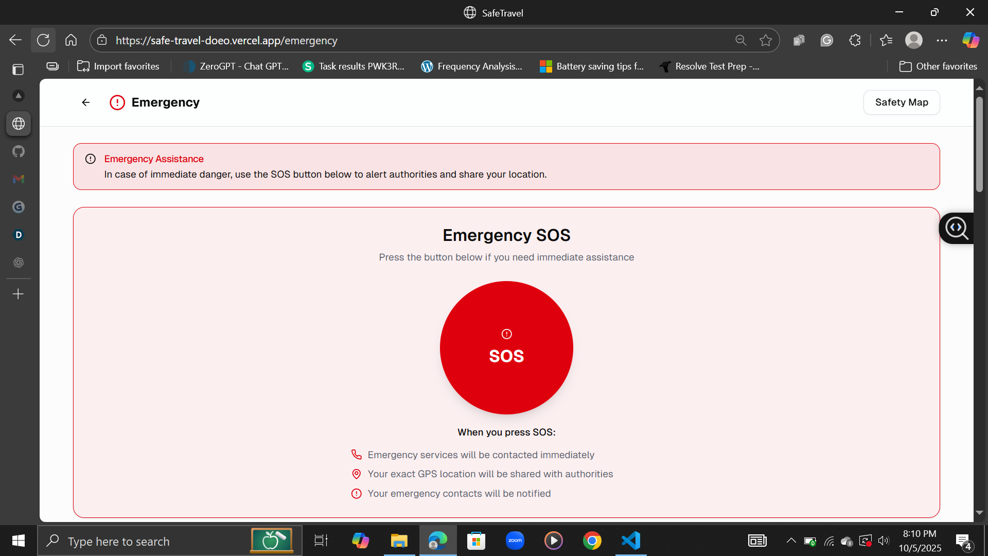
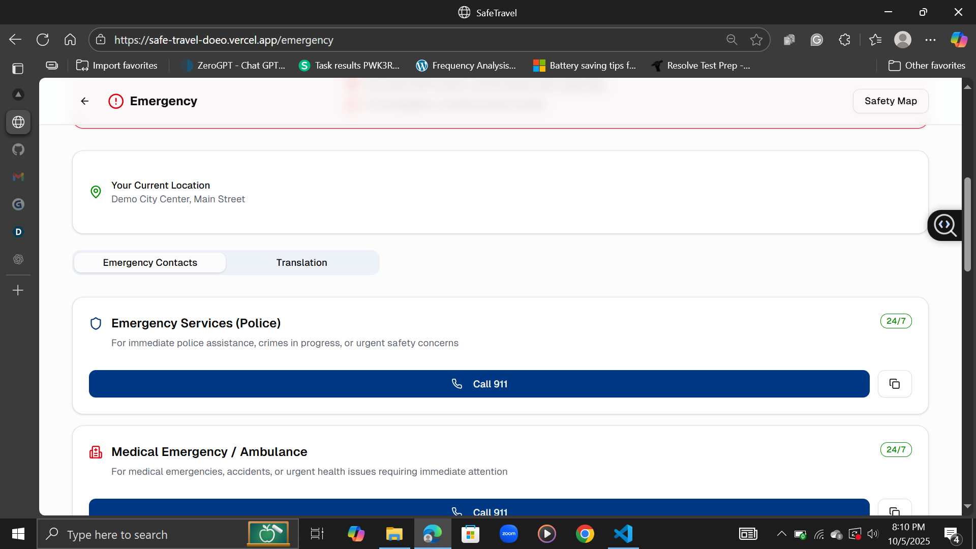
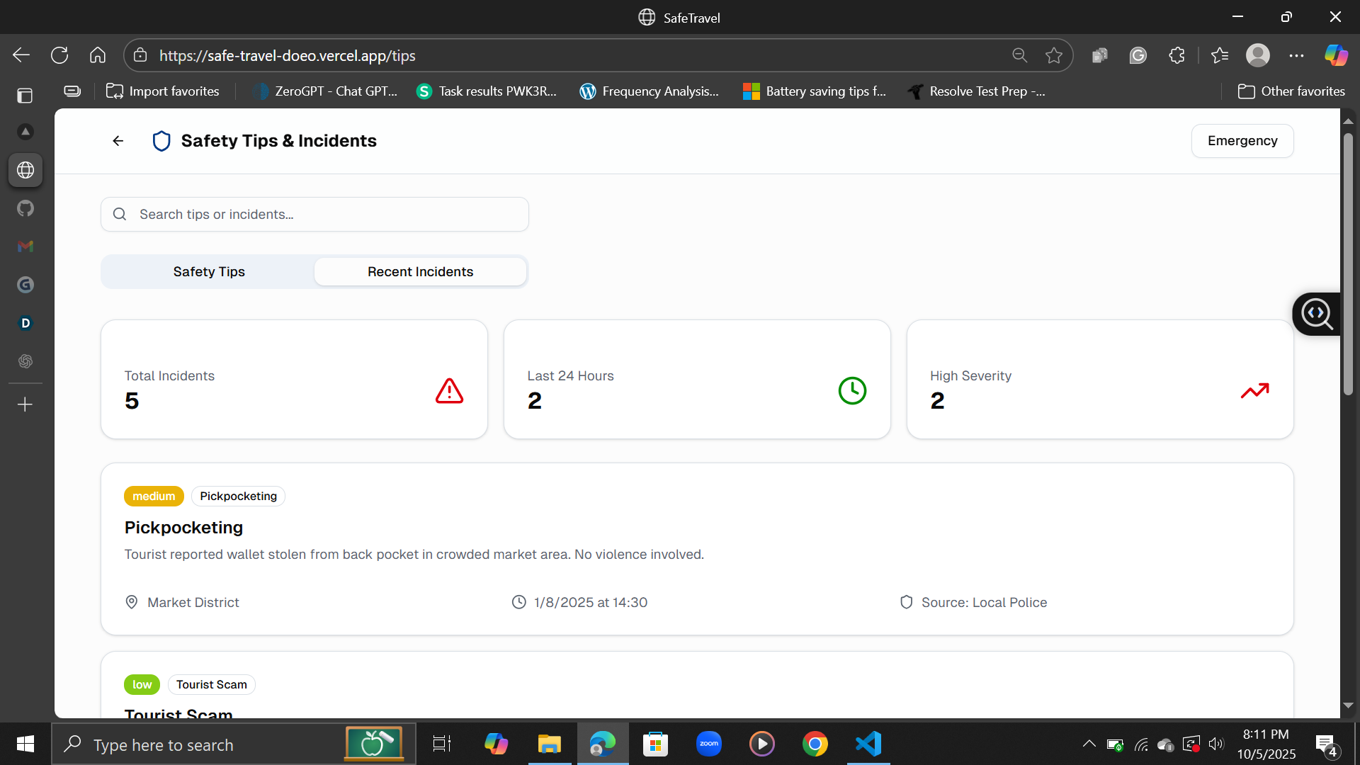
SafeTravel shows live safety information on a map. You can see which parts of a city are safer at a glance, get instant alerts about nearby incidents, and access local emergency contacts in one tap. It’s basically a pocket guide that helps you explore confidently.
How we built it
I built SafeTravel using Next.js with some dummy data to simulate real-time safety updates. The idea was to test how a clean interface could display complex data like risk levels without overwhelming users.
Challenges we ran into
Figuring out how to make “safety” visual was tricky. I spent time experimenting with color scales, data layouts, and how much info to show before it felt cluttered.
Accomplishments that we're proud of
Getting the live heatmap to feel intuitive was a big win. Even with mock data, it already feels practical — like something I’d actually use while traveling.
What we learned
Sometimes the simplest visuals — colors, icons, short tips — communicate complex data better than text-heavy dashboards. I also learned how important design is when you’re dealing with sensitive topics like safety.
What's next for SafeTravel
Next up, I want to connect it to real public data sources and refine the alerts system. The goal is to eventually make it reliable enough that anyone can open it and instantly know where it’s safe to go.
Built With
- javascript
- next.js
- openstreetmap


Log in or sign up for Devpost to join the conversation.