-
-
Cover 1
-
Cover 2

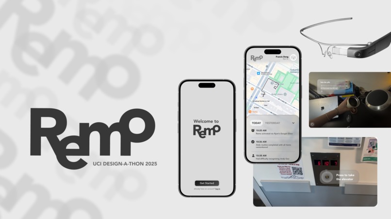
Our Story
We began this designathon haunted and inspired by Memorable, Bruno Collet’s Oscar‑nominated stop‑motion short in which an aging painter watches the world melt into abstractions as Alzheimer’s erases his sense of form. Two of us have watched loved ones experience that same un‑mooring; the film distilled their quiet panic into clay and color, and lit a fire under our team to craft something practical, gentle, and dignified. We asked: what if the painter had a companion that could repaint the outlines he was losing, right inside the canvas of real life? That question led us to Remo.
What We Learned & How We Built
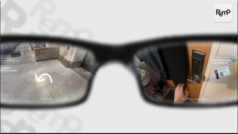
Diving into dementia research quickly humbled us. The core UX lesson was unequivocal: less is more. Cognitive overload can turn help into harm, so every pixel must earn its place. We adopted dementia‑friendly heuristics: clearly presented text, co‑located way‑finding arrows, multimodal feedback, and absolute consistency in iconography, stripping away anything decorative that didn’t reinforce safety or memory. Figma was our primary canvas; its nascent 3D‑AR plug‑ins couldn’t deliver live spatial mock‑ups, so we storyboarded still‑frame vignettes that implied depth and gaze‑based interactions (think comic‑panels of an AR world). Each frame focused on a single micro‑state: a medication reminder over a pillbox, or an arrow threaded down a hallway. Caregiver screens were built in parallel, emphasizing triage, one‑tap escalation, and routine editing.
Challenges
None of us had experience with spatial interfaces before. Forgoing animation meant we had to be surgical in our frame selection: the wrong background or UI state could mislead reviewers about flow or scale. Maintaining the “simplicity mandate” was equally taxing; our instincts kept drifting toward feature creep (“couldn’t we also…”). Frequent hallway tests with blank “paper helmets” reminded us how quickly clutter confuses. Finally, translating medical literature into design constraints required more scientific reading.
In the end, the constraints became our compass: if a painter’s dissolving world can be held steady by one clean line of light, our interface should aspire to be exactly that—no more, no less.
Built With
- adobe-illustrator
- figjam
- figma


Log in or sign up for Devpost to join the conversation.