-
-

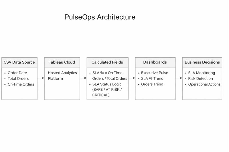
Architecture of pulseOps
-
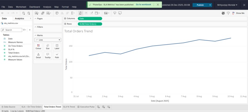
orders trend
-

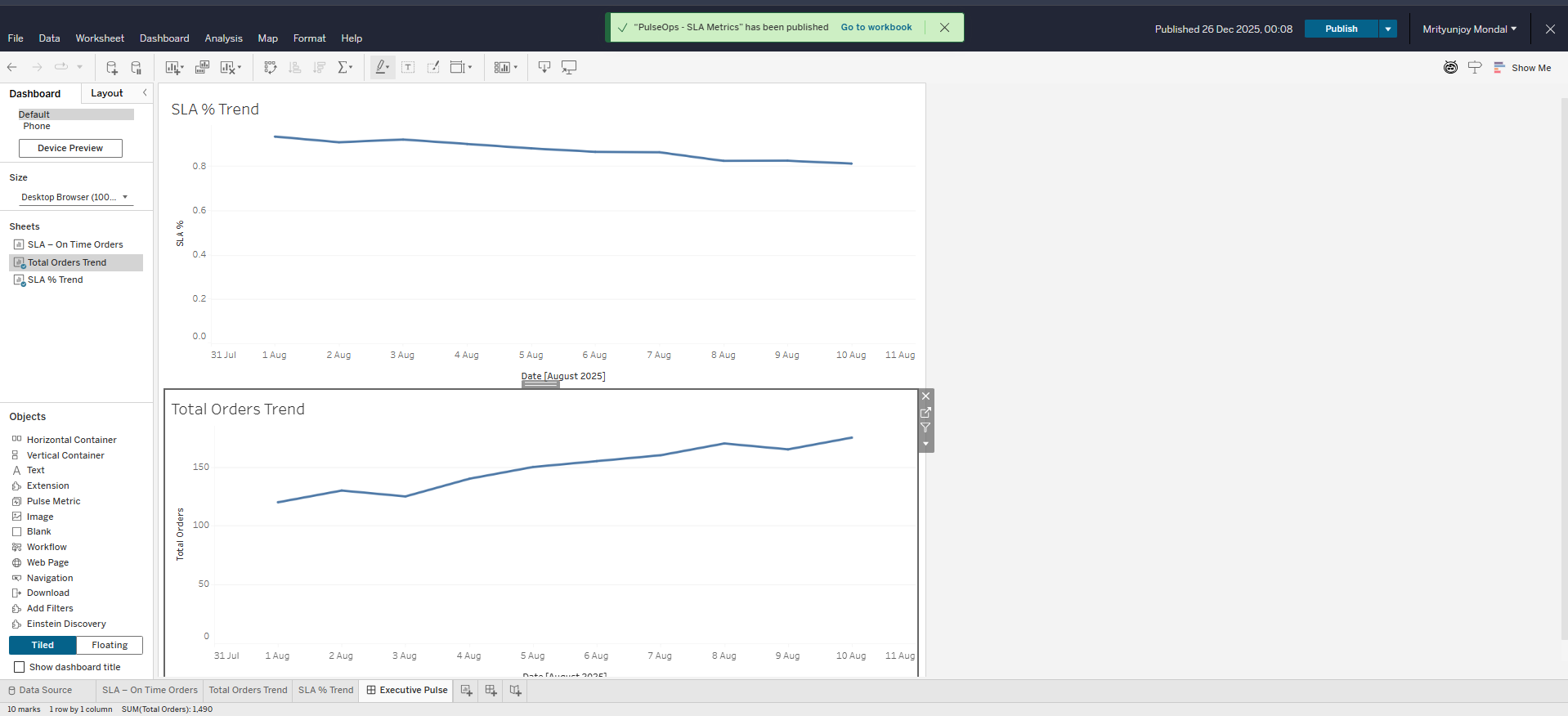
executive pulse
-
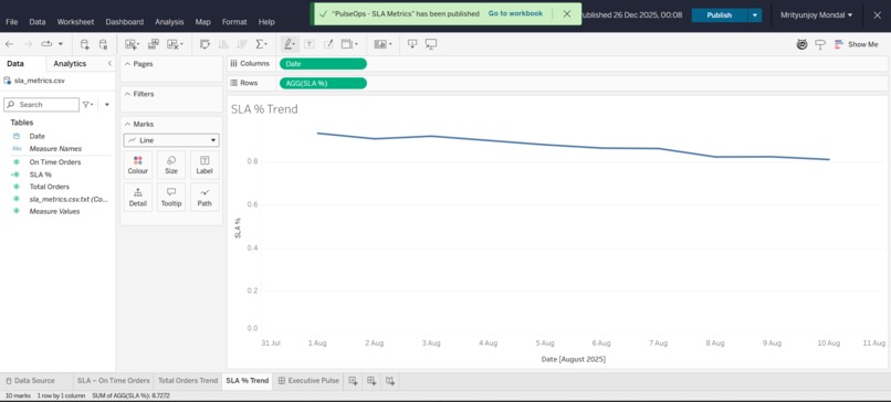
sla trend


Inspiration
Operations teams rely on dashboards every day, yet critical issues are still often detected too late. While working with analytics and observing real-world workflows, I noticed a recurring problem: dashboards show what is happening, but rarely help teams decide what to do next. This disconnect between insights and actions leads to delayed responses, SLA breaches, and reactive firefighting. PulseOps was inspired by the need to bridge this gap and turn operational monitoring into real decision support.
What it does
PulseOps is an operational decision intelligence dashboard that helps teams detect early risk, understand why it’s happening, and take action before SLAs are breached. Instead of overwhelming users with dozens of charts, PulseOps provides a clear view of operational health through a single risk score, highlights the key drivers behind rising risk, and recommends practical next steps. The goal is to reduce cognitive load and enable faster, more confident decisions.
How we built it
PulseOps was built using Tableau Cloud, with a focus on simplicity, stability, and explainability. I used structured sample operational data representing SLA performance, incident volume, and resolution times. Using Tableau’s calculated fields, I modeled core KPIs and a composite Operational Risk Score (0-100) based on trends across these metrics.
The solution is organized into three focused views:
- Executive Pulse for instant health visibility
- Risk Breakdown to explain contributing factors
- Action Panel to guide next steps
All interactions are handled natively within Tableau using filters and dashboard actions, keeping the solution low-complexity and reliable.
Challenges we ran into
One of the biggest challenges was avoiding overengineering. It was tempting to add more metrics or advanced models, but doing so would reduce clarity and usability. Another challenge was learning Tableau while building the project, which required careful prioritization of business logic over tool complexity. Ensuring that every visual served a clear decision-making purpose was a constant focus.
Accomplishments that we're proud of
- Designing a clear, decision-first operational dashboard rather than a traditional monitoring view
- Creating an explainable risk scoring approach without relying on complex models
- Delivering a complete, stable, and realistic Tableau solution as a solo participant
- Translating real operational pain points into a product-ready analytics experience
What we learned
This project reinforced that effective analytics is not about showing more data, but about enabling better decisions faster. I learned how to design Tableau dashboards around user intent, how to model metrics for clarity and trust, and how thoughtful UX can significantly improve operational workflows. Building PulseOps also strengthened my product thinking and ability to balance simplicity with real-world value.
What's next for PulseOps
With more time, PulseOps could integrate live operational data sources, add configurable alert thresholds, and support deeper root-cause analysis across teams or regions. The core concept could also be extended to other domains such as customer support, supply chain operations, or IT service management. PulseOps is designed as a foundation for scalable, action-driven operational analytics.
Built With
- actions
- csv-based
- dashboard
- data
- github


Log in or sign up for Devpost to join the conversation.