-
-

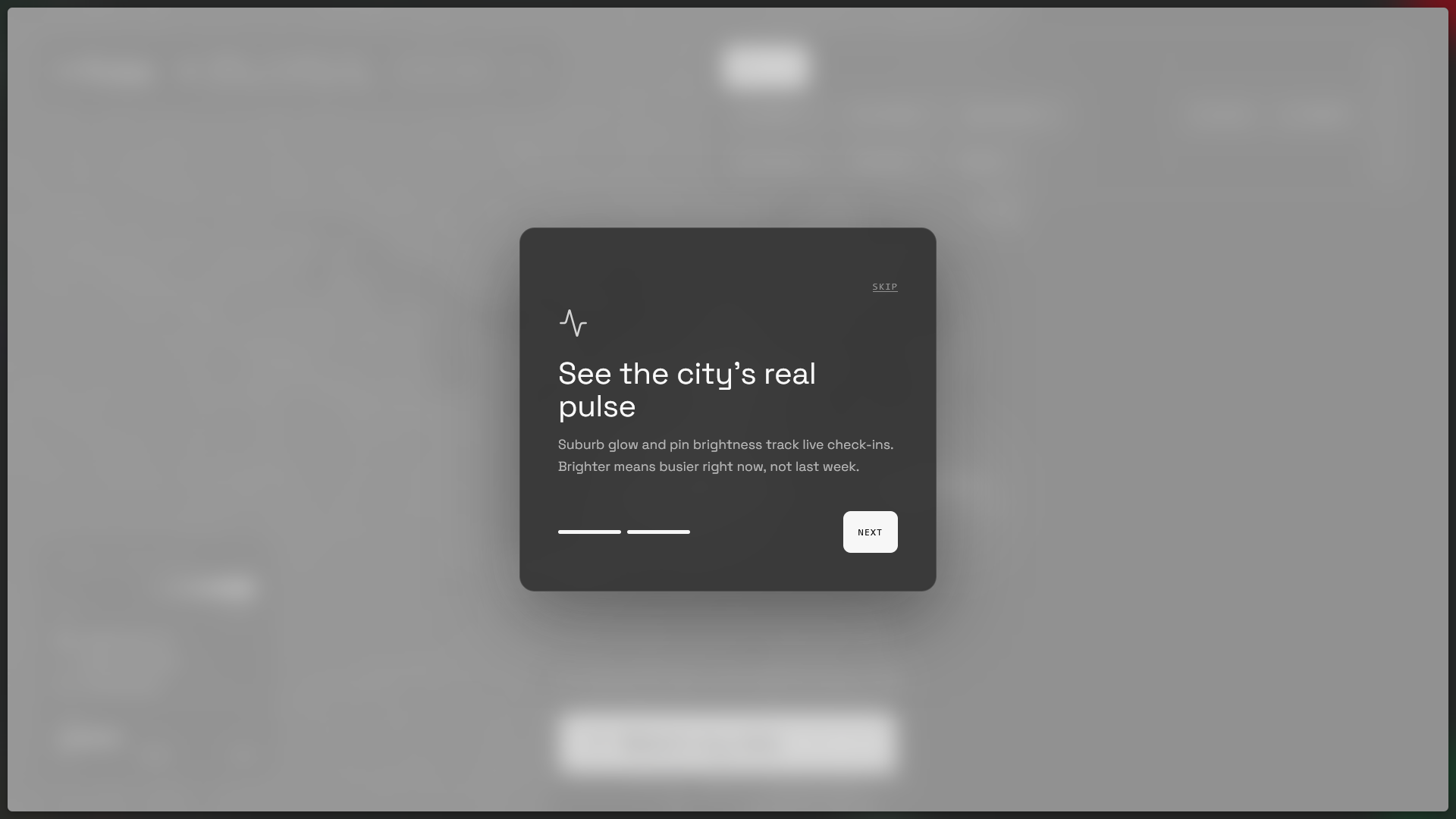
Onboarding 1
-
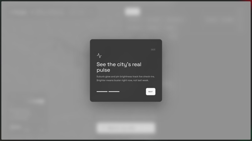
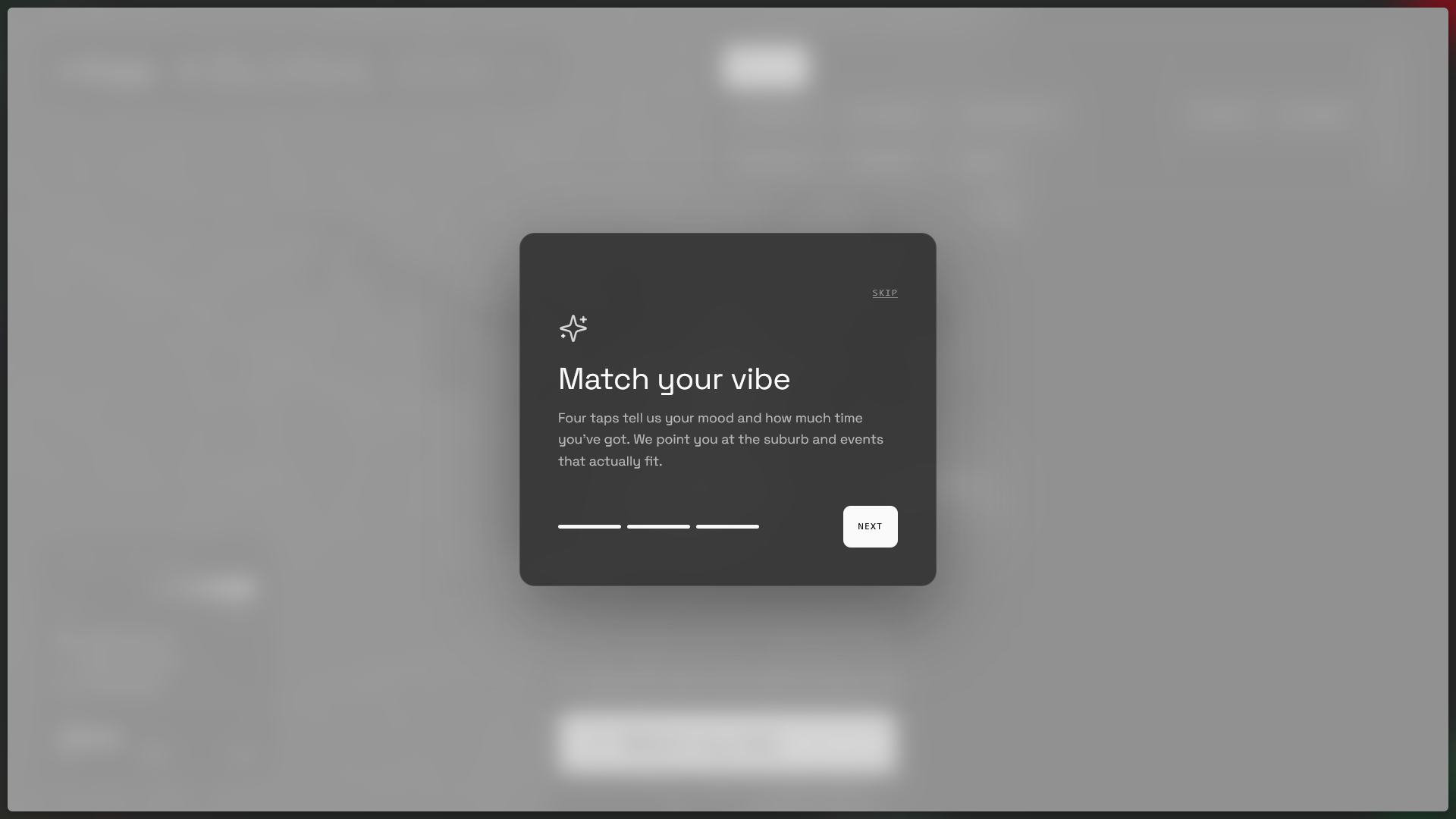
Onboarding 2
-
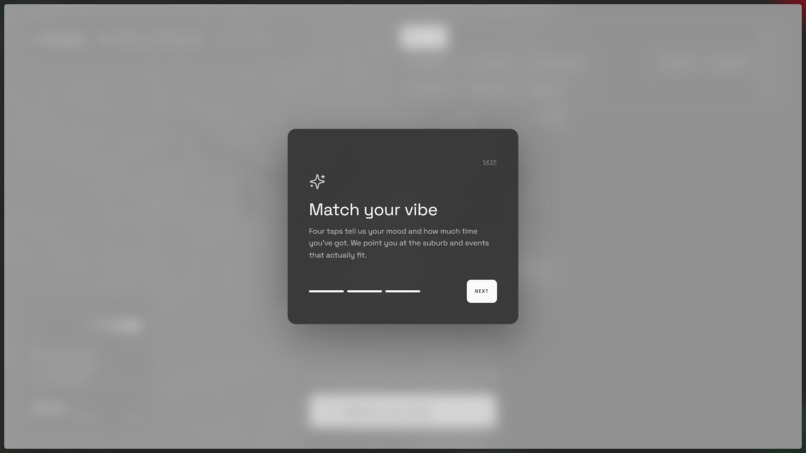
Onboarding 3
-
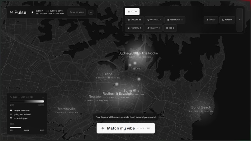
Default Map with heatmap
-
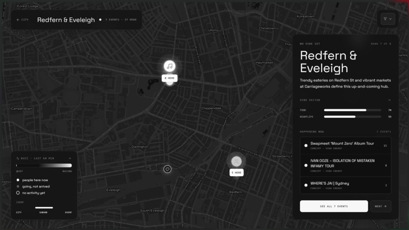
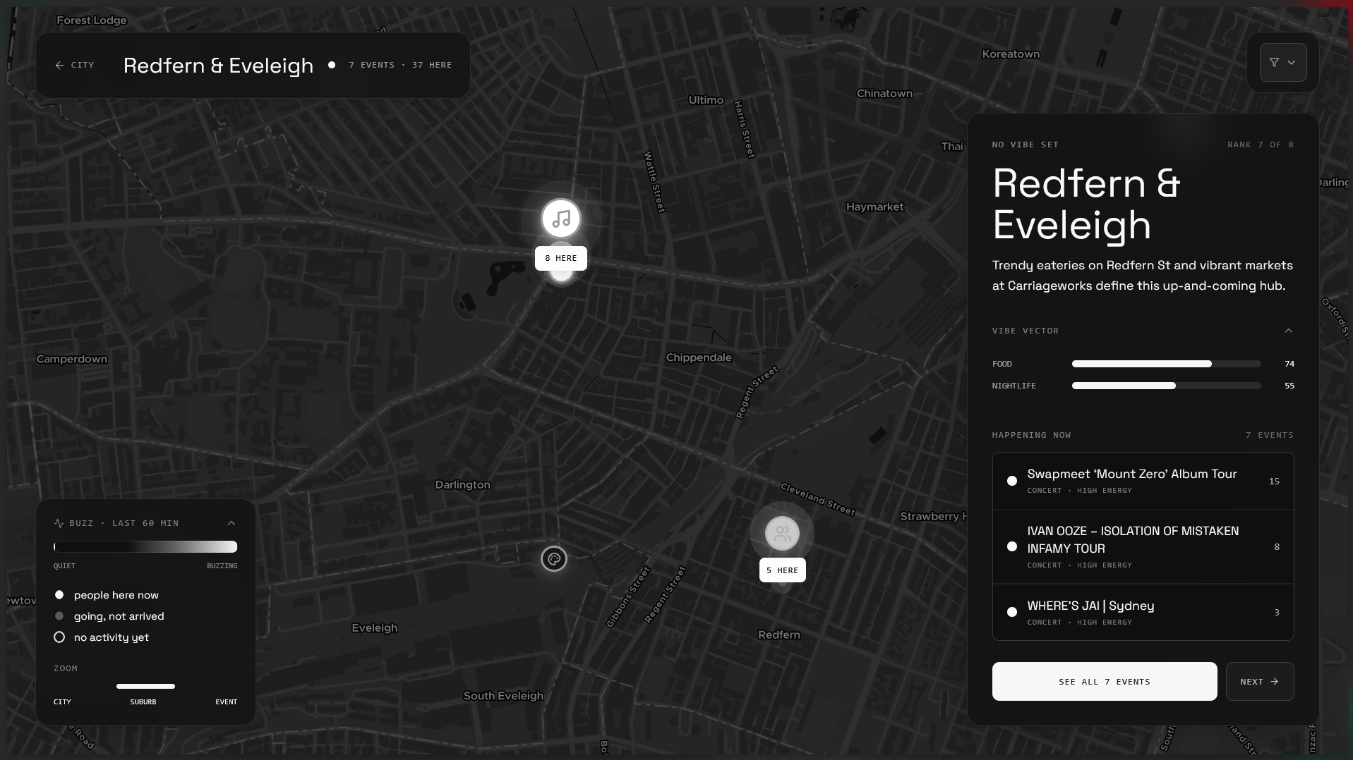
Suburb Card #1
-
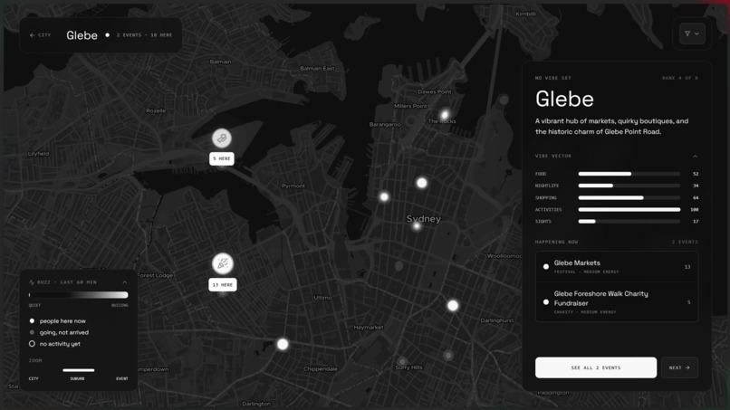
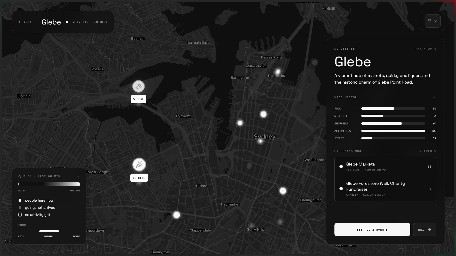
Suburb Card #2
-
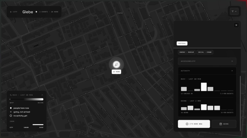
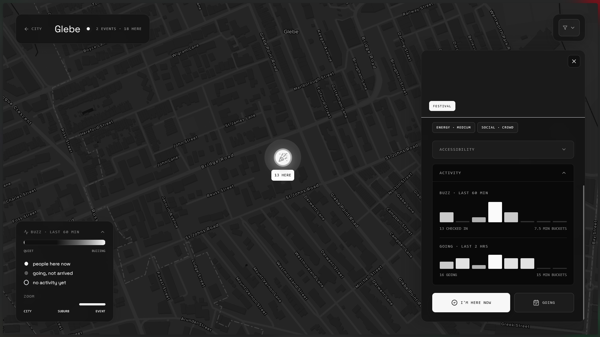
Event/Place Card
-
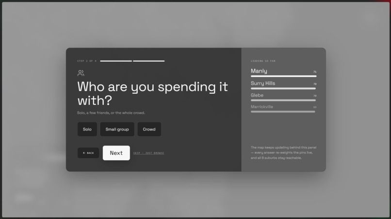
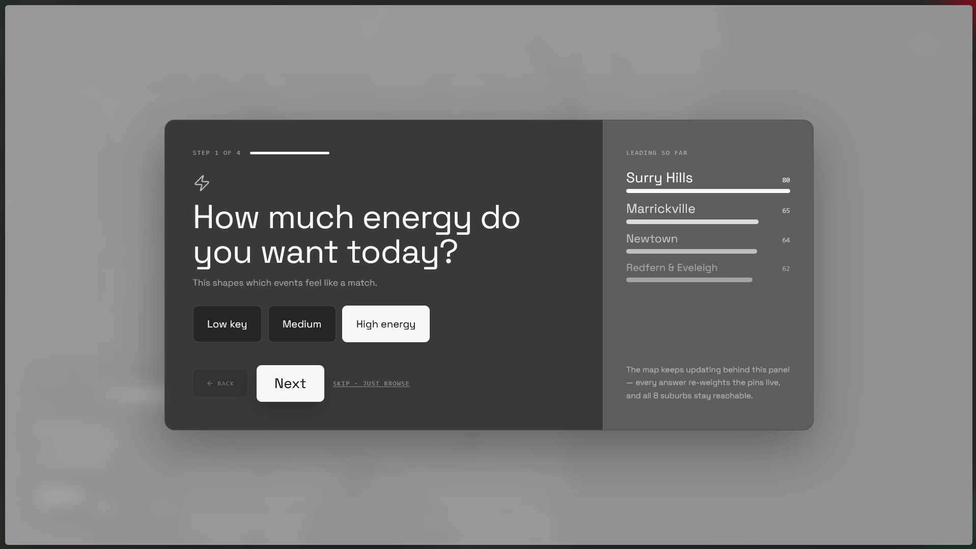
Mood Quiz #1
-
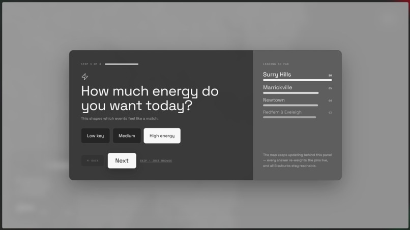
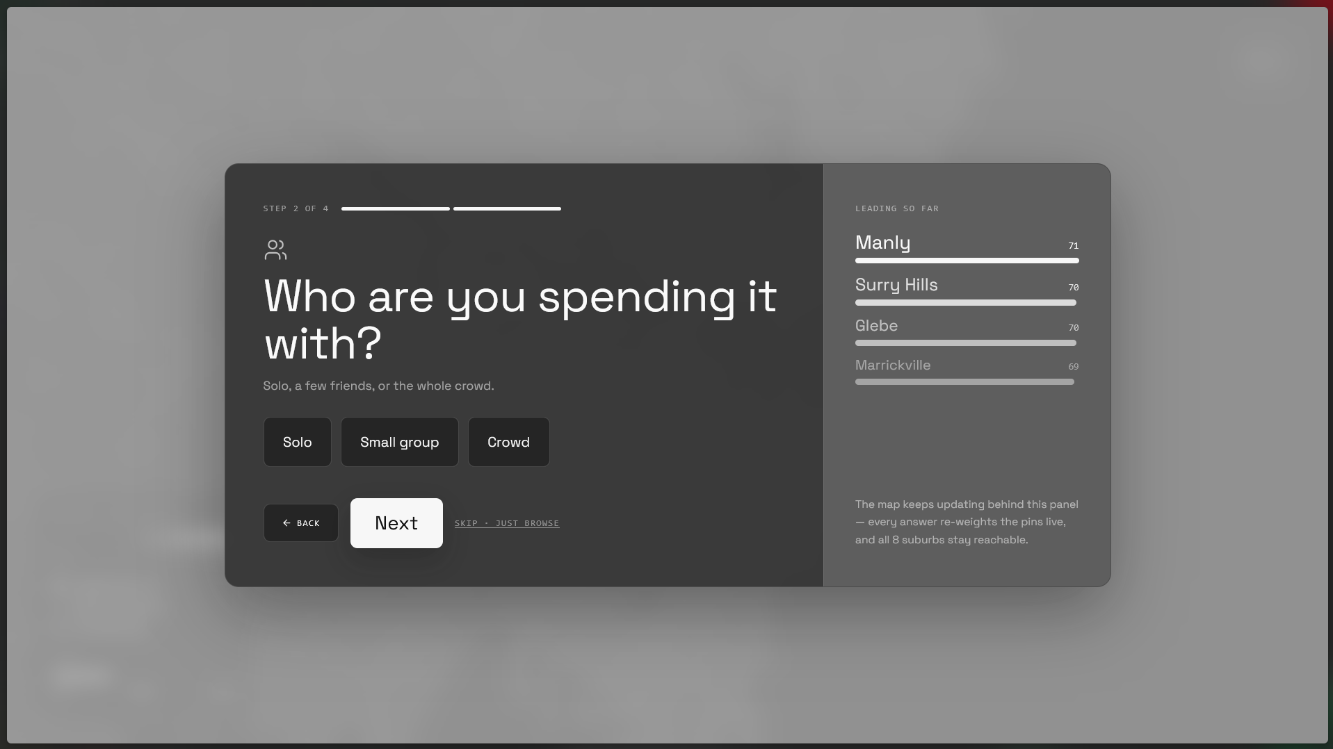
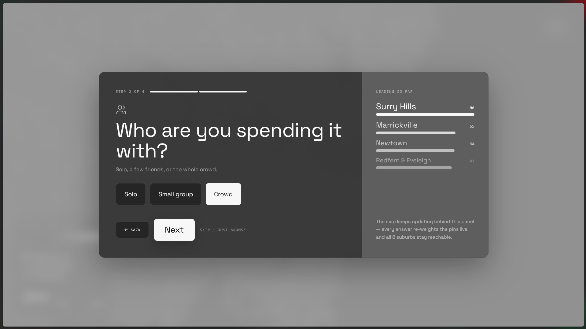
Mood Quiz #2
-
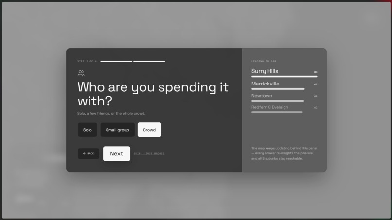
Mood Quiz #3
-
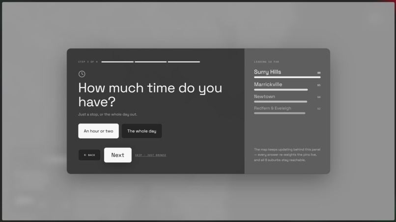
Mood Quiz #4
-
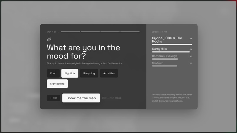
Mood Quiz #5
-
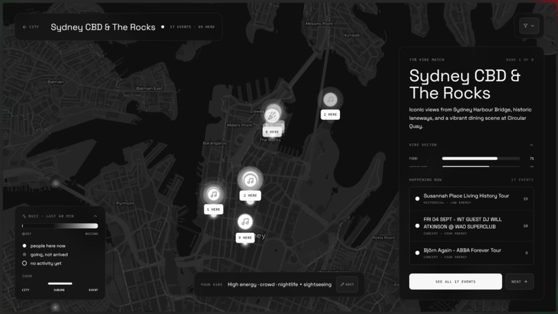
Mood Quiz Results & Suggestions


Inspiration
Google Maps tells you what's there. It doesn't tell you what's good right now, or what actually fits the mood you're in tonight. Event listings are just as static — a page full of things that are technically happening, with no sense of which one is actually buzzing versus which one is a ghost town. We wanted a map that felt alive: one where the city's real energy — driven by real people, not stale listings — was the whole point.
What it does
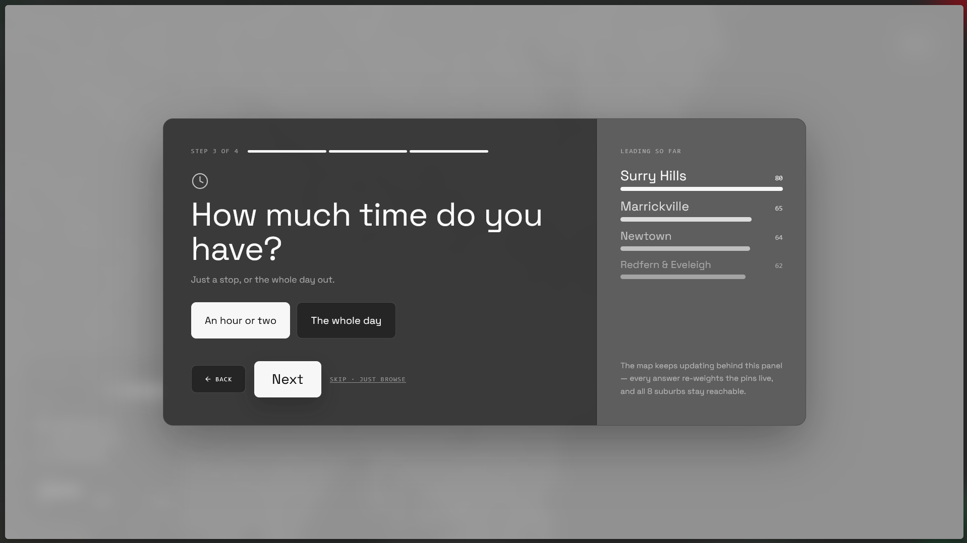
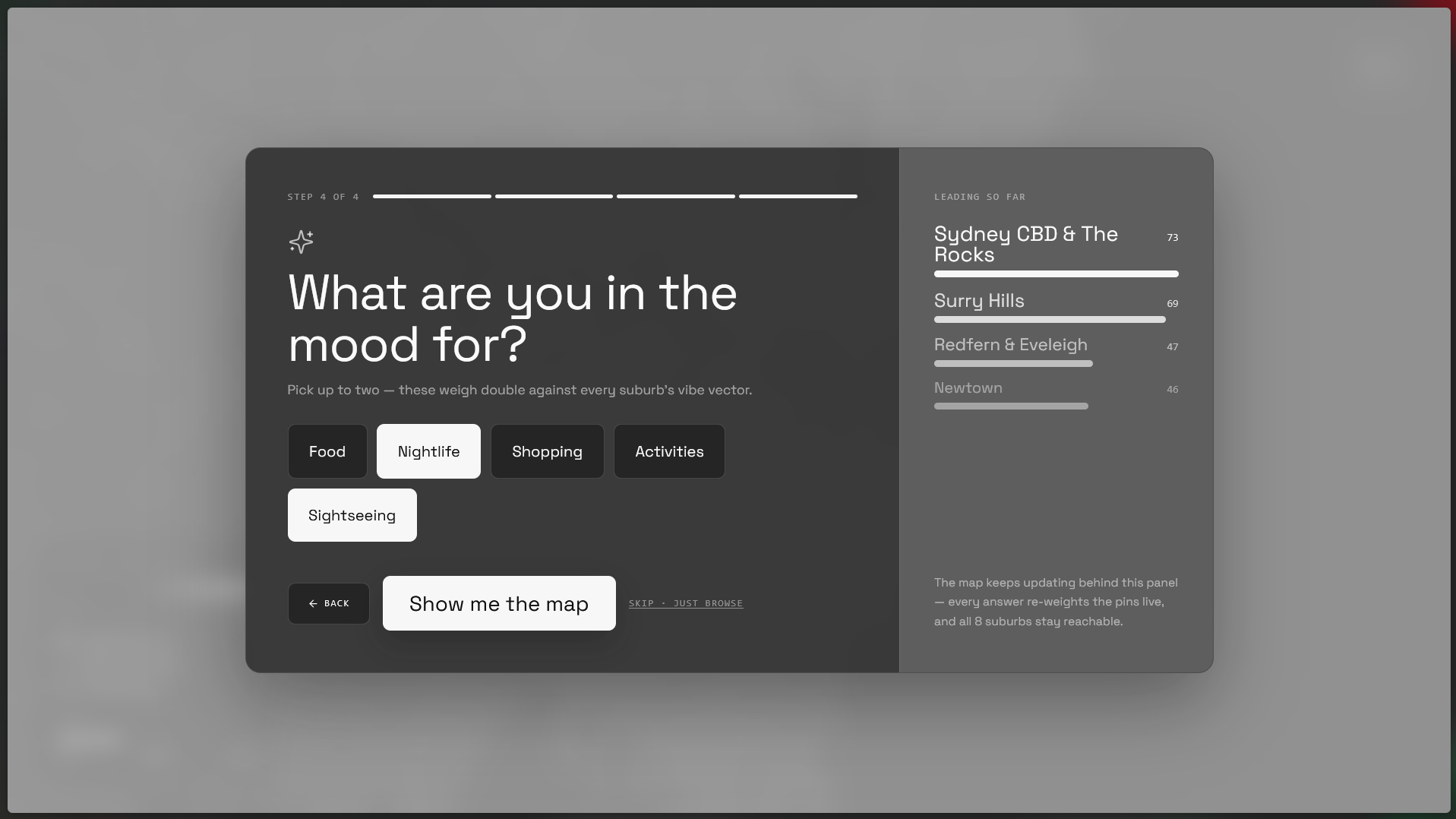
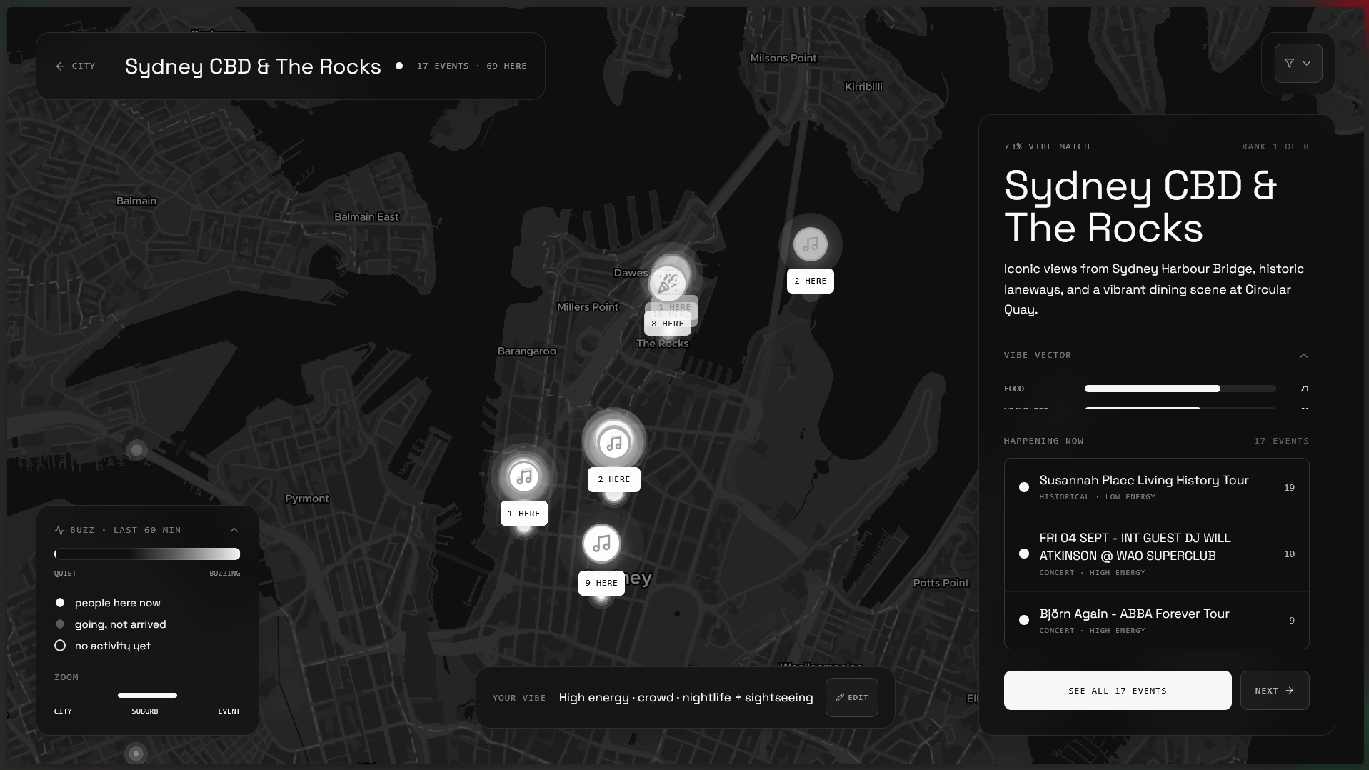
Pulse is a live map of Sydney where suburbs glow and event pins brighten based on real-time check-ins, not guesswork. Tap into a suburb to see what's happening now, ranked by live buzz. Don't know where to go? A four-tap mood quiz (energy level, who you're with, how much time you've got, what you're after) matches you to the suburb and events that actually fit, with the leaderboard re-ranking live as you answer. Check in when you arrive and the map updates for everyone watching, in real time.
How we built it
- Frontend: Next.js 14 (App Router) + TypeScript + Tailwind, with a dark glassmorphism design system built on Radix UI primitives and Framer Motion for the interaction layer.
- Map: MapLibre GL over a MapTiler basemap — we started on Mapbox but switched because Mapbox GL JS refuses to initialize without an access token even for third-party styles, while MapLibre has no such requirement.
- Backend: Supabase (Postgres + Realtime) for suburbs, events, check-ins, and "going" RSVPs, with buzz scores computed client-side from the live check-in/going stream — the same signal drives pin glow, the heatmap, and the quiz's suburb rankings.
- Data pipeline: a hand-curated "golden path" of real Sydney events layered with live pulls from the Ticketmaster API, plus a tiered randomized seeding script so the map never looks dead — or lopsided — on first load.
Challenges we ran into
- Proportion problem: early on, a single real check-in would light up like the whole suburb was on fire, because there was no baseline activity to compare it against. Fixed with a log-scaled buzz curve, a seeded baseline of realistic activity, and a heatmap color ramp with a wide "quiet" floor.
- A Flexbox gotcha:
overflow-hiddenon a flex-column child implicitly zeroes its minimum height per the CSS spec, which silently crushed two of our collapsible cards down to nothing and made them overlap. - MapLibre's expression rules: you can't combine a
zoomexpression with other operators — it has to be the sole top-level input to aninterpolate. Cost us a round of debugging before we split the logic into two separate paint properties. - An unbounded scroll container: a suburb with a lot of events had nowhere to stop scrolling, so the whole page — not just the panel — scrolled with it. Traced it back to a missing
overflow-y-autoboundary. - Iterating on the heatmap itself: we tried a proper hex-bin grid (via turf.js) as a more "designed" alternative to the gaussian blur, but pulled it back in favor of a gaussian heatmap re-styled with quantized color bands — giving a concentric-rings look without the extra complexity.
Accomplishments that we're proud of
- A real end-to-end pipeline: tap check-in → Supabase Realtime → every connected client's pin glow and heatmap update, live, no polling.
- A quiz that recomputes the full suburb leaderboard on every single tap, so the map visibly reacts to your answers before you've even submitted.
- Filters that actually filter — toggling a category hides non-matching suburbs and pins outright, not just dims them.
- A cohesive dark glassmorphism redesign applied consistently across every panel, chip, and drawer in the app, not just the flashy parts.
What we learned
- Live-activity visualizations are only as convincing as their baseline — you can't validate "does this look right" on real data alone; you need a believable seeded backdrop first.
- Library APIs deserve a quick sanity check before you trust them: turf.js's
points()helper applies one shared properties object to every point rather than one-per-point, which quietly broke our first heatmap aggregation attempt. - Sometimes the more "sophisticated" solution (hex-binning) isn't the right one — a well-tuned version of the simpler approach can look better and ship faster.
What's next for Pulse
- Expand past Sydney to other cities, since the whole architecture (suburb vibe vectors, live buzz scoring) is city-agnostic.
- Persistent user accounts instead of anonymous session IDs, so check-in history and quiz preferences carry over.
- Push notifications: "the suburb you matched with just started buzzing."
- Social layer — see which suburb your friends are actually in, right now.
- More live event sources beyond Ticketmaster to keep the golden path fresh automatically.
Built With
- class-variance-authority
- css
- framer-motion
- geojson
- html
- javascript
- loremflickr-api
- lucide
- maplibre-gl
- maptiler
- next.js
- node.js
- npm
- postcss
- postgresql
- radix-ui
- react
- shadcn/ui
- sonner
- supabase
- supabase-realtime
- tailwind-css
- ticketmaster-api
- typescript

Log in or sign up for Devpost to join the conversation.