-
-

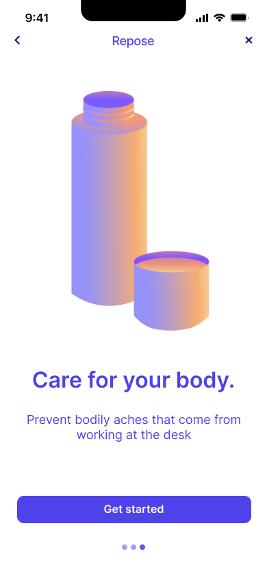
Onboarding screen
-

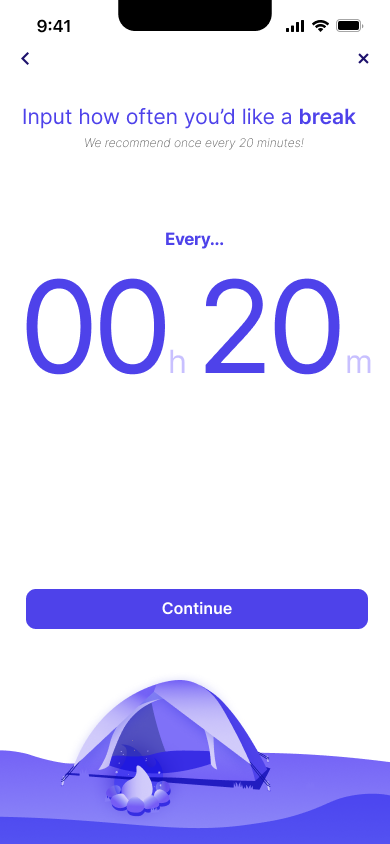
Selecting timer intervals
-

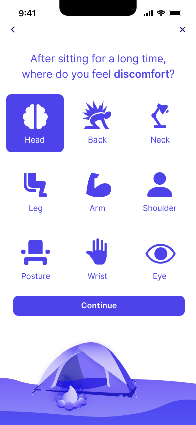
Selecting pain points
-
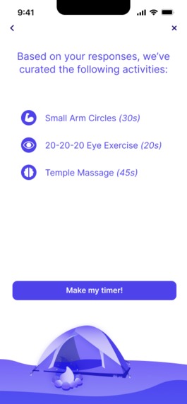
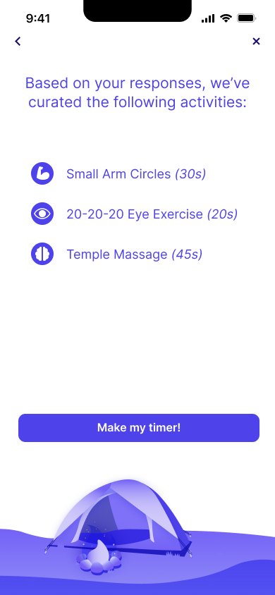
Curated activities targeting selected pain points
-
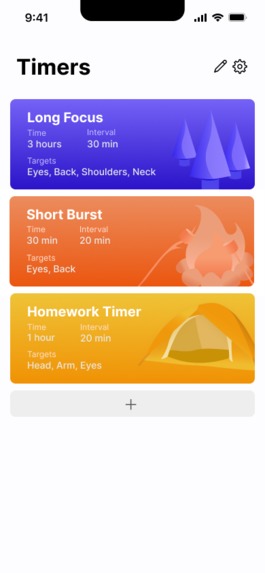
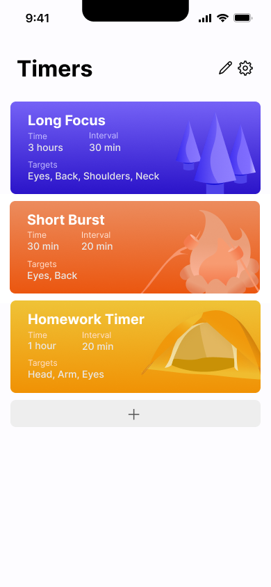
Timer homepage
-
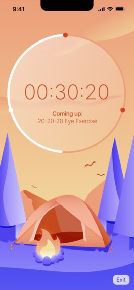
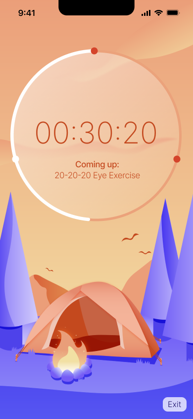
Timer screen
-
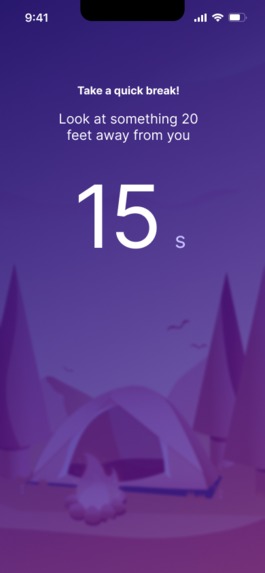
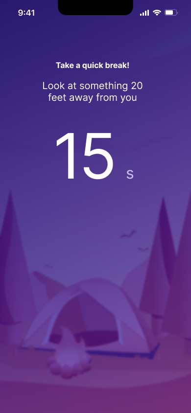
Activity timer
-

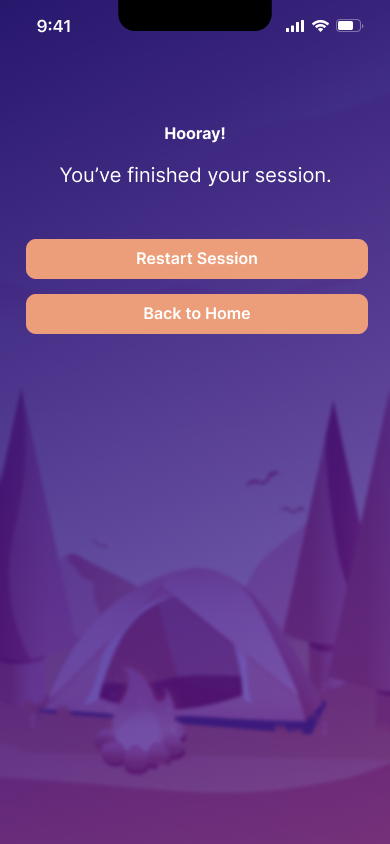
End of timer
Track: Health and Lifestyle
Inspiration
In a world where remote work and innovative technology has allowed us to produce work from the tip of our fingers, there has proven to be downsides to our physical health and wellbeing from being at a desk all day. Repose was inspired by our personal experiences with sore necks, strained eyes, and cramping fingers after hours of work. We sent out a survey to 31 people about their ergonomic work experience, and found that 97% of people suffered from physical ailments after working at a desk, with 29% working for 8+ hours a day, and 32% working for 4-5 hours a day. We saw a clear need for a product that gave people a simple way to keep their bodies moving without even leaving their rooms.
What it does
Our app utilizes a timer function that helps the user allocate time to do stretches and other activities to promote better ergonomic health. Repose sends out reminders at certain time intervals depending on the pain points of the user. For example, if the user deals with a lot of back pain and shoulder pain when working at a desk, they can create their own timer and our app will curate a program for the user to stretch/exercise in those areas. The activities are all under a minute, so it is easy and convenient for the user to complete at their desk. The user will also be able to select how long their work session is and how long their break intervals are (we also provide a recommendation for how long the interval should be if the user cannot decide). The user is also able to name their customized timer. Along with the custom timer, there are default timers already implemented in the app if the user doesn’t create a custom timer.
How we built it
We used FigJam and a traditional whiteboard to plan out our screens and get visual inspirations. Then, we used Adobe Illustrator to create custom illustrations for all the graphics displayed in the application, including the background image, splash screen graphics, and categorical elements. Finally, we put it all together in Figma and prototyped it!
Challenges we ran into
In the beginning, we struggled a lot with the concept of the app. We wanted to ensure that it created a safe and welcoming environment, as the goal of the app was to help users take a break and take care of their bodies without any discomfort. We also struggled with deciding on a cohesive theme that felt immersive to the user. We were deciding between various scenes (such as a road trip and hiking) the app would show, and eventually settled on a camp theme to play on the idea of taking a break and stepping out into nature. Other challenges included figuring out the best layout for our functions, such as the category section, where we originally wanted to include a checklist. We eventually shifted to a grid layout instead, as it was more user-friendly and legible.
Accomplishments that we're proud of
We are really proud of the illustrations we were able to create in such a short amount of time, and how it tied into the peaceful atmosphere of the application itself. There were a lot of small design problems we came across, such as how to display the timer, or how the flow to create a new timer should be. After doing a lot of external visual research, we are proud of overcoming these challenges and creating a final project.
What we learned
We learned so much about design thinking, and how to create seamless solutions to a niche problem that nothing on the market seems to solve. We also learned a lot about how to ensure visual consistency through illustrative, graphic, and type elements. By taking from our own experiences, as well as friends and family, we learned to conceptualize an app with a clear use-case from scratch, and bring it to life!
What's next for project
We definitely want to create a wider range of graphics and include ways for users to customize the exercises/stretches during their breaks.
Built With
- adobe-illustrator
- figma

Log in or sign up for Devpost to join the conversation.