-
-
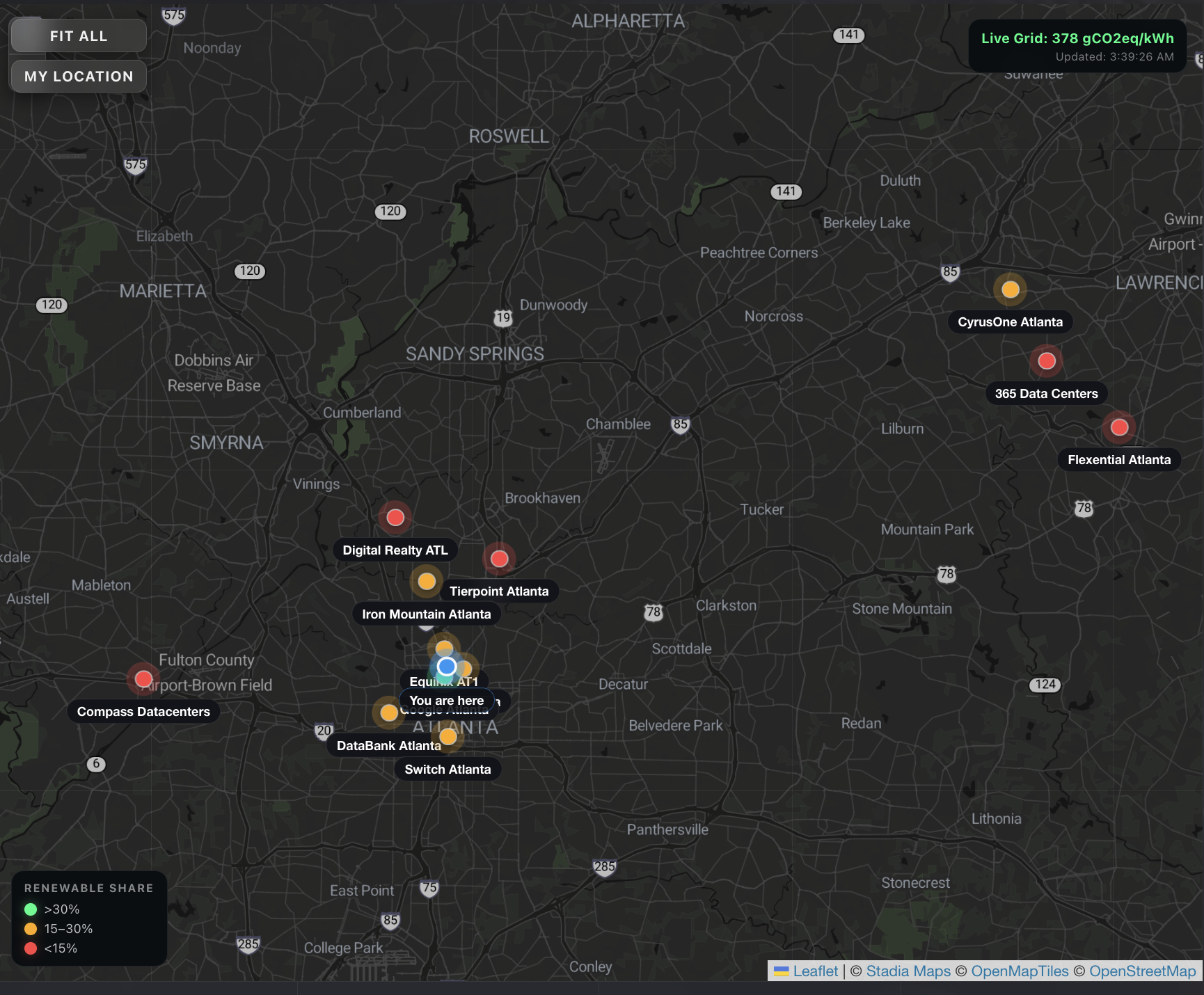
Zoomed in map
-
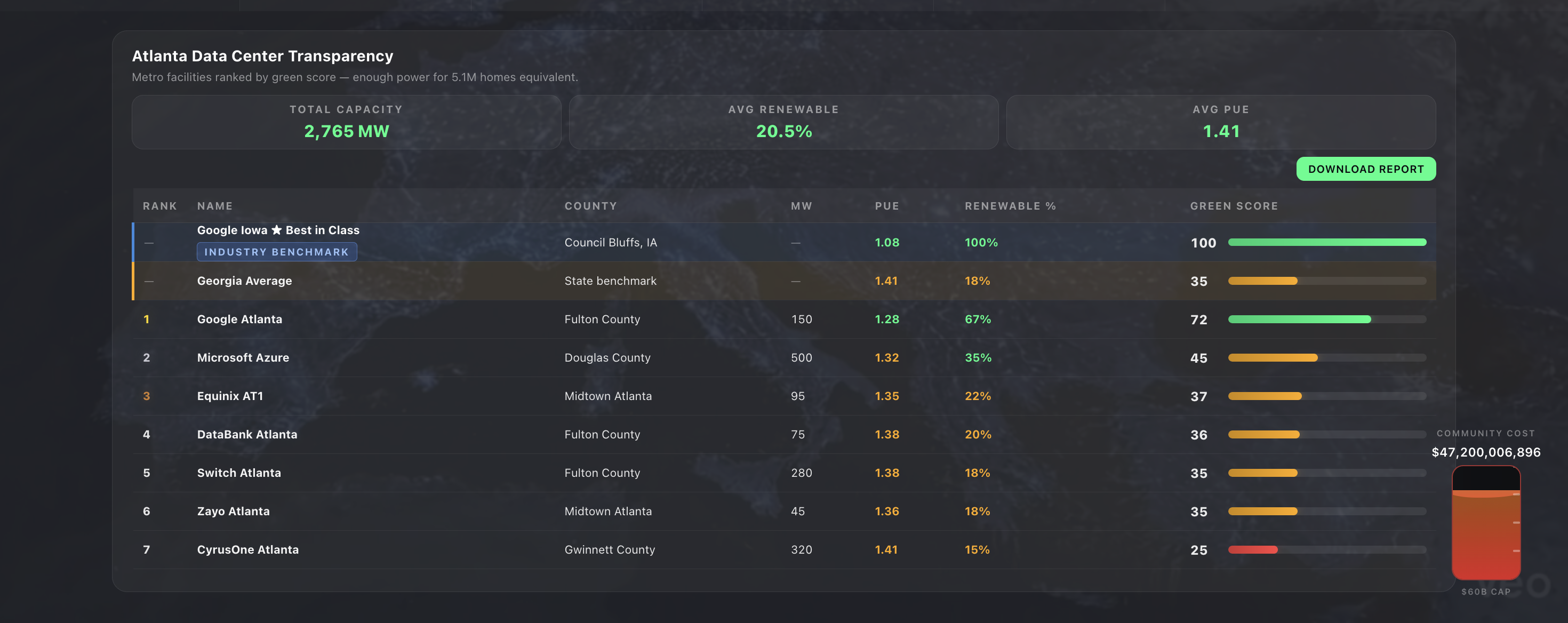
Data center transparency
-

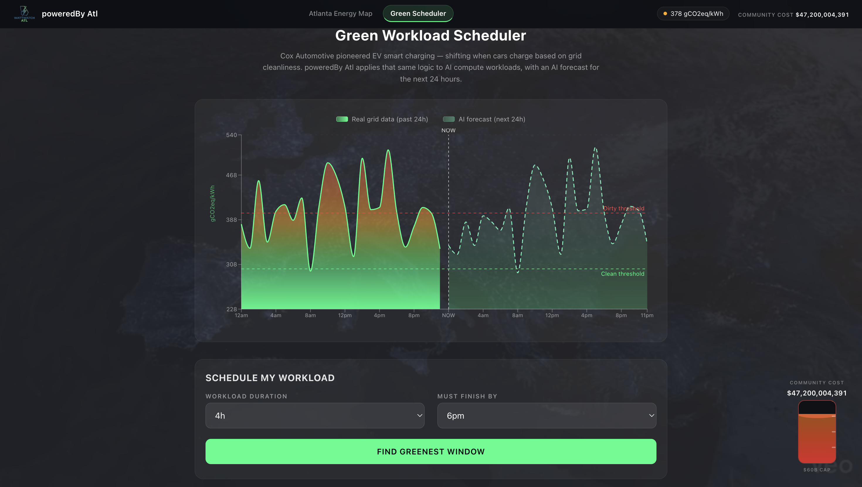
Green Scheduler
-
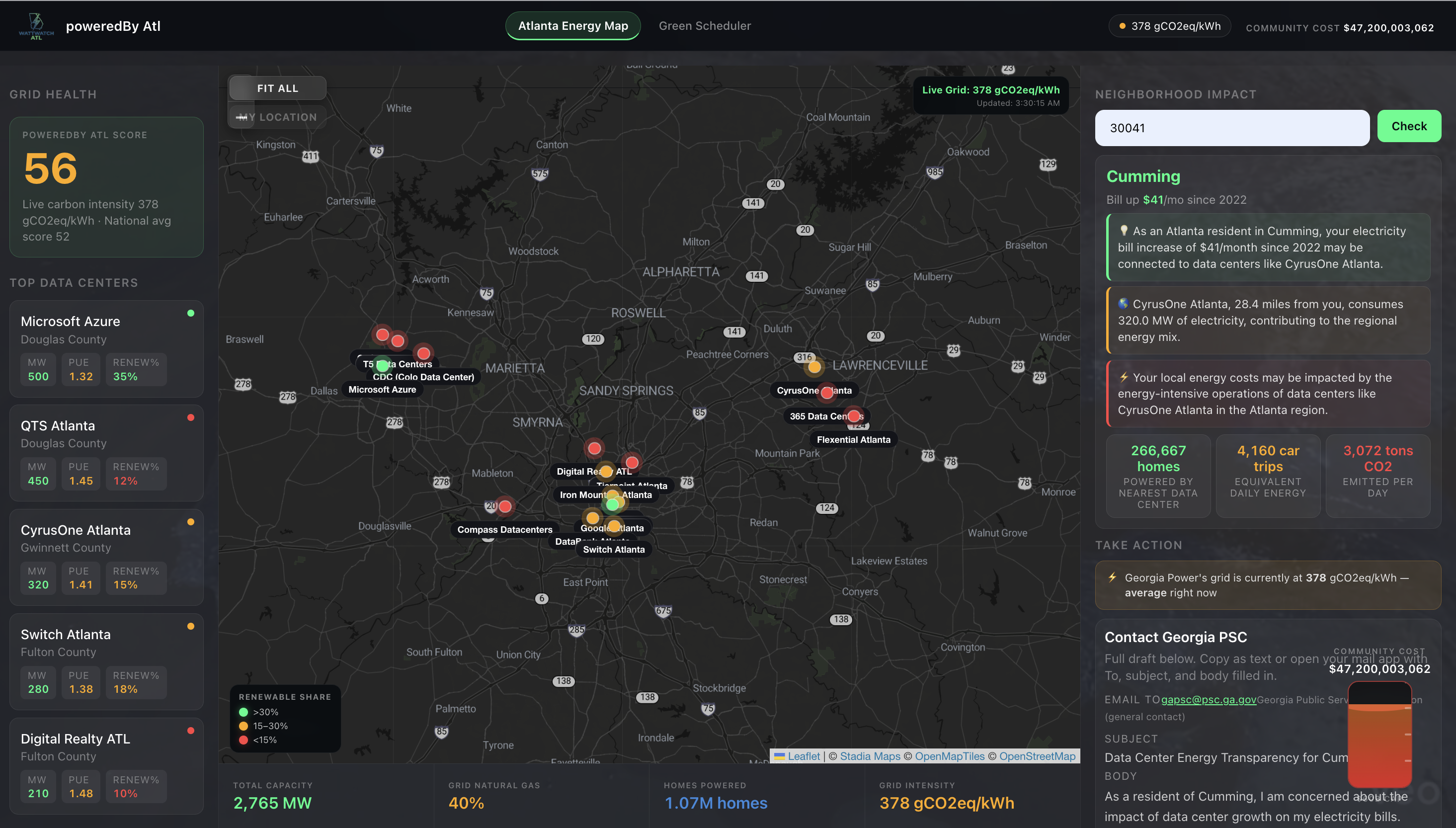
Main dashboard with live map tracking
-
Logo
Inspiration
My dad showed me his Georgia Power bills last month. 2022 to 2026, up $41 every single month. He thought it was inflation. It wasn't.
On December 19th, 2025, Georgia regulators unanimously approved Georgia Power's request for nearly 10,000 megawatts($16 billion) of new energy capacity, 80% of it for data centers. The Southern Environmental Law Center called it "putting the $60 billion risk on the backs of everyday Georgians." The average Atlanta residential bill has already climbed more than $43 a month over the past two years.
And there was no public tool to see any of it.
That's why we built PoweredBy ATL.
What it does
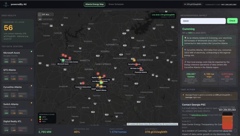
PoweredBy ATL is an AI-powered energy transparency and community action platform built for Atlanta. It gives any resident, journalist, or regulator visibility into what data centers are consuming, what it's costing their neighborhood, and, critically, what they can do about it.
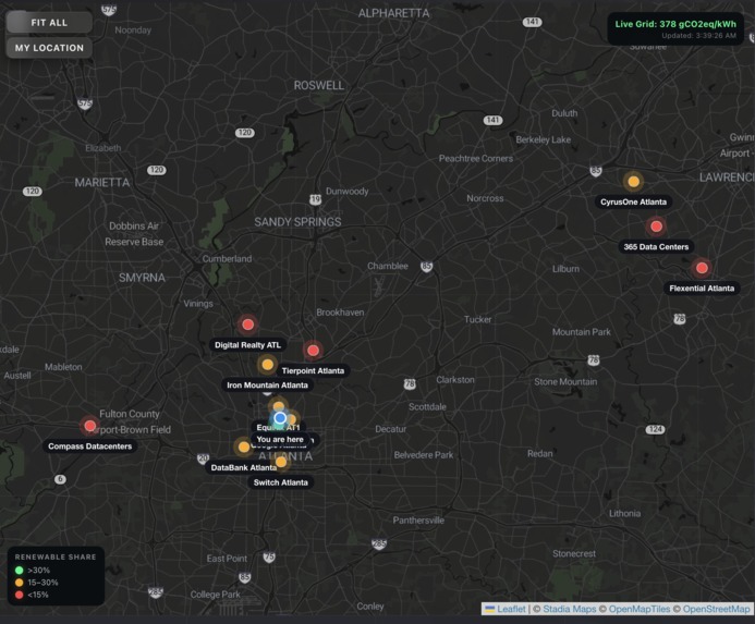
Atlanta Energy Map A live interactive map of 16 Atlanta-area data centers showing real-time carbon intensity from Georgia Power's actual grid (via Electricity Maps API), renewable share, MW capacity, and PUE efficiency ratings. Color-coded markers show at a glance which facilities are green vs fossil-heavy. Auto-detects your location and shows your nearest data center.
Neighborhood Impact Type any Georgia zip code and our AI, powered by Groq (Llama 3), generates a plain-English explanation of what data center growth means for your specific neighborhood. Your bill increase. Your nearest facility. Your grid. 80+ Georgia zip codes supported, from Cumming to Savannah.
Community Action Engine This is what makes PoweredBy different. We don't just inform you, we help you act. One tap generates a personalized email to the Georgia Public Service Commission with your neighborhood data pre-filled. One click connects you to your Georgia State Senator. One button generates an AI-written social post for your neighbors. One person emailing the PSC is a complaint. Ten thousand people is a movement.
Green Workload Scheduler Cox Automotive pioneered EV smart charging, shifting when cars charge based on grid cleanliness. We applied that exact logic to AI compute workloads. Our scheduler uses 24 hours of real Georgia grid data plus an AI-generated 24-hour forecast to find the greenest window for any batch job. Run your AI training job at 1pm instead of 8pm, save 17% carbon. Same mental model Cox already sells, extended to AI infrastructure.
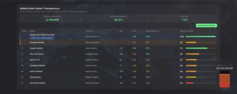
Data Center Transparency Leaderboard Every major Atlanta data center ranked by our Green Score, a composite of PUE efficiency and renewable percentage. Google Atlanta leads at 72. Compass Datacenters sits at 13. This data should be published by the data centers themselves. We're doing it for them.
How we built it
Frontend: React + Vite, React Router, Recharts for the 48-hour carbon chart, Leaflet + react-leaflet for the interactive map, Stadia Maps dark tile layer.
Backend: FastAPI (Python), uvicorn, httpx for API calls.
APIs:
- Electricity Maps API — live hourly carbon intensity for Georgia Power's SOCO balancing authority. Real data, updated every hour.
- Groq API (Llama 3 8B) — three uses: neighborhood impact bullet generation, 24-hour carbon intensity forecasting from real grid patterns, and personalized social post generation.
- Nominatim (OpenStreetMap) — reverse geocoding to auto-detect zip code from browser location.
- Stadia Maps / OpenStreetMap — dark map tiles.
Data sources:
- Data center locations, MW capacity, and PUE from publicly available industry reports and company sustainability disclosures.
- Bill increase figures from Southern Environmental Law Center PSC testimony (December 2025).
- $60B risk figure from PSC hearing transcript (December 19, 2025).
- National carbon intensity averages from US EIA data.
Challenges we ran into
Real data vs. mock data: Our biggest early challenge was finding free, real APIs for Georgia grid data. WattTime's free tier only covers California. We found Electricity Maps, which covers Georgia Power's SOCO zone on their academic/free tier, and the data came back live immediately. 397 gCO2eq/kWh on the first call. That moment made the whole project feel real.
LLM forecasting: We wanted a 24-hour carbon forecast but didn't have access to a paid forecast API. We fed the real 24-hour historical data into Groq and prompted it to forecast the next 24 hours based on Georgia's known grid patterns, solar peaks midday, evening demand spikes. The LLM actually captures these patterns well enough to be useful for scheduling recommendations.
Layout complexity: Building a three-panel mission control layout, left sidebar, full-screen Leaflet map, right sidebar, with all panels updating from the same live data context was technically the hardest UI challenge. Leaflet in particular requires invalidateSize() calls after any DOM resize, and getting the map to fill its container correctly took significant iteration.
Data accuracy: We were transparent throughout that data center MW, PUE, and renewable figures are public estimates, not officially disclosed by the facilities. This is actually central to our argument: data centers should be required to publish this data. We're building the tool that shows what mandatory transparency would look like.
Accomplishments we're proud of
- Every grid number on screen is live, not simulated. Georgia Power's actual balancing authority, right now.
- The AI community impact bullets are genuinely empathetic and neighborhood-specific, Groq nailed the tone.
- The action engine: going from "here's your data" to "here's your pre-written PSC email" in one tap is the feature we're most proud of. It closes the loop between awareness and action.
- The Green Scheduler's 48-hour chart, real data left, AI forecast right, divided by a NOW line, looks and functions like a real product.
- We built this in one night. At Georgia Tech. For our city.
What we learned
- Free APIs with real data exist if you look hard enough, Electricity Maps gave us live Georgia grid data for free with an academic license.
- LLMs are genuinely useful for explaining complex infrastructure data to regular people. The gap between "403 gCO2eq/kWh" and "your electric bill went up $41/month because of this" is exactly where AI adds value.
- Transparency tools only work if they drive action. A dashboard that shows you data but doesn't tell you what to do with it is just an interesting chart. The PSC email feature is what makes PoweredBy a civic tool rather than a visualization.
- The story matters as much as the tech. My dad's bill is the reason this exists. That's not a pitch trick, it's the truth.
What's next for PoweredBy ATL
- Real forecast data: Electricity Maps' paid tier provides 72-hour forward grid forecasts. That upgrades our scheduler from pattern-based to genuinely predictive.
- Mobile app: Real-time push notifications when your grid goes green, "Good time to run your AI job" or "Your grid just hit its cleanest point of the week."
- Expand beyond Atlanta: Dallas, Ashburn, Phoenix, the three other fastest-growing US data center markets. Same codebase, new zip data, live in 48 hours.
- B2B layer: Data center operators need ESG reporting. PoweredBy's leaderboard framework is the public accountability version of what they need for internal reporting. Enterprise SaaS built on the same data infrastructure.
- Partner with Cox: Cox already has relationships with data center operators through their automotive data infrastructure. The Green Scheduler is a natural extension of their EV smart charging product into AI compute, we'd love to build this together.
Built With
- api
- cartodb
- fastapi
- groq
- leaflet.js
- nominatim
- openstreetmap
- python
- react
- render
- vercel
- vite

Log in or sign up for Devpost to join the conversation.