-
-
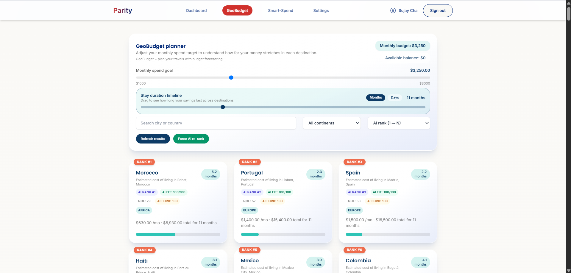
GeoBudget
-
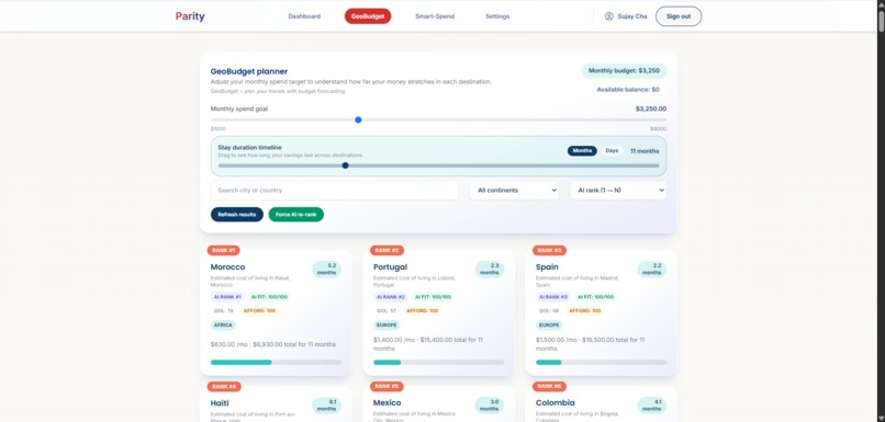
GeoBudget
-
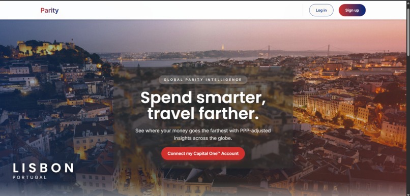
Landing Page
-
Sign Up Page
-

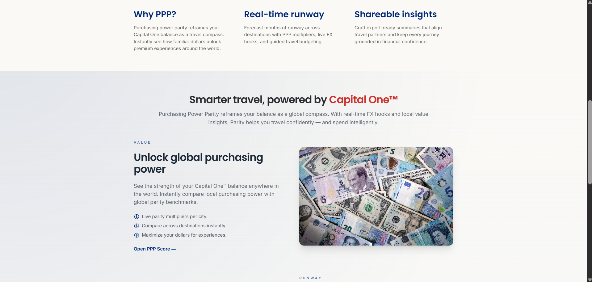
Landing Page
-

Landing Page
-
Landing Page
-

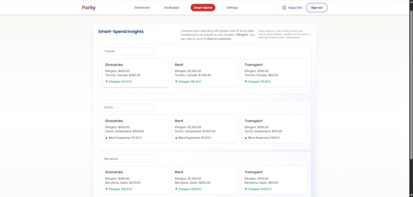
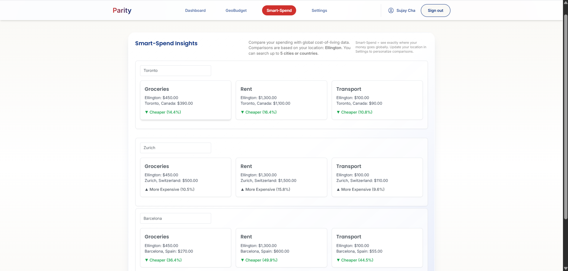
Smart-Spend


Inspiration
The exchange rate for the US Dollar (USD) to Indian Rupee (INR) is 80 INR for 1 USD. In America, there’s not much I can buy with a dollar. But in India, 80 rupees can get me a meal at a fancy restaurant. In the foreign exchange market, those two amounts of money are equivalent. But I’ve always wondered—why does a dollar have so much more purchasing power in India than in the US?
This phenomenon is called purchasing power parity (PPP). The purchasing power of a currency differs by country and is not the same as the exchange rate. This means planning vacations or foreign retirement is more complicated than just multiplying a few numbers. It’s harder to plan foreign travel when your money’s purchasing power can change so dramatically by simply crossing borders.
What it does
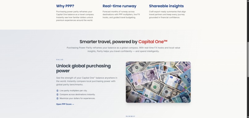
Parity is a web app that allows you to visualize your money’s purchasing power in other countries. It goes beyond simple exchange rate conversions by incorporating PPP and cost-of-living data.
Parity helps with financial planning for vacations, retirement abroad, and short trips. It integrates seamlessly with your Capital One accounts, pulling in data and providing insights to help you stretch your dollars further.
Key features include:
- GeoBudget – Uses Google Gemini’s 1.5 Flash model to rank nations by how much your bank account could purchase there. It even shows you how many days you could live in each country.
- Smart-Spend – Lets you explore the cost of living in any city worldwide. Type in a city, and Smart-Spend provides a breakdown (rent, transportation, groceries) and compares it to your current location, so you know where your money gets the most bang for your buck.
How we built it
Parity’s frontend is built entirely with ReactJS and NextJS. We use Supabase for database management and API key handling.
Our machine learning models are trained on data from the World Bank and the International Monetary Fund, while also factoring in global cost-of-living disparities. We layered in explainability so users can see why a certain country or city ranks well for them.
Challenges we ran into
- Data normalization: World Bank/IMF PPP data didn’t align cleanly with cost-of-living sources or even country names (e.g., “Czechia” vs. “Czech Republic”). We solved this by building a reconciliation layer using ISO codes and alias maps, imputing missing categories conservatively, and surfacing “estimated” values in the UI when needed.
- Latency and rate limits: Gemini initially slowed down the app because the planner called the model after every user tweak. We redesigned the flow to run inference at first load, memoize results per user + filters, and re-rank locally (PPP × QoL × safety). This kept the page responsive and consistent.
- Security and explainability: We had to ensure API keys and user data were safe. Keys now live in Supabase with row-level security, and rankings run behind a controlled edge call to avoid leaks and rate-limit issues.
Accomplishments that we're proud of
- Successfully built an app that makes PPP data actionable and intuitive.
- Solved tough data reconciliation challenges across international datasets.
- Designed a responsive experience despite heavy model calls.
- Added explainable insights that don’t just give numbers but also context (“why this ranks for you”).
What we learned
- Exchange rates alone don’t tell the full story—PPP is a much better lens for planning travel or living abroad.
- Clean, consistent data is critical when combining multiple international sources.
- Performance and responsiveness are just as important as accuracy in user-facing apps.
- Users value transparency—showing why a result appears builds trust and engagement.
Built With
- javascript
- nessie
- nextjs
- node.js
- numbeo
- openstreetmap
- react
- shell
- supabase
- typescript
- vercel


Log in or sign up for Devpost to join the conversation.