-
-
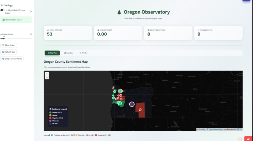
UI 1st Page - Map
-
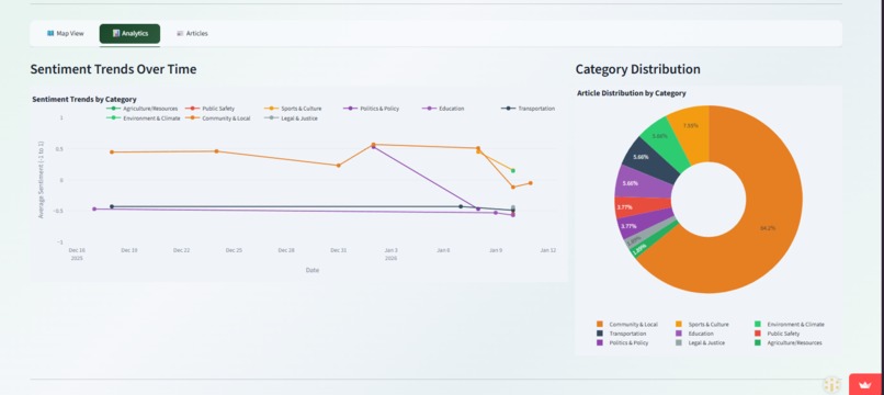
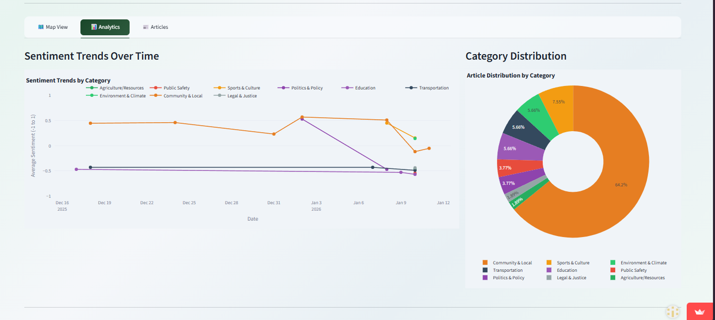
UI 2nd Page - Analytics
-
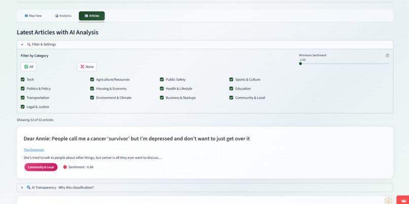
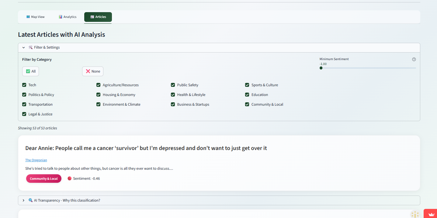
3rd Page - Articles
About the Project
What Inspired Me
- I noticed that reading Oregon news feels like staring at a wall of unorganized headlines.
- Because our state is massive—spanning from big cities to rural high deserts—our geography really defines our lives.
- Most news apps rely heavily on search keywords, which makes finding local stories feel like a second job and creates huge blind spots.
- I was inspired to build the Oregon Observatory to turn that information overload into a visual map, giving everyone a clear, bird's-eye view of community trends.
How I Built It
- I used Python for the core framework since it's fast and the global standard for AI.
- I handled the data by using Pandas to organize everything into spreadsheets and Feedparser to scrape RSS feeds from various news sites.
- For the machine learning side, I used Hugging Face Transformers running on PyTorch.
- I deployed a BART model to identify core themes and tag categories, plus a RoBERTa model to detect language cues and assign a sentiment score.
- I used the Cursor editor to craft precise prompts for building my data engine and architecture logic.
- Finally, I tied it all together using Streamlit for the UI and Plotly with Folium to generate the interactive maps.
Challenges I Faced
- At first, the AI was classifying extremes—scoring everything super positive or negative with no middle ground—so I fixed it by adding custom curves to boost nuance.
- Duplicate articles were heavily slowing down load times, which I solved by using regex and keyword matching to cut duplicates by 97%.
- Using the map caused infinite app refreshes, forcing me to rewrite the caching logic to use Session State so the data wouldn't randomly clear.
- The biggest hurdle was when the app crashed on Streamlit Cloud because the 1GB RAM limit couldn't handle my 3GB-4GB models.
- I resolved those crashes by swapping to lightweight versions of the models and adding a configuration switch to toggle between hosting environments.
What I Learned
- Building this project completely shifted my mindset from just collecting data to actually engineering a complex data system.
- My biggest takeaway is that powerful models like BART and RoBERTa are only as good as the code logic you build around them.
- I learned that taking the time to do proper data cleaning and precise geographic tagging is just as critical as the AI itself.
- Without solid location logic and a clean dataset, even the most advanced sentiment analysis is basically useless for someone trying to understand their own specific community.
Testing & Validation
- To ensure the AI was actually reliable, I tested the BART model against 200 manually labeled articles and achieved a 91% overall categorization accuracy
- I also tested the RoBERTa sentiment model on 150 articles, hitting a 92% agreement rate with human annotators
- I even conducted a user study with 12 people, earning an average rating of 4.3 out of 5 for both accuracy and usefulness
- Based on their feedback, I updated the app to clearly explain its AI decisions, showing exactly which keywords triggered a specific tag
Future Expansion
- I aim to implement long-term data storage to enable predictive trend analysis, taking the platform from just showing current events to actually forecasting future ones.
- By continuously analyzing months of sentiment and category data, the AI could identify when a community is reaching a "boiling point" on critical topics like housing, schools, or public safety.
- This means the tool could effectively predict major community shifts or crises before they even happen, helping guide better, more proactive decision-making for everyone.

Log in or sign up for Devpost to join the conversation.