-
-
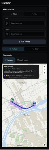
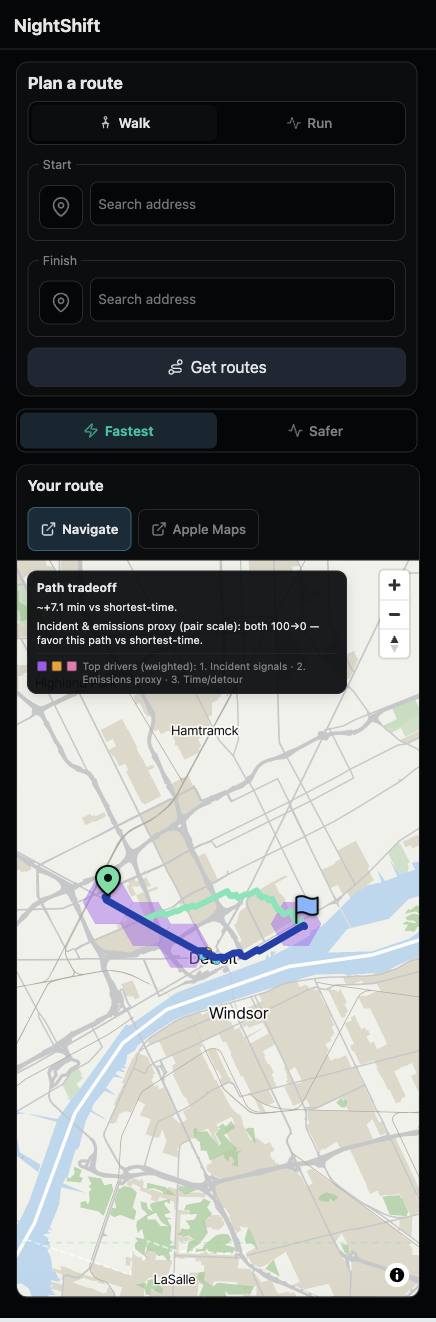
mobile view
-
desktop view
-
used in google maps
Inspiration
NightShift Detroit started from a real late-night walk in Midtown Detroit.
My friend and I were working late at TechTown, and later that night we had to walk back to our place at University Tower. The trip was only about 20 minutes on foot, so the problem was not distance. The problem was that we wanted more than “fastest” from a navigation app. We wanted a way to compare routes using public-record risk signals, area-level air-exposure context, and proximity to listed help/resource locations, while still keeping travel time in the picture.
That moment became the spark for NightShift Detroit: route comparison for walking and running in Detroit that is transparent about tradeoffs, and honest about what the data can and cannot mean.
What it does
NightShift Detroit is a route comparison web app for Detroit walking and running. It is not a safety guarantee, crime prediction, block-level pollution truth, or an official routing recommendation.
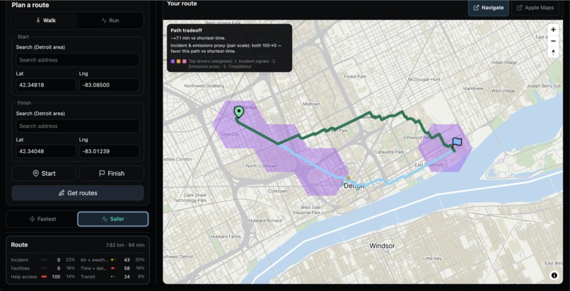
In the UI, users can compare:
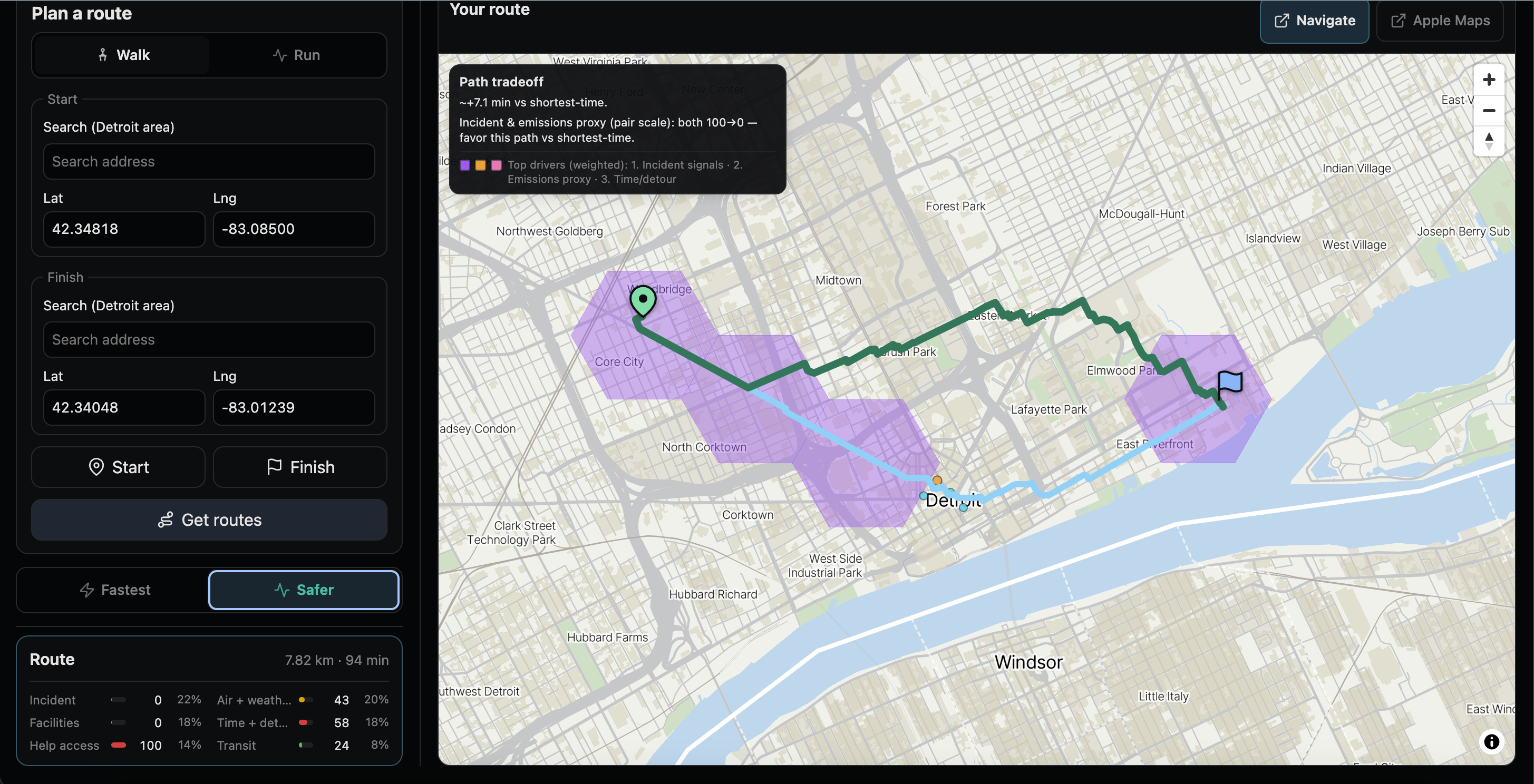
- Fastest (shortest estimated travel time)
- Safer (the UI label for lower combined burden in code): a holistic composite score built from six 0–100 burden components (higher = worse), including incident signals, emissions-facility proxy, help access, transit access, ambient air + weather, and time/detour spread.
On the map:
- Blue shows the shortest-time path.
- Green shows the lower combined burden path.
- The darker stroke highlights the geometry for the active mode.
When the two winners differ, the map can show a Path tradeoff panel plus weighted top-3 drivers that explain which factors most contribute to the composite gap versus fastest.
Near-route context layers (within about 120 m of the relevant paths) can include:
- Violet incident-grid context when incident ranks in the top three drivers
- Amber emissions proxy points
- Cyan listed help/resource points
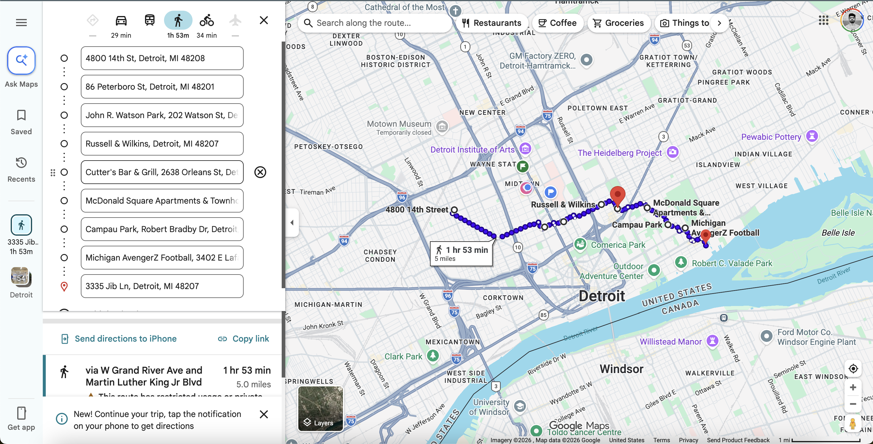
After a route is shown, users can open external directions (Navigate + a second maps link) to start turn-by-turn navigation in their maps app.
How we built it
Frontend
- React 19 + TypeScript + Vite 8
- MapLibre GL for the interactive map
- Turf.js for geospatial helpers
Routing + search (dev/preview)
- OpenRouteService powers route candidates via
POST /api/routes(implemented as Vite dev/preview middleware so the ORS key stays server-side) - Address search uses
GET /api/geocode(ORS Pelias autocomplete), with optional per-IP rate limits
Data + scoring
- Cached GeoJSON/JSON ships under
public/cache/for an offline-first demo experience - Route scoring runs in the client from a returned
RouteBundle(src/lib/scoreRoute.tsand related modules) - The README documents the canonical scoring model, including bundle-relative scaling for incident/facilities when multiple candidates exist, missing-data renormalization, and the decisive-factor math for the fastest vs lower-combined-burden pair overlay
Quality
- Vitest unit tests and Playwright end-to-end tests
npm run data:validateas a cache/schema compliance gate
Challenges we ran into
- Responsibility vs usefulness: public-record incident signals and area-level air exposure are real constraints, but they are not perfect knowledge. We had to design language and UX that helps users compare routes without overclaiming.
- Integrating heterogeneous data: routing geometry, cached public layers, air/weather context, and help/resource proximity all have different limitations and freshness. Making them feel like one coherent comparison experience took iteration.
- Keeping secrets out of the browser: MVP routing and keyed fetch belong in Node/server-side paths, not bundled into the client bundle. That shaped our architecture (Vite middleware for
/api/*in dev/preview, with a note that a static host alone will not expose those endpoints in production).
Accomplishments that we're proud of
- A working end-to-end route comparison flow: request a route, see two meaningful alternatives on the map, and understand why they differ.
- A clear explainability layer: weighted top drivers, route signal bars, and map legend colors tied to fixed factor semantics.
- A thoughtful offline-first demo posture using shipped caches, while still supporting live routing during development/preview with server-side keys.
What we learned
- Users often want tradeoffs made visible, not just a single “best” line on a map.
- Transparency beats hype: being explicit about data limitations builds trust faster than marketing language.
- Good demos need tight product framing: compare modes, show the map story, then connect it to the scoring idea in plain language.
What's next for NightShift Detroit
- Production deployment path for custom routing: host the same
/api/routes+/api/geocodebehavior on a real backend (static hosting alone is not enough). - Continue improving data pipelines and freshness (AirNow/NWS fetch scripts, cache validation, attribution metadata in
public/cache/source_metadata.json). - Expand scenarios, refine mobile UX breakpoints, and deepen explanations while staying aligned with the product’s non-negotiable framing: public-record risk signals and area-level air-exposure context, not guarantees.
Built With
- airnow-api
- dotenv
- eslint
- geojson
- mapbox
- maplibre-gl
- maptiler-(optional)
- national-weather-service-(nws)-api
- node.js
- openrouteservice-(ors)
- ors-pelias-geocoding
- playwright
- react
- tsx
- turf.js
- typescript
- vite
- vitest


Log in or sign up for Devpost to join the conversation.