Inspiration
Between 2020 and 2022, 141 Georgia women died from pregnancy related causes, and Georgia's Maternal Mortality Review Committee found that 87% of those deaths had at least some chance of being prevented. At the same time, March of Dimes classifies 70 of Georgia's 159 counties (44%) as maternity care deserts, with no birthing hospital and no obstetric clinician.
We kept seeing news of rural labor and delivery units closing, including St. Mary's ending birthing services in Lavonia and shifting care to Athens. Each closure raises the same questions: how many women just lost nearby care, where will those births go, and where would a new investment help the most? Health planners make these decisions constantly, but we couldn't find a simple tool that answers them in minutes. MaternalGrid is our attempt to build one.
What it does
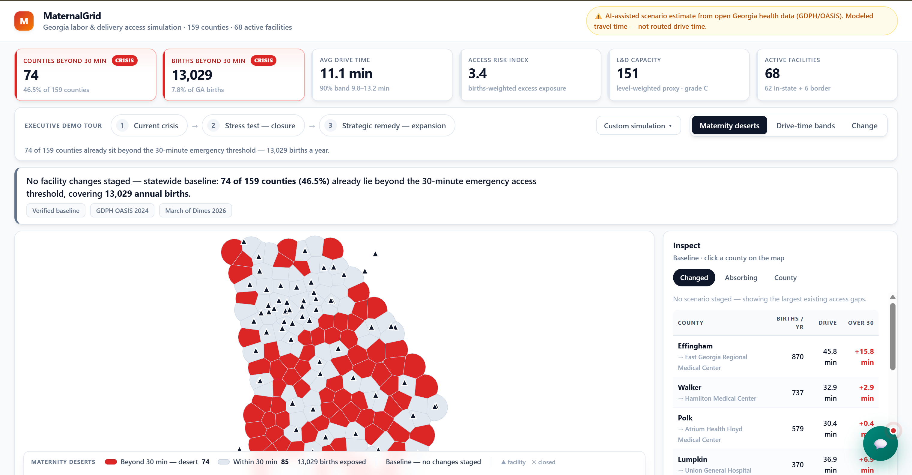
MaternalGrid is an interactive map of all 159 Georgia counties that shows modeled travel time to the nearest active labor and delivery hospital, along with births, women of reproductive age, obstetric workforce, and March of Dimes access classification. Planners can simulate closing a Georgia facility or adding a new one and immediately see which counties lose or gain 30 minute access, how many births are affected, and where displaced births would go. Claude then turns the results into a short, plain language planning brief.
How we built it
Data. Everything in MaternalGrid comes from public sources: 2024 births and a 10 year births time series for every county from Georgia DPH's OASIS system, women aged 15 to 44 from the Census American Community Survey, obstetricians and midwives from the CMS NPI Registry, county access classifications from March of Dimes, and a facility list compiled from Georgia DPH maternal designations, Department of Community Health data, and hospital websites. We also added delivering hospitals just across the border in Tennessee, Florida, Alabama, and South Carolina, since many Georgia women give birth there.
The access model. For each county $c$, we find the nearest active delivering facility $f^*$ and estimate travel time as
$$ t_c = \frac{1.3 \times d(c, f^*)}{45 \text{ mph}} \times 60 $$
where $d$ is the straight line (haversine) distance in miles from the county's center and 1.3 is a road factor. A county has access when $t_c \le 30$ minutes, matching the threshold March of Dimes uses. Because hospital level birth counts aren't public, we estimate each facility's volume by assigning every county's births to its nearest facility:
$$ V_f = \sum_{c \,:\, f^*(c) = f} B_c $$
When a facility is removed, its counties are reassigned to their next nearest option, which shows exactly where displaced births would go. Border hospitals stay fixed, since Georgia planners can't open or close facilities in other states. Every modeled value is labeled as modeled in the app.
The app. We built MaternalGrid in Python with Streamlit, pandas, and Plotly, using Claude Code to speed up development. The Claude API generates planning briefs from the scenario results, with a cache fallback so the demo works even if the API is unavailable. We used Tiger Data to store the births time series and a log of every scenario run, so planners can see demand trends and compare scenarios over time.
Challenges we ran into
Choosing the idea was our first real challenge. We debated several concepts, including a partner communication app for endometriosis and PMOS, before committing to MaternalGrid because it best fit the track, the sponsor's maternal health focus, and the public data available.
The data had more gaps than we expected. Georgia's birth data is organized by where mothers live, not where they deliver, so we had to model facility volumes instead of using real counts. Georgia's maternal designation process is voluntary, and only 15 hospitals have completed it, so we compiled the facility list from multiple sources and verified that each hospital still delivers. Some hospitals that looked active on paper had closed or paused their labor and delivery units, including Baptist Medical Center Nassau just across the Florida line. And ignoring border hospitals made border counties look worse than reality, so we had to research and add them.
Finally, we were building on a tight overnight timeline, which forced us to keep a strict scope: no invented wait times, no fake capacity data, and no feature that wasn't part of the core demo.
Accomplishments that we're proud of
Our model's inputs line up with independent benchmarks. Using OASIS data, the 70 counties March of Dimes classifies as maternity care deserts had 9,880 births in 2024, closely matching the report's estimate of about 10,000 births per year. We're also proud that every number in the app is either sourced or clearly labeled as modeled.
What we learned
We learned that the hardest part of a health data project is often knowing what the data actually represents, such as births by residence versus by delivery location, or a hospital holding a license versus actually delivering babies. We learned to validate against established benchmarks instead of trusting our own outputs, and that being transparent about assumptions makes a tool more credible, not less. We also learned a lot about making fast, fair decisions as a team under pressure.
What's next for MaternalGrid
Real drive times instead of straight line estimates, actual facility birth volumes and staffing data, prenatal care access as a second layer, and expansion across the Southeast, where many of the same rural hospital pressures exist.
Built With
- anthropic
- census-api
- claude
- claude-code
- data-vizualization
- geojson
- georgia-oasis
- geospacial-analysis
- geospatial-analysis-if-you-have-room-and-want-to-add-more
- github
- march-of-dimes-peristats
- npi-registry
- numpy
- pandas
- plotly
- postgresql
- psycopg
- public-health
- python
- streamlit
- streamlit-community-cloud
- tiger-data
- timescaledb


Log in or sign up for Devpost to join the conversation.