-
-
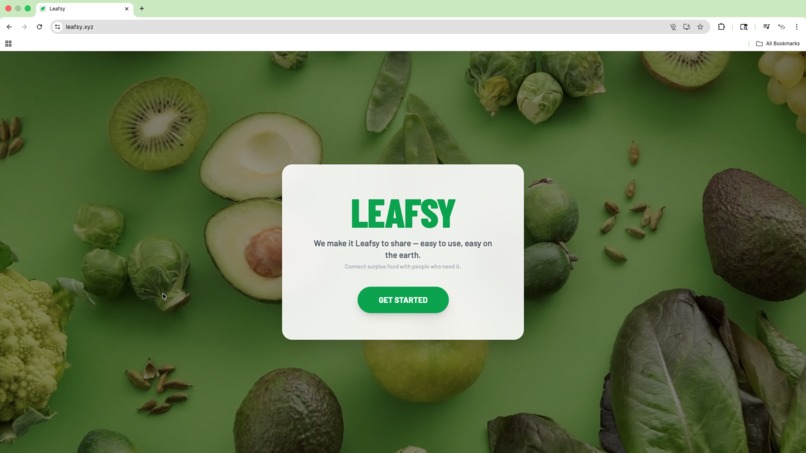
Leafsy Home Screen
-
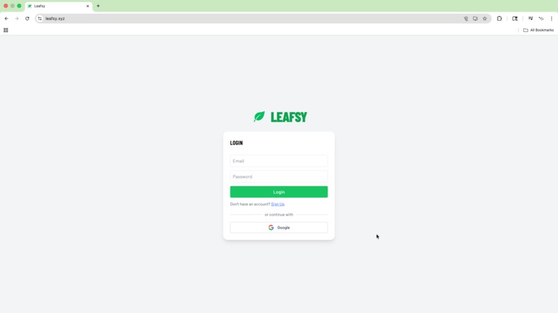
Leafsy Log In
-
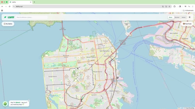
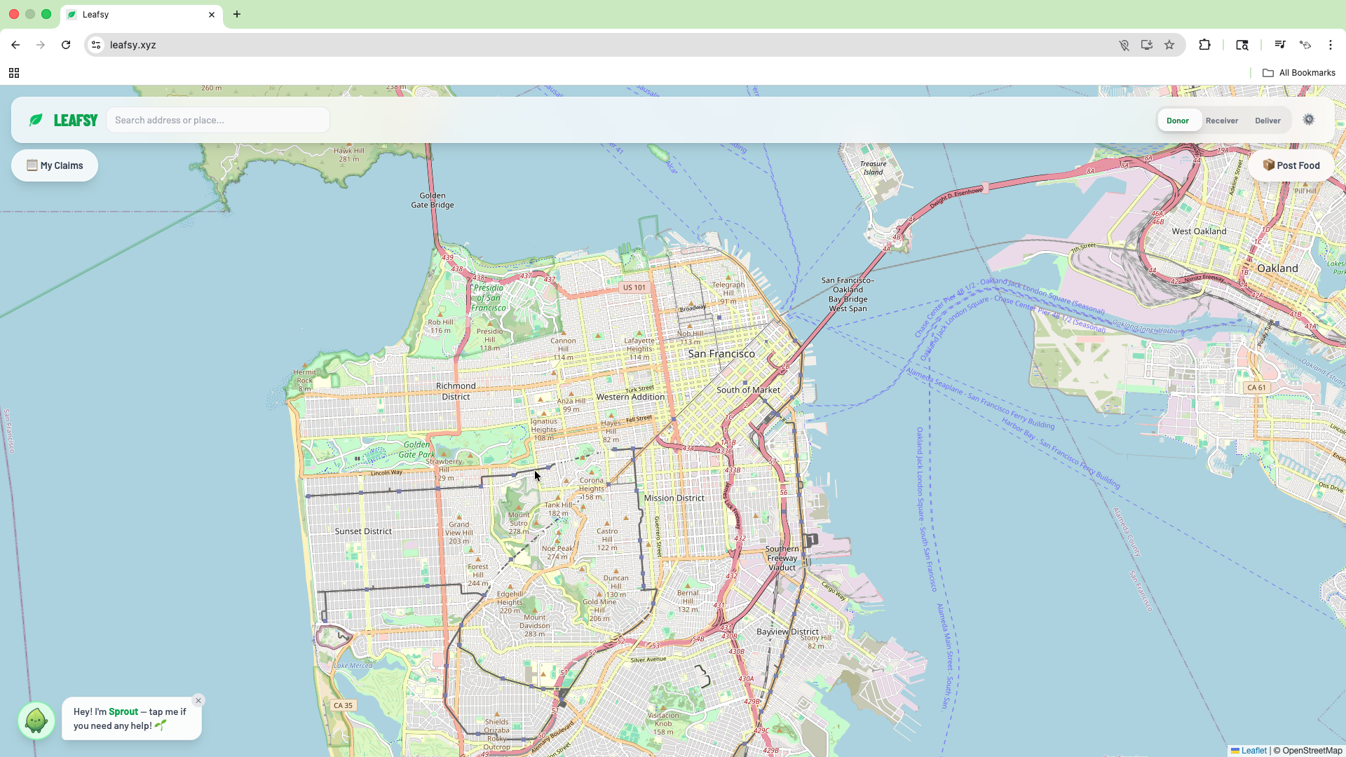
Leafsy Desktop
-
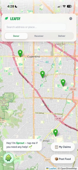
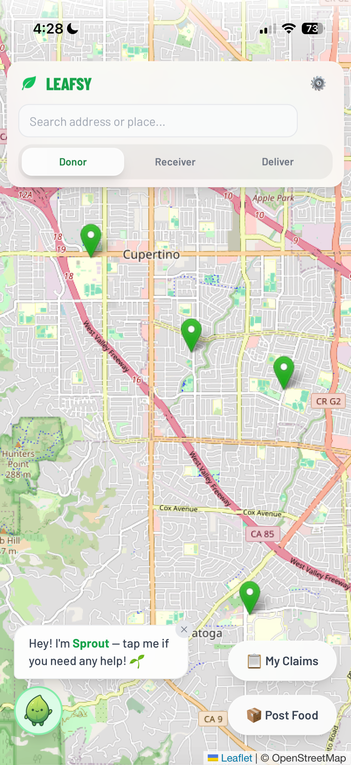
Leafsy Mobile
-
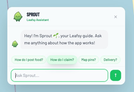
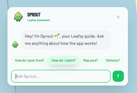
Sprout AI Assistant


Sustainability Track: Waste Reduction
Inspiration
We’ve all had extra food, whether it was from the garden, the fridge, or an event, and didn’t know what to do with it. As someone who grew up in the backyard and saw neighbors in the same situation, I felt bad watching it go to waste while knowing others could use it. In the U.S., about 31% of the food supply is lost or wasted, and only 2% of surplus gets donated. I wanted a simple way to connect people with extra food to people who need it. No messing around. Just a map and a few taps.
Functionality
Leafsy connects donors, receivers, and volunteer couriers on one map. Donors post surplus food (name, quantity, hours left, address or map pin, optional photo). Receivers browse a list sorted by distance from home or tap green pins on the map to claim for pickup or delivery. Volunteer couriers accept delivery requests and update status (accepted → in transit → delivered). Everyone sees the same live map; receivers get real-time toasts when delivery status changes. Sprout, an in-app AI assistant (Gemini), answers questions about how to use Leafsy. Settings let you set a home location for when GPS is off. The goal is to turn surplus into shared meals instead of waste.
Process
- Frontend: React + Tailwind CSS
- Map: Leaflet + OpenStreetMap tiles
- Backend / data: Firebase (Auth, Firestore, Cloud Storage)
- Geocoding / search: Nominatim (OpenStreetMap) for address autocomplete and search
- AI: Google Gemini for Sprout (in-app help and answers about Leafsy)
- Real-time: Firestore onSnapshot plus a short-interval poll so new pins show up quickly
- Delivery flow: Firestore documents for claims, delivery status, and toasts
- Responsive: Mobile bottom sheets, safe-area insets, and separate tutorial copy for mobile vs desktop
Challenges
- Map tap vs drag on mobile: Picking a location for post/delivery was hard on touch. I disabled map dragging in pick mode and close the panel on mobile when entering “pick on map” so the map is tappable, then reopen the panel after a location is chosen.
- Navbar and buttons on small screens: Address bar and Donor/Receiver/Deliver bar overflowed; Sprout, My Claims, and Post Food overlapped. I restacked the nav on mobile, added safe-area insets, and put the action buttons in non-overlapping positions (for example: Sprout bottom-left, My Claims/Post Food stacked bottom-right); only one panel open at a time on mobile.
- Map jumping when new pins appeared: fitBounds ran on every update. I removed it so the map stays put and only moves when the user searches.
- Distance and “mi” for receivers: I wanted distance from home, not just GPS. I passed homeLocation into the receiver list, compute distance from home (or fallback location), and sort the list by distance.
- Tutorial matching the device: Copy said “top left” for My Claims but on mobile it’s bottom-right. I added a mobile/desktop check and separate tutorial steps so the wording matches the layout.
Accomplishments
- End-to-end flow works: post food → pin on map → claim (pickup or delivery) → courier accepts → in transit → delivered, with toasts and status in sync.
- One map for everyone: donors post, receivers claim, couriers deliver, all with the same live view. Sprout (Gemini) gives in-app help and stays on-topic for Leafsy.
- Mobile-first UX: bottom sheets, safe areas, a single open panel, and a tutorial that reflects mobile vs desktop.
- Distance from set home and list sorted by distance so receivers see “nearest first.” ## What I learned
- Real-time Firestore is powerful but you have to design with the donors, receivers, and couriers so that they stay in sync.
- On mobile, map interactions (tap vs drag) and overlapping UI need explicit handling (for example: disable drag in pick mode, manage panel state).
- Safe-area insets and viewport-fit matter for notched phones and bottom UI.
- A small “edit step” (for example: confirm or tweak address after map pick) improves trust and correctness.
- Keeping the map stable (no auto-fit on every update) made the app feel much more usable.
Leafsy's Future
- Richer conflict logic (for example: same donor posting overlapping times, courier capacity).
- Smarter ordering (urgency, hours left, distance) and optional filters.
- Notifications/reminders (for example: “Your delivery is on the way,” “Pick up in 2 hours”).
- Optional in-app ratings or kudos for donors and couriers.
- Polished production launch (for example: domain, PWA, and analytics).
Built With
- css
- firebase
- firestore
- gemini
- html
- javascript
- leaflet.js
- node.js
- nominatim
- openstreetmap
- react
- tailwindcss


Log in or sign up for Devpost to join the conversation.