-
-

2
-

1

Inspiration
We wanted to help our community persevere through the economic collapse caused instigated by the world's concerns of catching this virus, thus we created a website that informs people throughout the USA of the restrictive measures they should be taking and the level of caution they should pursue.
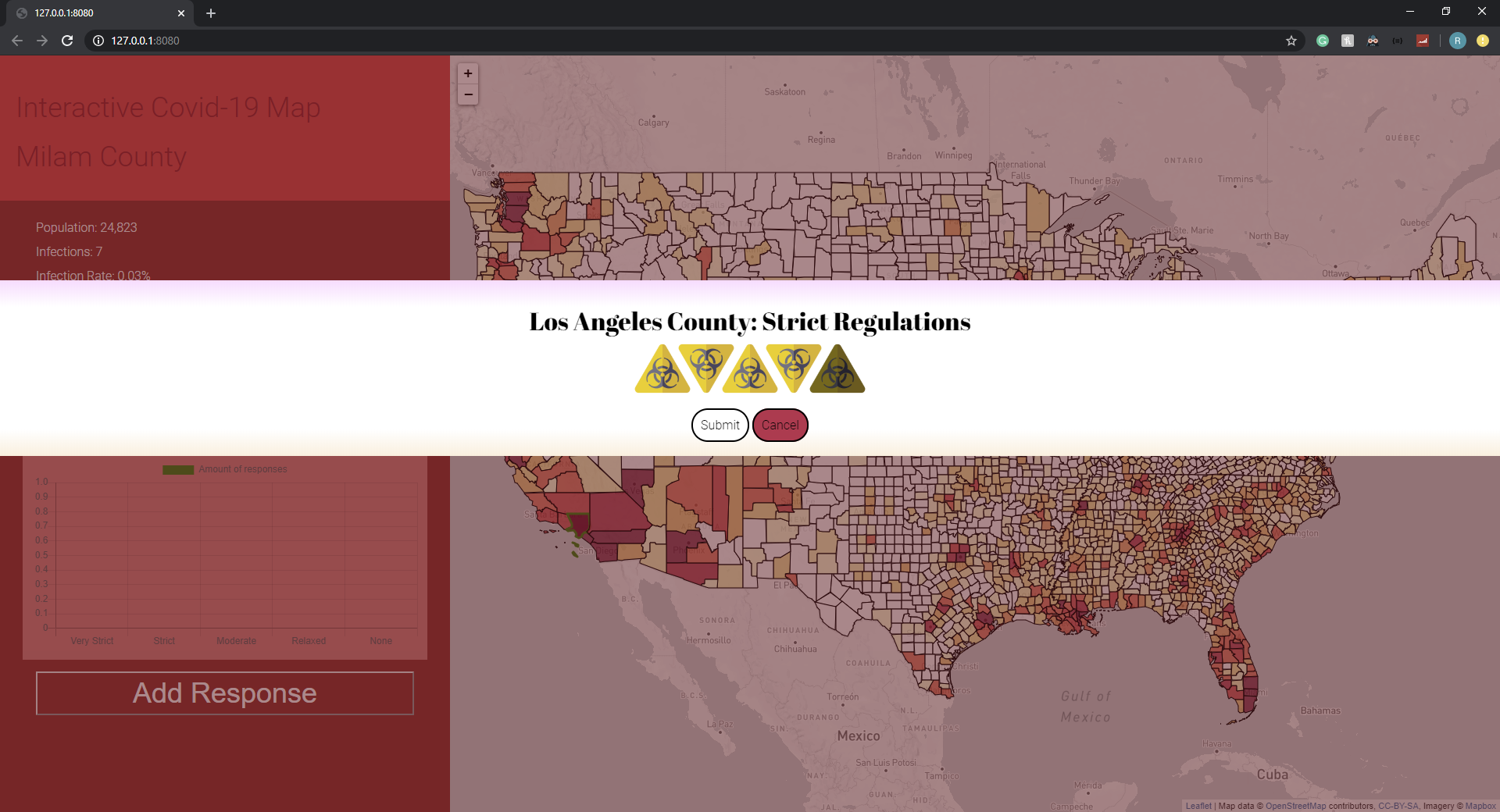
What it does
This interactive US map provides information on every county's demographics, the impact COVID-19 has on the county, as well as a live rating of the severity of the situation. Specifically, our website compiles the following data for each county in the nation:
- population
- the number of infections
- the proportion of infections (infections/population)
- the number of fatalities
- the projected number of fatalities (at least: infections * derivative-of-infections * 1 year)
- social distancing measures advice (different for each county)
- a unique set of ratings given by residents of the area
How we built it
We used html, css, js, leaflet.js, mapbox, openstreetmap and usadata to produce this webpage.
Our main files
Server.js Manages the database App.js Client-side processing Index.html Visualizes Information styles.css Makes everything look nice
Challenges we ran into
We struggled to find any APIs that provided live data of the virus in each county.
Accomplishments that we're proud of
We LOVE how it looks & we are PROUD that it works ;)
What we learned
We learned how to program an interactive map for web development and we furthered our understanding of databases.
What's next for Interactive Covid-19 Map
- Daily Updates (Data)
- Blocking users from spamming submissions
VIDEO
Please go to https://github.com/RoryHemmings/CovidMap for the video presentation


Log in or sign up for Devpost to join the conversation.