-
-
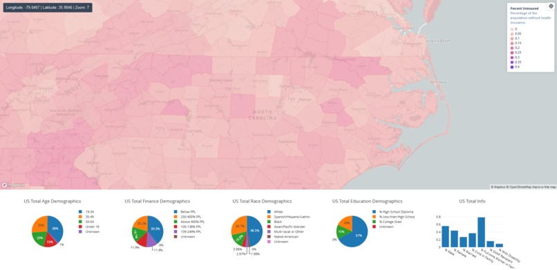
App just after launching
-
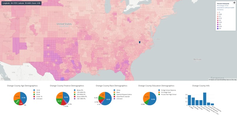
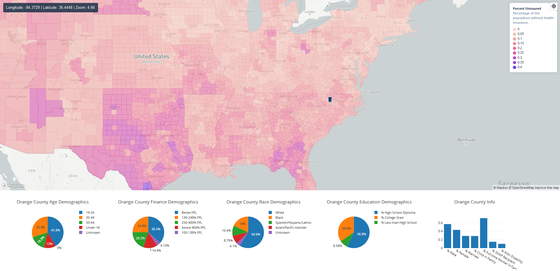
When a county is clicked

Inspiration
I've wanted to learn more about front-end development, particularly when it comes to visualizing data in modern, interactive ways. Previously I had no experience in react, and the only javascript I had written was for google sheets scripts, and so I thought this project would be a good opportunity to make a simple app with react.
What it does
The app shows an interactive map of the US, with each county colored based on the percent of people who are uninsured in that county. Users can click on any given county to highlight it, which also changes the data in the charts at the bottom of the page to display information from that county. The graphs contain demographic data about age, finances, race, and education, as well as some other potentially useful data.
How we built it
The map was the main part of the app, but in order to visualize the data, I needed to combine the data from the excel sheet with geographic geojson data for each county. This was done in convert_data.ipynb. Then, it was just a matter of setting up the Map component for the webapp in a way that could show a chloropleth map of the data. I also decided to add some other things to make the map look nicer, such as a sidebar showing the current coordinates and an effect that shows which county the cursor is hovering over.
Once this was done, I had to store the county that was last clicked in a redux store, and then chart the data below the map using plotly.
Challenges we ran into
In terms of specific challenges, the most difficult moment was trying to figure out how to send data from the map component (tracking which county was clicked) to the Chart component (displaying the data from that county). After a lot of searching and failing to figure out how to implement various tools, I was finally able to create a redux store that could store the state at the App level to allow the components to communicate.
Accomplishments that we're proud of
I'm proud of how the map looks visually with the data, especially with the hover and click effects for counties. I'm also proud of being able to learn how to use simple react components and functions in such a short amount of time.
What we learned
I've learned a lot about react and front-end development, and I think that it would be much easier and faster to make a similar project in the future.
What's next for Healthcare Map Visualization
There are some visual improvements that can be made to the app itself, such as formatting with better css and html in order to make the webapp look more polished on all devices.
The next big step would be to incorporate some sort of actual model into the visualization instead of just showing the raw data. The app is also still its own react component, so it can be used as one part of a larger website analyzing either insurance data or other healthcare and demographic data.
Datasets Used
I used the Estimates of Uninsured Population dataset from the US Department of Health and Human Services for the data, and geojson features from Eric Celeste.

Log in or sign up for Devpost to join the conversation.