-
-
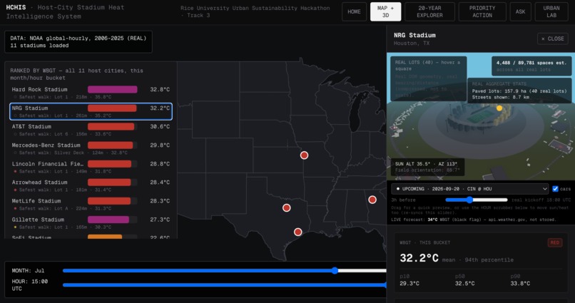
All 11 real World Cup stadiums ranked live by WBGT heat risk, with a real 3D parking + walk-exposure view per venue.
-
Homepage: click any of the 11 real stadiums to watch its real 20-year July WBGT trend line draw in live.
-
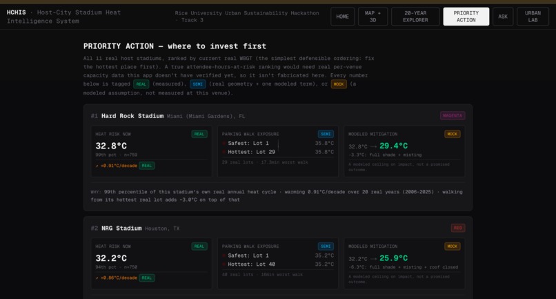
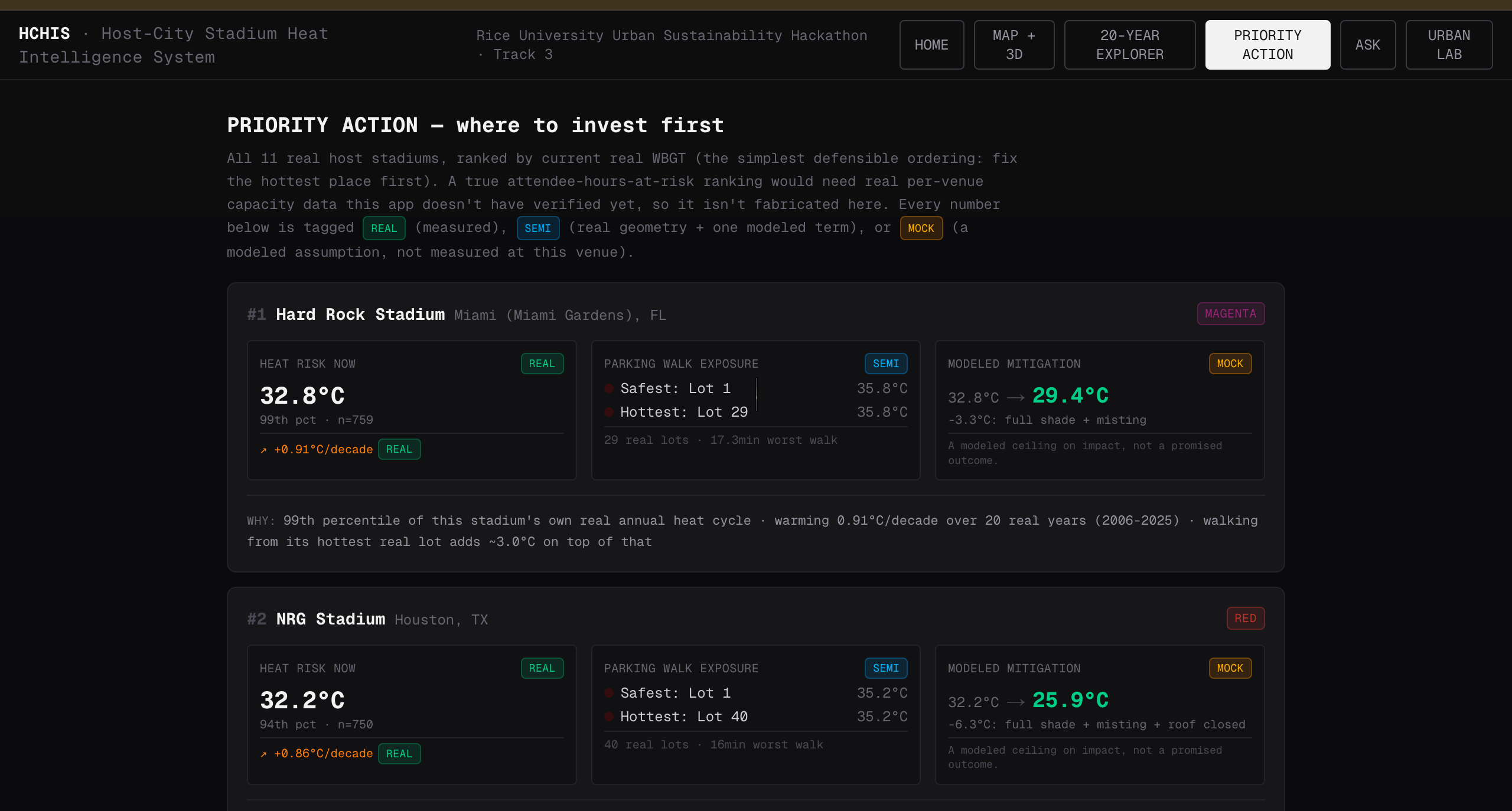
Priority Action: all 11 stadiums ranked by real heat risk, with real walk exposure and modeled mitigation impact.
-
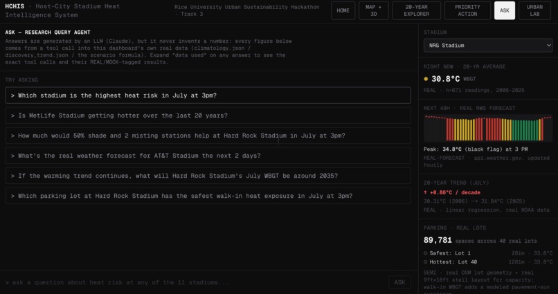
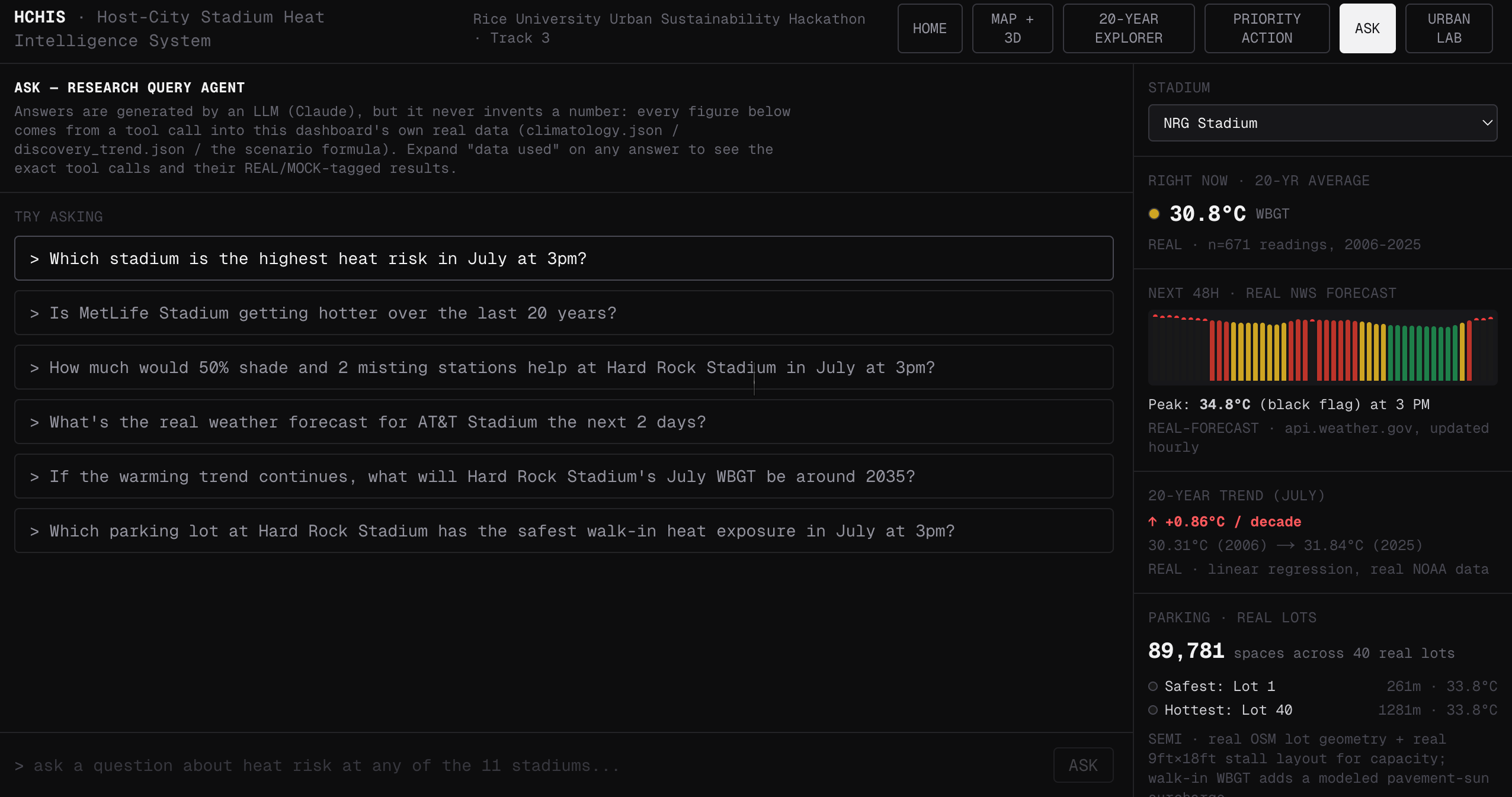
Ask: a Claude agent answering real questions about heat risk, trends, and parking exposure — real tool calls only.
-
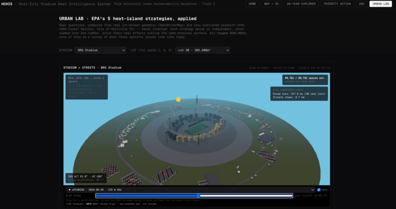
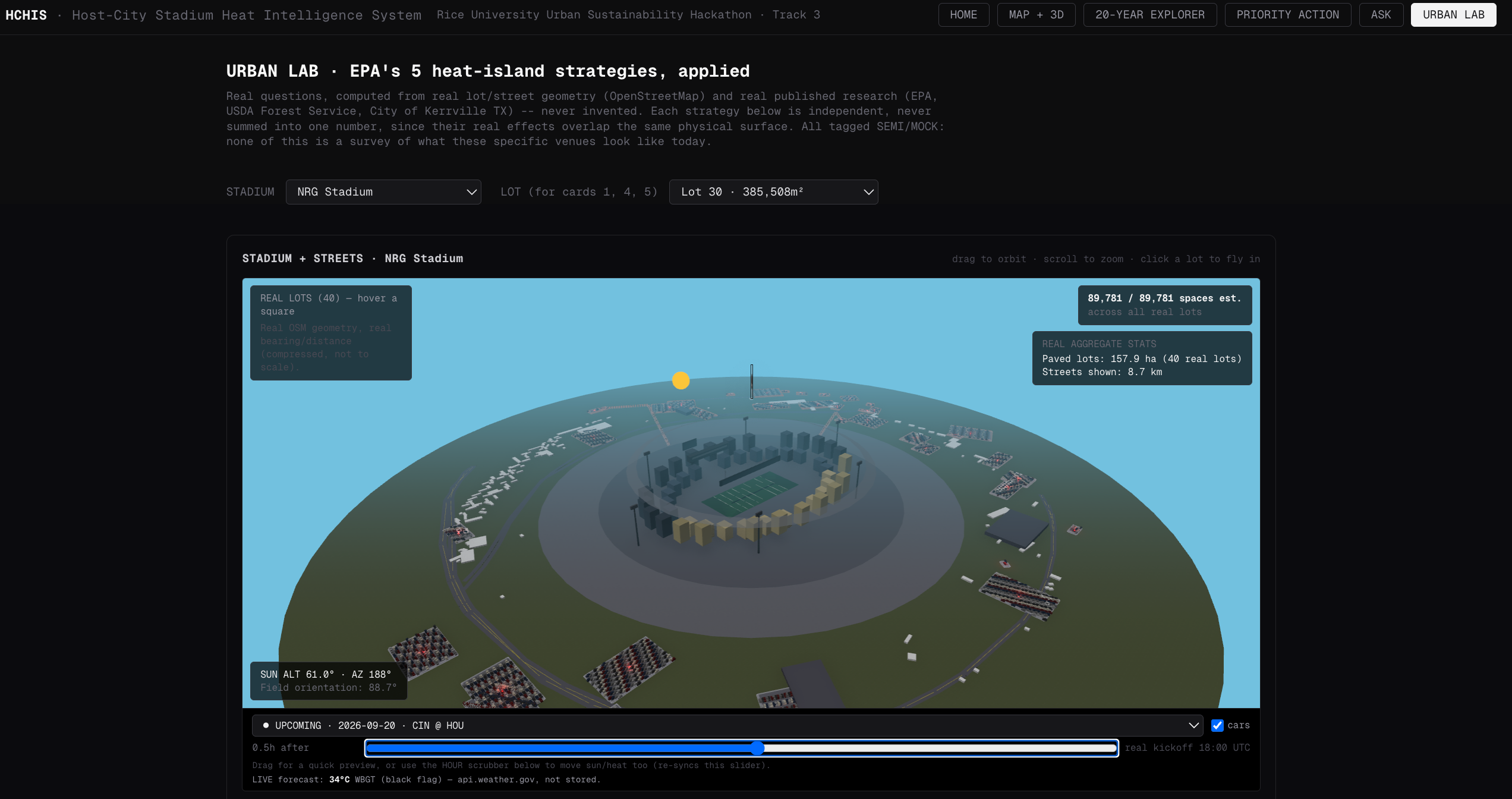
Urban Lab: EPA heat-island strategies (trees, roofs, cool pavement, smart growth, solar carports) tested on a real stadium.
-
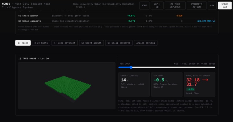
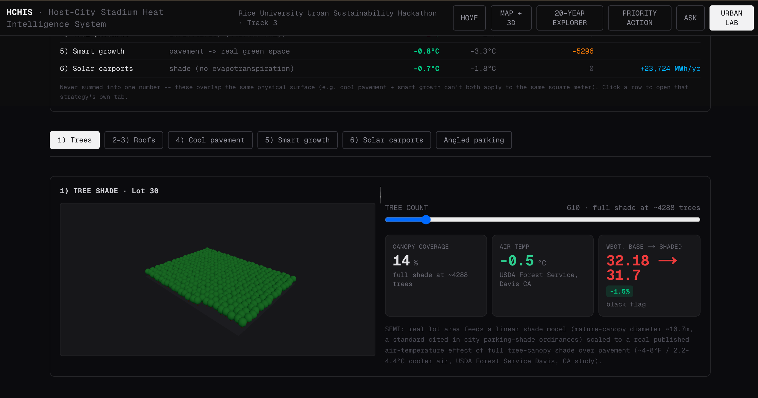
Urban Lab scenario: real parking-lot geometry used to model a real, cited heat-mitigation strategy before/after.
-
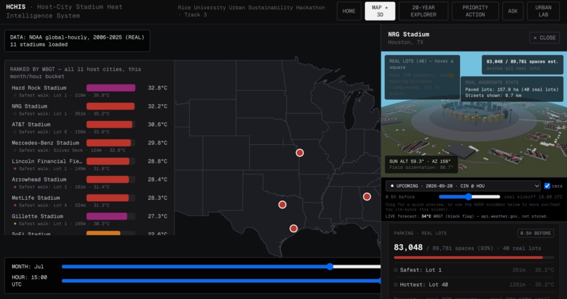
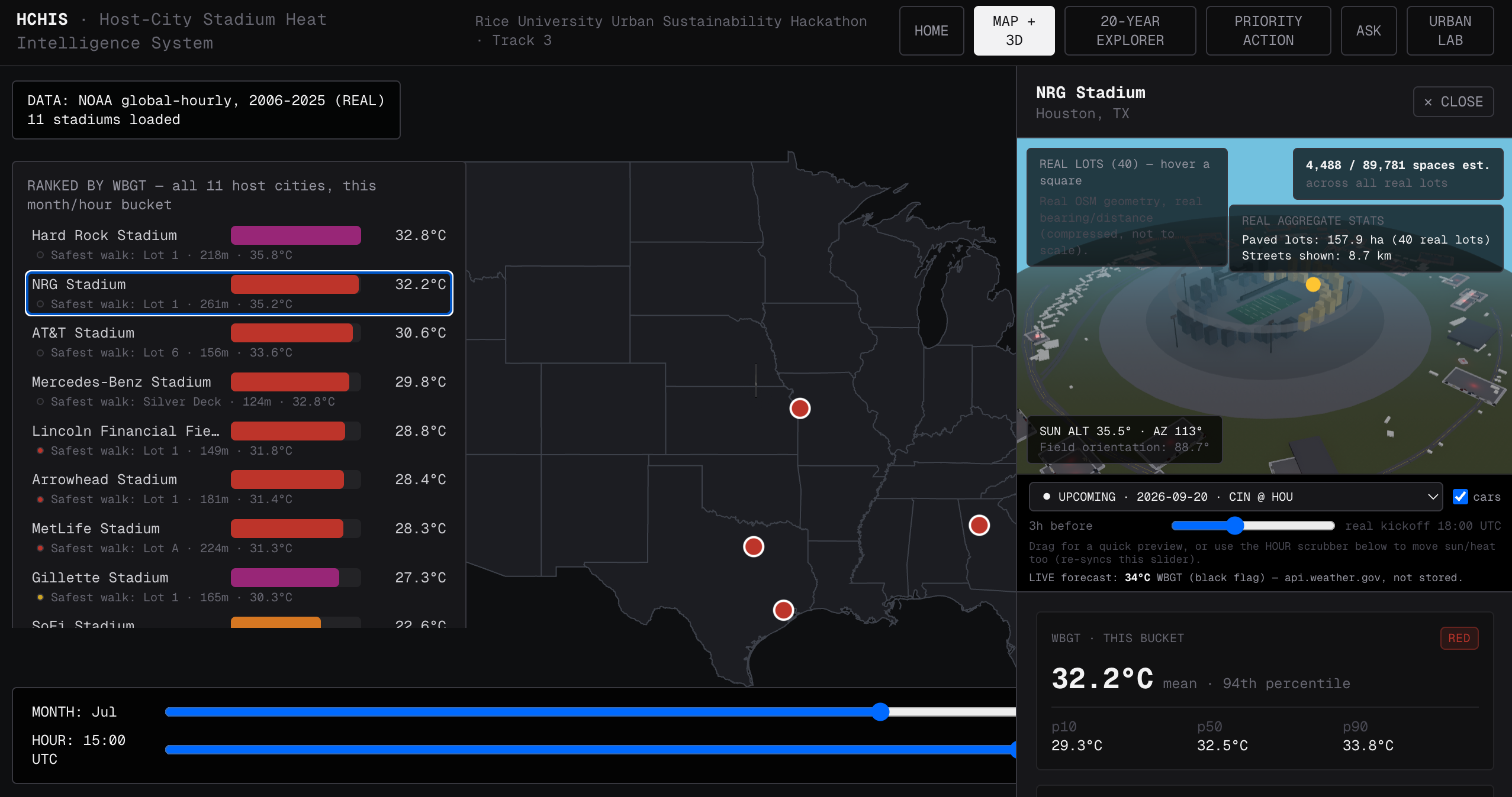
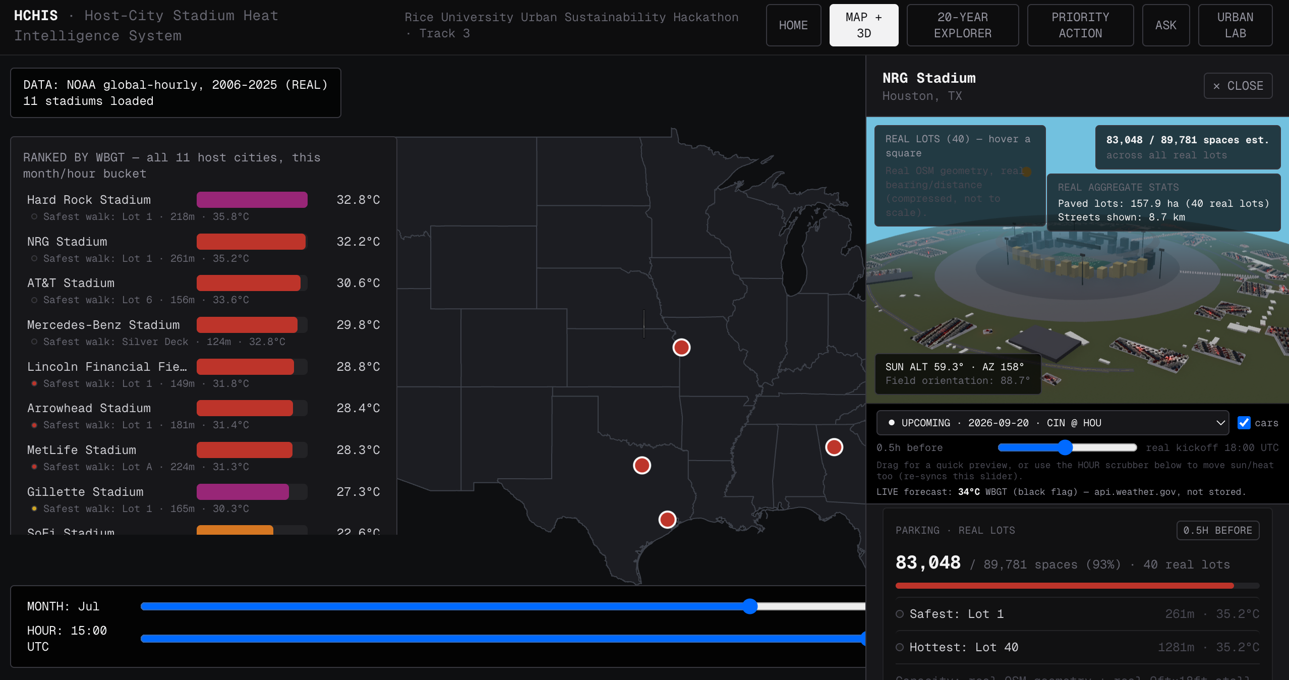
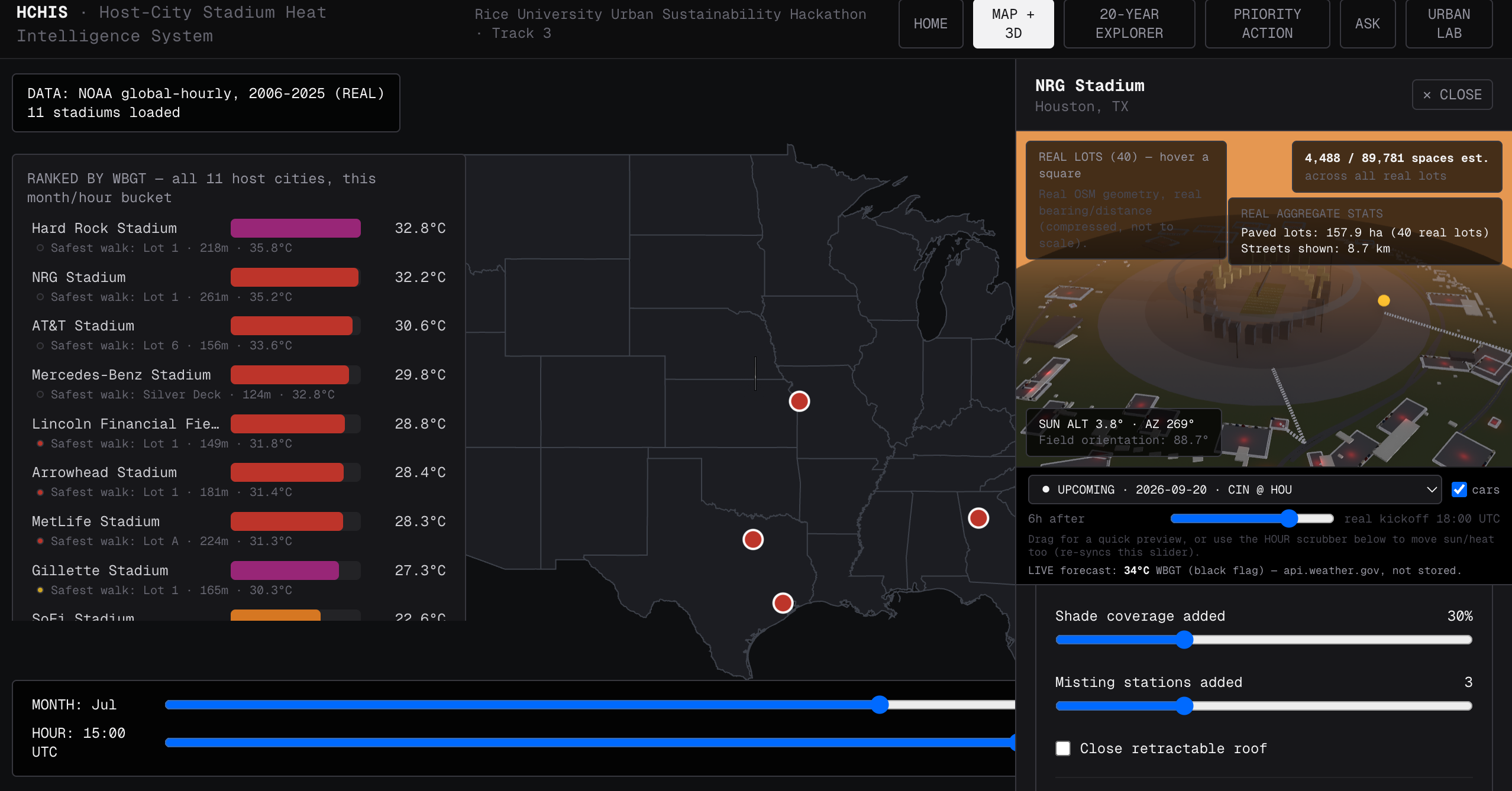
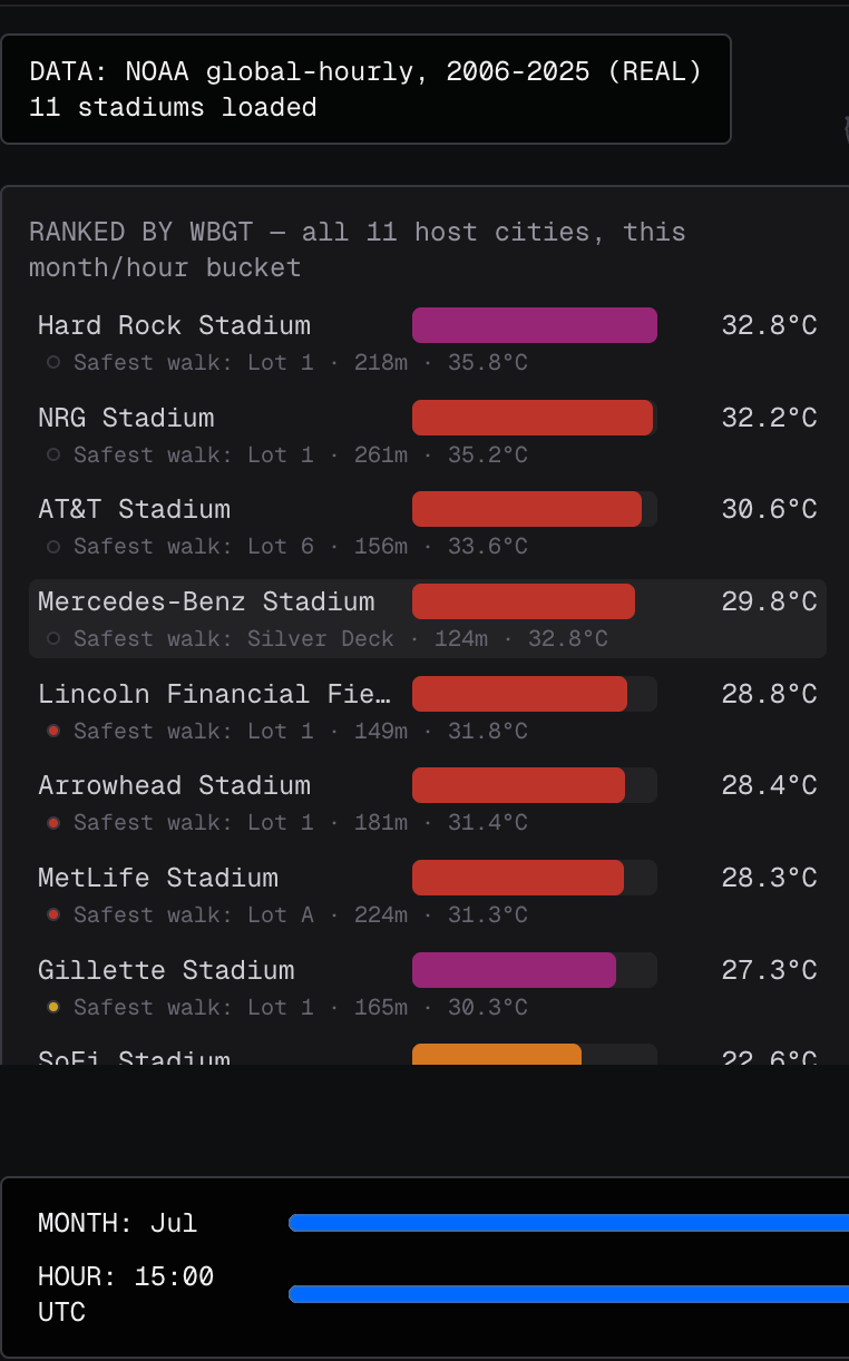
Map + 3D: all 11 real stadiums ranked by WBGT, with a real 3D parking and heat-exposure view for the selected venue.
-
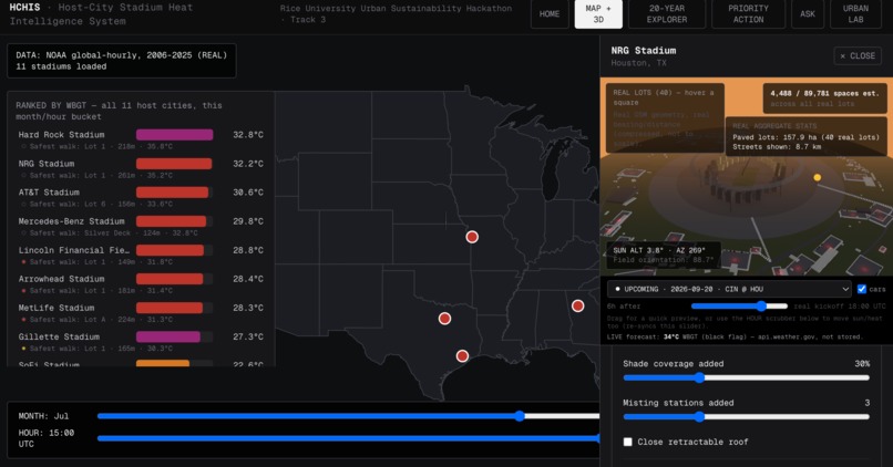
Map + 3D: switching stadiums live-updates the ranking, the 3D scene, and every real parking/heat number shown.
-
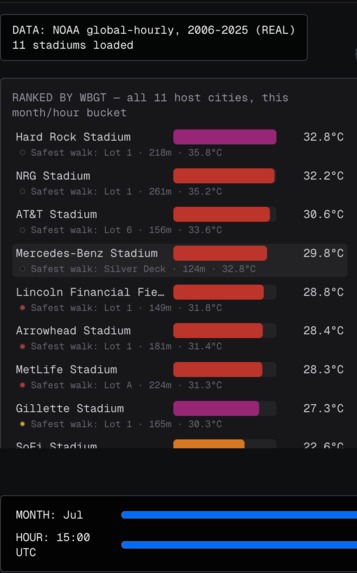
All 11 real host stadiums ranked live by real WBGT heat risk, from 20 years of real NOAA weather data.
-
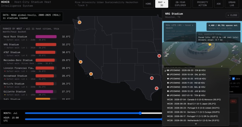
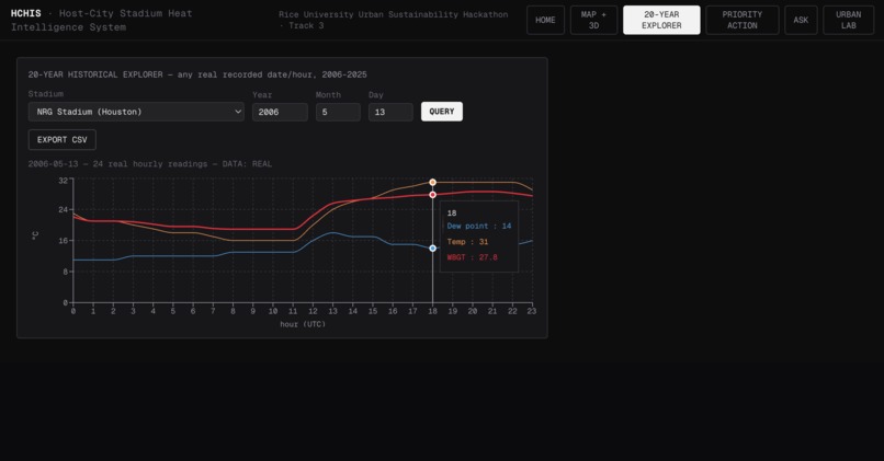
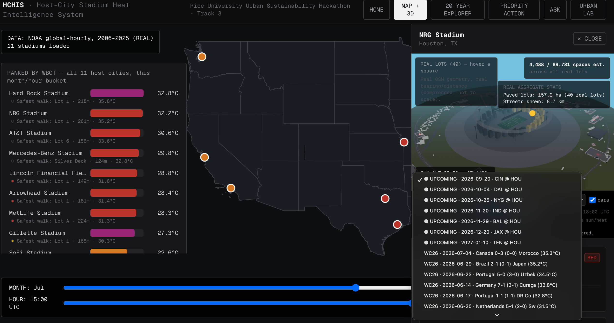
Pick any real past World Cup match or real upcoming 2026 NFL game at this stadium — with a live NWS forecast for it.
Inspiration
The 2026 World Cup will be played across 11 US stadiums in the middle of summer — Miami, Houston, Dallas, Atlanta, Kansas City. All of them get dangerously hot. We kept seeing the same shallow framing of "climate + sports" projects: a single temperature number on a map. That doesn't help a city decide anything. A stadium operator or city planner needs to know where exactly people are exposed — the parking lot, the walk to the gate, the seating bowl — and what specifically to do about it, with real numbers behind every claim.
So we asked one concrete question and refused to answer it with guesses: where should host cities act first to protect fans from extreme heat, and why?
What it does
HCHIS (Host-City Stadium Heat Intelligence System) is a decision-support dashboard covering all 11 real World Cup 2026 host stadiums, built entirely on real, verifiable data:
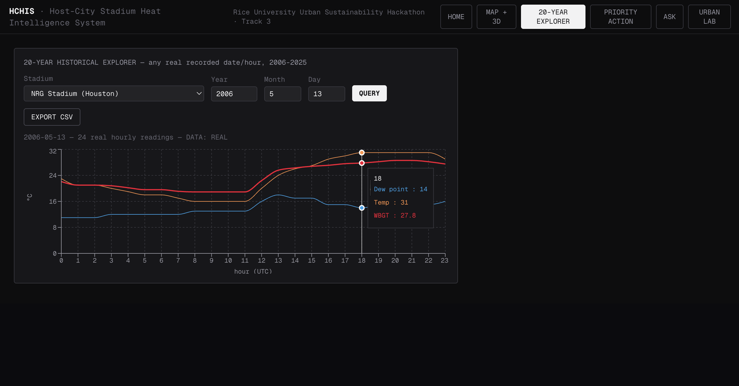
- 20 years of real NOAA hourly weather (2006–2025, ~2.46M readings) per stadium, turned into WBGT (Wet Bulb Globe Temperature) climatology — the actual sports-safety metric, not just air temperature.
- A real discovery: 10 of 11 stadiums show a real 20-year warming trend; we verified it down to the exact regression.
- All 78 real 2026 World Cup matches matched against real historical weather for their real kickoff date/time (Iowa Mesonet ASOS archive) — 54 of them ran hotter than that stadium's own 20-year normal, and the hottest real peak WBGT recorded was 35.3°C.
- A real 3D environment per stadium: real OpenStreetMap parking-lot geometry (411 real lots), real street network, real surrounding buildings, real field compass orientation, real sun position — and a real stall-by-stall parking capacity calculation (9×18ft stalls, 24ft aisles) instead of a flat area guess.
- A real pedestrian-exposure model: for every real parking lot, how far is the walk, how long does it take, and how hot is it along the way — visualized as an actual heat-colored walking route from car to gate.
- A live NWS forecast integration (api.weather.gov) for upcoming real NFL 2026 games at these same stadiums, since the World Cup itself is now in the past for this dataset.
- Six real, cited heat-mitigation strategies (EPA's heat-island framework, plus solar carports) modeled against real lot geometry — tree shade, green/cool roofs, cool pavement, smart growth, angled re-striping, and solar carports — each with a real published effect size, never invented.
- A function-calling AI agent (Claude) that answers questions by calling real data tools only — it narrates numbers, it never invents one.
- A Priority Action view ranking all 11 stadiums by real heat risk, with real walking exposure, real 20-year trend, and modeled mitigation impact, each clearly tagged REAL / SEMI / MOCK.
Every single number on every screen carries a tag: REAL (measured), SEMI (real geometry plus one modeled term), or MOCK (a modeled assumption from published research, never measured at that specific venue). Nothing is presented with more precision than we can actually back up.
How we built it
- Next.js 16 + TypeScript + React 19, deployed on Vercel.
- Data pipeline in Python: NOAA global-hourly bulk downloads, Iowa Mesonet ASOS archive scraping, OpenStreetMap/Overpass queries for parking lots, streets, and buildings, and the nflverse open dataset for the real 2026 NFL schedule. All committed as static JSON, no scraping at runtime.
- 3D scene: Three.js via React Three Fiber + drei, GPU-instanced rendering for thousands of individual real parking stalls, real sun-position physics (SunCalc) tied to each stadium's real lat/lon and the match's real kickoff time, and post-processing (ambient occlusion, bloom) for a more legible night/day scene.
- Turso (hosted libSQL) for the 172MB / 2.46M-row historical table — too big for a normal Git push, so the 20-year hourly explorer now works in production instead of only locally.
- Claude API function-calling for the Ask agent, with a bounded tool-call loop and a system prompt that enforces the same REAL/SEMI/MOCK discipline as the UI.
- Recharts for the interactive year-by-year trend charts on the homepage.
Challenges we ran into
- The 20-year database was too big for Git. GitHub rejects files over 100MB; our historical table was 172MB. We migrated it to a hosted Turso database so the full 20-year explorer works in production, not just on a laptop.
- A real WebGL buffer overflow. Instancing car geometry with a size derived from data that started empty locked the GPU buffer at capacity 1; later writes corrupted the render. Fixed by using a fixed, sufficiently large instance limit.
- A real performance cliff. Rendering all ~90,000 real stalls at our largest stadium froze the page for several seconds per interaction. We measured it directly (not guessed) and capped per-lot rendering at a tuned value, while always keeping the exact real count in the text/UI regardless of what's drawn.
- A real geometry bug: cars from long real lots were drifting visibly through the stadium bowl, because their placement used the lot's raw real length instead of the same clamped scene size the lot's own outline used. Fixing the normalization fixed the drift.
- A rotation-convention mismatch: our lot-placement helper and Three.js's own mesh rotation use opposite mathematical conventions for the same angle — a real bug that made a lot's boundary outline visibly disagree with its own paved pad until we found and documented the mismatch.
- Deciding what NOT to build. We looked at fully replicating a dedicated 3D map-rendering engine (streets.gl) and concluded that's a multi-year graphics project, not a hackathon feature — so we borrowed only what was genuinely achievable (real building footprints, ambient occlusion, bloom) instead of faking the rest.
Accomplishments that we're proud of
- Every number on this dashboard is traceable to a real source file or a clearly labeled model — we treated "don't invent data" as a hard constraint, not a suggestion, through every feature we added.
- We found and fixed real bugs the same way a production team would: reproduce it, verify the root cause with real measurements, fix it, verify again.
- The 3D view isn't decoration — it's built from the same real parking-lot geometry, real capacity math, and real heat-exposure numbers used everywhere else in the app, so clicking around it actually answers "where is this walk hot."
What we learned
- Real geometric and physical bugs (coordinate systems, rotation conventions, GPU buffer sizing) are just as important to get right in a data-honesty project as the data itself — a beautiful 3D scene built on a subtly wrong number is still wrong.
- Cross-referencing every claim against the underlying dataset before shipping it caught real mistakes we would have otherwise presented confidently (a "biggest heat swing between lots" statistic that would have always read zero, discovered only by checking the live API before writing the homepage copy).
What's next for HCHIS
- Real per-gate entrance surveys (today the pedestrian route approximates the stadium entrance point, since no public per-gate dataset exists).
- Extending the 20-year climatology and live forecast coverage beyond these 11 venues to other major-event host cities.
- A public API so city planners and event organizers can query this data directly instead of only through the dashboard.
Built With
- api.weather.gov
- claude-api
- next.js
- noaa
- openstreetmap
- python
- react
- react-three-fiber
- recharts
- tailwind-css
- three.js
- turso
- typescript
- vercel


Log in or sign up for Devpost to join the conversation.