-
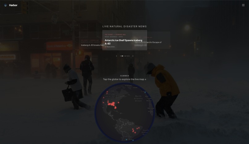
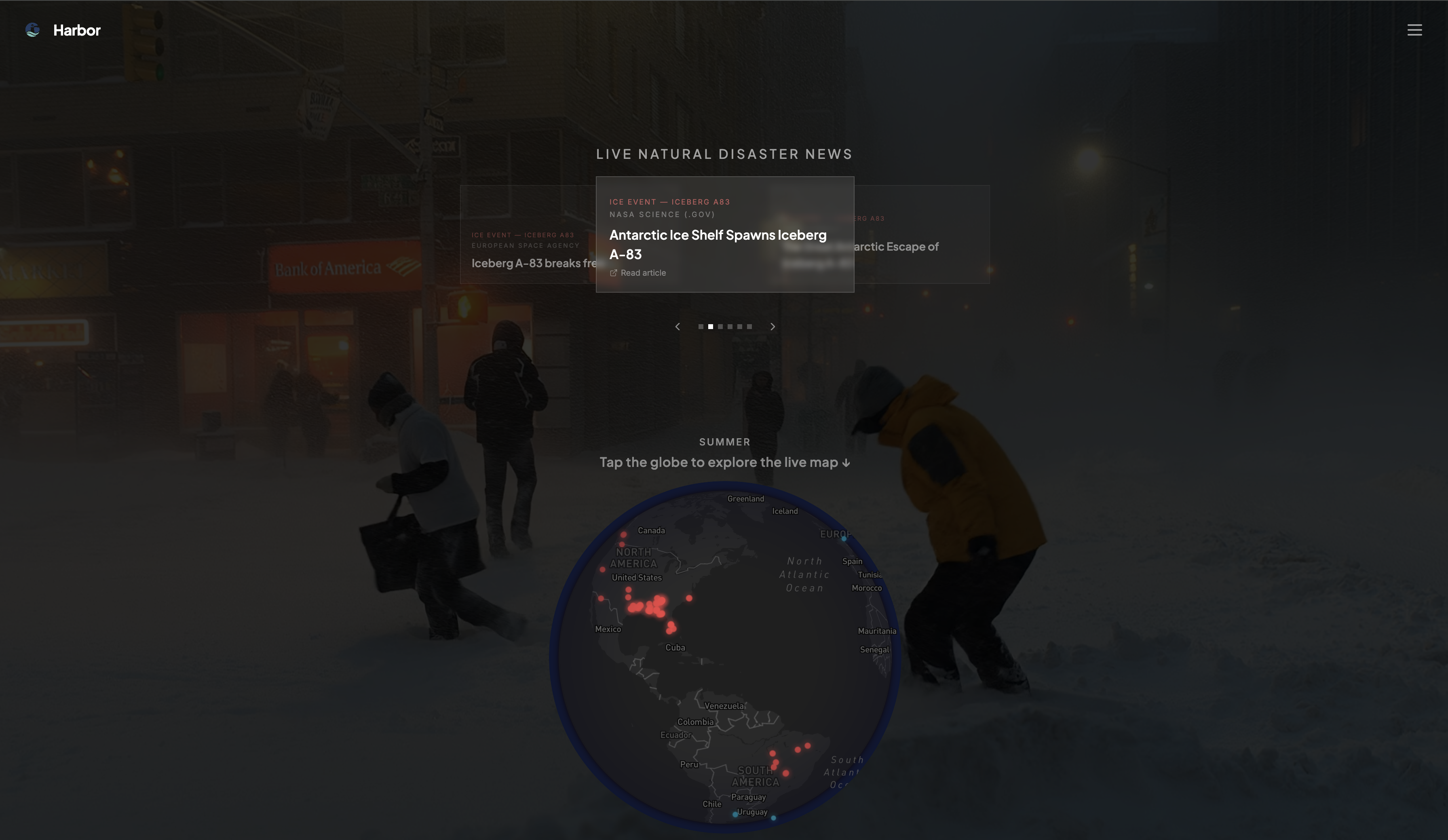
Home Page
-

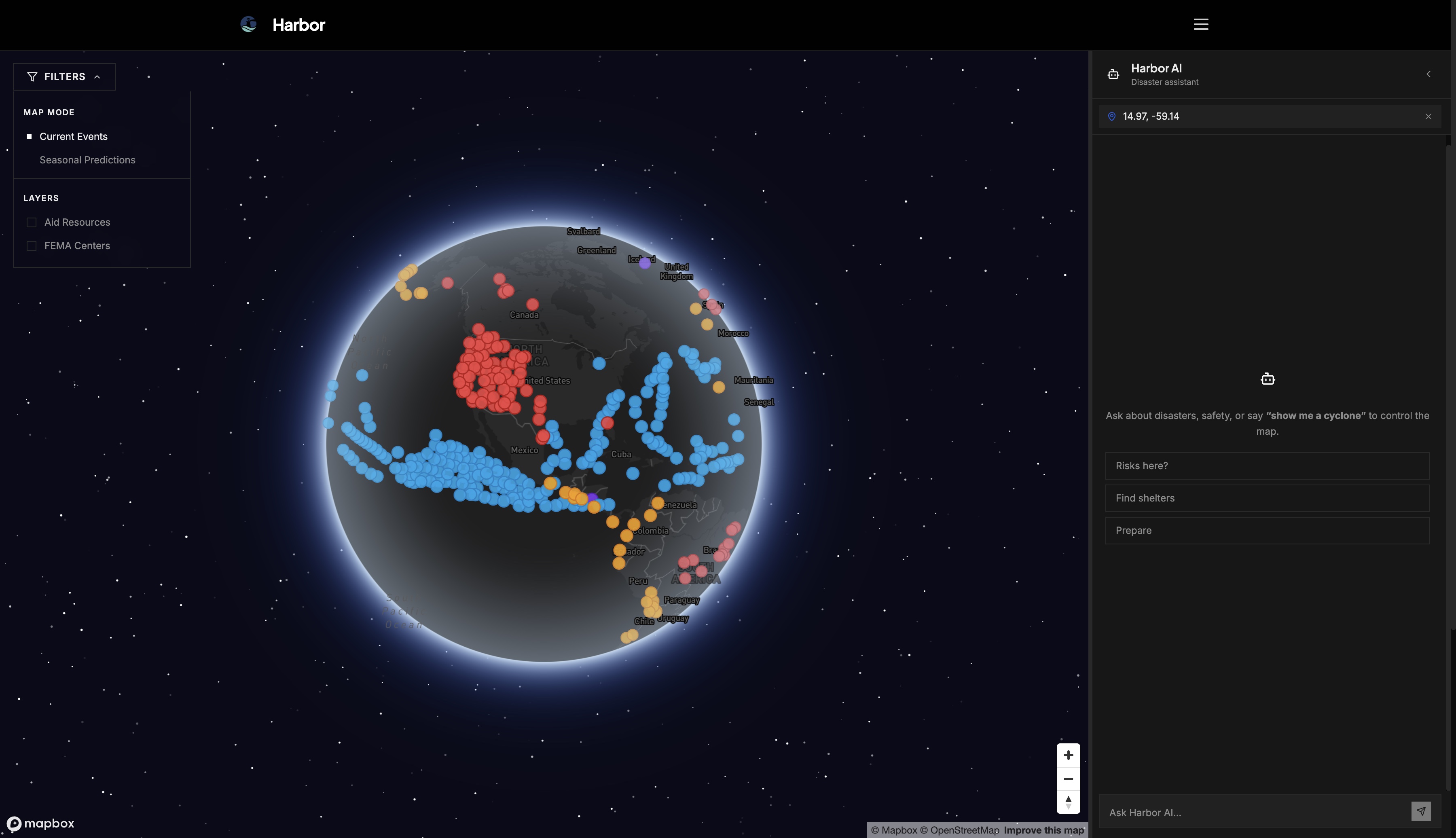
Disaster Map Page
-
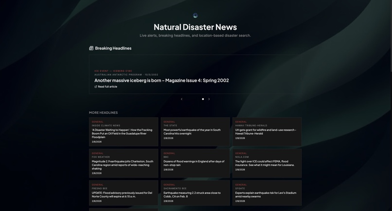
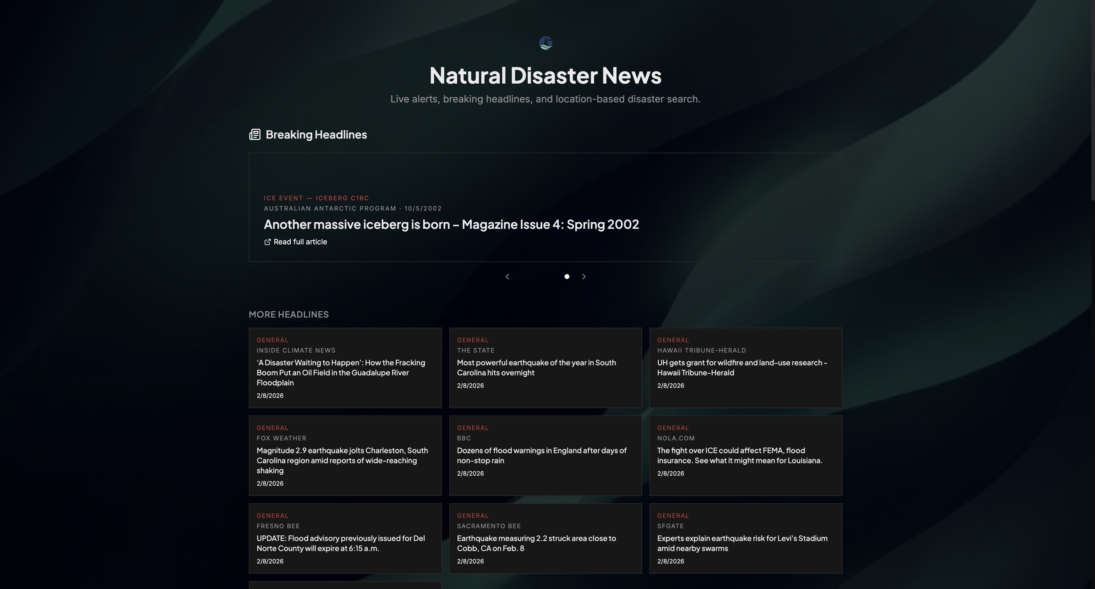
News Page
Inspiration
We were motivated by the gap between the availability of disaster data and the usability of that information for everyday people. Critical information about wildfires, storms, floods, and other hazards already exists, but it is often buried in technical dashboards, static reports, or scattered alert systems. Most tools either target specialists or overwhelm users with unstructured updates.
Our goal was to translate complex, real-time disaster data into a spatial experience that is easy to understand at a glance. By visualizing events on a rotating 3D globe and pairing that with an AI assistant, we aimed to make disaster awareness more intuitive and actionable. Advances in web-based geospatial rendering and AI copilots made it possible to connect live environmental data with interactive guidance in a single platform.
Key ideas that shaped our direction:
- Use geography as the primary interface, not tables or feeds
- Combine live data with AI explanations
- Design for clarity under stress, not just visual appeal
How We Built It
Harbor is a web-based disaster intelligence platform that integrates real-time geospatial data, AI assistance, and modern web graphics.
We used Mapbox GL JS with globe projection to render an interactive 3D Earth. Live disaster events are layered onto the globe using public data sources such as NASA EONET for global hazards and NOAA and NWS alerts for active weather events. We also built seasonal datasets to help users see how disaster risk patterns shift throughout the year.
From a technical perspective, the system includes:
- Frontend: React with Tailwind CSS for a responsive and consistent UI
- 3D Visualization: Mapbox GL JS with globe projection for spatial rendering
- AI Assistant: Gemini-based chat that uses map context in responses
- Data Integration: Public datasets such as FEMA Open Data and OpenStreetMap for aid and infrastructure locations
We focused heavily on motion and continuity. Shared-element transitions allow the globe on the home screen to smoothly transform into the interactive disaster map. This reduces the sense of switching pages and instead creates a continuous spatial experience.
Challenges We Faced
One of the main challenges was translating raw disaster feeds into a form suitable for visualization. Data sources often use inconsistent formats and levels of detail. We had to normalize event data, remove duplicates, and design filtering strategies so the globe remained informative without becoming cluttered.
Performance was another key challenge. Rendering a rotating 3D globe with multiple live data layers and animated transitions required careful optimization. We reduced data density at wider zoom levels, managed layer visibility dynamically, and ensured animations remained smooth across devices.
We also faced integration challenges:
- Aligning AI responses with geographic context in real time
- Handling multiple data sources with different update frequencies
- Maintaining visual consistency while layering dynamic map elements
Designing smooth visual transitions without distorting the globe or breaking layout constraints required multiple iterations. We carefully managed scaling, masking, and container geometry to maintain a consistent and believable spatial effect.
What We Learned
We learned that accessibility of information is as important as the information itself. Clear spatial visualization can communicate risk more effectively than lists of alerts or raw data tables.
We also learned how to balance visual richness with performance in web-based 3D environments. Careful control of data volume and rendering behavior is essential for maintaining responsiveness.
From a systems perspective, we gained experience integrating heterogeneous public datasets into a unified interface and building AI features that operate with real-time contextual awareness.
Some key takeaways:
- Spatial context improves comprehension of complex data
- Motion and transitions can improve usability when used carefully
- AI is most helpful when grounded in user and map context
- Tools for disaster scenarios must prioritize clarity and reliability
Most importantly, we learned that building for crisis scenarios requires empathy. Every design decision should support quick understanding and confident action, especially when users may be under stress.
Built With
- animations
- fema-open-data
- gemini-ai
- globe-projection
- mapbox-gl-js
- nasa-eonet
- noaa-nws
- openstreetmap
- react
- shared-element-transitions
- tailwind-css


Log in or sign up for Devpost to join the conversation.