-
https://hobday0.wixsite.com/hackharvard2019
-
Paint with Bold Strokes


Context & Problem
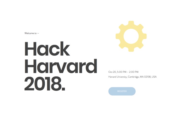
HackHarvard’s website is the main hub of information. However, after doing landscape research, there are more visually pleasing and more legible ways to present this information.
Question: How can we make HackHarvard’s website a frictionless user experience, so that hackers can quickly acquire all the information that they need?
Opportunity: HackHarvard 2.0 is a rebrand of the original website, using improved typography and imagery.
Inspiration
Hack the North is renowned for having solid design skills and Hack Harvard 2.0’s foundation was based on those pillars of information.
Hack the North was also inspired by the work of Ueno, succinct and playful branding. They’ve rebranded uber’s case studies.
What it does
HackHarvard 2.0 will provide hackers with the essential information that they need to hack, laid out in a functional & visually pleasing manner.
How I built it
Using Wix’s Website Editor, I was able to quickly rebrand using their drag and drop template editor.
Challenges I ran into
The largest challenge that I ran into were technical capabilities. The website could be even more cool if I knew how to code properly. Maybe if I had a dev who could set up API’s and pull more info it would’ve been a lot better ¯_(ツ)_/¯
Accomplishments that I'm proud of
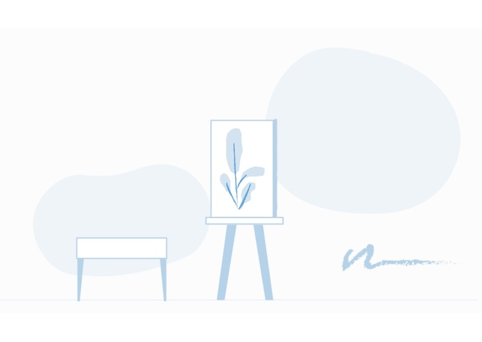
I literally painted with bold strokes — I haven’t illustrated for UI nearly as much as I’d like to and I think it adds a humanistic touch.
What I learned
Fail fast.
What's next for HackHarvard Website 2.0
Finding a developer who can make this website even cooler!


Log in or sign up for Devpost to join the conversation.