Inspiration
Power companies plan their transmission work years ahead, and neighbors mostly plan alone. In 2024, FERC Order No. 1920 pushed utilities toward coordinated long-term planning, because planning in isolation wastes money and slows down the grid. Sperry Tech's GridLock challenge asked a sharp version of that question: where exactly do Dominion Energy South Carolina's and Georgia Power's planned projects come close enough, in space and in time, that they should be coordinating?
What it does
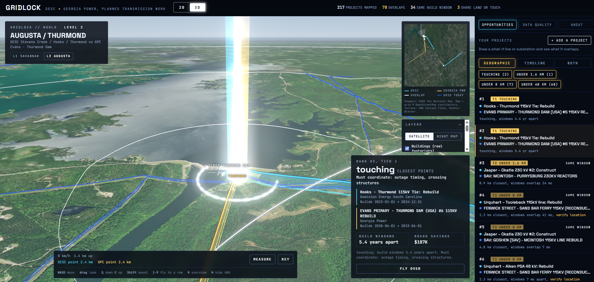
GridLock reads both utilities' public construction plans, puts every project on a map, and ranks the places where they overlap.
- 252 planned projects extracted (44 Dominion Energy SC, 208 Georgia Power). 217 are mapped to real substations and lines, each linked to its source page.
- 78 cross-utility overlaps, measured between the closest points of the two projects, as the spec asks, and ranked by distance tier first, then build timing:
- touching: must coordinate outages and crossings
- under 1.6 km: share the land
- under 8 km: share site logistics
- under 40 km: share crews and equipment
- Build windows: 34 of the 78 pairs are under construction at the same time.
- A savings estimate for every opportunity: one crew mobilization avoided plus shared right-of-way, with editable assumptions.
- One page, two views: a 2D satellite map and a 3D world of both border regions. One switch flips between them at the same spot, and the savings follow you into 3D.
- Add your own project: draw a line or drop a substation, and it's scored against the other utility's plans instantly, in 2D and 3D.
- Downloads: tables in Sperry's spreadsheet layout, plus a Google Earth file with every project and overlap.
How I built it
- Parsing: Python and Poppler extract 252 projects from the two utilities' PDF filings. Dominion's budget tables are checked against their stated totals.
- Locations: OpenStreetMap through the Overpass API. Where OSM has no substation name, I traced the power-line network to find it. Every location carries a confidence level.
- Overlap engine: closest points with Shapely in a local projection, the spec's four tiers, and build-window overlap. The browser version of the math matches the Python pipeline exactly: the same 78 overlaps, distances within 1 m.
- Web app: TypeScript, Vite and MapLibre GL, with Sentinel-2 cloudless and USGS satellite imagery, none of which need an API key.
- 3D world: Blender and Three.js, generated from the same data and embedded in the same page. The 2D/3D switch hands the map's camera to the 3D camera. An optional mode streams Google's photorealistic 3D tiles.
- Validation: it reproduces all 6 overlaps in Sperry's sample, with in-service gaps matching to the day.
- Tools: built with the help of AI coding assistants. The demo video's narration was generated locally from my own voice sample (Chatterbox).
Challenges I ran into
- Sperry's own documents disagree on how to measure. The starter guide measures center to center; the spec says closest points. At Thurmond, the center method says 3.9 miles, yet the projects share a substation. The app shows both methods side by side.
- OpenStreetMap doesn't name every substation. Tracing the power lines found two key ones, and every manual location cites its evidence.
- Street names are ambiguous. A line in Columbus, GA was briefly placed in Savannah because both have a "First Avenue", so street matches now need a nearby partner.
- Three of Dominion's budget tables don't add up in the source PDF. They're flagged in the app, not silently "fixed".
Accomplishments that I'm proud of
- Real findings from real public data, checked against the sponsor's answer key.
- Honesty about uncertainty: every location has a confidence level and every number has a source page.
- A tool, not just a report: add a project and see where it would collide.
- The switch from 2D to 3D feels like one continuous camera move.
What I learned
How transmission planning actually works: integrated resource plans, regional planning forums like SERTP, and restricted grid data (CEII). Also how much of "AI and data" work is careful extraction, validation, and admitting what you don't know.
What's next for GridLock
- Real line routes along the power network instead of straight segments.
- More utilities: Santee Cooper, Duke, and the rest of the Southeast.
- Automatic ingestion of new filings, with alerts when a new plan creates an overlap.
Built With
- blender
- cesium
- elevenlabs
- google-maps-platform
- openstreetmap
- python
- three.js
- typescript


Log in or sign up for Devpost to join the conversation.