-
-
Our Website

Inspiration
The issue of food deserts, where millions of Americans lack access to fresh, healthy food, is both urgent and deeply personal to us. With over 17 million people affected, we are passionate about using our skills as data scientists to tackle this challenge. By analyzing the USDA Food Research Atlas and Food Environment Atlas, we aim to identify key indicators that contribute to food inaccessibility and offer data-driven policy recommendations to reduce these deserts. We saw this competition as an opportunity to put our talents to good use, break down barriers, and help create a future where nutritious food is accessible to all.
What it does
We analyzed various factors influencing food insecurity, finding that counties with lower food insecurity tend to have more grocery stores, though fast food restaurants outnumber them. We observed that food insecurity decreases with a larger elderly population and is higher in areas with greater obesity and diabetes rates, as well as lower household incomes. Through density contours, we showed increased food assistance participation in low food access areas, and identified a correlation between population loss and higher food insecurity. We also found a negative correlation between WIC-authorized stores and fast food expenditures, suggesting WIC stores reduce fast food reliance. Finally, our regression analysis revealed higher food insecurity in counties with larger White or Black populations, reflecting historical inequities.
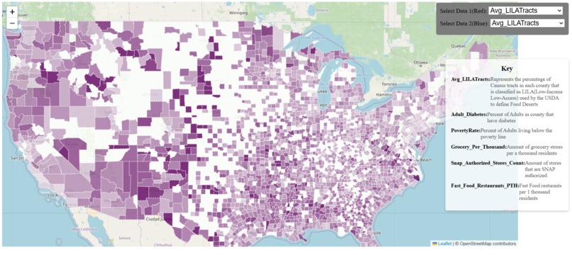
We also created an interactive map that we uploaded to the web, allowing users to explore various metrics visualized across the United States. This map enables users to compare different metrics side by side, helping them identify areas with the greatest correlations between factors. By interacting with the map, users can gain a deeper understanding of the complex issues surrounding food insecurity and how different factors are interconnected and how they can be region depedent because of geographical or historical factors.
How we built it
For Data Cleaning and wrangling, we merged the USDA Food Environment Atlas dataset sheets by FIPS, a US county identifier, using an outer join to create a single data frame for our analysis. We then conducted a correlation analysis to eliminate redundant columns, reducing the feature set from 284 to 30, . We also aggregated the Food Research Atlas data by county, and renamed columns for clarity and consistency.
As for the Interactive map we used the USDA Food Research Atlas (FoodAccessResearchAtlasData2019.csv) file and the USDA website to determine a metric for food insecurity/food deserts, and we ended up using low-income and low-access tract measured at 1 mile and 10 miles(LILA). The CSV gave us data in census tracts but the other data we had was in US counties so we combined them by finding what percentage of census tracts in a county were LILA. From there we also chose 5 other metrics that through our previous analysis correlated highly with LILA decided to map them out. Using GeoJson county data and LeafletJS we created a simple website the can display multiple metrics on the map to see where the correlation is the highest.
Challenges we ran into
There was a lot of discrepencasies between the two datasets so making them mesh was a big challenge. Getting the website online although not needed was really important for us but did take up alot of our time trying to figure it, luckily GoDaddy provided us with a free domain. And then finding a good way to show two metrics at the same on the map was difficult and we ended up using a simple color mixing to show it.
Accomplishments that we're proud of
Having our interactive map working and online!
What we learned
Gained alot of experience in Leaflet.Js and manipulating data in general
What's next for FoodDesertData.Wiki
If given more time I would have defintly liked to imporve the UI/UX design and add more metrics for comparison


Log in or sign up for Devpost to join the conversation.