-
-
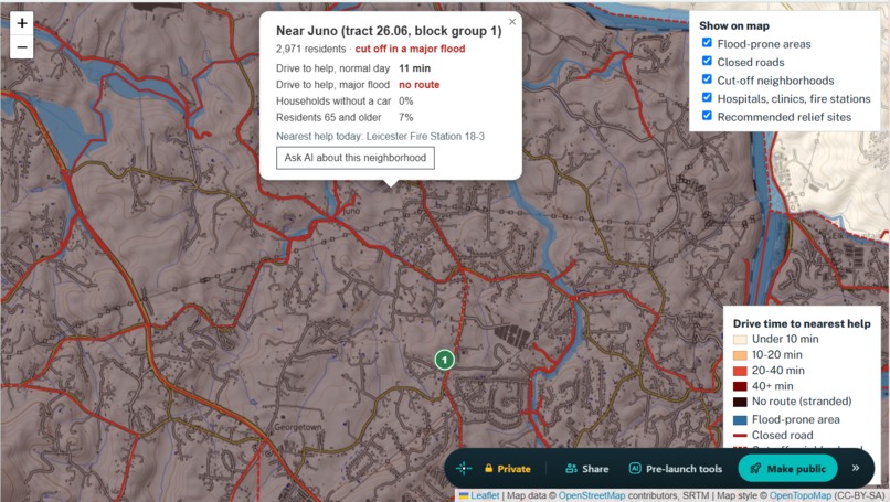
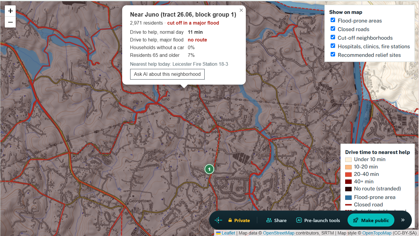
Selecting a specific county on map.
-
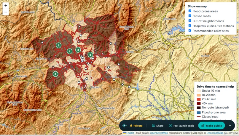
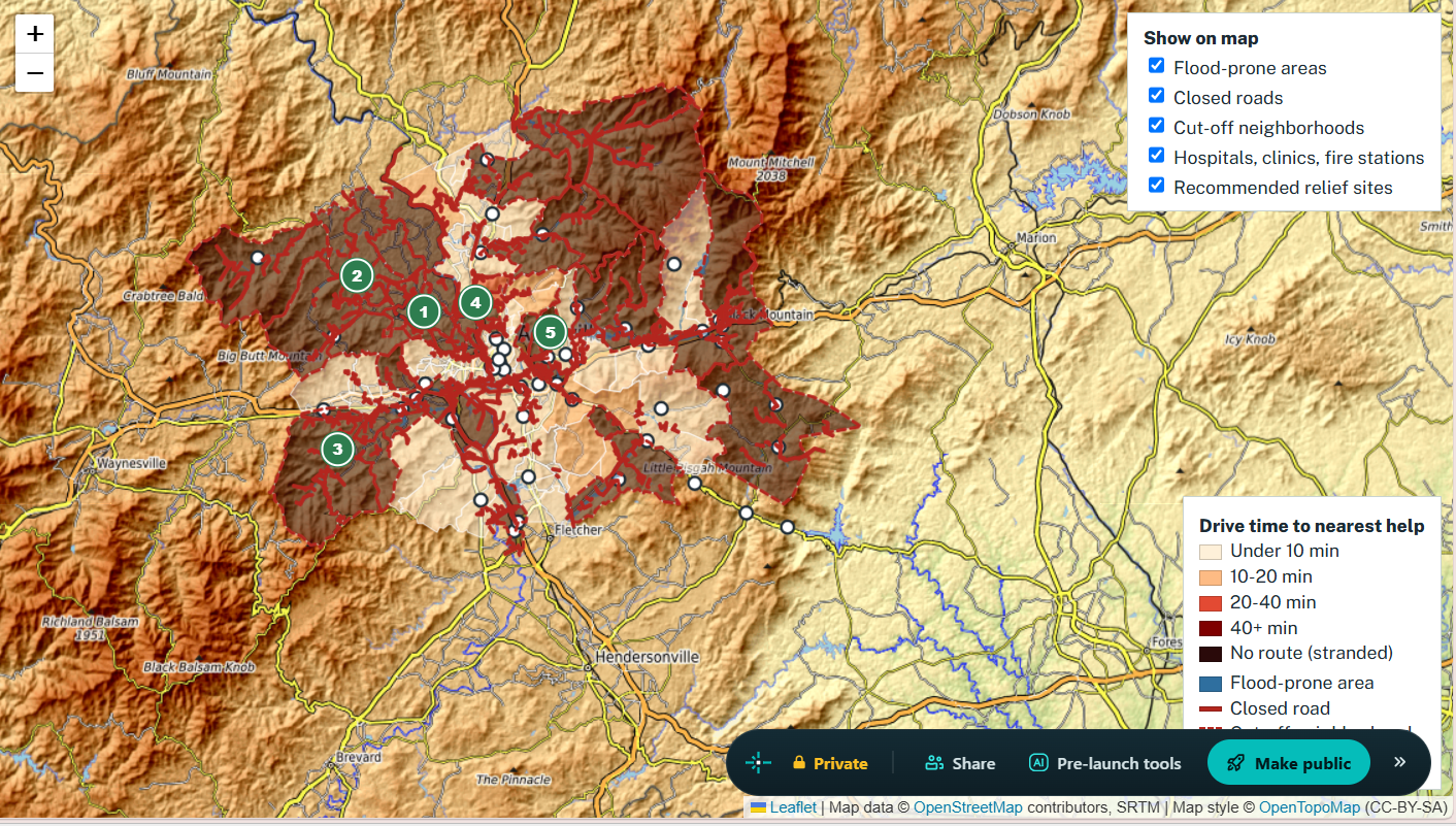
Simple image of interactive map.
-
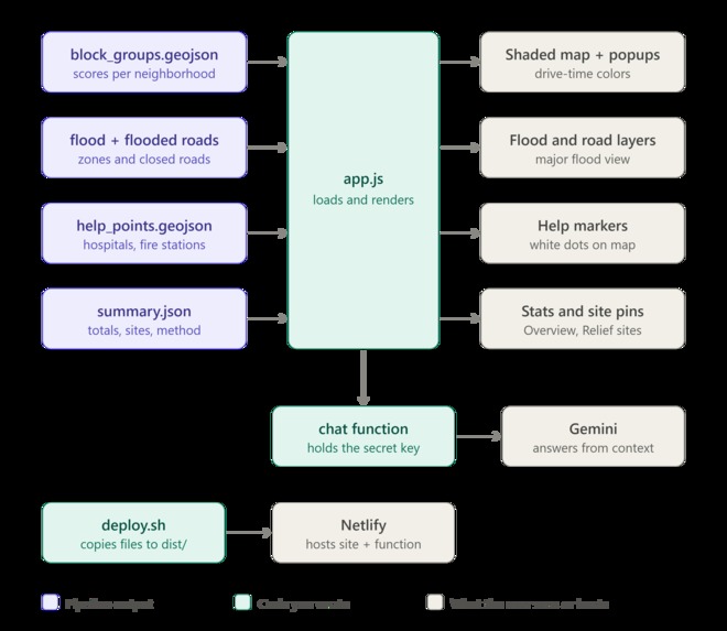
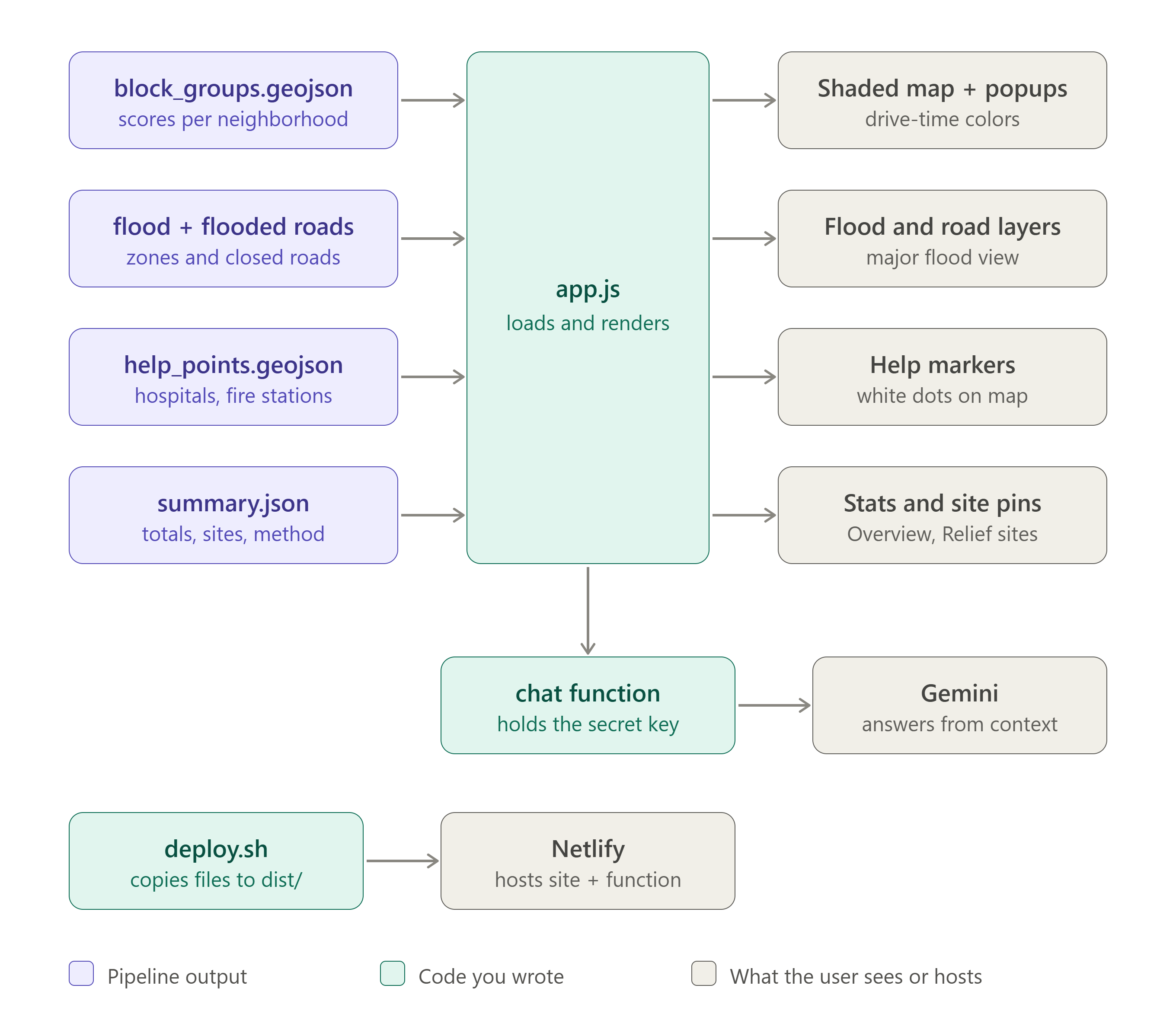
Code layout (app)
-
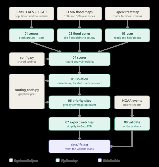
Code layout (pipeline)

Inspiration
This past weekend, one of us visited Boone, NC with a friend who grew up there. She talked about how locals are still recovering from Hurricane Helene, two years after it hit in September 2024. We wanted to understand why Western North Carolina gets hit so hard, and build something that helps decide where to act before the next storm.
What it does
FloodGap models what happens to a county's road network in a major flood, using Buncombe County (Asheville, Swannanoa, Black Mountain), one of the hardest-hit counties during Helene.
- Normal day vs. major flood buttons: allows the user to switch between two views. The normal day view colors each neighborhood by its drive time to the nearest hospital, clinic, or fire station. The major flood view closes every road in FEMA's flood-prone areas, showing exactly which neighborhoods lose their route to help. Cut off neighborhoods are outlined in red so they stand out on the map.
- Relief site recommendations: lists the existing schools, community centers, places of worship, and libraries that would reach the most stranded residents within 15 minutes and showing how many people each one reaches. Clicking a site zooms the map to it.
- Terrain map: shows the mountains and valleys, so users can see how flooding and closed roads follow the narrow river valleys where towns are built. The elevation layer is important because mountains squeeze extra rain out of storms. Steep slopes funnel that water into narrow valleys, so rivers rise fast. And the towns and main roads are built right in those valleys, because that's where the flat land is. Many communities only have one or two roads out. When those wash out, people are stranded. The elevation layer highlight areas in need and helps users spot them faster.
- Map layer toggles: allows the user to turn map layers on and off. Displays flood prone areas, closed roads, cut-off neighborhoods, hospitals, clinics, and fire stations, and recommended relief sites.
- Neighborhood details: clicking any neighborhood opens a popup comparing its drive time to help on a normal day vs. in a flood, plus the share of households without a car and residents 65 and older.
- Overview panel: summarizes the key numbers, explains why western NC floods so badly, and lists the largest cut-off neighborhoods. Clicking one zooms the map to it. Also displays how many residents and neighborhoods lose their route to help in a major flood.
- AI assistant: a Gemini-powered chat that answers questions about the results in plain language, with suggested starter questions and an "Ask AI about this neighborhood" button in each popup.
How we built it
Data: 4 public sources
- US Census American Community Survey 5-year estimates (2018–2022): population, households without a vehicle, residents 65+, and poverty for all 168 block groups in Buncombe County (269,449 people)
- Census TIGER/Line: block group boundaries
- FEMA National Flood Hazard Layer: 100-year and 500-year flood zones
- OpenStreetMap via OSMnx: the drivable road network with speed limits, plus hospitals, clinics, fire stations, candidate relief sites, and streams
Analysis pipeline (Python: GeoPandas, Shapely, OSMnx, NetworkX):
- Built the road network as a graph: intersections are nodes, and road segments are edges weighted by drive time.
- Removed every road segment intersecting the flood zone using a spatial join.
- Ran multi-source Dijkstra from every hospital, clinic, and fire station to get each block group's drive time to the nearest help, on both the normal and flooded networks.
- Flagged a block group as cut off if it has no route, or if flooding adds 15+ minutes
- Weighted each stranded block group by its population and a vulnerability index
- Picked relief sites with a greedy maximal-coverage algorithm.
Website: HTML, CSS, and JavaScript with Leaflet on a terrain basemap, hosted on Netlify. A Netlify serverless function calls the Google Gemini API, so the API key never reaches the browser.
Challenges we ran into
- Deployment: our repo lives under a university-managed GitHub account, which blocked Netlify from connecting to it, so we deployed from the command line instead.
- AI answers getting cut off: Gemini's internal "thinking" used up the token limit, so we raised the limit and filtered out the thinking text.
- Scope: our first version had too many features to explain clearly, so we cut it down to one story and one action.
Accomplishments that we're proud of
- Going from little geospatial experience to a working pipeline that pulls real government data, models an entire county's road network, and produces a concrete recommendation, all in 24 hours. It has the ability to expand to first responders to help them make stronger decisions about vulnerable populations.
What we learned
- Geospatial fundamentals: coordinate systems, spatial joins, and shortest-path routing on real road networks.
What's next for FloodGap
- All of western NC: run FloodGap for Watauga County (Boone) and the other hard-hit mountain counties. The pipeline works for any county with a one-line change.
- Creating customizable action plans for individuals based on their locations and accessible relief areas.
Built With
- api
- claude
- css
- gemini
- geopandas
- github
- html
- javascript
- leaflet.js
- netlify
- networkx
- openstreetmap
- opentopomap
- osmnx
- pygris
- python
- shapely
- vscode


Log in or sign up for Devpost to join the conversation.