Every match ends. Can the trains keep up?
Inspiration
The final whistle blows at NRG Stadium. If 60,000 fans came and one in five rides transit, 12,000 people head for the METRORail Red Line at the same moment. Does the everyday schedule get them home in time? When we started, nobody could tell us.
We began with an easier question: which host city has the best transit access to its stadium? The GTFS feeds broke that question almost immediately.
- MetLife Stadium has a rail station 207 meters from the gate. It runs service on 5 of the 180 days in the feed.
- Houston's NRG Stadium sits farther from its stop, but the Red Line serves it every day.
A station next to the gate tells you almost nothing. What matters is whether the network can empty the stadium, and every host city answers that with its own consultant study that nobody can compare. So we built one method, run the same way on all 11 U.S. host cities, that a transportation modeler can check line by line.
What it does
EventFlow answers two questions for every host city:
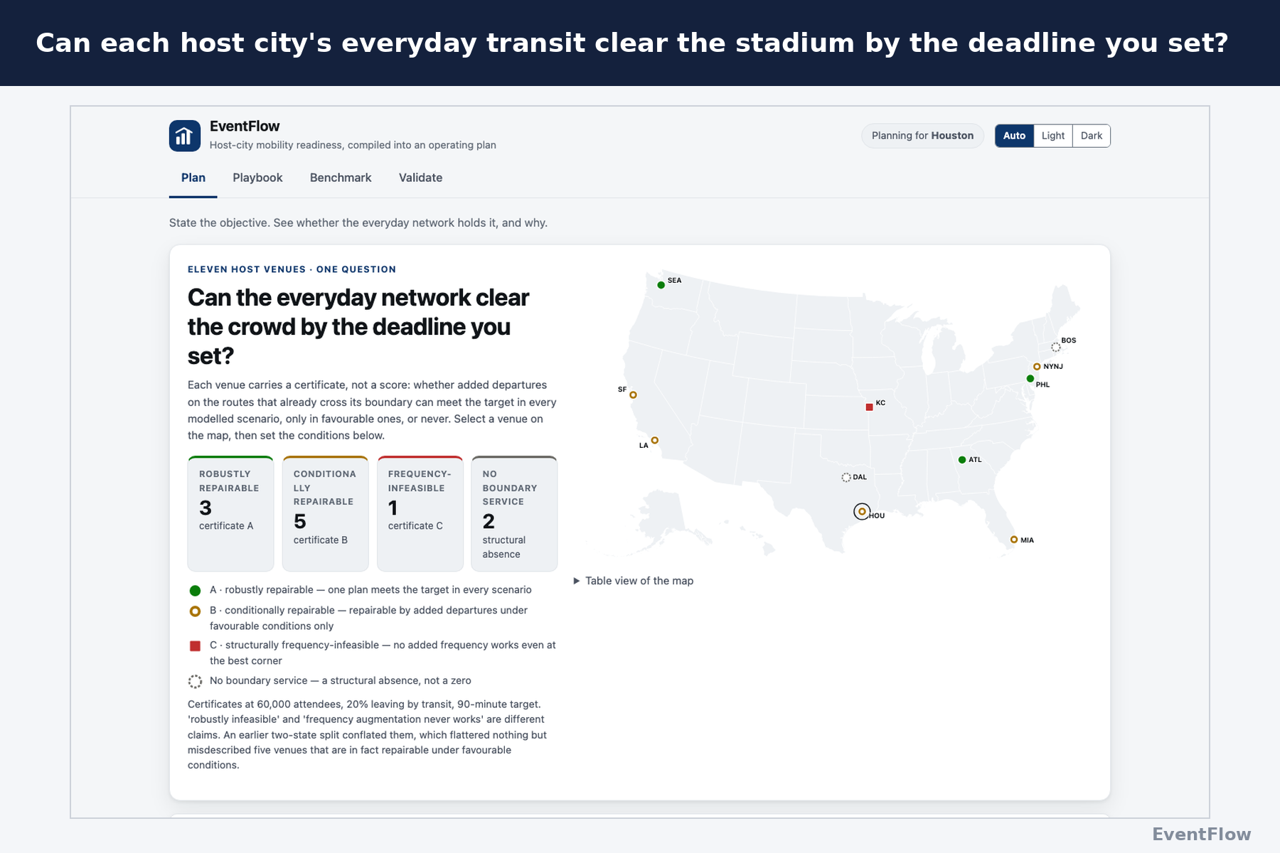
- Can the everyday transit schedule clear the stadium before your deadline?
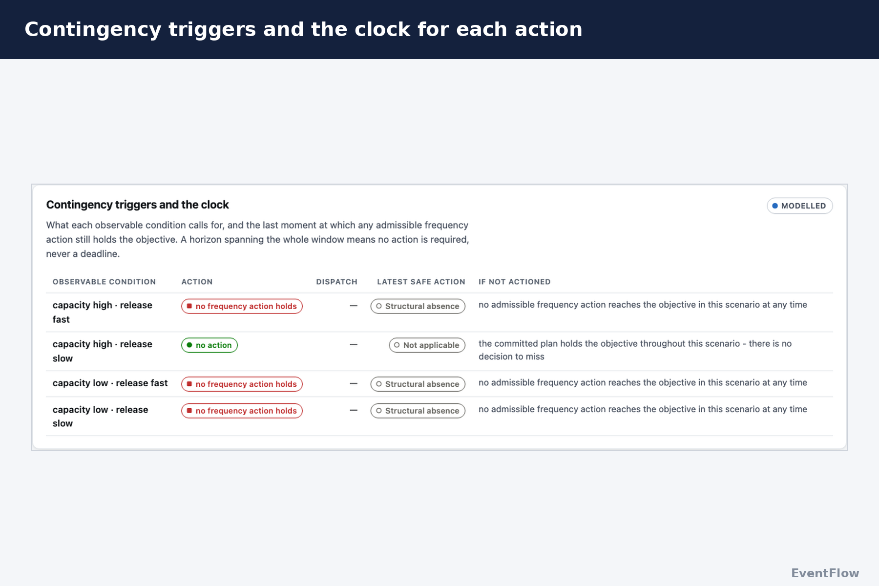
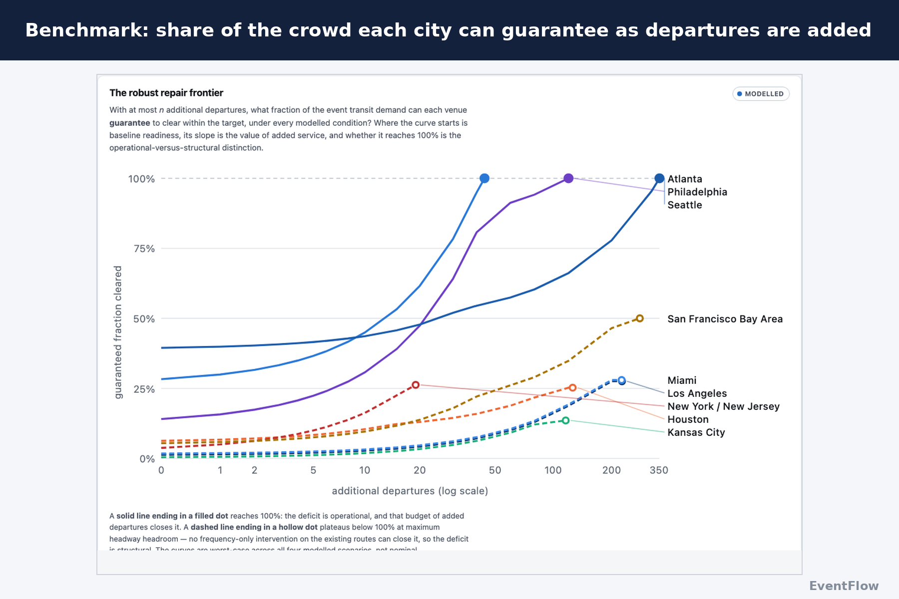
- If it can't, what's the smallest fix using routes the city already runs?
You set the crowd size, the share riding transit, how fast fans leave, the deadline, and which route breaks down. We don't predict the crowd, because no consistent visitor-origin data exists across 11 cities. Crowd size is your dial, and every map and chart updates as you turn it.
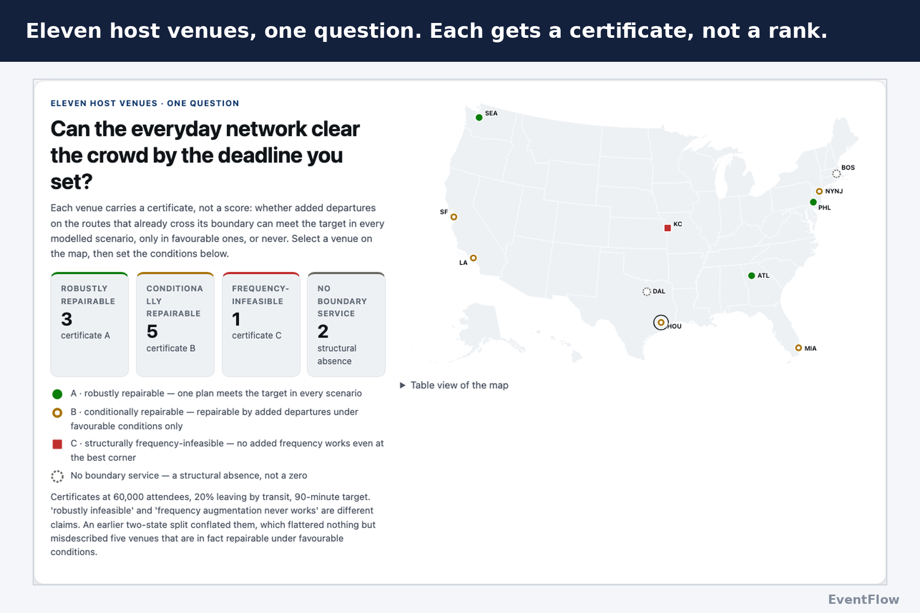
Instead of ranking cities, each venue earns a certificate:
- 3 venues are robustly repairable. One plan works under every tested condition.
- 5 are conditionally repairable. They can be fixed, but only under favorable operating conditions.
- 1 is frequency-infeasible. No amount of added service on existing routes works.
- 2 have no scheduled service crossing the venue boundary at all.
At 60,000 fans, 20% by transit, and a 90-minute target:
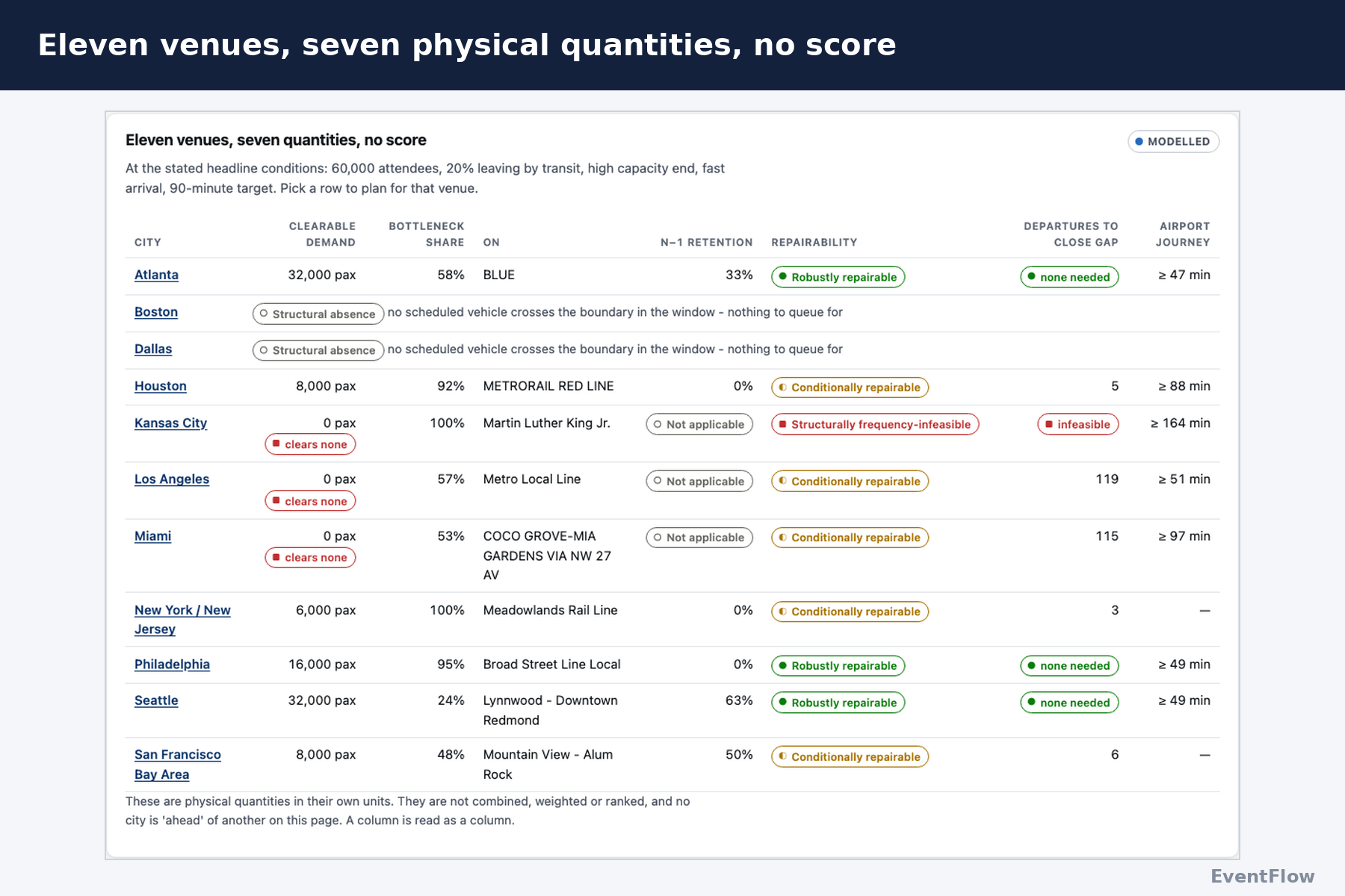
| City | Today's schedule | Smallest fix |
|---|---|---|
| Seattle | Clears in 22 min | None needed |
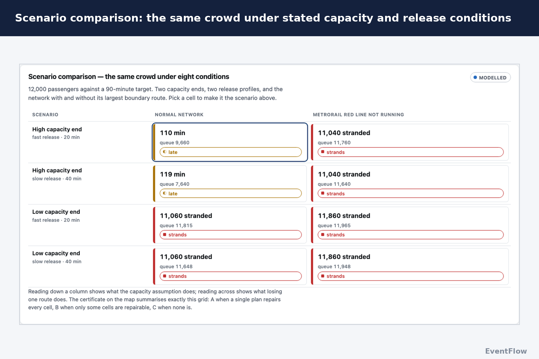
| Houston | Clears in 110 min | 5 more Red Line departures |
| New York / New Jersey | 1,000 fans stranded | 3 more Meadowlands Rail departures |
| Kansas City | Misses the target | Added frequency can't close the gap |
| Boston, Dallas | No boundary service | Flagged with its reason, never shown as zero |
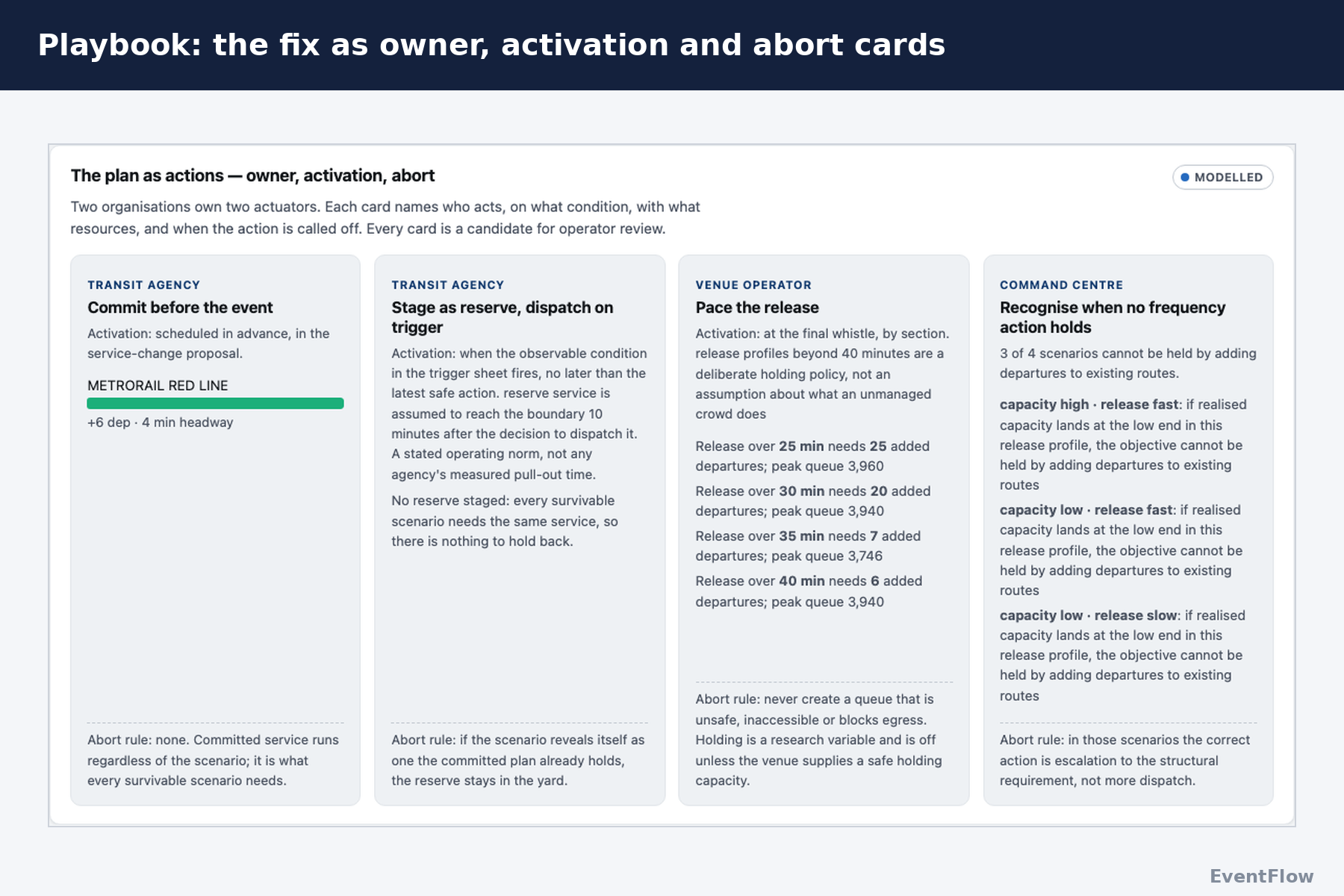
The app has four screens. Plan runs the stress test. Playbook turns the fix into an operations plan with owners, activation triggers and abort rules. Benchmark lines up physical quantities for all 11 venues. Validate tests the model against what agencies did during the tournament.
Why it matters to a city
- Impact and feasibility: every fix adds trips to lines a city already runs, with crews and track it already has. Nothing requires new infrastructure before kickoff.
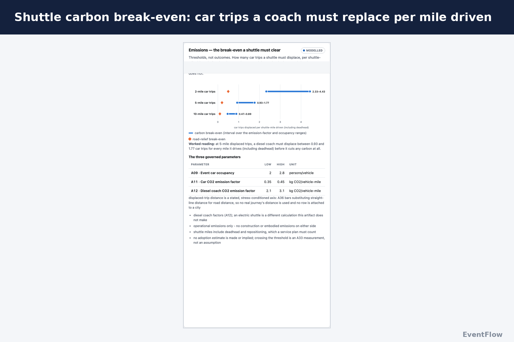
- Sustainability: before a city buys shuttles, EventFlow shows the carbon bar. On 5-mile trips, a diesel coach has to replace 0.93 to 1.77 car trips for every mile it drives, deadhead included, before it saves any carbon.
- Residents: the search can add service but can never remove a scheduled trip, so fans never get home at the cost of someone's weekday commute.
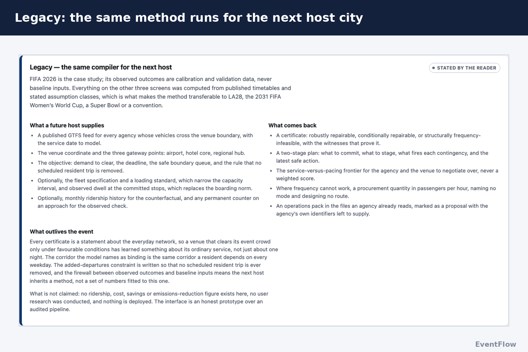
- Legacy: nothing in the engine is World Cup-specific. The same test runs for LA28, a Texans game or a convention downtown, and the added trips land on lines residents keep using.
How we built it
Data
A Python pipeline pulls GTFS timetables, FTA's National Transit Database, Census ACS, EPA, FEMA, NOAA and BTS data into versioned JSON artifacts. Every number on screen carries four labels: its source, unit, year and evidence grade. Each figure is also tagged as observed, modeled, or stated by the user, so a judge or planner always knows which kind of number they're looking at.
Missing data gets the same care. A gap is never a blank or a zero. It's classified as one of three things: a structural absence (the thing doesn't exist, like Boston's boundary service), pipeline pending (a named input would fill it), or not applicable.
The model
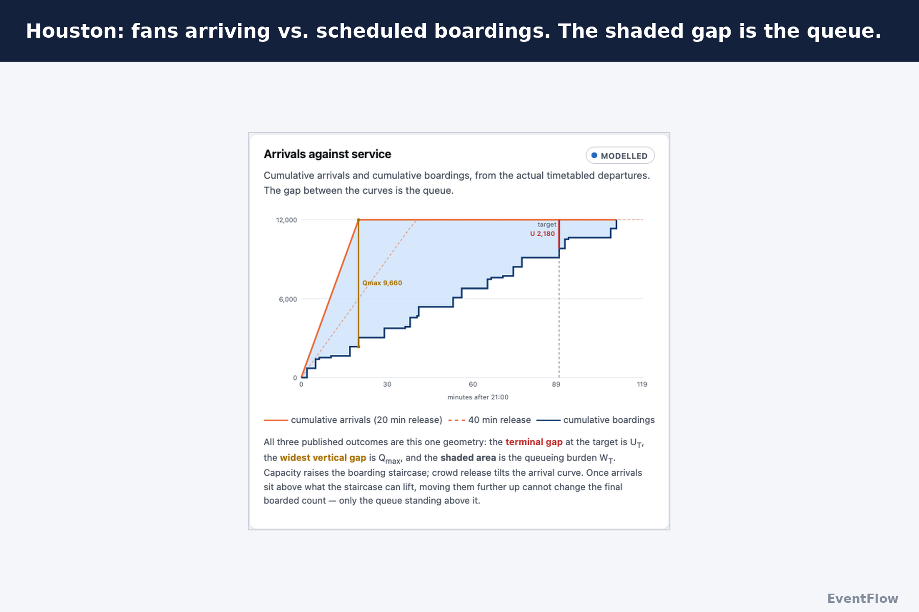
The core is a queue at the station boundary. Fans arrive evenly over an egress window $T_e$, and each scheduled departure $k$ at time $t_k$ with $c_k$ places boards whoever is waiting:
$$ A(t) = D \cdot \min!\left(1, \frac{t}{T_e}\right), \qquad B_k = \min\big(A(t_k),\; B_{k-1} + c_k\big) $$
The venue clears at the first departure where everyone has boarded, $B_k = D$. The fix is the smallest number of added departures $x_r$ that clears the crowd by the target $T$:
$$ \min \sum_r x_r \quad \text{s.t.} \quad t_{\text{clear}} \le T, \quad x_r \ge 0 $$
Every added departure on a route adds the same number of places. So filling the highest-capacity route first, until its minimum headway binds, gives the exact minimum with no heuristic gap.
What the model revealed about Houston
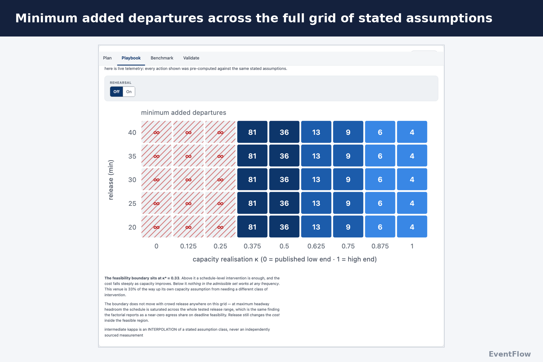
- Capacity is an interval. Houston's everyday schedule offers between 940 and 12,160 places in the two hours after a match, depending on vehicle size and load assumptions. We show both ends, because the true figure isn't published.
- There's a tipping point. Below about a third of the way up Houston's capacity range, no amount of added service meets the target. Above it, a handful of departures is enough.
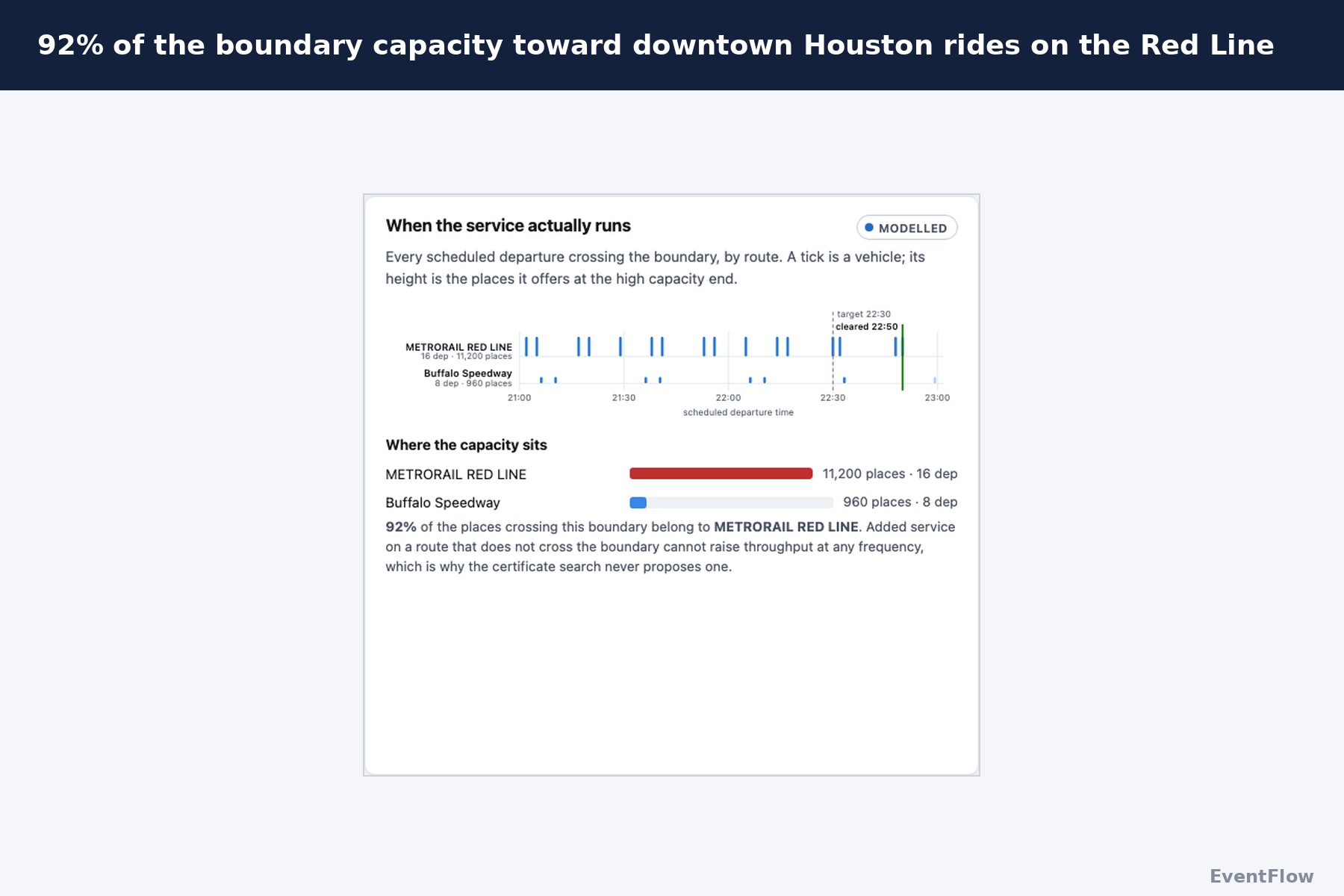
- One line carries almost everything. 92% of the capacity crossing the venue boundary belongs to the Red Line. Take the Red Line out, which the app lets you do, and rail capacity at the boundary falls to zero.
- Capacity controls whether the venue clears, and crowd release controls how bad the platform gets. Across our full set of capacity and release scenarios, capacity drives nearly all of the difference in meeting the 90-minute deadline. Pacing fans out of the stadium barely moves the deadline, but it changes the peak platform queue, which is a safety question.
The stack
React and TypeScript on Vite, with D3 drawing the maps as SVG over Census GeoJSON and TopoJSON. Every venue is a focusable element a screen reader can announce. There's no backend, no API key and no map tiles, so any agency can host the whole app as a folder of static files. We built with Claude Code as a pair programmer, under one rule: if a figure can't name the file it came from, it doesn't appear.
How we know it holds up
- The browser and pipeline must agree exactly. The browser runs the same model as the Python pipeline, so you can test scenarios we never precomputed. A parity test replays every published result through the browser engine and fails the build on any disagreement.
- Outcome data can't leak into the model. The engine can't read the file holding tournament results, and a second check fails the build if any active assumption shares a source with those results.
- We fixed our grading rules before looking. We committed every city's certificate and our scheme for coding agency actions before reading a single operator record. Result: 3 cities consistent, 3 partially consistent, none inconsistent, 5 not comparable. Kansas City's certificate says frequency alone can't work, and Kansas City ran a dedicated coach network.
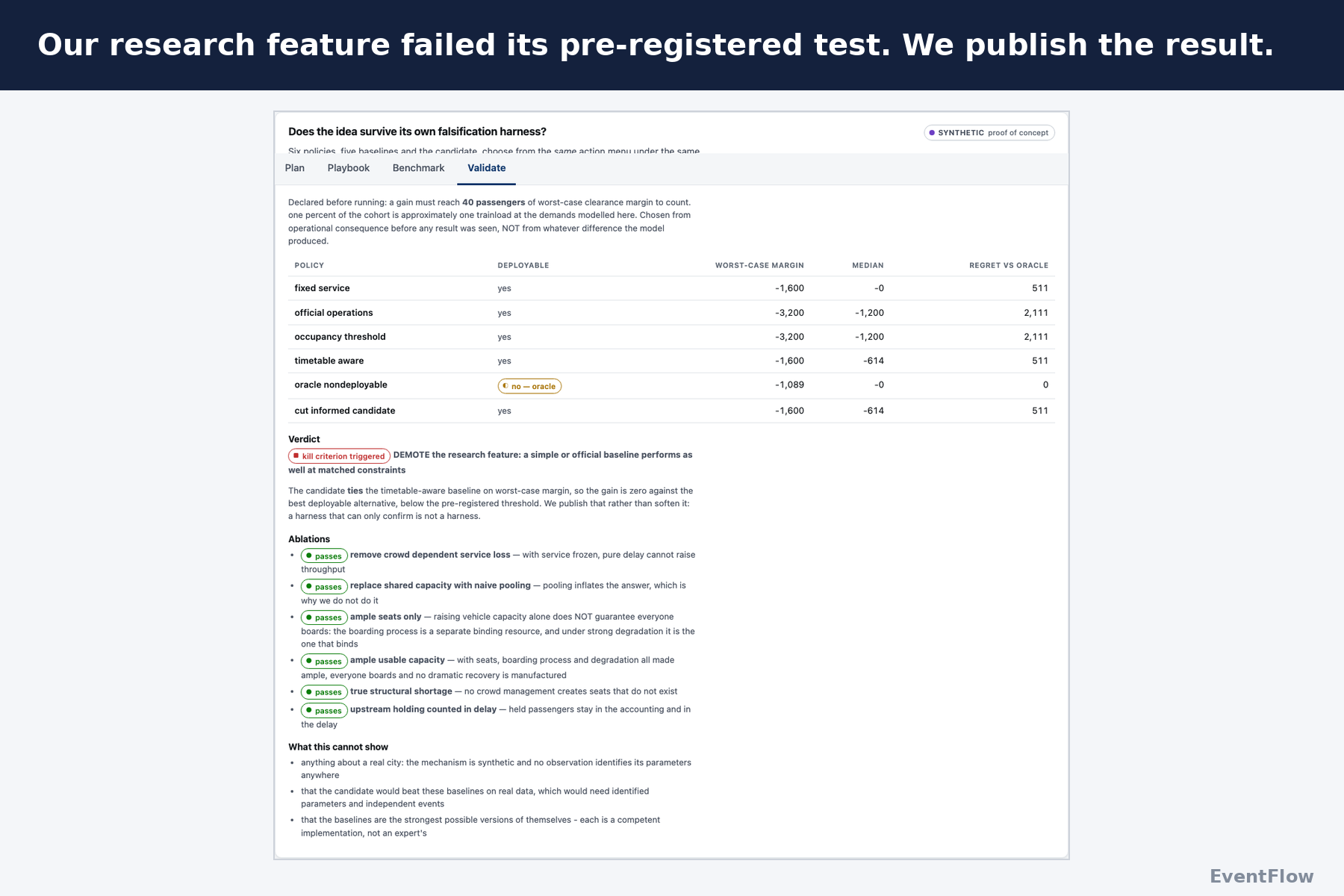
- We published a result that went against us. Our most ambitious research feature had to beat the best baseline by a pre-registered margin. It tied, so the kill criterion fired. We left that result in the app.
- We don't claim precision we don't have. Our tournament ridership comparisons are associations, not causal effects. With only three cities verified against real operations, we show the rows and refuse to report an accuracy rate.
Challenges we ran into
- There is no World Cup mobility dataset. The model was the easy part. Every agency publishes different data, in different formats, at different levels of detail. We pieced together GTFS schedules, NTD records, Census data, venue information, accessibility data, fares and local sources by hand.
- Cities don't all support the same depth. Houston had far richer operational and traffic data than most, so it became our deep-dive case. We didn't pretend the other ten could support the same analysis.
- Some inputs exist nowhere. Visitor origins, mode shares and vehicle load factors were missing for most cities. We didn't invent them. We rebuilt the model around what we could measure.
- One feed could have broken the comparison. New York/New Jersey's timetables had outdated service calendars. Rather than estimate one city and compute the rest, we publish no travel-time comparison until one method works for all 11.
What we learned
- We stopped asking what we could compute and started asking what the data could support. Sometimes our most useful output was a list of missing data and how much each gap limits a real decision.
- Ridership can rise while service gets worse. In July, Houston ran 30% more rail service and carried 4% fewer passengers than the July before. One month proves nothing alone, but it shows why we measure capacity and not headlines.
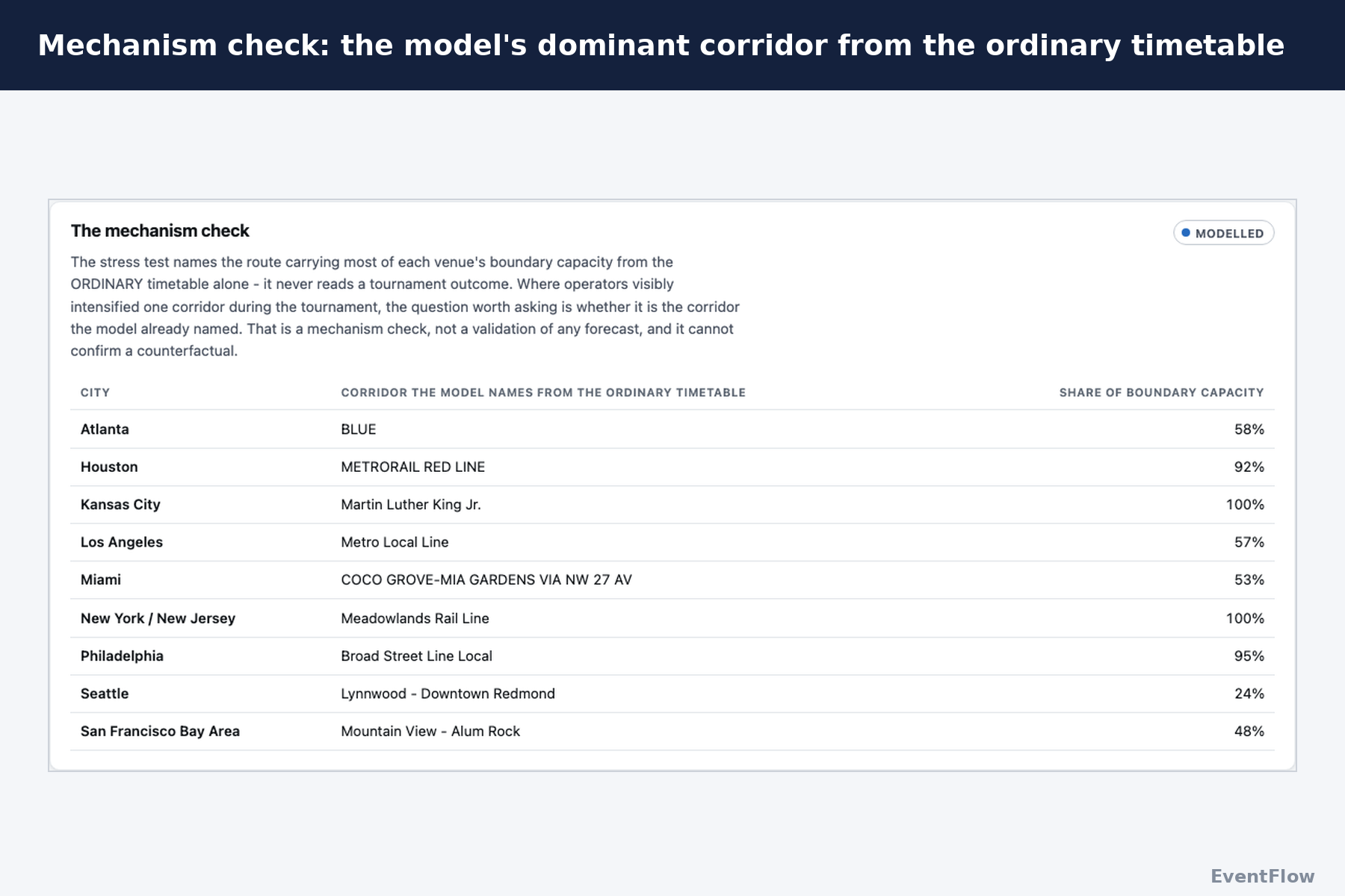
- The ordinary timetable already points to the bottleneck. From everyday schedules alone, the model flagged the Red Line, and Houston did add Red Line service for the matches.
- A single score can hide the answer. Our first version rolled everything into a 0 to 100 score. No planner can act on a 49.8, so we deleted it two days before submission. Minutes to clear, fans stranded and trips added became the product.
What's next
We want one transit agency to share its real Houston inputs, like visitor origins, mode share and load factors, so EventFlow gets tested against a decision someone actually has to make. Then we'd take it to LA28.


Log in or sign up for Devpost to join the conversation.