-
-
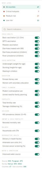
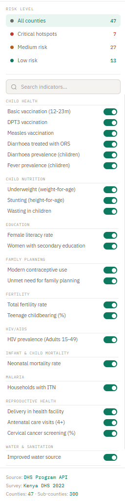
Sidebar for Risk level and indicators
-
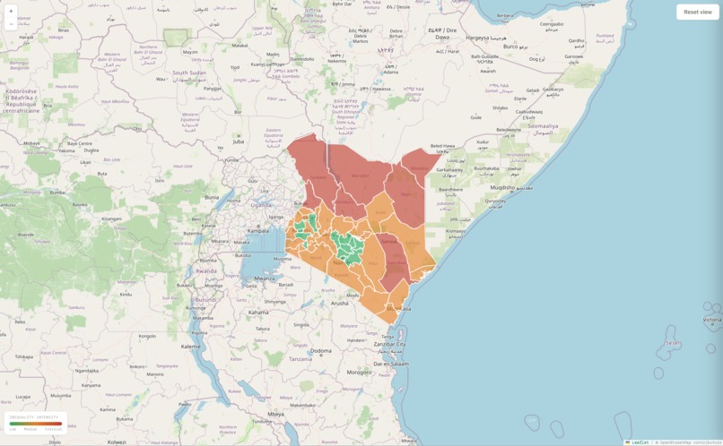
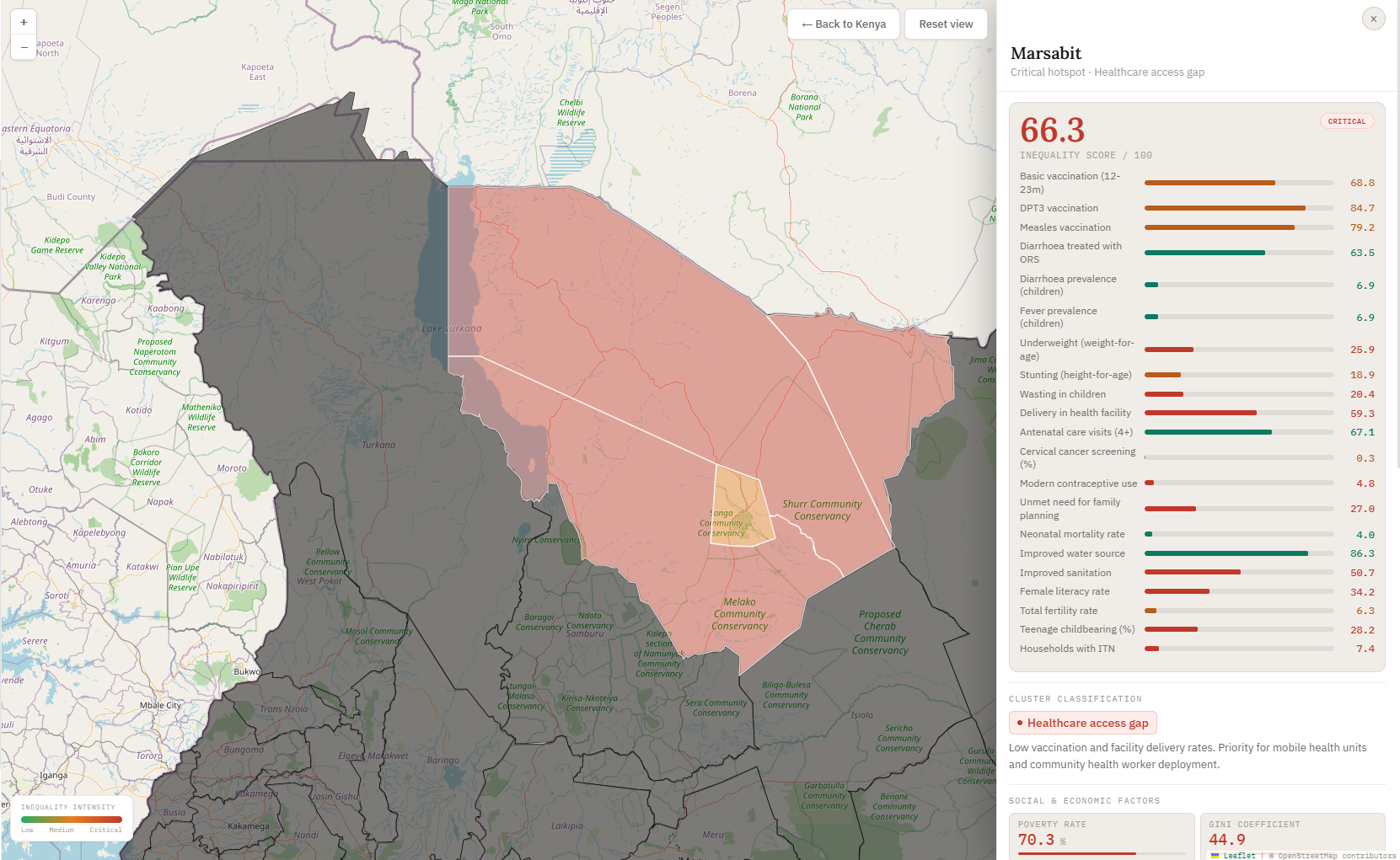
Every county is coloured by its inequality score — green is doing well, red is a critical hotspot
-
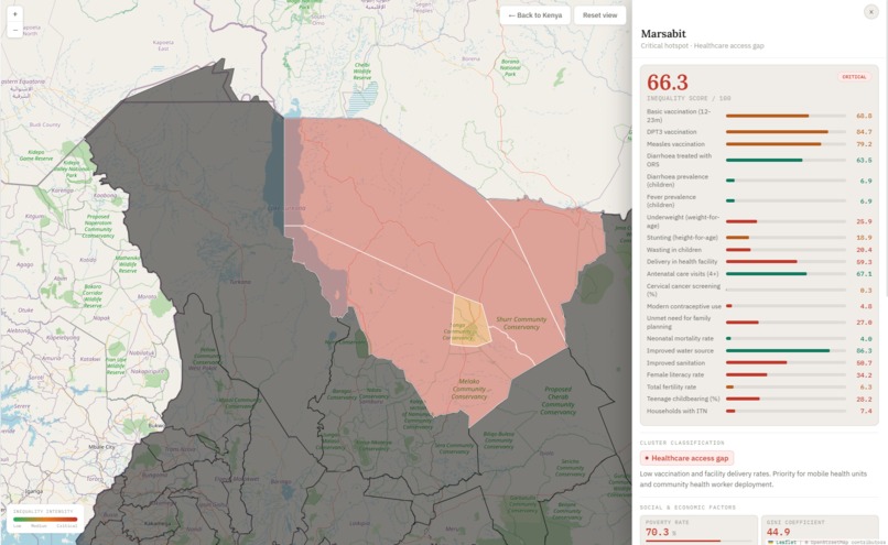
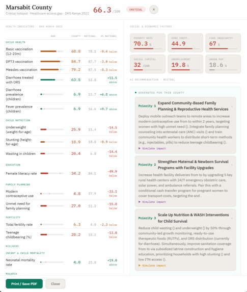
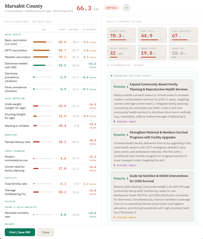
Insides about regions in the specific county.
-

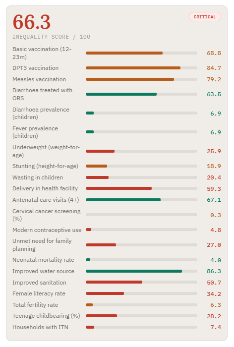
Inequility score
-
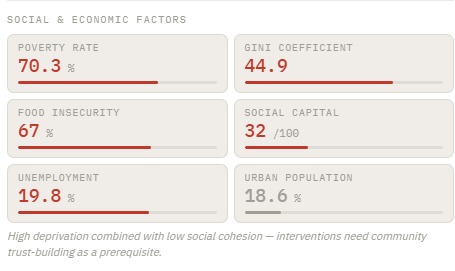
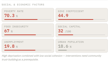
Social and economic factors
-
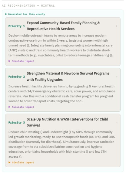
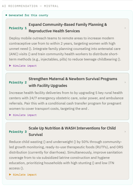
AI recommendation
-
Full statistics report

Inspiration
We believe the data to fix health inequality already exists — it sits in health systems across the world, collected every day but rarely turned into action. What's missing is the intelligence to find who's being left behind and tell decision-makers exactly what to do about it. That's the problem we wanted AI to solve, and that's what brought this team together.
What it does
HealthEquity AI transforms routine public health survey data into an interactive decision-support platform. It maps all 47 Kenyan counties by a composite inequality score, clusters them by deprivation profile, and generates AI-powered, clinically framed intervention plans through the Mistral API.
A doctor or policy maker can click any county, see how it compares to the national average across 23 health indicators and 6 social determinants of health, then simulate what happens to that county's score between 2022 and 2030 — with or without a targeted intervention.
How we built it
The dashboard is a single self-contained HTML file — no build step, no backend, no framework. All logic runs in the browser: Leaflet.js renders the choropleth map, vanilla JavaScript computes scores and trajectories live, and the Mistral API generates the intervention recommendations.
Challenges we ran into
The biggest challenge was finding usable, county-level data for the demo. The DHS Program API provided the 23 health indicators, but social and economic context data — poverty rates, Gini coefficients, food insecurity, unemployment — had to be sourced separately from KNBS 2019 household survey reports and World Bank estimates, then manually matched to all 47 counties.
Sub-county (constituency) boundaries and scores were another gap: no constituency-level health data exists publicly, so those scores are synthetic — modelled as random variation around the parent county score. Making this limitation transparent in the UI while keeping the demo meaningful was a deliberate design decision.
Accomplishments that we're proud of
The most important accomplishment was sourcing entirely free, open data:
- DHS Program API — 23 health indicators for Kenya 2022, freely accessible
- GADM — county and constituency boundary shapefiles, open licence
- KNBS 2019 Welfare Monitoring Survey — county-level poverty and inequality estimates, publicly available
- Mistral AI — API with a free tier sufficient for the demo
The entire platform was built and deployed at zero cost, which directly validates the thesis that this tool can be made available to governments and NGOs in low-resource settings without significant infrastructure investment.
What we learned
"Personally, I have learnt teamwork across different timezones and with technology (AI) we can bridge the inequity gap." - Simon Ernest
"I learned about how much healthcare information fails to be presented or understood, and just how beneficial that data could be for society." - Todor Enchev
"Ive really valued working across different disciplines and learning from everyone. Combining public health, policy, and AI, and seeing how each perspective shapes a usable solution" - Rithika Ravishankar
"I learned a lot from this project, especially about thinking beyond individual solutions and focusing on system-level impact. It showed me how powerful AI can be when applied in a meaningful way, and I’m honestly impressed by what we were able to create together from a simple idea. It also really highlighted the value of teamwork, bringing different perspectives together made the solution much stronger and more practical." - Shahd Jadalla
"This was my first hackathon, and honestly, I started out feeling lost. I didn’t code the system myself, but I contributed by shaping the core idea combining a machine learning layer with a generative AI layer to make the insights more usable. I learned how an idea can be quickly translated into a real product with good people around you." - Muhsin Ahamed
Building this project made the need for it impossible to ignore. Health outcomes in Kenya vary by a factor of three between the best and worst counties — not because of genetics or chance, but because of measurable, addressable factors: distance to a facility, sanitation coverage, female literacy, food security.
We also learned how deeply social determinants shape clinical outcomes. A county with high poverty and low social capital scores poorly on child nutrition and vaccination coverage not because health workers are absent, but because structural barriers prevent families from accessing or affording care. No clinical intervention alone fixes that — the data makes this visible in a way that a table of numbers never could.
Finally, the project demonstrated the power of fast feedback loops. A minister or NGO director looking at a spreadsheet cannot see that Turkana needs a different intervention than Kilifi. This tool makes that distinction immediate, actionable, and explainable — and that speed of insight is where the real value lies.
What's next for EquityLens AI
For Equity Lens AI, we think a key next step is to validate the recommendations with policymakers and clinicians, and make sure the outputs are clear and practical so they can actually be used to inform decisions on the ground.
Built With
- claudecode
- css3
- dhs-program-api
- gadm
- html5
- javascript
- leaflet.js
- lovable
- mistral-ai-api
- openstreetmap


Log in or sign up for Devpost to join the conversation.