-
-
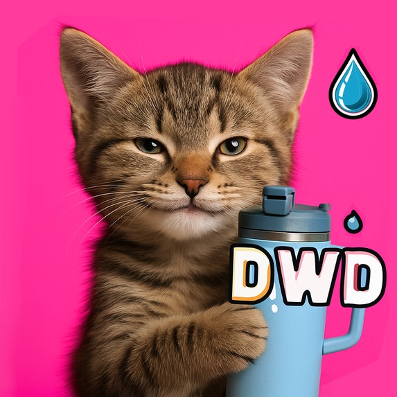
Drink Water, Dummy icon 1024x1024
-
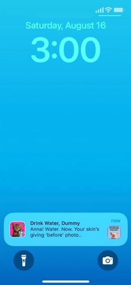
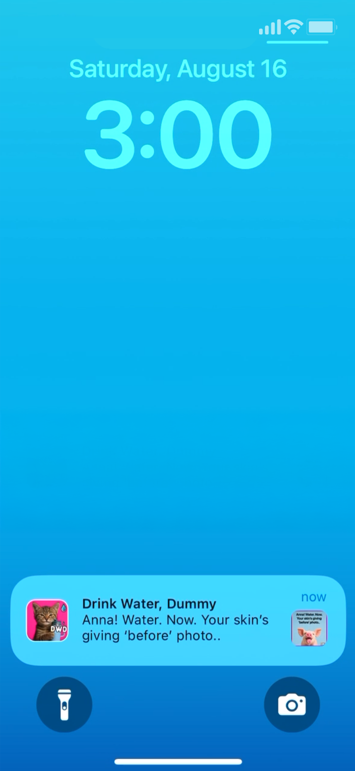
Reminder/Notification Custom Sounds: Free get DWD jingle, Pro get goat bleating "drink", crow squawking "drink" etc + new drops (ElevenLabs)
-
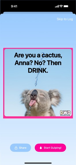
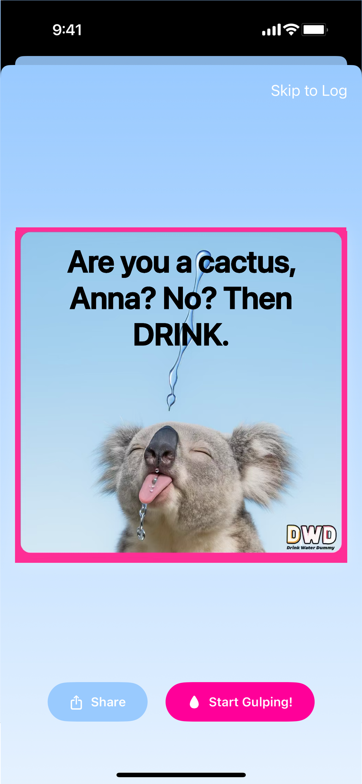
Meme and Gulp Screen: Appears after tapping notif, tap Start Gulping to trigger an animation + satisfying ‘gulping and aah’ (ElevenLabs).
-
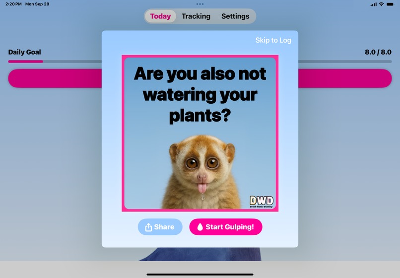
iPad Meme & Gulp Screen: Appears after tapping notif, tap Start Gulping to trigger an animation + satisfying ‘gulping and aah’ (ElevenLabs).
-

Log Screen: Log your intake and enjoy the funny custom sound- Pro users get more plus new drops. (ElevenLabs)
-
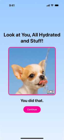
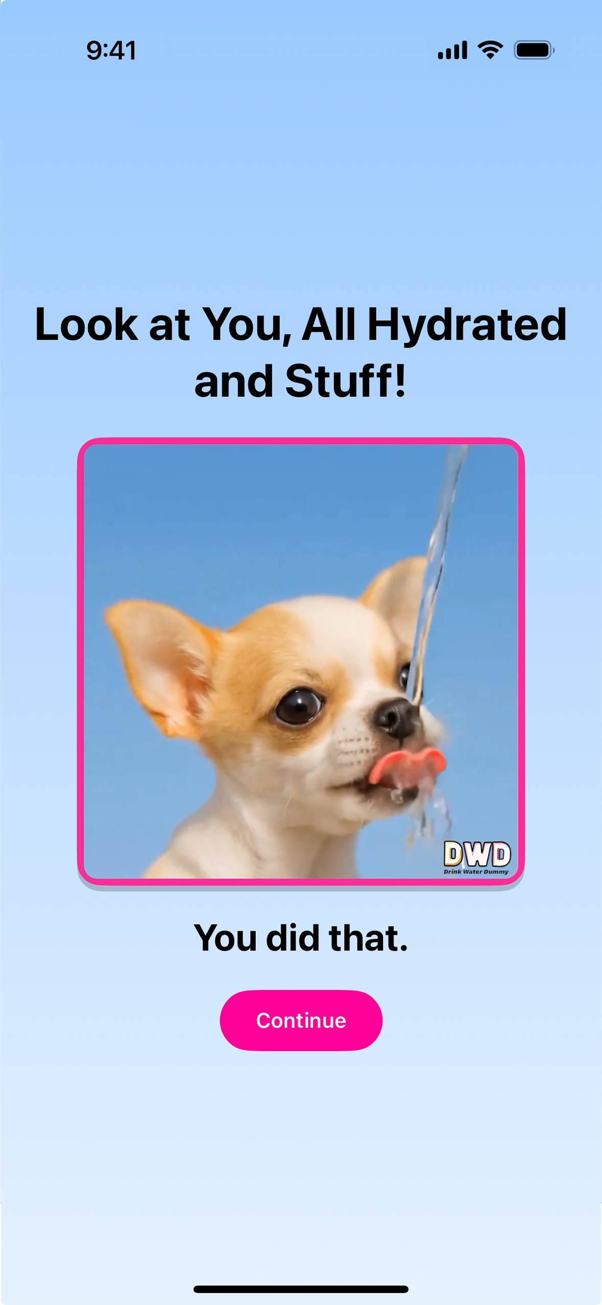
Reward Screen: Video of adorable puppy drinking water. Pro users get more reward animals. Drinking and water sounds created in ElevenLabs
-
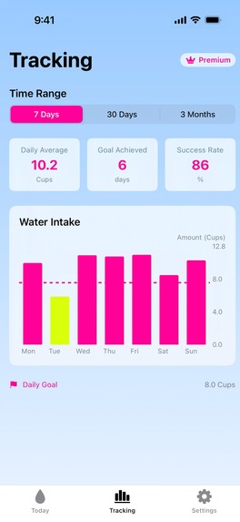
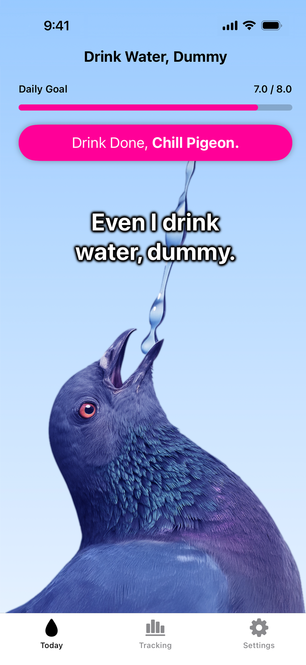
Tracking Screen: Hourly/Daily, Weekly, & Three Month. Miss your goal? You’ll see ‘Mountain Dew yellow’ a reminder your pee shouldn’t match.


Inspiration
We are Anna and Daniel Leighton, teammates in Shipaton and in life. Daniel is the developer and system architect and Anna is the designer and marketer.
Drink Water, Dummy (iOS app) was born from two places:
- Frustration with boring wellness tools.
Other apps: “Track your ounces.”
Ours: “Your organs are shriveling, Brenda.” - Our personal stories.
Anna has ADHD, which shaped the design to be funny, direct, and impossible to ignore.
Daniel has lived with Crohn’s Disease since birth, and when people with Crohn's ask for advice, his #1 recommendation is hydration. Again and again, people tell him how surprised they are at how much it helps.
We thought: drinking water is weirdly hard for humans, but not for animals. So why not make them our coaches? Tough love + roasts from cute animals = yes please.
That’s also how we came up with our slogan:
“Animals hydrate instinctively, humans need memes.”
Design inspiration:
Anna wanted it to be effective and have the vibe of water. It needed fresh, clean, but also with an edge, not antiseptic. One day she was working on the app wearing a light blue sweatshirt with neon pink nails. The way the colors popped became the vibe: calm water + bold edge.
The neon yellow highlight color came later when it was inspired by the roast “Your pee shouldn’t look like Mountain Dew, Anna.” So in the tracking, the color shows up when you don’t reach your goal - keeps the joke going.
Also, it is designed to release oxytocin via adorable animals drinking and dopamine with reward-driven, playful animations and sounds (“drink” squawks, bleats, gulping “ahh” and more). And of course, to tickle the funny bone and spark joy all the way to hydration town.
Meme notifications come from all kinds of animals: from household pets to the super-weird saiga antelope. Memes are designed to give that mix of awww and ouch, motivating and hilarious at once.
How we built it
- Core app: iOS, built in SwiftUI with RevenueCat for subscriptions
- Notifications: Multi-layered system refreshing via app open, background tasks, or silent push from a Cloudflare Worker
- Performance: All 60 notifications scheduled as lightweight metadata, then upgraded into meme images in the background
- Sync & updates: iCloud integration + custom Version Migration System to preserve data, streaks, and settings across devices/versions
- Testing concept: Astro
- UI exploration: Mobbin
- Sounds: ElevenLabs (sarcastic squawks, bleats, gulp + “ahh,” animals drinking)
- Images, videos, and marketing assets: AI tools (animal memes, drinking clips, “dumb human” videos, billboard mockups, sticker packs)
- Website: Carrd
- Waiting list: Beacons
---
What it does
It gets people, who forget they have organs, to hydrate.
The flow:
- You get roasted (notification + meme).
- You laugh (or cringe) as you grab water.
- You sip water (animation on your meme + gulping and “ahh” sound).
- You log it (dopamine hit: weird sound + bar filling).
- You hit your goal → you get a puppy (adorable drinking video with sound).
Free: 3 reminders/day, 5 animals, hundreds of roasts
Pro: Up to 48 reminders/day, 100s of animals hundreds of roasts, tracking, more rewards, and new drops
Drops: Frequent new memes, animals, and sounds keep the app fresh
User settings:
- Frequency: Choose reminders (3/day free, up to 48/day with Pro).
- Personalization: Roasts include your name (mixed with name-free roasts so it doesn’t get stale).
- Notification sounds: “Don’t Be Dumb” DWD jingle, “Drink” squawks, bleats, etc.
- Logging sounds: Floop, Blibble, Glibble, etc.
- Goals & tracking: Hourly, daily, weekly, monthly, and 3-month views. If behind, tracking goes neon yellow — a playful “pee warning” from the roast: “Your pee shouldn’t look like Mountain Dew.”
- Measurement options: Cups, ml, oz, etc.
---
Challenges we ran into
Notifications: Limit + Refresh Logic
To keep users engaged despite iOS’s 60-notification limit, we built a multi-layered system that automatically refreshes notifications whenever the app is opened, during daily background tasks, and if the user has been inactive for a few days, via a silent push notification triggered by a Cloudflare Worker. This ensures that users continue to receive reminders even if life gets busy and they haven’t opened the app in a while.
Notifications: Lightweight vs. Full-Image
We also had to make notifications efficient. To avoid performance bottlenecks during startup, we schedule all 60 notifications immediately using lightweight metadata instead of pre-rendered images. A background thread then progressively generates and upgrades these notifications into image-based memes in small batches, which keeps the app responsive, reduces CPU and memory load, and makes the system scalable.
Version Migration System
Beyond notifications, we built a Version Migration System that keeps updates seamless for users by safely migrating their data, updating settings, and showing the right feature announcements even if they skip versions. It also future-proofs new features like Streaks, which in upcoming releases will calculate progress from historical data so users get full credit for their past activity.
Cross-Cultural Unit Conversion System
One unexpected challenge was creating a unit conversion system that works intuitively for users worldwide without causing frustration when switching between metric and US customary units. The naive approach of exact mathematical conversions (like 64 oz = 1893.7 mL) creates awkward numbers that don't feel natural to users. Instead, we built a sophisticated "preferred conversion" system that maps common US values to clean metric equivalents (8 cups/64 oz becomes a nice round 2L, 1 cup becomes 250mL instead of 236.6mL). This required handling edge cases where the same underlying data needs to display differently depending on the user's unit preference, preventing issues like progress bars not filling completely due to rounding mismatches. The system maintains mathematical relationships while prioritizing user experience.
Thoughtful Small Touches
We also tried to be thoughtful about the small details that make life easier for users. For example, instead of sending someone into the App Store to hunt for their subscription, we give them a direct link to subscription management. The same goes for settings: when the app shows a link, it takes you straight to the exact place you need instead of dropping you at the top level and making you dig around. Some apps do this, some don’t, but as users ourselves we wanted to do everything we could to max out the user’s ease. There’s so much stress in the world these days, and the last thing anyone needs is a frustrating app. We wanted to make ours a nice, easy experience.
Accomplishments that we’re proud of
- Built an app that looks great, is funny, and actually gets people to hydrate!
- Appeals to multi generations and communities. People in the wellness community, who we thought might resist, said things like “You had me at bullying” and “I need it, I’m a dummy.”
- Tested (and still testing- just started-only 15 days old) YouTube Shorts with ~8,000 views without promotion, to give us us data on what makes people laugh enough to watch and share.
- Marketing isn’t an afterthought, it’s part of the product. We created a pipeline of marketing content we are excited about.
- Getting real IRL traction from people we share it with: stickers at skateparks and trendy hangouts, bottles, and beta testers giving testimonials we used as copy.
- Shipping!!!!
- Submitting to our first hackathon
- Working great together + getting exercise! Almost daily walks and talks about app.
---
What we learned
- Testing ideas is the way to go - don’t delay. YouTube Shorts, or even at meetups. Next time - launching earlier.
- Humor is universal. What we thought was just for Gen Z, with all the sass, ended up resonating with Gen X, Boomers, and wellness folks too. The zen-est people we know surprised us with comments like:
- “You had me at bullying.”
- “I need it, I’m a dummy.”
We all laughed at that one!
- “You had me at bullying.”
- Small touches (like skipping generic menus or carrying streaks forward) make a huge difference in how people feel about using an app.
---
What’s next for Drink Water, Dummy
- Launch party: Zoom
- Localization: English-speaking regions first (US, UK, Canada, Australia), then full translations.
- New drops: Animals, sounds, and roasts to keep content fresh.
- Community challenges: Naming the mascot, streak competitions, sticker giveaways.
- Custom Product Pages: Experiment in App Store to target different audiences (ADHD, wellness, chaotic humor, boomers).
- Marketing expansion: Sticker packs on TikTok, new videos, IRL placements.
- Long-term: Gamification (leaderboards, XP, streak comps), global translations, more integrations.
---
More:
Testimonials (Beta Reactions)
- “You had me at bullying.”
- “It stands out.”
- “It’s so different and I love it. I drank more water in 3 days than the last month.”
- “I need this, I’m a dummy.”
- “I didn’t know I needed to be insulted into self-care, but apparently I did.”
Awards We Are Going For
- Buzziest Launch Award: so much marketing content- videos, songs, stickers, “global billboards” and more.
- RevenueCat Peace Prize: hydration is the gateway to a better everything.
- RevenueCat Design Award: app + marketing design- consciously designed to make you feel and go into action
- BuildInPublic Award: sharing progress through IRL feedback, Discord, and YouTube Shorts testing.
Built With
- adobe-illustrator
- alex
- astro
- chatgpt
- claude
- cloudflare
- descript
- elevenlabs
- heygen
- luma
- midjourney
- mobbin
- photoshop
- pixverse
- premierepro
- revenuecat
- runway
- suno
- swiftui
- xcode


Log in or sign up for Devpost to join the conversation.