Inspiration
There is plenty of public data about environmental conditions and communities, but using it to compare two places takes work. I wanted to make that information easier to explore, especially for someone deciding where to live.
What it does
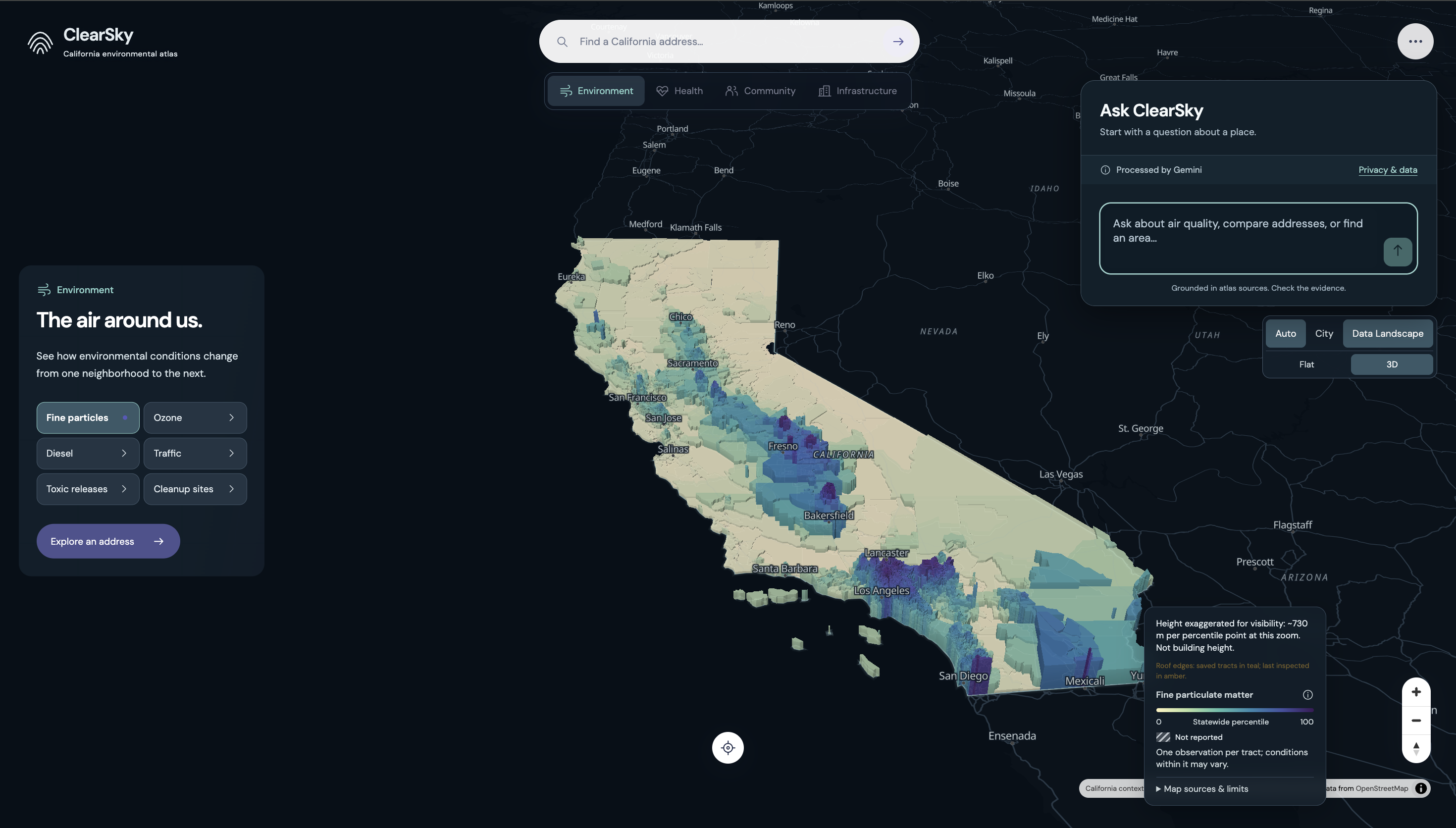
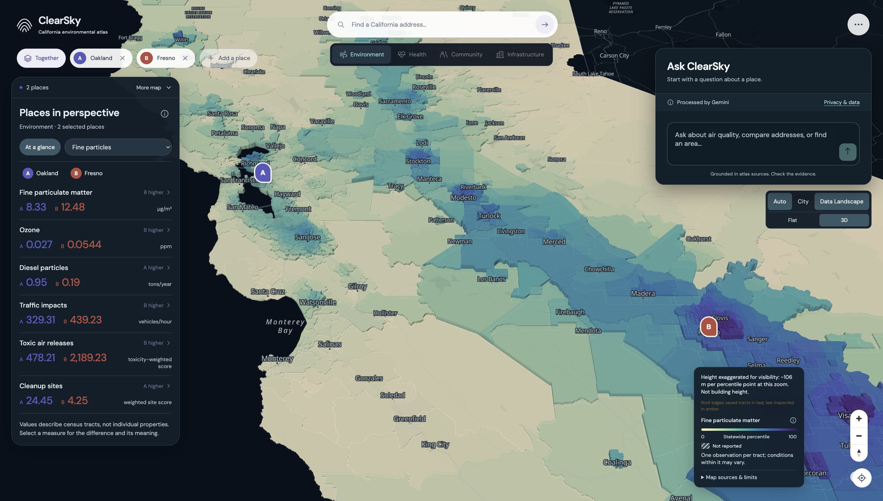
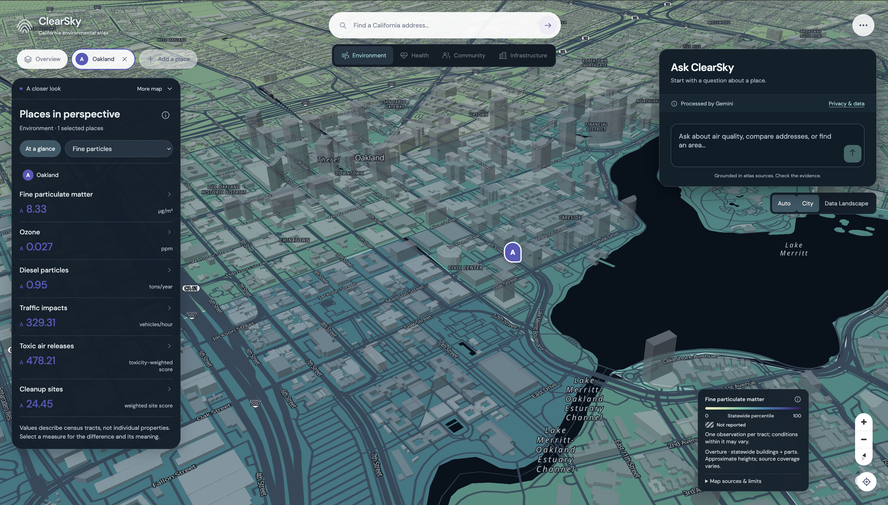
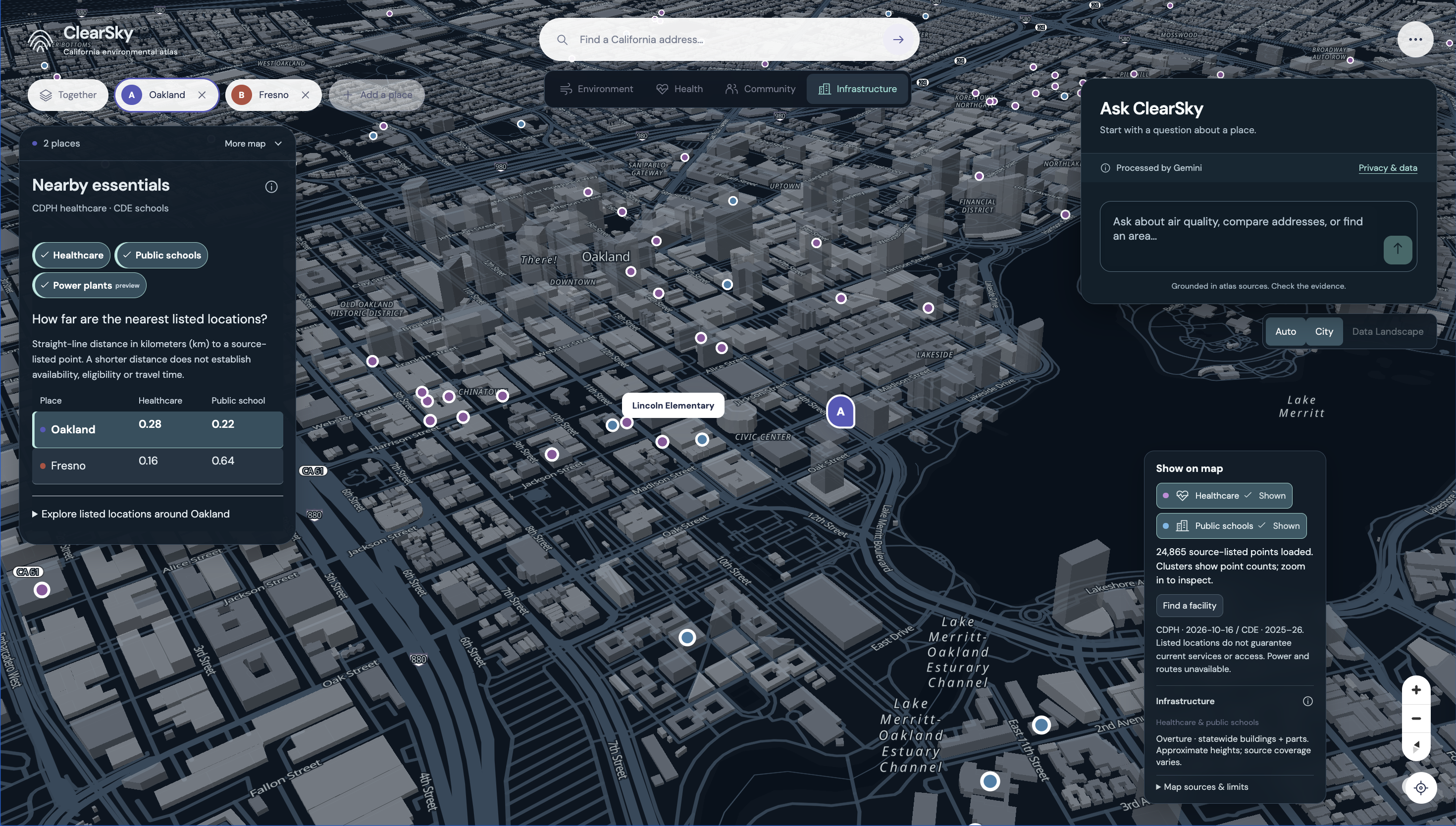
ClearSky lets users compare California addresses through environmental data, population health measures, nearby schools and healthcare. An interactive map shows the geographic context, including 3D buildings.
Users can also ask Gemini questions about selected places or search for other areas matching their priorities. The results connect back to the map and their source data.
How I built it
I used Next.js, React and TypeScript for the application, MapLibre for the map, and Python to prepare datasets covering 9,106 census tracts and 23 measures.
Addresses are resolved through Census and checked against detailed tract boundaries. The map uses simplified geometry and loads building tiles as needed to keep navigation smooth.
Gemini calls backend functions to retrieve evidence, calculate comparisons and search for areas. Searches can rank places by a selected measure or identify tradeoffs across several measures using Pareto selection.
Challenges and what I learned
Getting different datasets to work together took more effort than displaying them. Geographic identifiers, units, measurement periods and missing values all needed consistent handling.
Another challenge was keeping the map and assistant synchronized when users changed places or submitted a new question. I added cancellation and checks that prevent older responses from changing the current view.
I learned a lot about spatial data processing, rendering large geographic datasets and designing useful tools for an AI assistant. Testing complete browser interactions helped catch issues that individual functions and successful builds missed.
