
We have produced mockups and wireframes showcasing the core UI elements of this solution. These visuals highlight key user interactions, from image management and browsing to seamless insertion within Confluence pages:
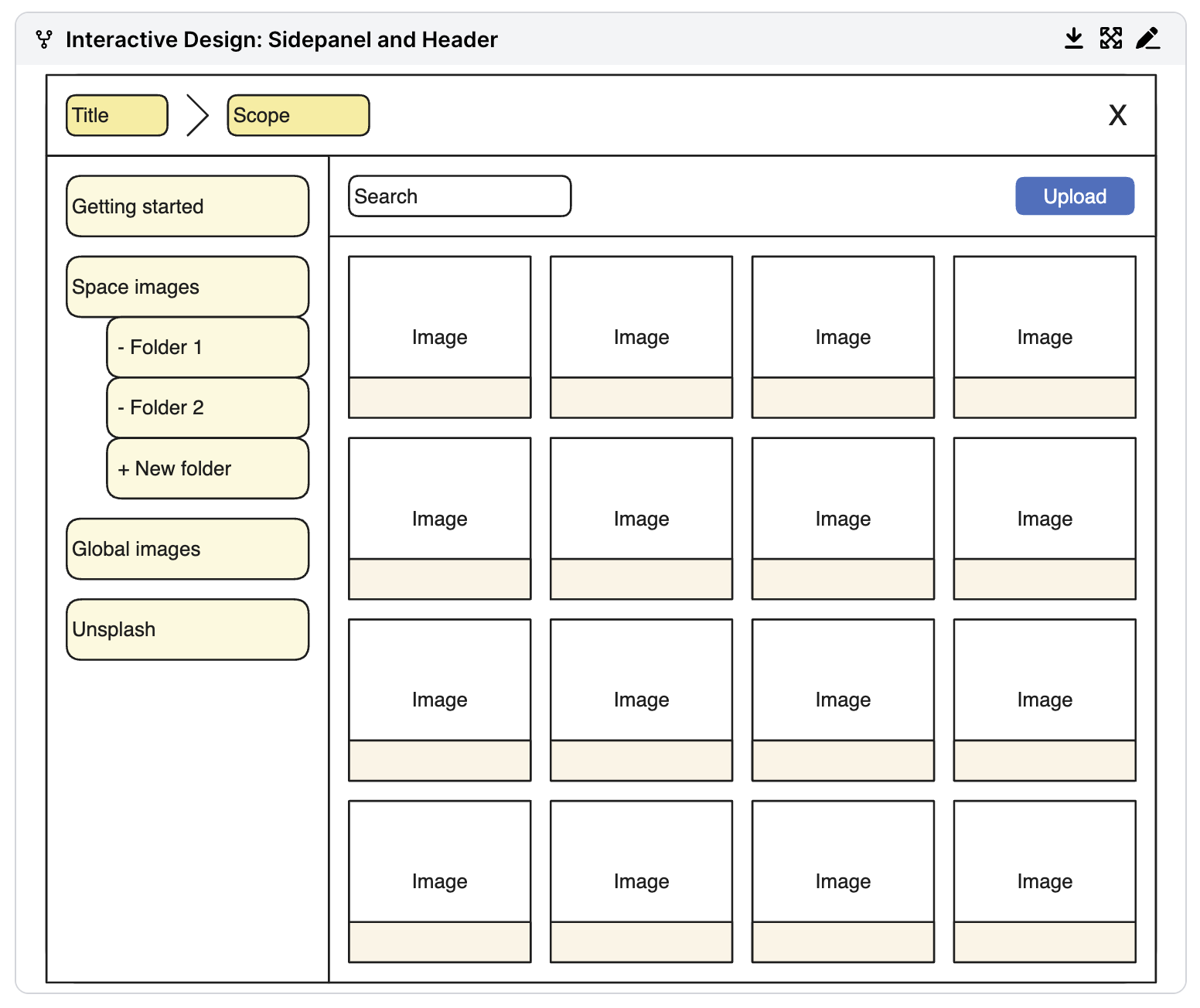
Image Management Page
- Sidebar: Displays collections (space or global). Users can quickly switch between different collections to access relevant images.
- Main Panel: Shows images within the selected collection. Users can preview and manage images in this panel, with options for upload, download, and inserting images into pages.
- Upload Options: Supports drag-and-drop uploads as well as a button for manual uploads.
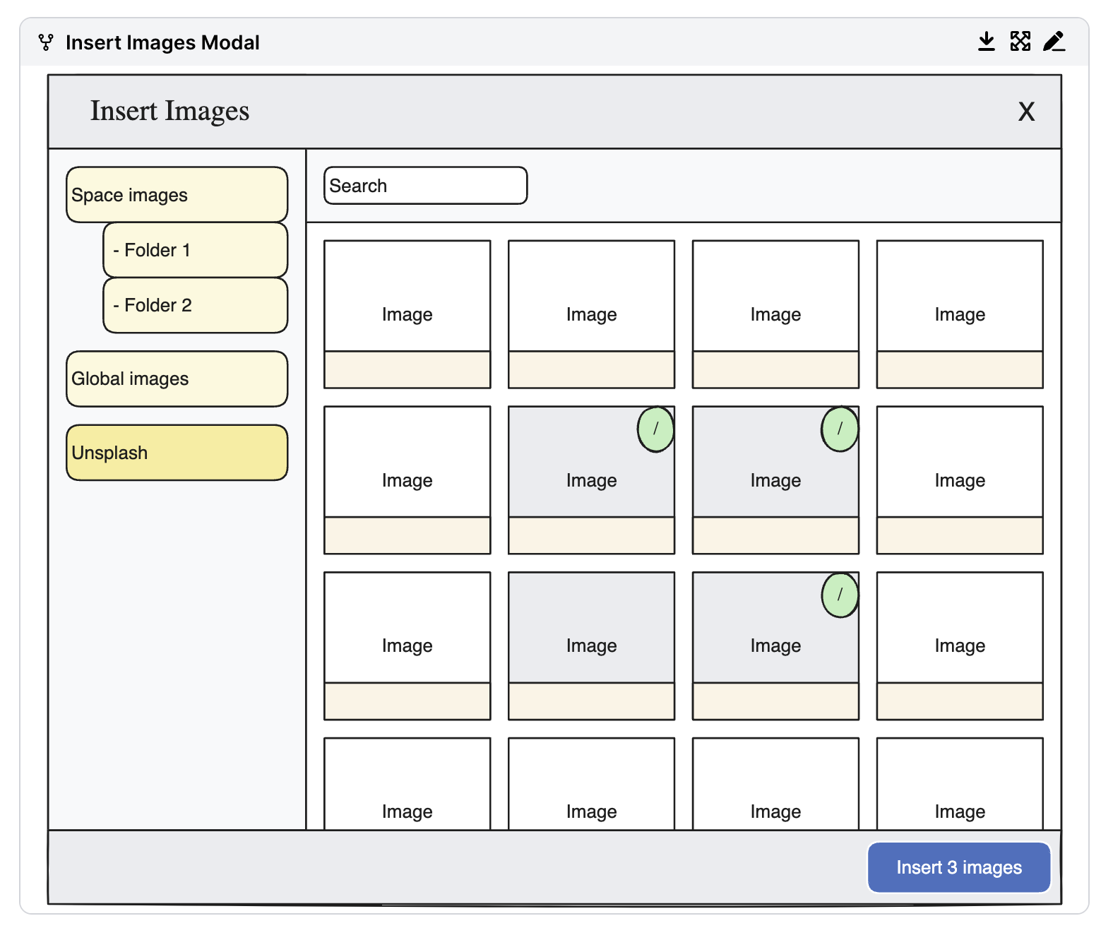
Insert Image Dialog
- Insertion Options: Users can insert single or multiple images from the dialog.
- Capable Menu: Provides quick access to the image library from any Confluence page, allowing on-the-fly insertion of images without disrupting the workflow.
View Image Page
- Detailed Image View: Allows users to open a larger version of the image, view metadata, and download the full-resolution version if needed.
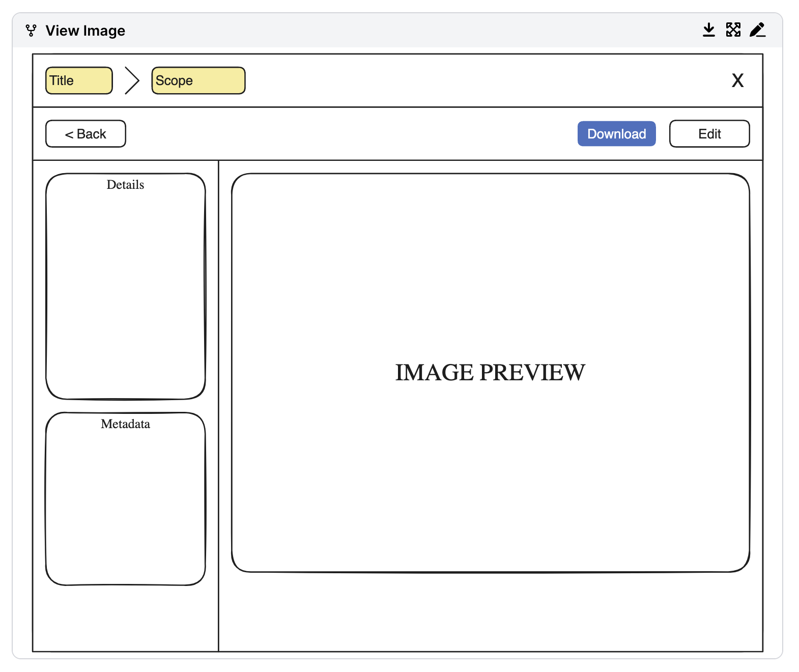
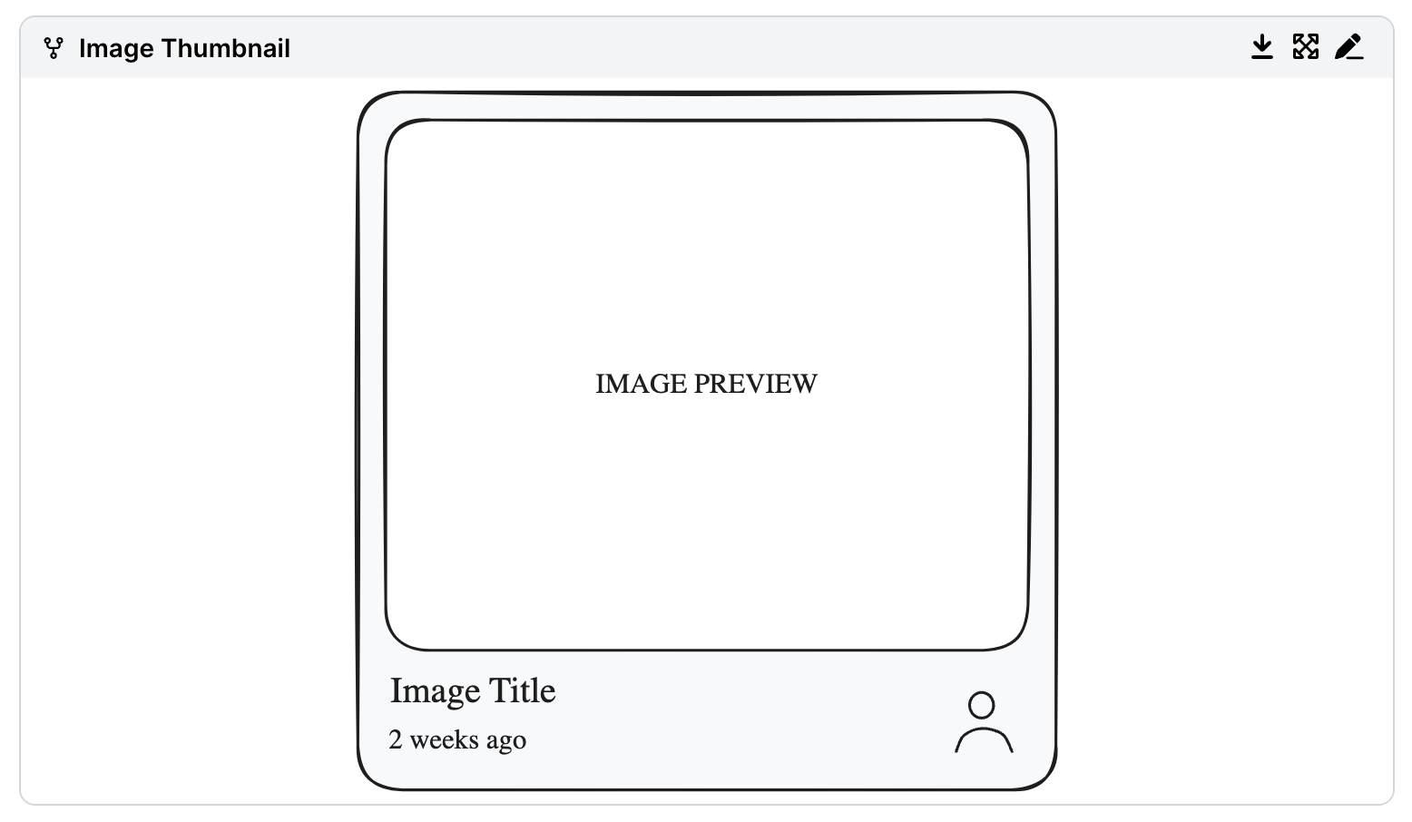
Image Thumbnail
- Thumbnail & Metadata: Displays a preview of the image, title, date of creation, and uploader.
- Hover Information: Shows additional details, such as the image description (if available), giving users more context.
Log in or sign up for Devpost to join the conversation.