-
-
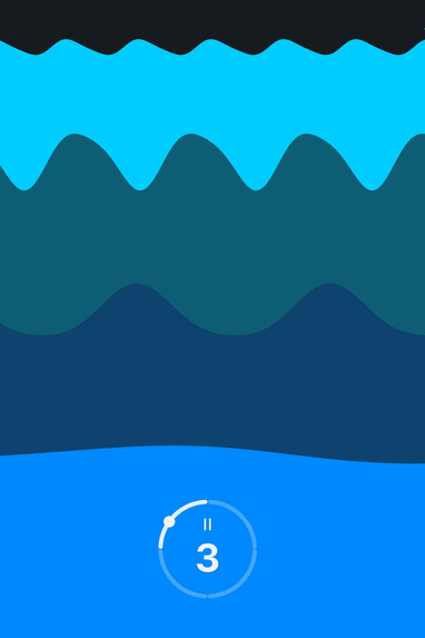
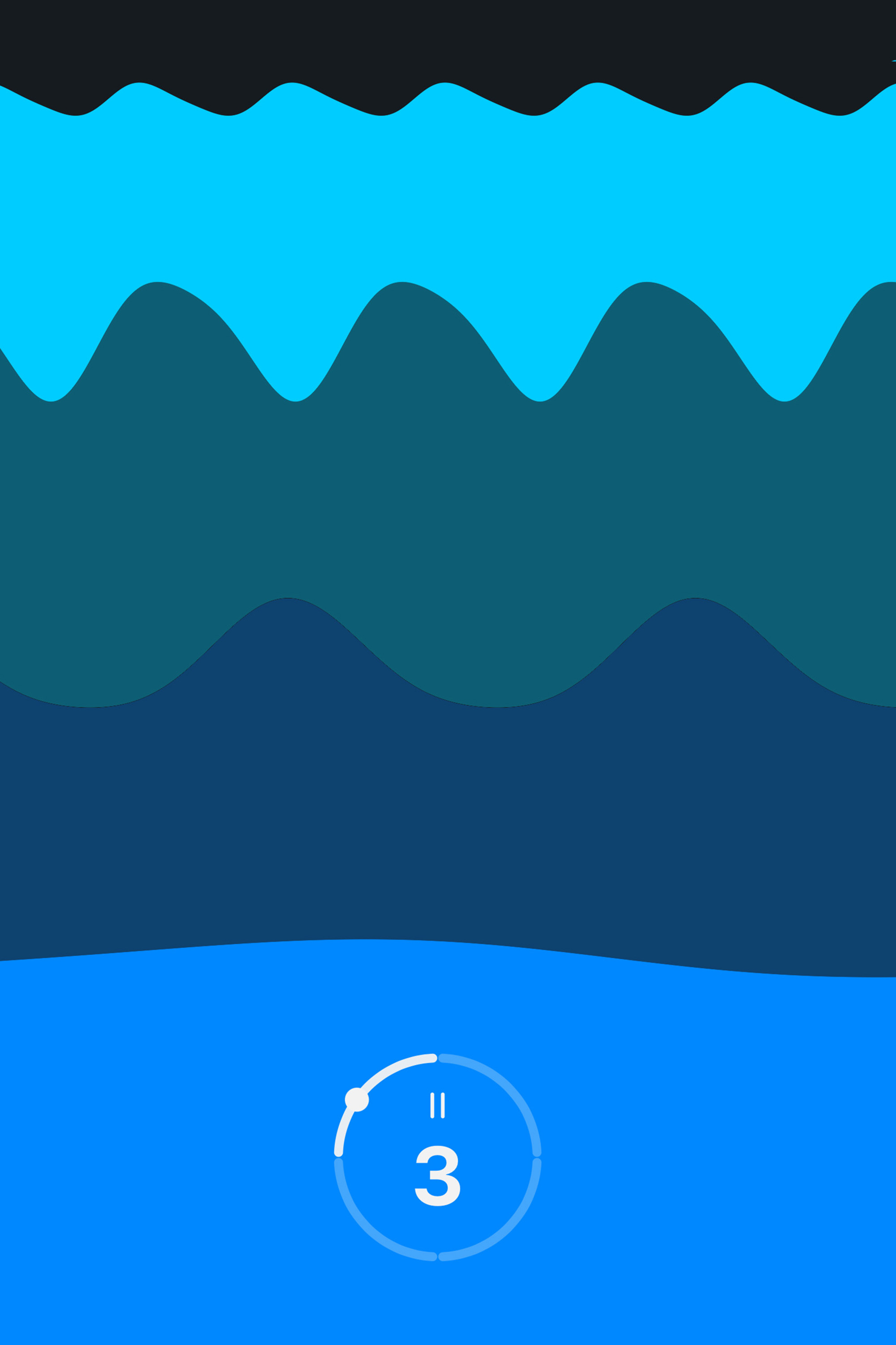
Breathe — the ring paces you, the picture keeps you company
-
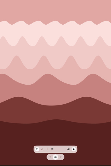
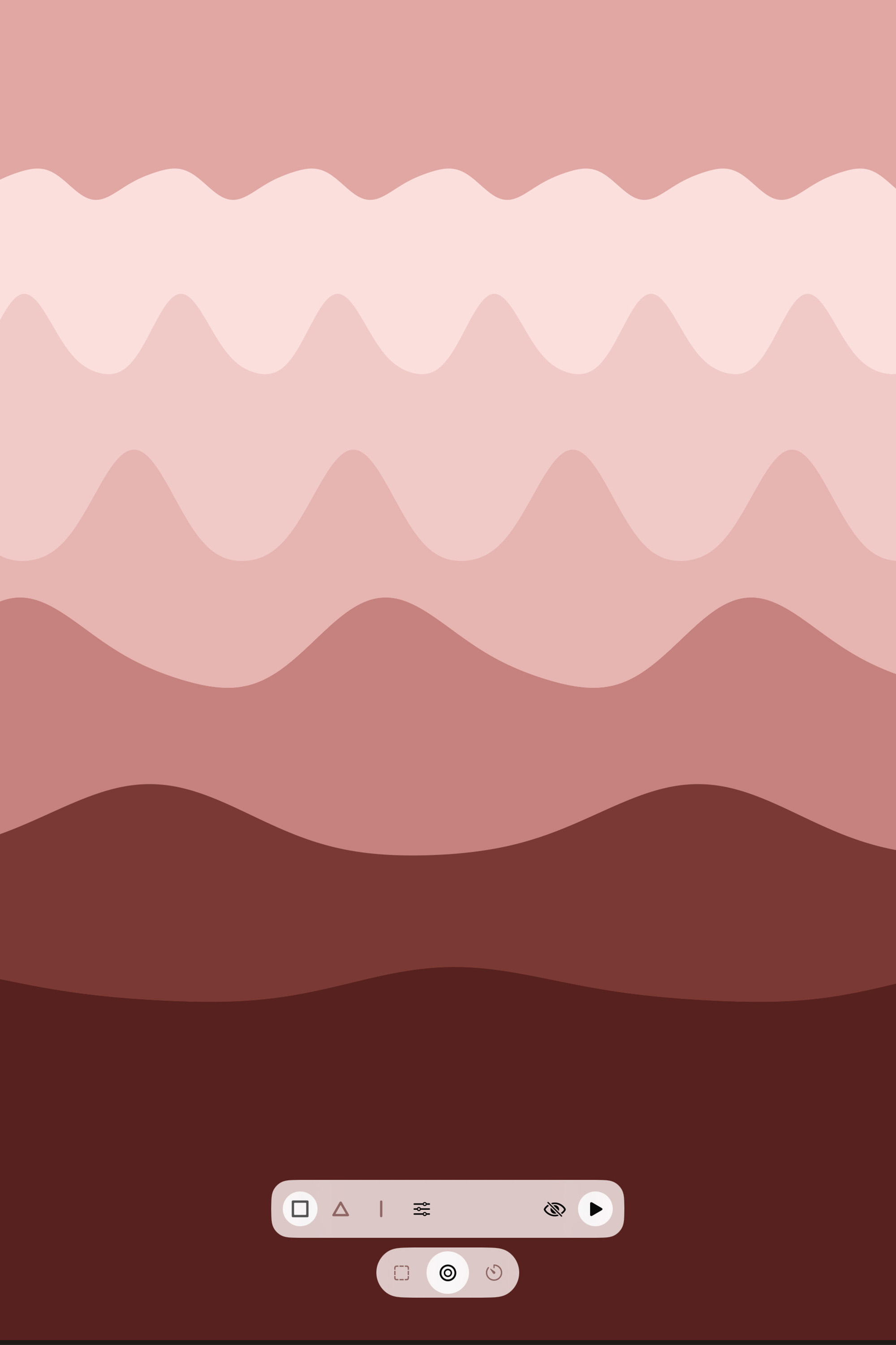
Breathe — pick box, 4-7-8, coherent, or draw your own pattern
-
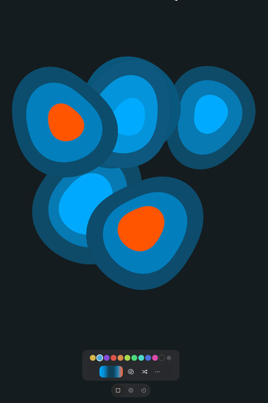
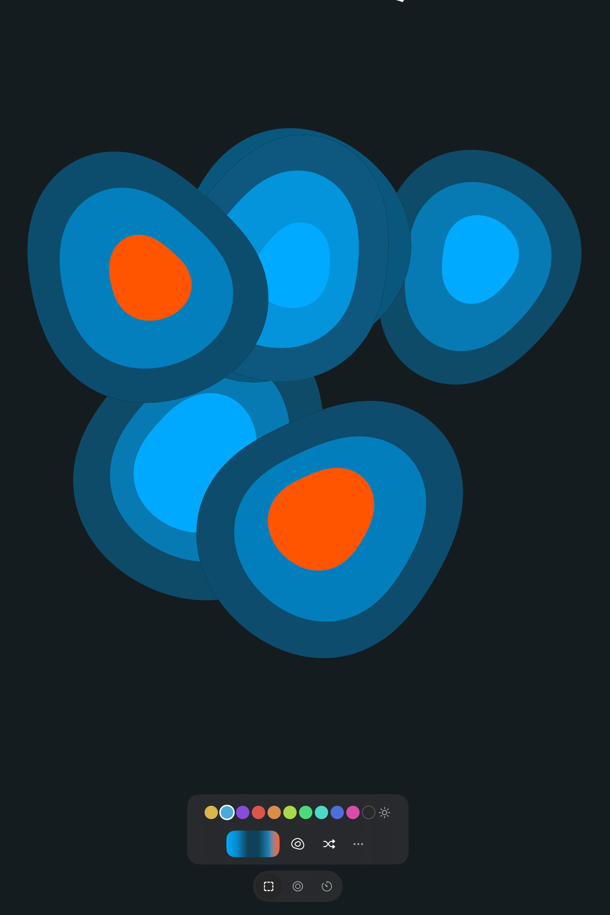
Compose — shuffle, recolor, reframe, and place your timer or ring
-
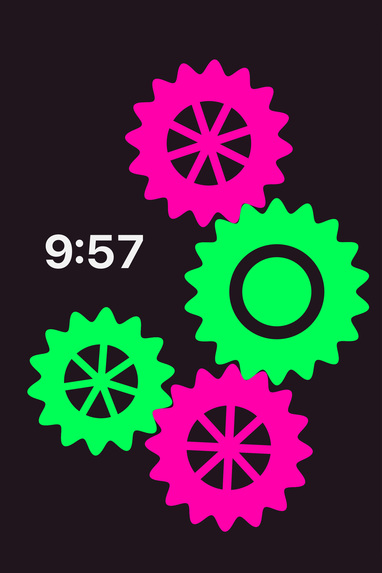
Focus timer — a countdown that lives inside the picture, as big as you like
-
App icon
Inspiration
I wanted an app for the short breaks in a day: five minutes with something that moves slowly and breathes with you or counts down. And I wanted to make something that moves. My earlier apps were built on short loops I animated by hand, first in Flash a long time ago, then in After Effects. Every loop was a file, so there were exactly as many as I had drawn. This time I wanted the loops computed on the phone itself, endless and seamless, so the person holding the phone can shuffle, recolor and reframe them instead of picking from my list.
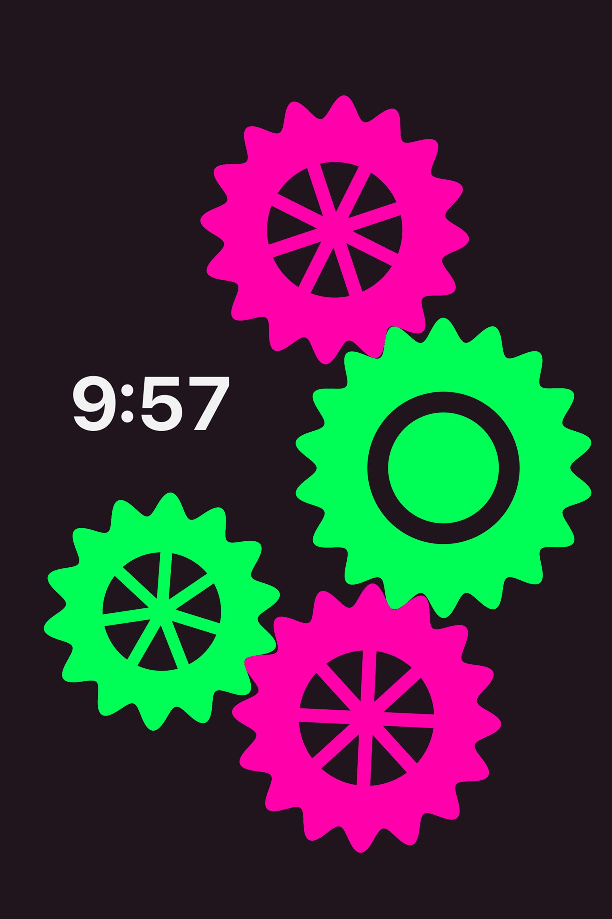
The name comes from painting: a camaïeu is a picture in shades of one color. That is also how the app renders. The shapes are drawn in gray and the color is applied afterward, which is why you can recolor a moving picture without it ever restarting.
Shipaton added a second goal. Camaïeu is the first app I charge for, and I wanted to learn subscriptions properly.
What it does
Camaïeu is a breath pacer and focus timer built on a moving picture you compose yourself.
Compose. Shuffle a picture from one of three shape families (cells, gears or waves). Color it: one hue, a hue and its complementary color, two hues of your choice, or plain gray, each in a light or a dark appearance. Frame it: pinch to full-bleed, drag, double-tap to recenter. Place the countdown or the breathing ring anywhere on the picture, tiny in a corner or across the whole screen, and pick its ink.
Breathe. Box breathing, 4-7-8, coherent breathing, or your own timing drawn on a breath-curve editor. The ring expands on the inhale, pauses while you hold and settles on the exhale, while the picture keeps moving slowly behind it and pauses when you do.
Timer. A 5, 10 or 20-minute countdown that lives inside the picture. When time is up it simply fades.
Keep it. Save looks to a shelf, share one as a short code so someone else sees exactly the same picture, or export a still or a seamless looping video.
Everything stays on your phone. The free version is a whole product: one shape family, three colors, every breathing and focus mode, still export. A subscription with a 7-day free trial unlocks the rest.
How I built it
SwiftUI and Metal, iOS 26, one person, one summer, on the side of a day job. First Swift file in July, App Store on September 1, two updates since.
Shape and color never meet: each family is a per-pixel Metal shader that outputs gray values only, and color is a 256-entry lookup table sampled in the fragment shader. Swapping the table recolors the picture mid-motion without touching geometry. Each family started as a JavaScript playground in the browser, then was ported to Metal and pinned by golden-value tests against that reference. Breathing is the loop clock itself: inhale drives the first half of the cycle, exhale the second, holds pause at the endpoints. A "look" is plain data, and one struct carries it to favorites, share codes, relaunch and export. Monetization is RevenueCat with a single entitlement; 143 tests cover families, palette, sessions, persistence and the free-tier rules.
Most of it was built in a daily co-working rhythm with Claude: I decided, sketched and tested on the device; it drafted, refactored and kept the documentation current.
Challenges I ran into
A clean screen that still offers choices. Three shape families, ten hues, four color modes, light and dark, brightness, framing, a placeable timer, breathing patterns, favorites, codes, export. The picture is the whole point and every control competes with it. The first two releases were too busy. Version 1.2 rebuilt the interface around one switch, Compose / Breathe / Timer, where each segment replaces the whole chrome, every expansion opens in one slot at one height, and the icons fade after four seconds.
Building in public, and being seen. I tend to stay away from social media, so for Shipaton I built a small system instead of a habit: a devlog on my own site with an RSS feed, a Bluesky account to echo each post, the Shipaton Discord for launches and questions, and three posts a week. Writing a real post every other day while shipping the thing you are writing about is a second job, and the hardest part is keeping it up when the room seems empty. Reach stayed small. But the replies that did come changed the app: the icon and the onboarding decision were both settled by them, and that turned out to be the point.
A paywall that came too soon. On the first TestFlight build, my own reaction was that the offer felt pushy. The price was fine; the layout was the problem. Free and premium colors were mixed in the same row, so a first tap almost anywhere opened the subscription sheet. The fix: free items come first in every row, with a thin line before the premium ones; a first tap on a premium item just lifts and settles the group; a second tap adds one line of explanation; only a third tap opens the plans. The app brings up the subscription itself once, and only once, on the fifth launch.
A picture that drifted upward. After every relaunch, the picture sat a little higher on the screen than before. Logging every touch showed why: when you swipe up from the bottom to go home, iOS delivers the first part of that swipe to the app as a real drag before taking it over. My framing gesture was applying those touches. The fix was three layers: ignore drags that start in the home-indicator band, rewind a drag that turns out to be a system gesture, and save the framing only once the gesture has actually ended.
A rejection. 1.0 was rejected by an automated check for a missing Terms of Use link in the App Store description. Metadata fix, same build, resubmitted the same day and live on September 1.
Accomplishments that I'm proud of
Camaïeu is live, with two updates shipped inside the Shipaton window, the second a full rework of the interface prompted by my own doubts rather than a bug. The countdown and the breathing ring are part of the picture: you drag them anywhere, pinch them as small as a corner or as big as the screen, and pick their ink, and the placement travels with the look into favorites, codes and exports. Recoloring mid-motion is the architecture made visible. And I kept a public devlog for six weeks and let it change the app.
What I learned
Monetization. A subscription is a design problem first: where the free things sit on screen decides whether the paywall reads as an offer or an interruption. An Apple free trial is a purchase, so the app should stop pointing at it.
Metal. My first shader-based app. Keep the GPU doing one thing per frame and keep everything else out of it; the whole app runs at 60 fps on ProMotion under 6 ms of GPU time.
Instruments. I measured before optimizing, and the render loop was already cheap. The real work was elsewhere: a ring redrawing for no reason, a paused session still presenting frames, and a phone that misbehaved once I faked a thermal state.
Working with Claude. Co-working every day with an AI on a real product taught me to write decisions down, to test each step on the device, and to say what I want precisely enough that a draft comes back right. Four documents lived alongside the code and were kept current with it: a summary of what the app is, a plan, a decision log (every choice with its reasoning, including the ones that failed), and a set of rules distilled from those decisions.
What's next for Camaïeu
French localization, since the site already has it. Then new shape families and more color options, one at a time, each earning its place the way cells, gears and waves did.
Built With
- avfoundation
- metal
- revenuecat
- swiftui
- telemetrydeck

Log in or sign up for Devpost to join the conversation.