Inspiration
Currently, data centers are being proposed across New Jersey, New York and the rest of the US at record pace. Each one can draw as much power as a small city, use hundreds of thousands of gallons of water a day, and sit next to wetlands, flood zones, parks and homes. In the United States, data centers consumed about 176 TWh by 2023, representing 4.4% of total U.S. electricity consumption. About two-thirds of data centers built since 2022 are located in water-stressed or drought-prone regions, putting immense pressure on local ecosystems. Environmental Law Institute, 2026
The information to judge a site is all public: FEMA flood maps, wetland inventories, protected-land databases, the Census, grid emissions data. But it's scattered across dozens of government map servers that only GIS specialists know how to use. Neighbors usually find out about a project at the zoning hearing, when it's almost too late to ask good questions. Current trackers show where projects exist and what disputes are happening; not what is on the land, what permits the site might trigger, or what to be concerned about.
We wanted to flip that: see what's on the land before the build, in plain language, for everyone.
What it does
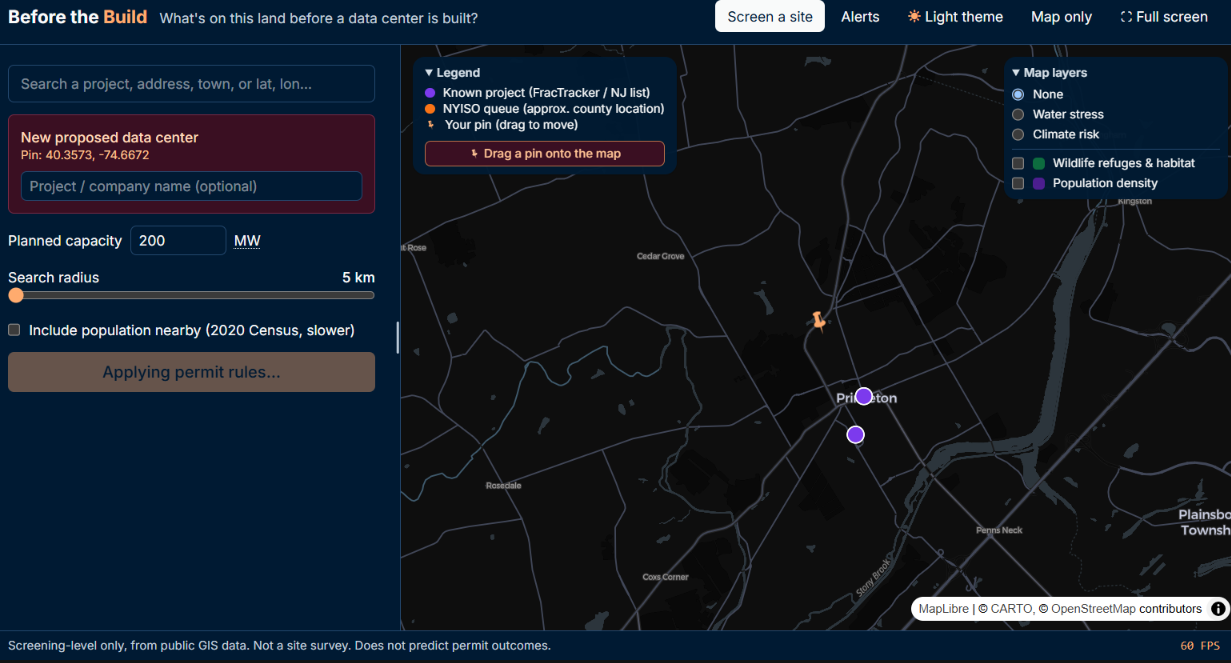
Before the Build is a site-impact screening tool. Drop a pin anywhere in the US (or pick one of 1,600+ known and proposed data centers from FracTracker, the NYISO grid queue and SJ Climate News), enter a size in megawatts, and in seconds you get:
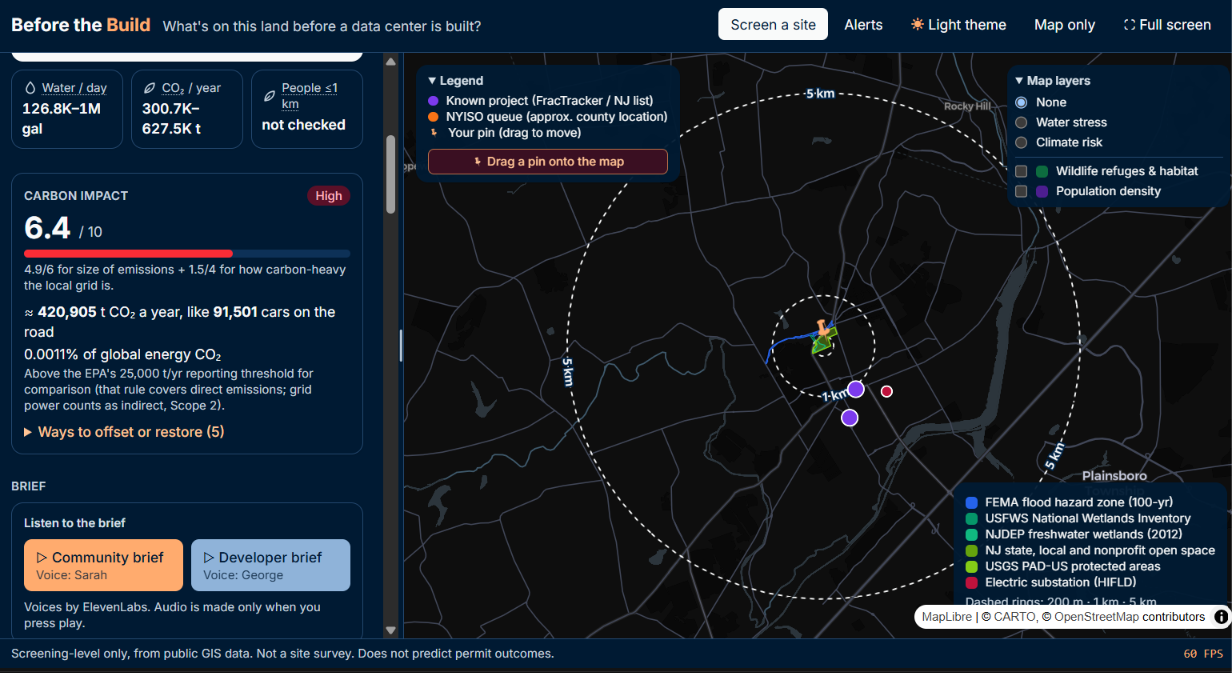
- Findings: wetlands, 100-year flood zones, protected land, critical habitat, NJ Highlands/Pinelands/coastal zones, power lines and substations, with exact distances (200 m / 1 km / 5 km rings, expandable out to 100 km).
- Likely permit triggers: e.g. Clean Water Act 404, NJDEP freshwater wetlands, Green Acres, each with a citation and a delay-risk level.
- Estimated demand: electricity, water, CO₂ and power cost as honest ranges, using the local grid's emissions rate.
- Lower-risk spots nearby: the app tests up to 40 nearby points against the same rules and suggests where the project would trigger fewer reviews.
- A plain-language brief: key facts, what residents can do (hearings, comment periods, questions to ask), and what developers should check. Every bullet cites the finding it came from.
- Listen to it: both briefs can be played aloud with ElevenLabs voices, so the results reach people who can't easily read a dense report.
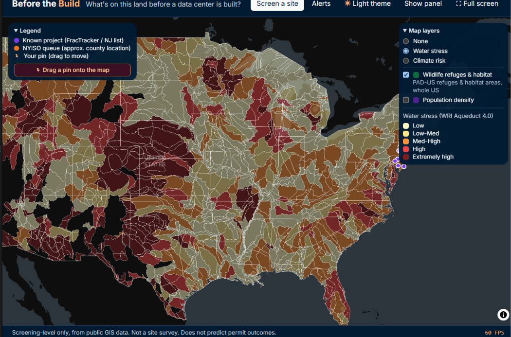
- National map overlays: water stress, climate risk, population density and wildlife refuges.
- Carbon impact score (0–10): how heavy the project's carbon footprint would be: up to 6 points for the size of its emissions and up to 4 for how carbon-heavy the local grid is. It shows the real-world scale (equivalent cars, share of global CO₂, the EPA's reporting threshold) and concrete ways to offset or restore it, such as how many MW of new solar or acres of forest would balance it, plus wetland restoration and water-saving cooling when the site calls for it.
It is deliberately screening-level: it never predicts whether a permit will be approved, and anything it couldn't check is labeled unknown. It also provides additional advice for companies and community members on how they can either prevent the data center from occurring to checking the environmental impact/trace it will leave behind for the company.
How we built it
- Frontend: React + Vite + Tailwind 4 + MapLibre GL, with a light/dark theme built on a single color palette and checked against WCAG AA contrast.
- Backend: FastAPI (Python) with Shapely and PyProj. All distances are measured in an equal-area projection (EPSG:5070), so a "1 km" buffer really is 1 km anywhere in the country.
- Data: 20+ public ArcGIS layers (FEMA NFHL, USFWS NWI, NJDEP, PAD-US, HIFLD, Census 2020, WRI Aqueduct, FEMA National Risk Index, EPA eGRID, EIA), fetched on demand per area, cached in Turso (hosted SQLite), and downloaded in parallel.
- Rules: a readable
rules.yamlmaps findings to permit triggers (e.g. a wetland inside the 200 m site buffer → 404 review, high delay risk*), so anyone can audit or extend them. - Carbon score: a log scale on yearly CO₂ (10,000 t scores 0, 1,000,000 t scores 6) plus the local EPA eGRID emission rate (up to 4 points), with offset sizes from EPA greenhouse-gas equivalencies and typical utility-scale solar output.
- Estimates: ranges from LBNL's 2024 data center energy report. For a site of capacity P (MW) running at utilization u:
$$E = P \cdot u \cdot 8760 \ \text{MWh/yr}$$
$$\text{CO₂} = \frac{E \cdot r}{2000} \ \text{tons/yr}$$
where r is the local EPA eGRID emission rate (lb CO₂ per MWh).
- Population nearby: area-weighted over Census tracts intersecting a circle C:
$$N(C) = \sum_i p_i \cdot \frac{A(t_i \cap C)}{A(t_i)}$$
- AI briefs: Gemini writes the briefs from only the structured findings. A validator rejects any bullet without a valid citation tag ([F1], [R2], …) and retries; if the model fails, a template brief takes over, so the app never shows an uncited claim.
- Voice: ElevenLabs text-to-speech (Flash model, two voices), generated only on demand and cached so replays cost nothing.
- Hosting: API on Render, site on GitHub Pages; secrets live only in environment variables, plus a pre-commit hook that blocks keys.
Challenges we ran into
- Government map servers are inconsistent. Some ignore paging, some time out, some cap results silently. We wrote a defensive fetcher (repeat-page detection, timeouts that degrade to "unknown" instead of hanging) and a health check that skips a dead server instead of waiting on it.
- Speed. Our first new-area screening took 30–60 s. Parallel downloads, one-query cache checks and background brief generation brought it to ~13 s for a new area and ~4 s for a cached one.
- Database size. National layers pushed our SQLite file past 100 MB. We simplified geometry, rounded coordinates to ~1 m, and moved to Turso.
- Keeping the AI honest. LLMs love to add facts. The citation validator and template fallback were the only way we could trust the output in front of residents.
- Searching 100 km without downloading 100 km. Instead of pulling every wetland in a huge circle, we ask each server "how many within 10 / 25 / 50 / 100 km?" and report the band the nearest one falls in.
- Free-tier limits. Gemini quotas and ElevenLabs' free plan (no library voices over the API) forced fast fallbacks, built-in voices and aggressive caching.
Accomplishments that we're proud of
- Every claim in a brief, provides traces back to a map finding you can click.
- Works nationwide, with deeper state rules for NJ, NY and DE.
- Accessible by design: keyboard navigation, screen-reader labels, AA contrast in both themes, reduced-motion support, and audio briefs.
What we learned
- Public data is powerful but fragmented. Most of the work is making it trustworthy, fast and honest about its gaps.
- Designing for two audiences (residents and developers) from the same facts forced us to separate what is true from what to do about it.
- Constraining an LLM with structure and validation beats prompting harder.
What's next
- Shareable links and a printable PDF report for town hearings.
- Spanish (and other language) briefs and audio.
- More state permit rules beyond NJ, NY and DE.
- Alerts when new data center projects enter a grid queue near you.
Built With
- carto
- css
- elevenlabs
- esri
- fastapi
- github
- google-gemini
- html
- javascript
- maplibre-gl
- openstreetmap
- pydantic
- pyproj
- python
- react
- render
- shapely
- sql
- sqlite
- tailwind-css
- turso
- us-census-api
- uvicorn
- vite

Log in or sign up for Devpost to join the conversation.