-
-
App Screenshot 2
-
App Screenshot 3
-
App Screenshot 4
-
App Screenshot 8
-
App Screenshot 6
-
App Screenshot 7
-
App Screenshot 1
-
App Screenshot 5
Inspiration
Every air quality app we'd ever used — IQAir, Google Maps, WAQI — did the same thing: show you a number and leave you to figure out what to do with it. Meanwhile, cities like Hanoi operate just 2 automatic air quality monitoring stations for 8 million people. That's roughly one sensor per 4 million residents. Entire neighborhoods, school zones, and daily commute routes are invisible to existing platforms.
We kept asking the same question: why does no app actually route you away from pollution? Google Maps optimizes for time. Waze optimizes for traffic. Nobody optimizes for what you're breathing. That gap became AirLens.
What it does
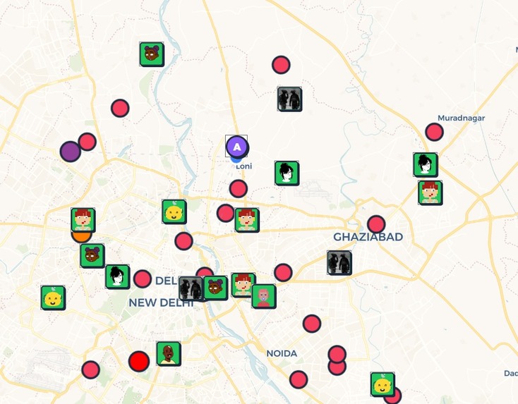
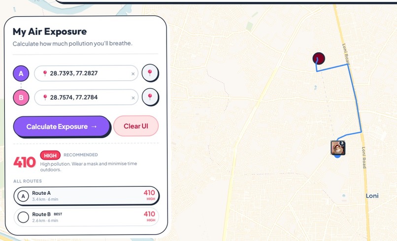
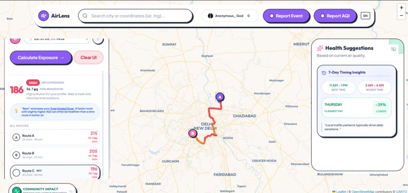
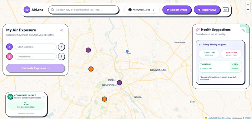
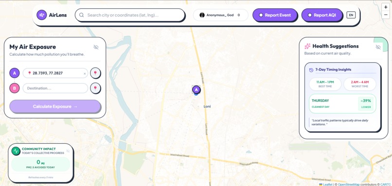
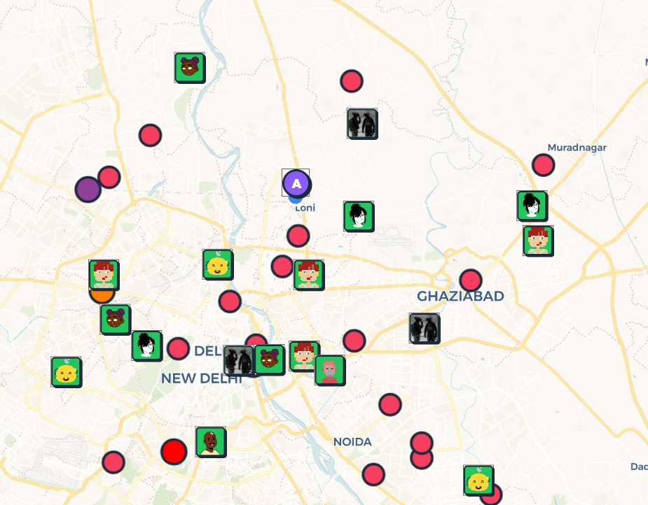
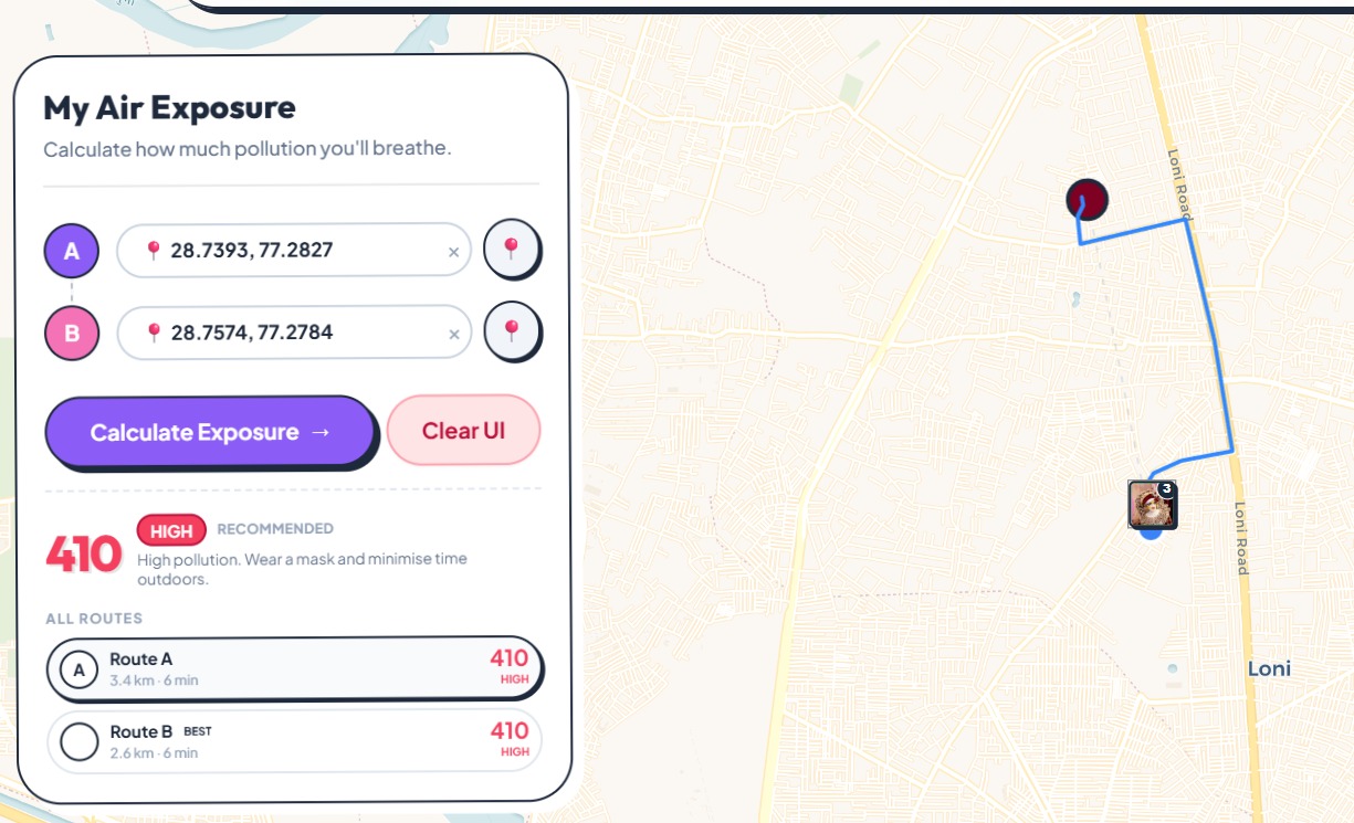
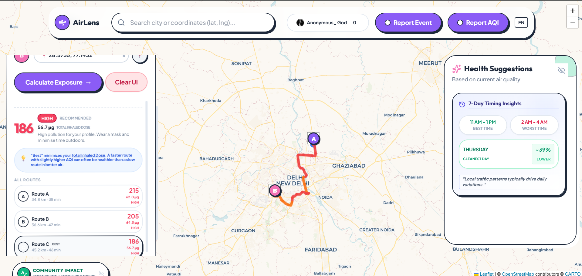
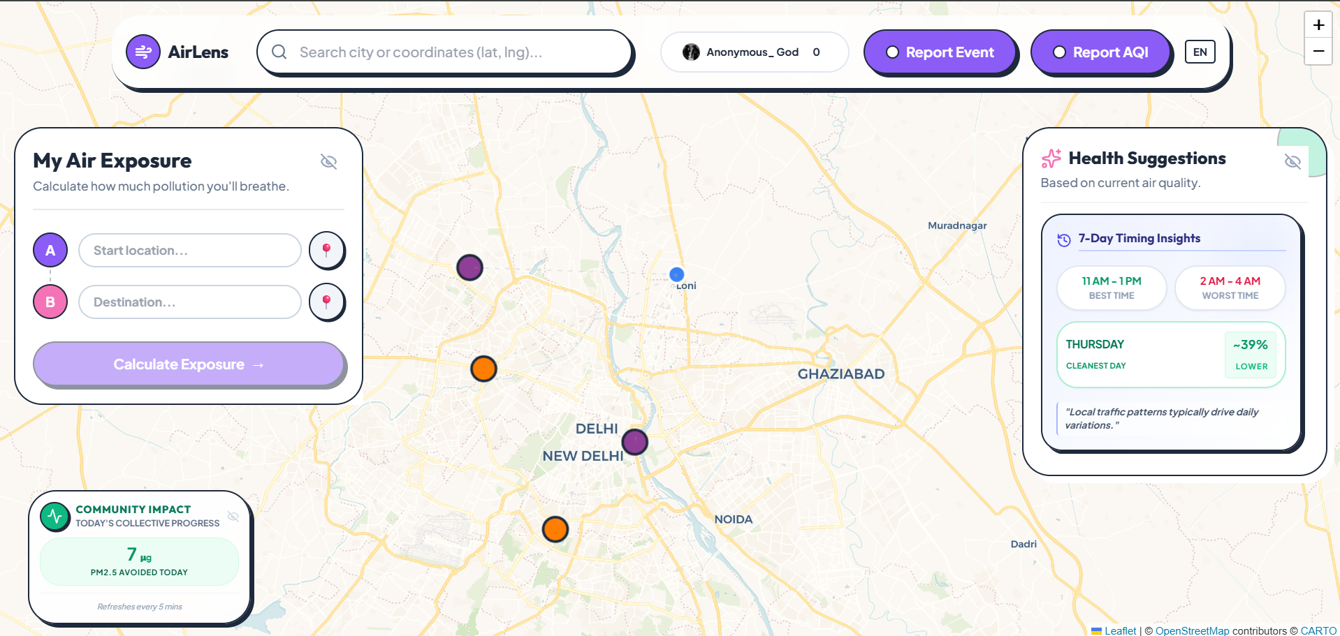
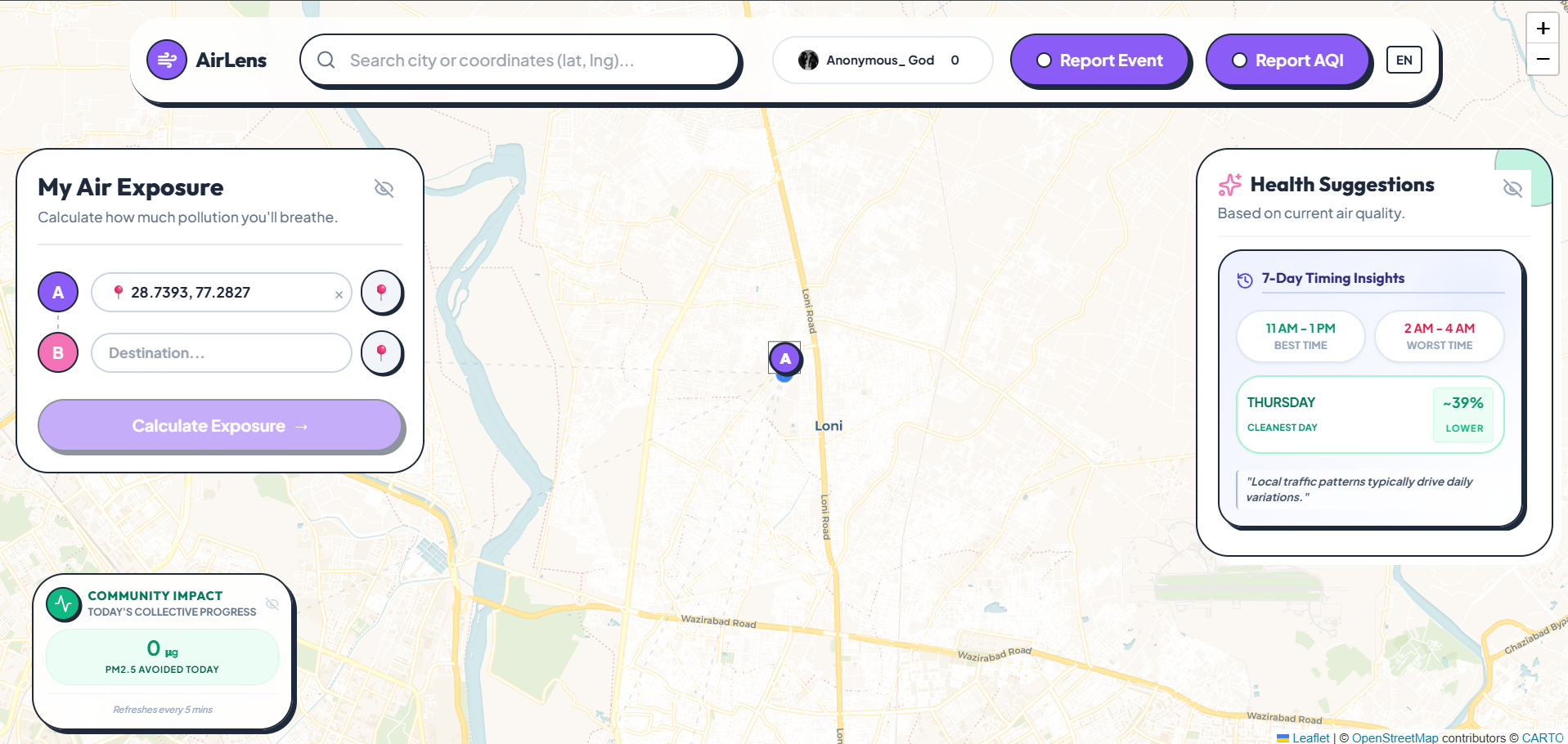
AirLens calculates your actual inhaled pollution dose across multiple route options and recommends the cleanest one — not the fastest. It fuses official sensor data (WAQI, OpenAQ) with real-time community reports (fires, smoke, traffic) to build a hyperlocal air quality map even in cities where official infrastructure can't.
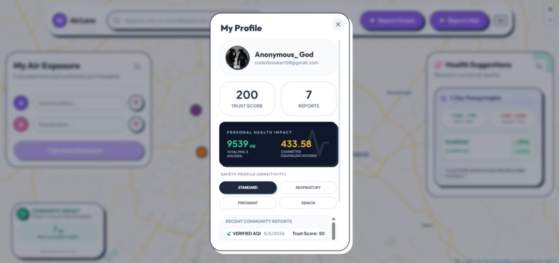
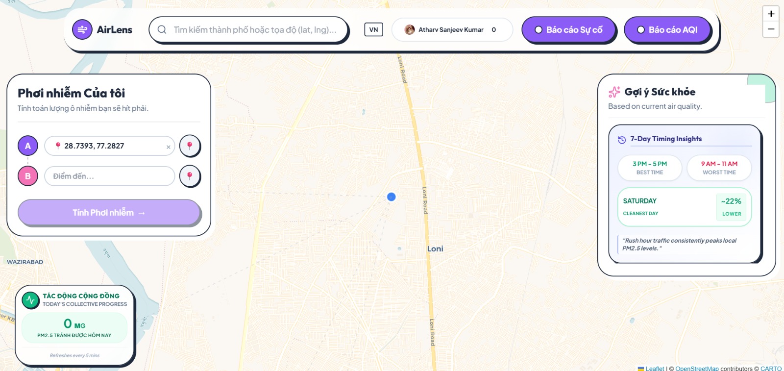
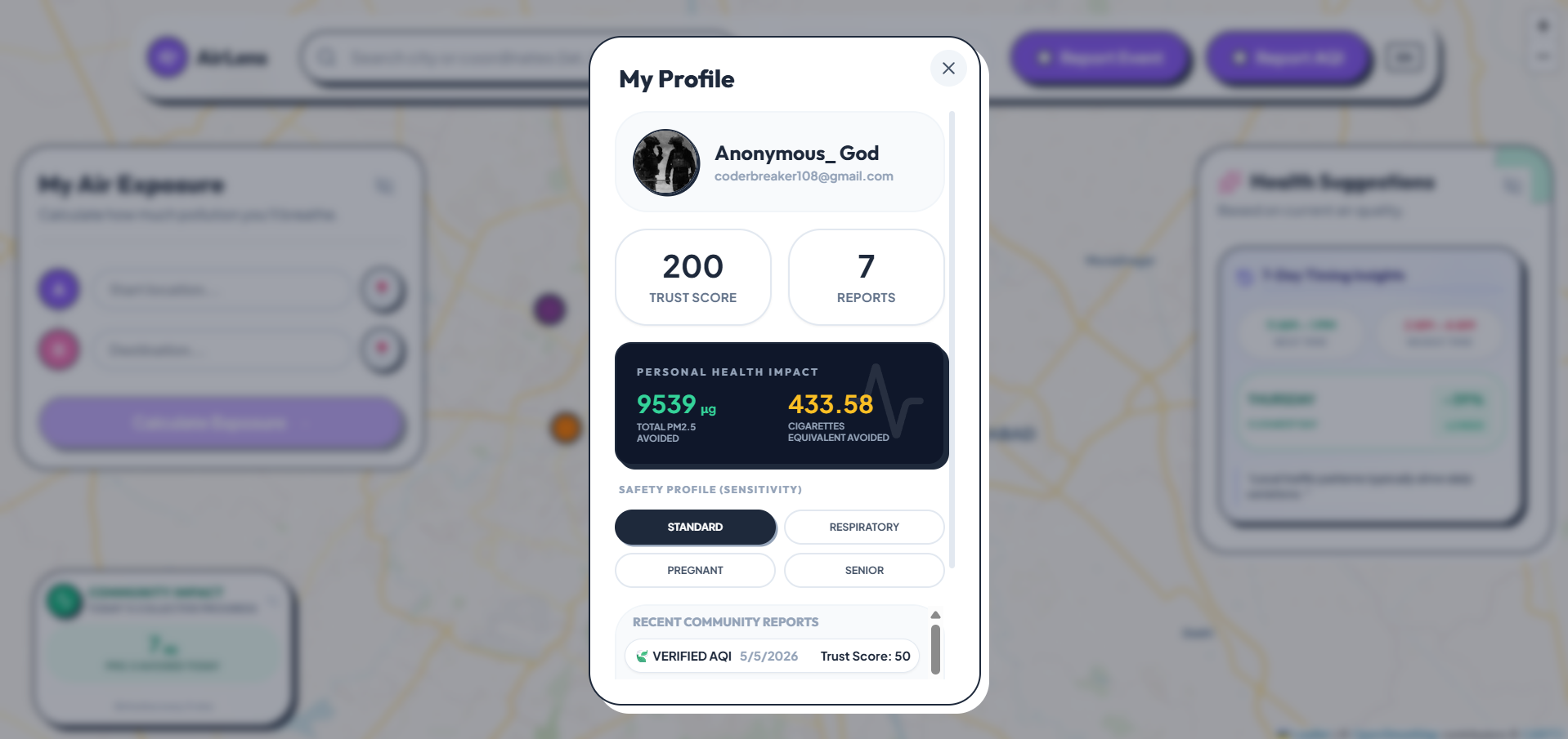
It also adapts to who you are — a route that's "moderate" for a healthy adult can be flagged as risky under a Respiratory, Pregnant, or Senior health profile, since safe thresholds aren't one-size-fits-all.
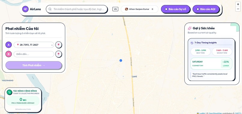
We also use generative AI to translate raw exposure data into language people actually understand. Instead of just showing "847 μg avoided this week," AirLens generates a short, personalized health narrative — something like "You avoided roughly the equivalent of 2 cigarettes' worth of particulate this week. Your highest-risk day was Tuesday, where your usual route hit AQI 167 versus 94 on the alternative you took." The goal was simple: AI shouldn't just power the backend math — it should be the thing that makes the math mean something to a 16-year-old or a grandparent who's never heard of PM2.5.
How we built it
The core of AirLens is a Cumulative Inhaled Dose (CID) model computed at every waypoint along a route:
$$ D = \sum_{i=1}^{n} (C_i + P_i) \cdot T_i \cdot R $$
where $C_i$ is background PM2.5 at waypoint $i$, $P_i$ is a localized penalty from nearby community-reported hazards, $T_i$ is time spent in that segment, and $R$ is the user's breathing rate (varied by health profile, derived from EPA exposure factor references).
Community hazard penalties decay spatially using an inverse-distance model:
$$ P(d) = \frac{E_{base}}{1 + (d/\sigma)^2} $$
and temporally, so a fire reported 5 minutes ago weighs more heavily than one reported 20 hours ago.
On top of this numeric core, we layered an LLM-powered narrative engine: a weekly job feeds each user's route history, exposure totals, and health profile into an AI prompt that generates a personalized, plain-language summary — turning a wall of micrograms and AQI deltas into something a non-technical user can actually act on.
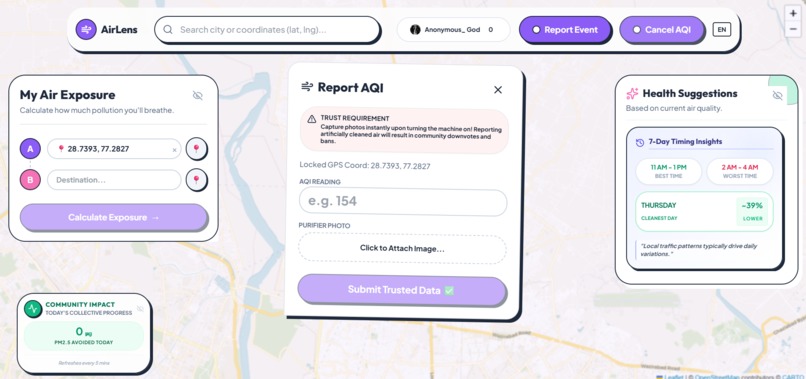
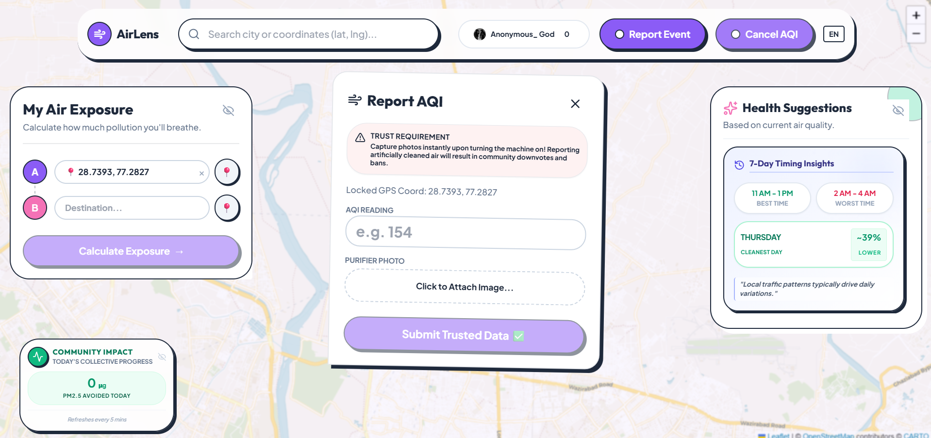
To keep the community layer trustworthy, every purifier-reported AQI value is cross-validated against the nearest official station — readings deviating more than 35 AQI points are automatically flagged as outliers and down-weighted in scoring, alongside geohash-based rate limiting to block spam.
Stack: Vue 3 + Leaflet for the frontend, Flask for the backend, Valhalla for routing, an LLM API for the narrative layer, WAQI/OpenAQ for baseline air data, with Redis-backed geospatial caching.
Challenges we ran into
The hardest part wasn't the code — it was making the science actually defensible. Early on, our dose model "looked right" but the units didn't survive scrutiny under unit analysis. We had to go back to EPA exposure factor literature to justify every breathing rate constant, and rethink how we modeled risk for vulnerable groups instead of just scaling numbers up arbitrarily.
Getting the AI narrative layer right was its own challenge — early prompts produced generic, forgettable summaries. We had to constrain the model tightly to ground every sentence in actual user data (real AQI deltas, real μg values) rather than letting it generate vague, feel-good text that wasn't backed by anything real.
We also had to solve a chicken-and-egg problem: a community-powered air quality map is useless with zero community data. We designed the system so official station data always provides a usable baseline, while community reports progressively sharpen accuracy as adoption grows — so the product is functional on day one, not just at scale.
What we learned
That rigor matters even in a hackathon. It's easy to build something that looks scientific; it's much harder to build something where every formula holds up when a domain expert asks you to defend it. We also learned a lot about spatial data structures (geohashing), API rate-limit management under load, and how to design trust systems that degrade gracefully instead of failing outright when data is noisy or adversarial.
We learned that AI is most powerful not as a gimmick bolted on top, but as a translation layer — taking something technically rigorous and making it human. The math doesn't change anyone's behavior. A sentence they understand does.
Most of all — we learned that solving an infrastructure gap doesn't always require infrastructure. It just requires using what people already have: their phones, their purifiers, and their willingness to report what they see.
Built With
- flask
- leaflet.js
- openstreetmap
- pinia
- valhalla
- vue


Log in or sign up for Devpost to join the conversation.