-
-
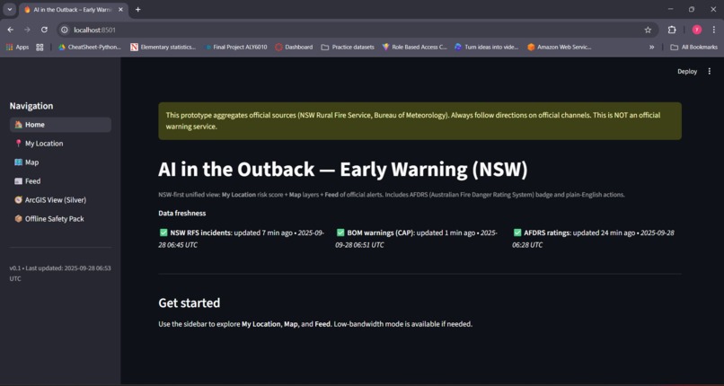
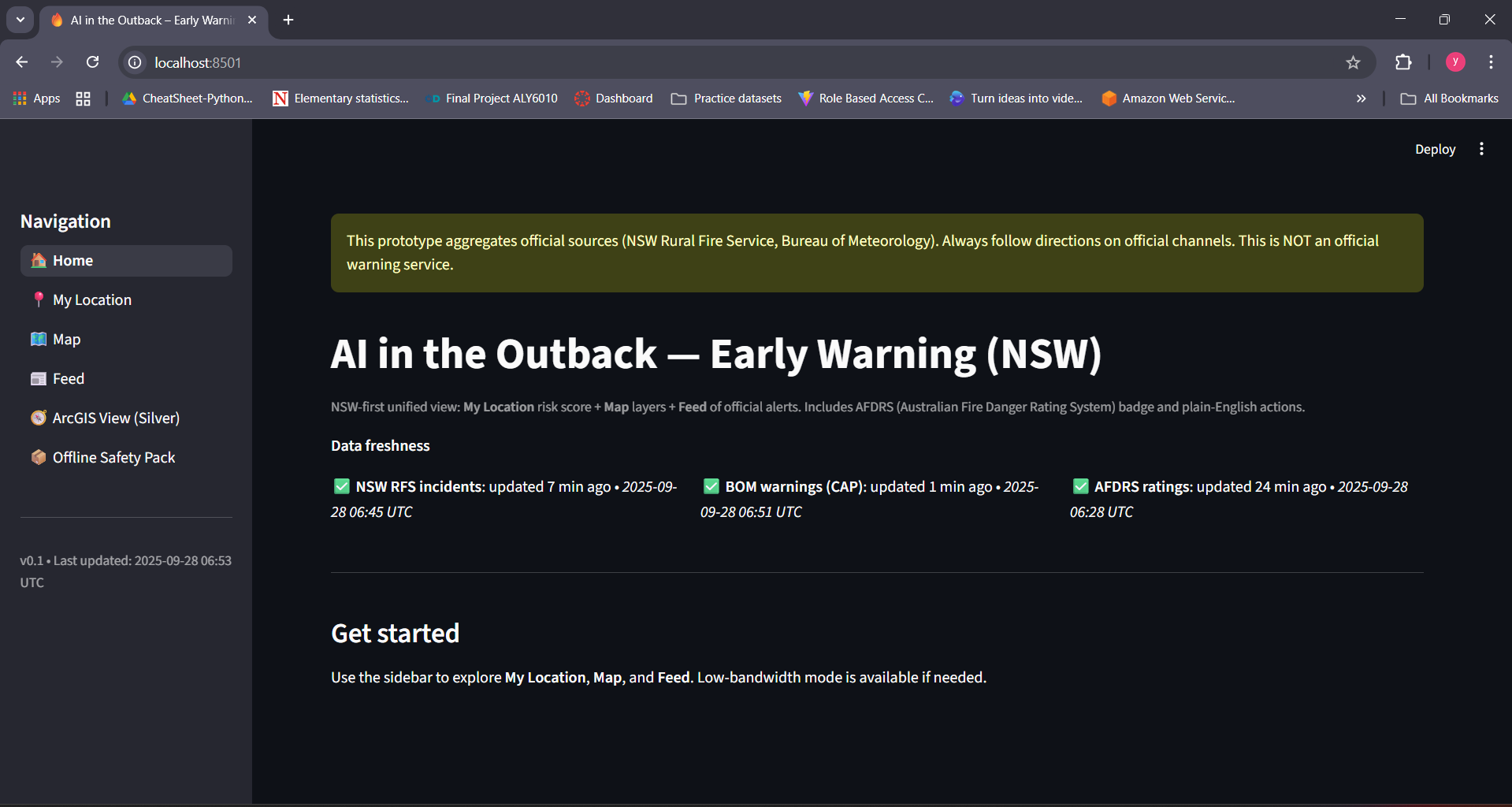
Unified dashboard with live data freshness badges for RFS, BOM, and AFDRS feeds.
-
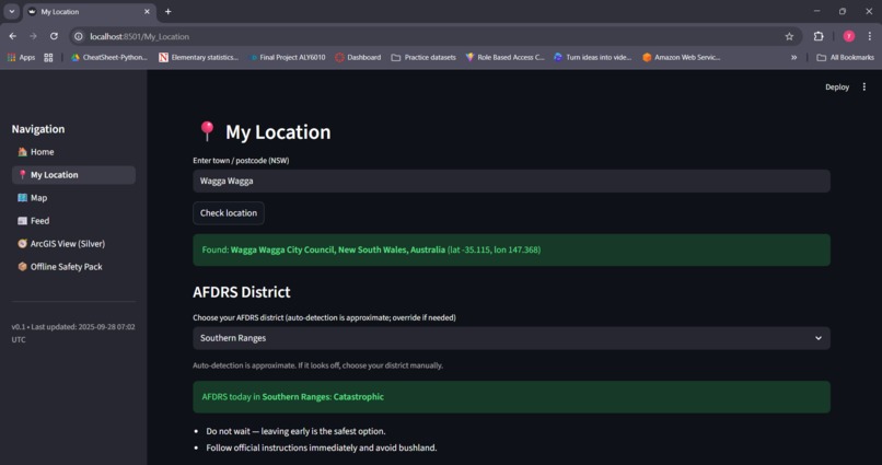
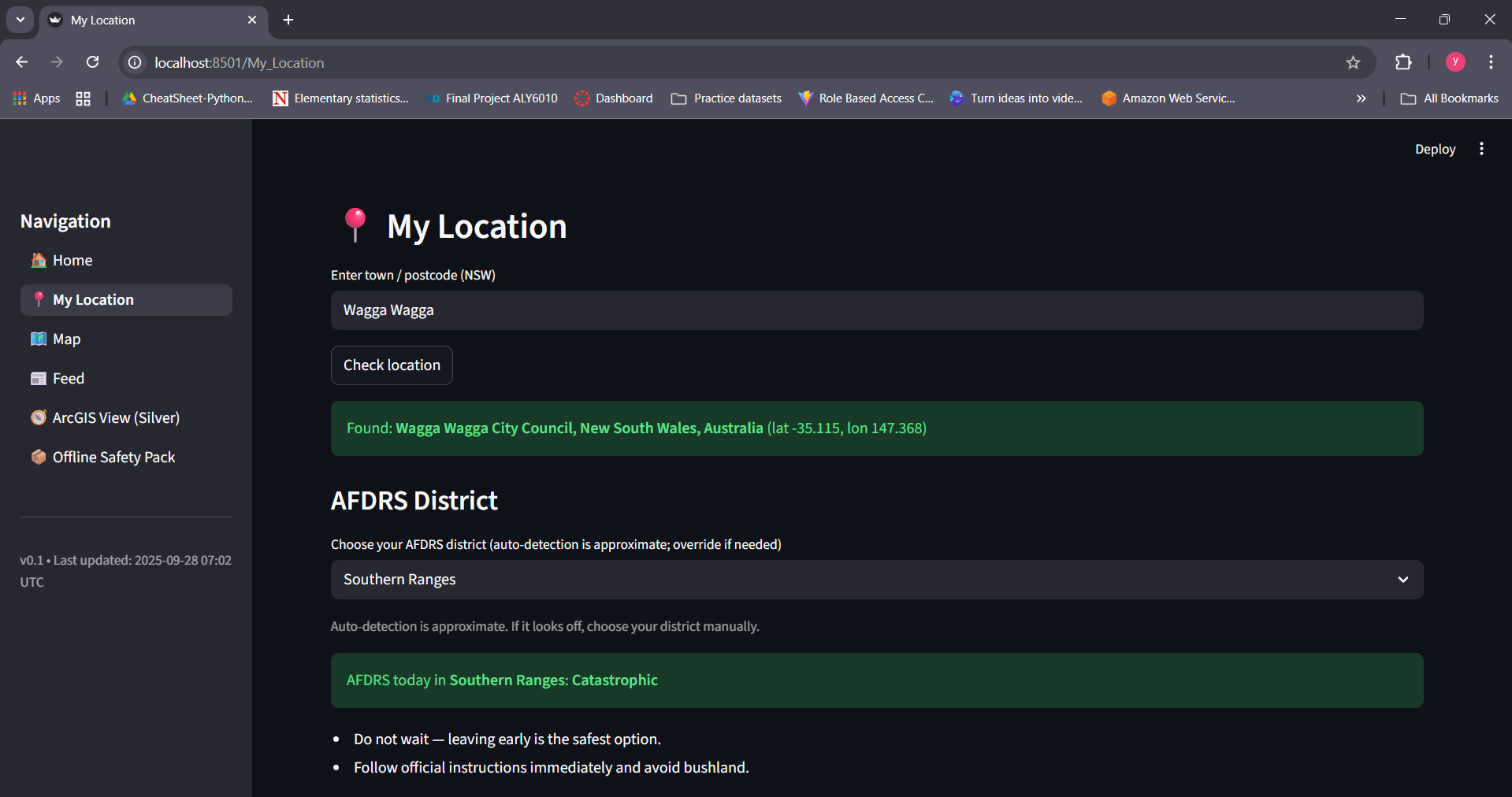
Local AFDRS risk detection shows Catastrophic danger level with safety advice.
-
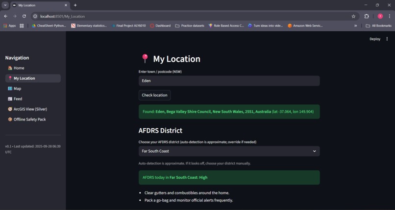
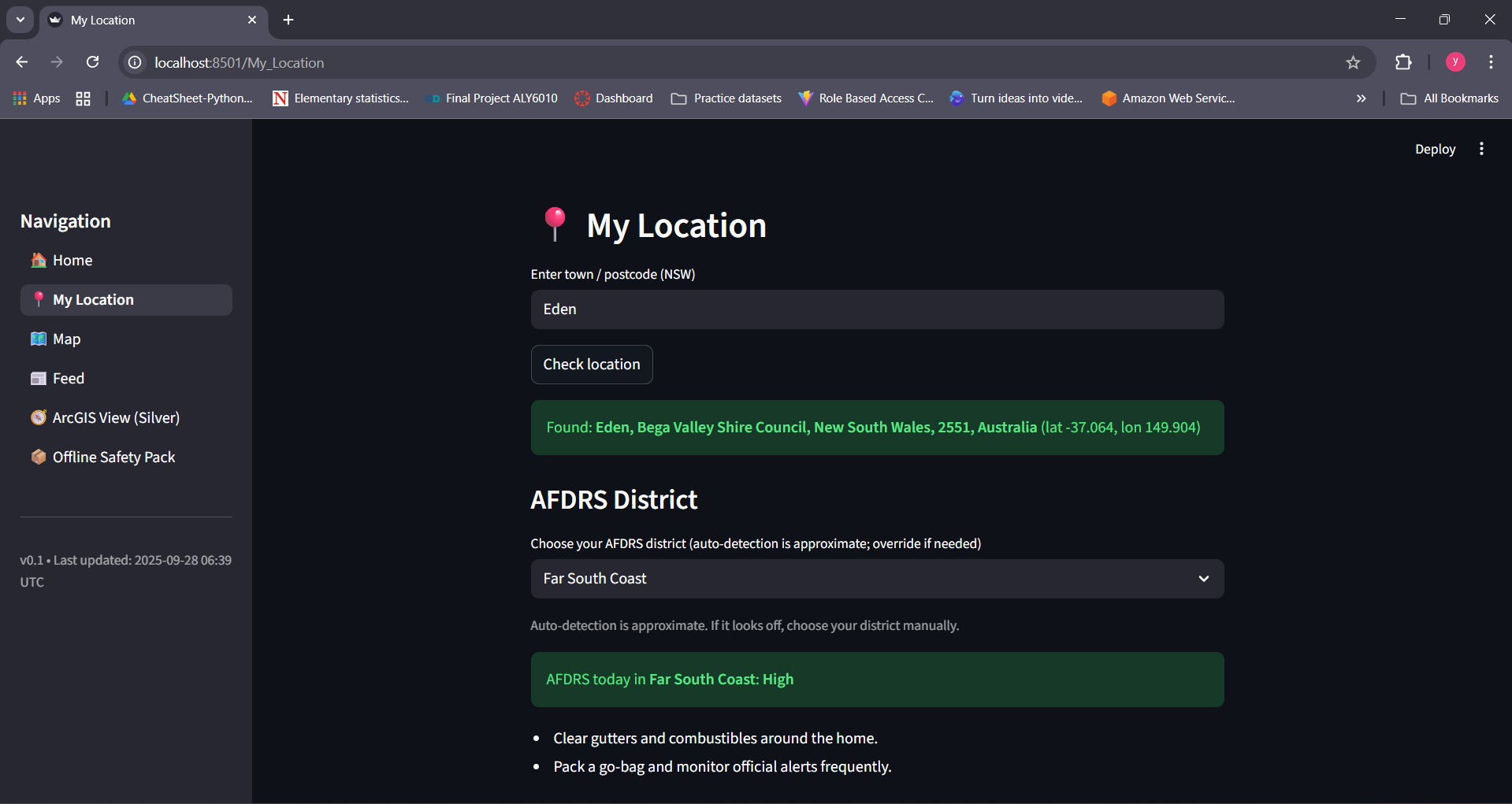
Example of AFDRS High risk rating with actionable fire safety guidance.
-
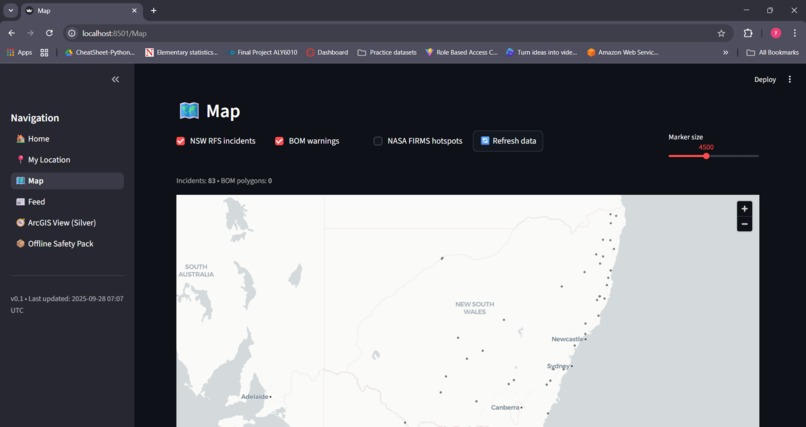
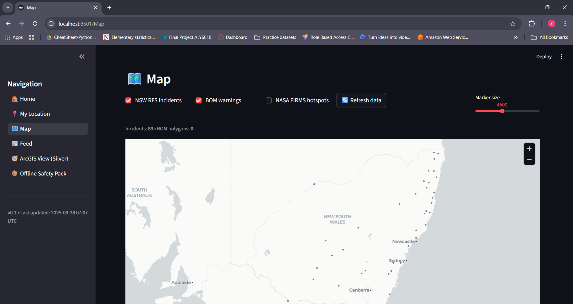
Interactive NSW map with toggleable layers: RFS incidents, BOM warnings, NASA hotspots.
-
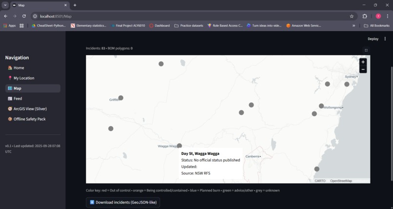
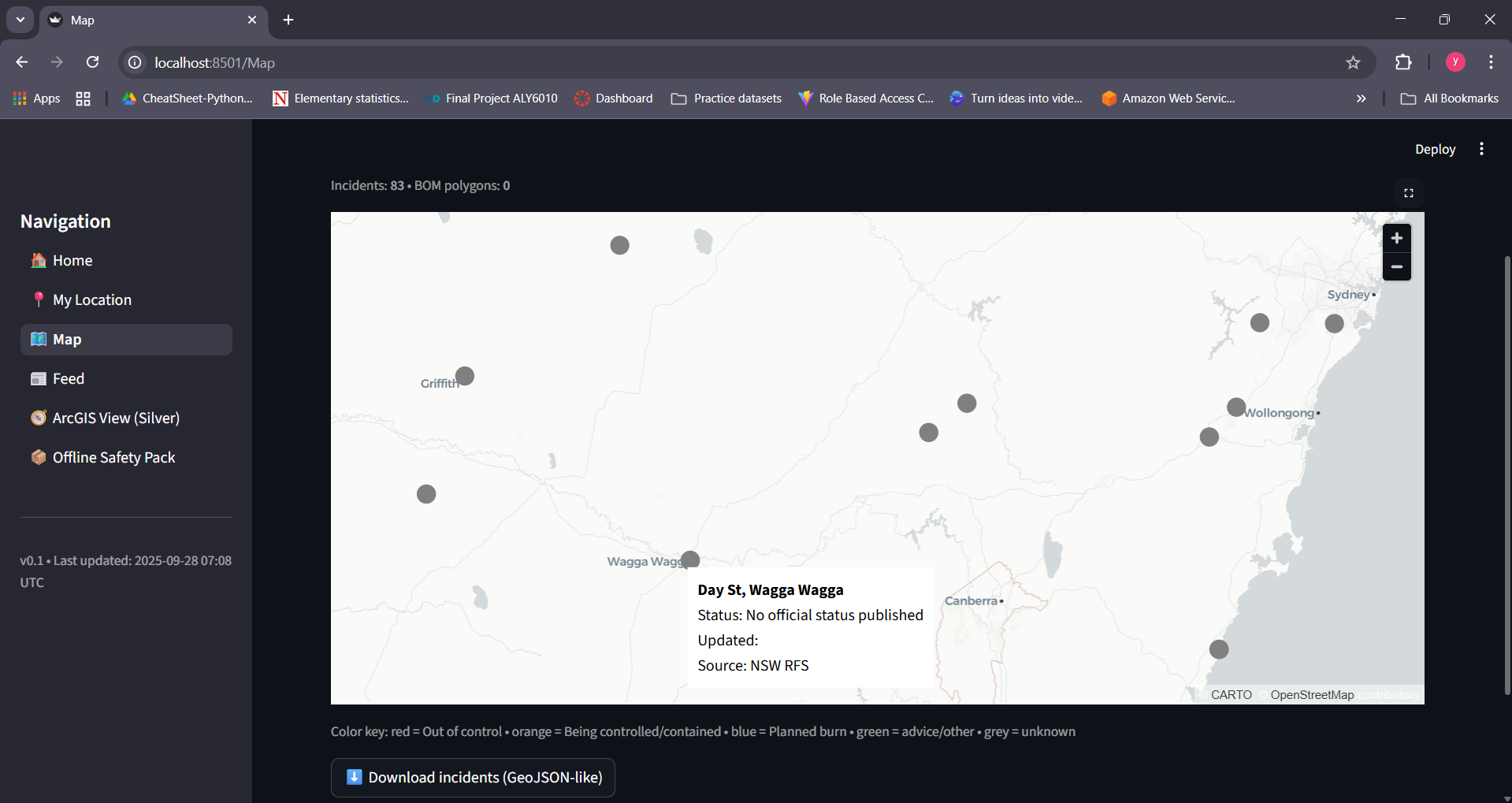
Map legend and GeoJSON export for incidents: red = out of control, orange = controlled, green = advice.
-
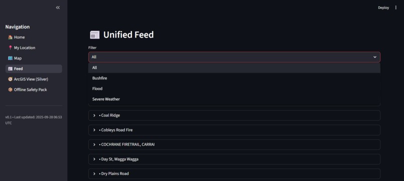
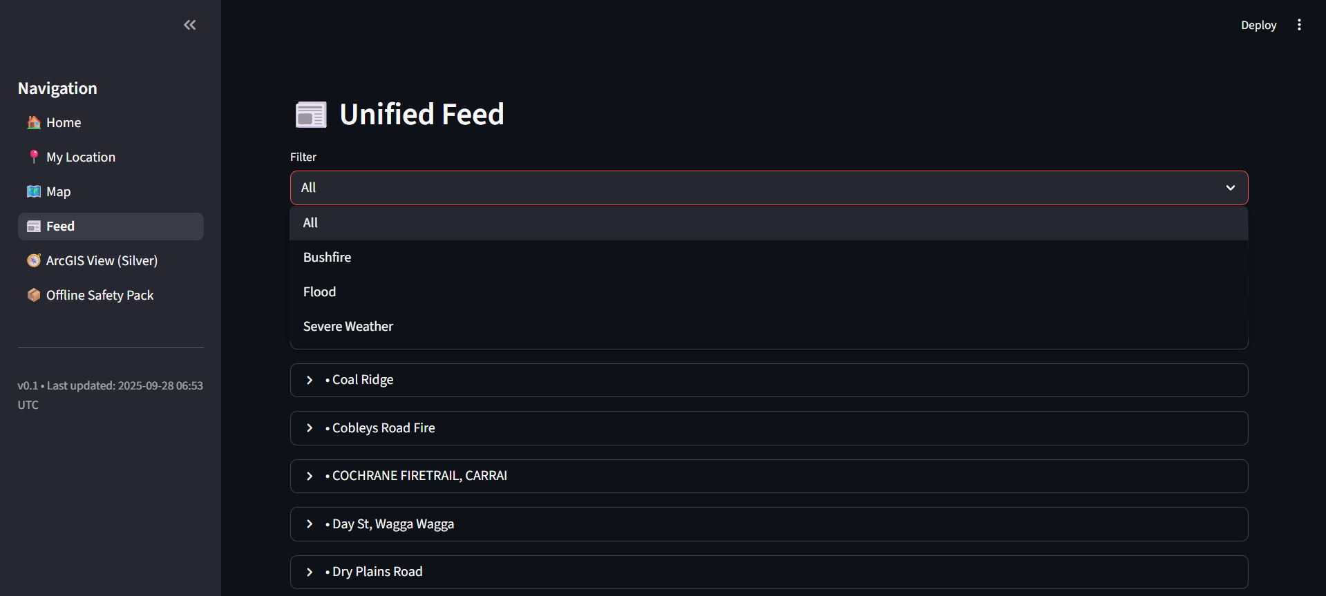
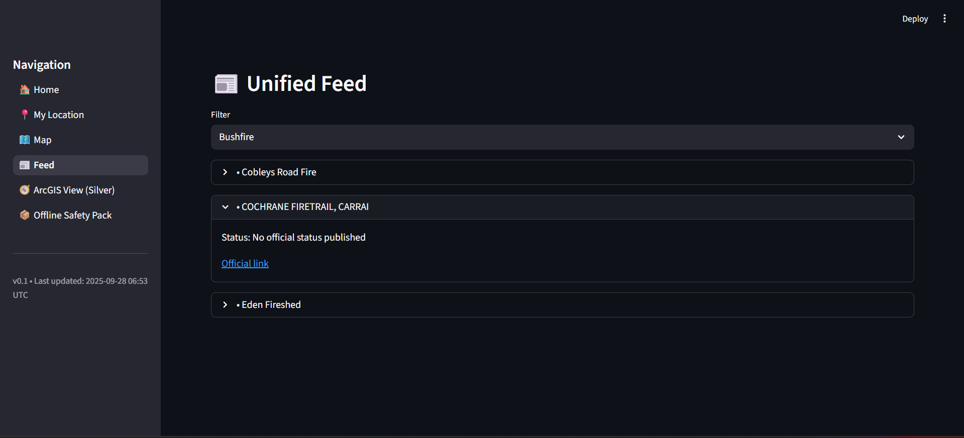
Unified Feed filter for Bushfire, Flood, and Severe Weather alerts.
-
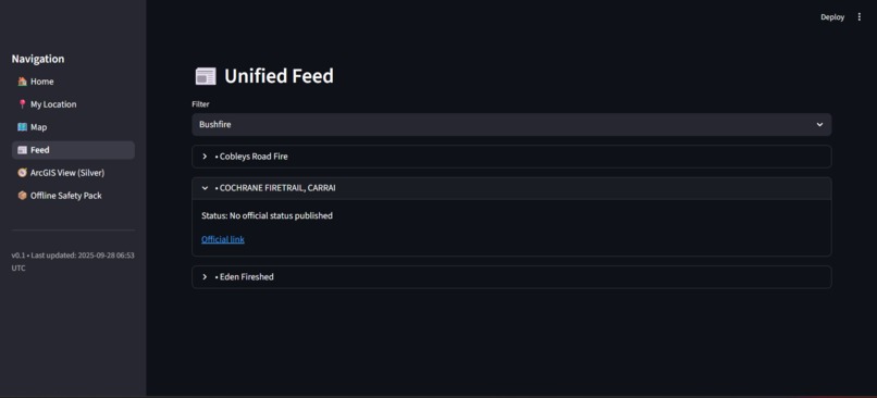
Expanded feed item with plain-English status and official source link.
-
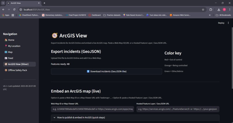
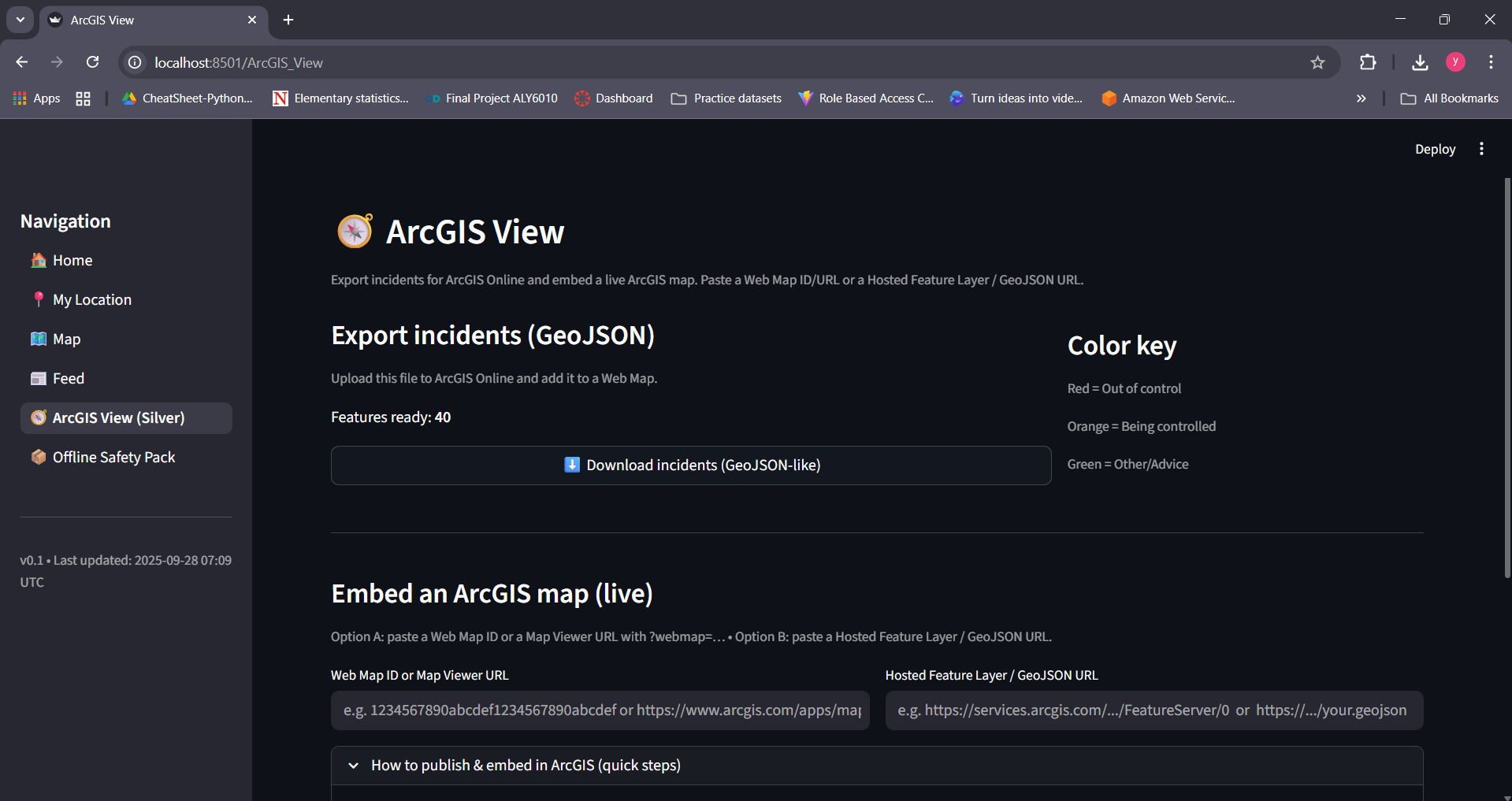
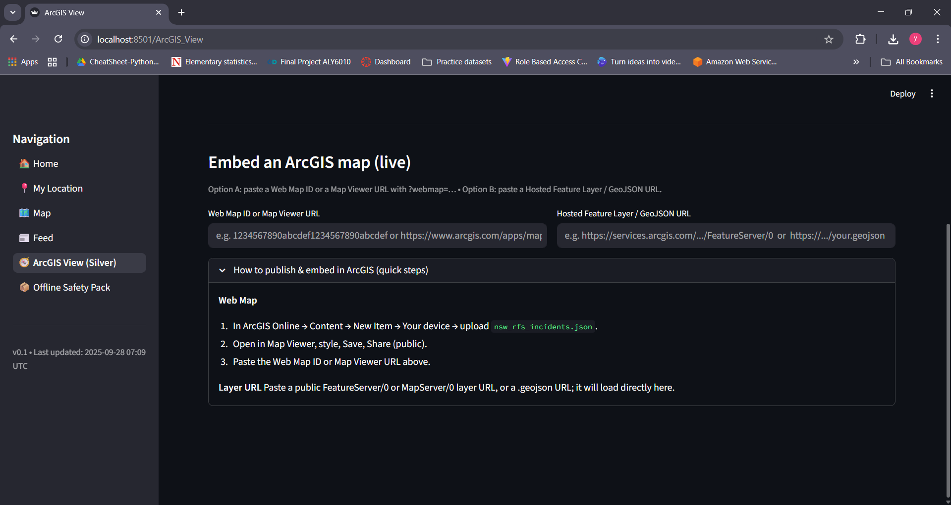
Embed live ArcGIS maps by pasting Web Map ID or Feature Layer URL.
-
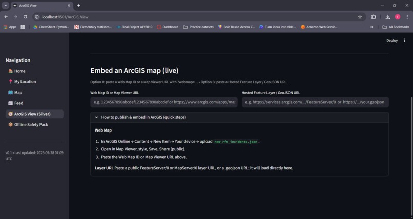
Export incidents as GeoJSON for use in ArcGIS Online or other GIS tools.
-
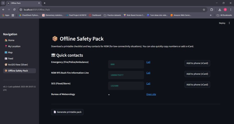
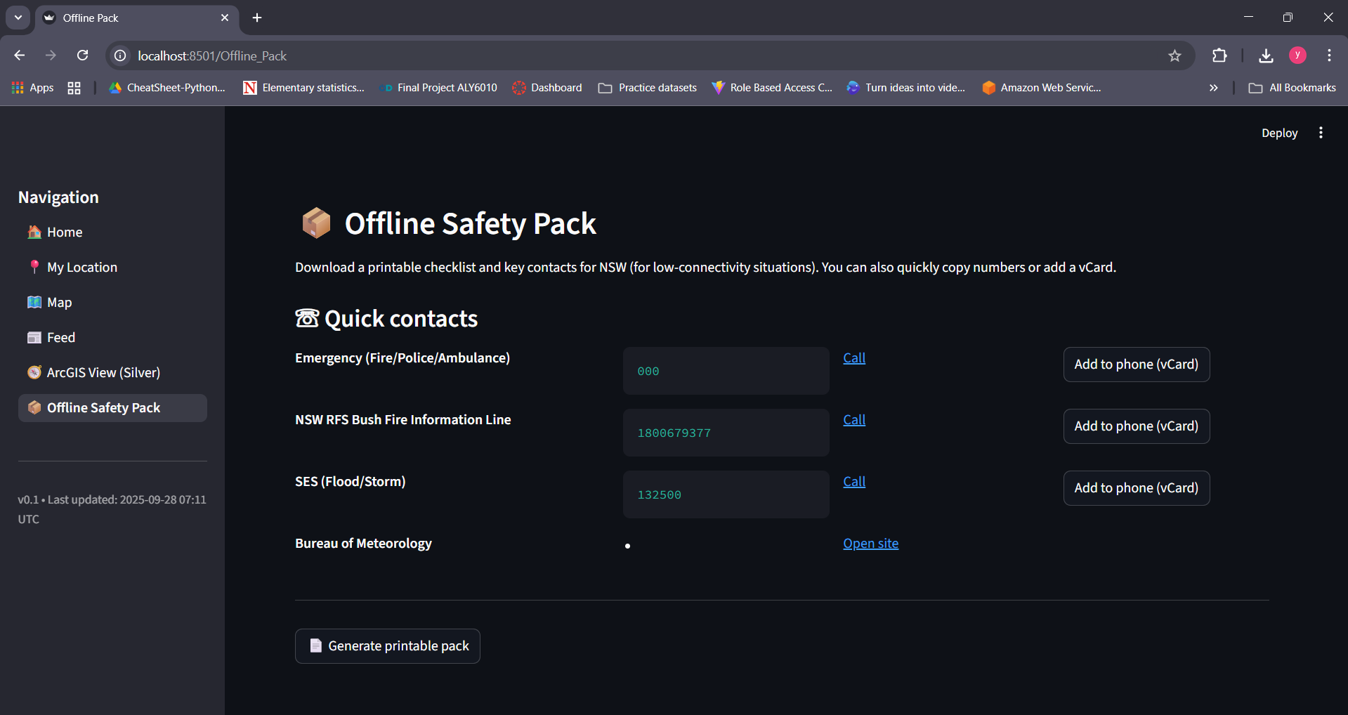
Offline Safety Pack with printable checklist and one-click emergency contacts.
Inspiration
Australia’s bushfire seasons are becoming longer and more dangerous with climate change. Critical information is spread across multiple official sources (RFS, BOM, AFDRS), making it hard for people to quickly assess their risk. We wanted to build a single, trusted dashboard that unifies these feeds into clear, actionable insights.
What it does
- Home: Shows data freshness badges for fire, weather, and AFDRS feeds.
- My Location: Enter a town/postcode → see today’s AFDRS fire danger rating (e.g., High, Extreme, Catastrophic) and a prototype local risk score.
- Map: Interactive NSW map with incidents and warnings; color-coded markers for status (red = out of control, orange = being controlled, green = advice/other).
- Feed: Unified alerts with filters for Bushfire, Flood, Severe Weather, each linking to official sources.
- ArcGIS View: Export GeoJSON incidents and embed them in ArcGIS Online (Gold feature).
- Offline Safety Pack: Printable checklist and quick-dial contacts for low-connectivity use.
How we built it
- UI/Frontend: Streamlit (Python)
- Data Sources: NSW RFS incidents feed, BOM warnings (CAP XML), AFDRS JSON, NASA FIRMS hotspots
- Mapping: Pydeck (Deck.GL) with ArcGIS integration
- Performance: Caching + fallback handling for missing data
- Collaboration: GitHub for version control and team workflow
Challenges we ran into
- Handling missing or inconsistent fields in government feeds.
- Keeping refresh times fast while merging multiple live data streams.
- Designing low-bandwidth fallback modes for rural communities.
- Maintaining UI consistency across multiple pages and features.
Accomplishments that we're proud of
- Delivered a fully working prototype with multiple data sources in one interface.
- Added plain-English safety actions to AFDRS levels for clarity.
- Built an offline safety pack to help residents without reliable internet.
- Showcased AFDRS danger levels from Moderate through Catastrophic in a real demo.
What we learned
- Emergency tools must prioritize clarity and speed over complexity.
- Using caching and heuristics improves usability of imperfect datasets.
- Iterative “phase-by-phase” development works well for building a polished MVP.
What's next for AI in the Outback — Early Warning (NSW)
- Deploy publicly (Streamlit Cloud or AWS).
- Add push notifications via SMS/email/mobile app.
- Expand coverage to other states and hazards (floods, cyclones, heatwaves).
- Partner with councils and agencies for pilot testing and real-world impact.


Log in or sign up for Devpost to join the conversation.