Rewind
Inspiration
My camera roll is full, but not because every photo is important.
It is full of blurry bursts, forgotten screenshots, duplicate angles, old receipts, and videos I have not watched in years. Yet every time I try to clean it, I stop after a few minutes.
At first, this looked like a storage problem. But the more I thought about it, the more I realized that the real problem was emotional friction.
A photo is not just a file. Even an imperfect image may contain a person, place, or moment that matters. Asking someone to review thousands of photos means asking them to make thousands of small emotional decisions. When those decisions appear in an endless grid, cleanup quickly becomes overwhelming.
Most cleaner apps frame the goal as:
Delete as much as possible, as quickly as possible.
I wanted to explore a different question:
What if cleaning your camera roll felt less like deleting files and more like rediscovering your life?
That question became Rewind, an iOS app that transforms photo cleanup into a calm, finite journey through forgotten memories.
Instead of asking users to “clean 10 GB,” Rewind invites them to open a short deck. An old dinner, a forgotten trip, a screenshot that once mattered, or a video they have not seen in years may appear next.
Storage cleanup becomes a side effect of rediscovery.
Rewind is not just another photo cleaner. It is a time machine that happens to free up storage.
Research and Competitive Landscape
Before building Rewind, I studied how popular photo-cleaning products approach the same problem.
I found that most existing apps fall into three categories.
1. Utility-first automatic cleaners
Apps such as Cleanup and Clever Cleaner focus on storage efficiency.
They scan for duplicate photos, similar images, screenshots, large videos, contacts, or other removable files. Many automatically identify a “best” photo and recommend deleting the rest. This is effective when the user’s primary goal is to recover storage as quickly as possible.
However, these products often treat media as storage objects before treating them as memories. Their main value is detection, compression, bulk selection, and one-tap cleanup.
That approach answers:
“Which files can I remove?”
Rewind instead asks:
“Which moments still matter to me?”
I did not want an algorithm to make the final emotional decision. Rewind may surface similar images, but the user remains in control. Similar-photo detection appears inside the normal memory deck, so cleanup does not become a separate technical workflow.
2. Swipe-based photo organizers
Apps such as Slidebox make manual organization faster through swipe gestures, albums, favorites, and one-by-one review.
This is more personal than automatic bulk deletion, but it can still feel like processing a long queue. Users are usually moving through a chronological or manually selected collection with a limited set of decisions.
The familiar binary model is:
- Keep
- Delete
But real decisions about memories are rarely that simple.
Sometimes I recognize that a photo is meaningful. Sometimes I know immediately that it is useless. But often, the honest response is:
- “I do not want to decide right now.”
- “I want to see this again later.”
- “This is not important, but I am not ready to delete it.”
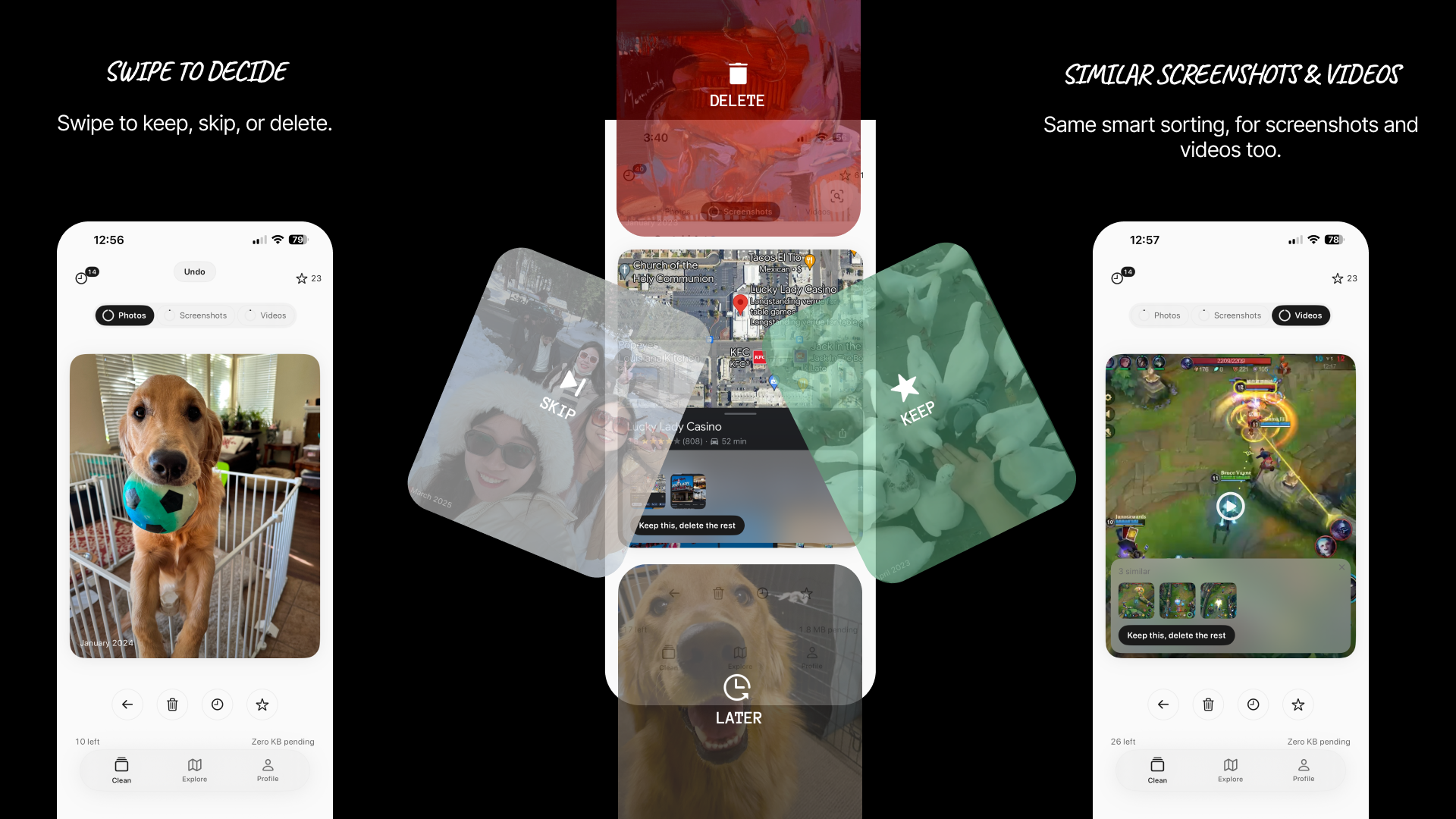
That insight led to Rewind’s four-direction interaction grammar:
- Up: delete
- Right: keep
- Left: skip
- Down: decide later
The goal is not to add gestures for novelty. It is to represent the ambiguity that already exists when people make decisions about personal memories.
3. Gamified memory-cleaning apps
Swipewipe comes closest to combining cleanup with nostalgia. It includes swipe-based decisions, monthly cleanup, On This Day, a memory map, bookmarks, widgets, and streak-based motivation.
This validated an important part of my idea: people want photo cleanup to feel more enjoyable and personal.
However, Rewind makes a fundamentally different behavioral choice.
Many cleanup experiences use chronological progress, completion percentages, daily habits, or streaks to motivate users. These mechanisms can be effective, but they can also turn a personal photo library into another obligation. Missing a day or seeing years of unfinished progress may increase the same guilt that caused users to avoid cleanup in the first place.
Rewind deliberately avoids streaks and infinite chronological queues.
Instead, it uses short, randomized decks of 20–30 items. Every session has a visible ending. Users do not need to “finish 2022” or maintain a daily record. They only need to complete one small chapter.
The Gap I Identified
My research showed that existing apps are already very good at several individual tasks:
- Detecting duplicates
- Finding large files
- Organizing albums
- Accelerating manual deletion
- Adding swipe-based interactions
- Surfacing old memories
The opportunity was not simply to add another cleaner with more features.
The opportunity was to combine these ideas around a different product philosophy.
| Existing approach | Rewind’s approach |
|---|---|
| Storage is the primary goal | Rediscovery is the primary experience |
| Chronological or category-based queues | Randomized, age-weighted decks |
| Keep or delete | Keep, skip, delete, or revisit later |
| Progress means processing the entire library | Progress means completing one finite chapter |
| Streaks and urgency encourage return visits | Curiosity and forgotten memories encourage return visits |
| Similar photos become a separate cleanup mode | Similar photos appear in context inside the deck |
| Algorithms recommend what should disappear | The user keeps final emotional control |
| Deletion is the action | Deletion is staged, reviewed, and committed in a batch |
| Analytics and broader utility features may be included | No account, backend, analytics, or photo upload |
Rewind is not objectively better for every type of user. Someone who only wants to remove duplicate files in ten seconds may prefer an automatic cleaner.
Rewind is better for a specific and underserved group: people who have already avoided or abandoned cleanup because the process feels endless, impersonal, or emotionally exhausting.
Its advantage is not a single feature. It is the way the entire system is designed around reducing decision fatigue without removing human agency.
What It Does
Rewind presents a finite deck of 20–30 photos, screenshots, or videos selected from across the user’s library.
Older memories are more likely to appear, but recent media is never completely excluded. This makes every deck feel like opening a blind box from your own life.
Each card supports four decisions:
- Swipe up: stage it for deletion
- Swipe right: keep or favorite it
- Swipe left: skip it without making a decision
- Swipe down: move it to the Later Stack
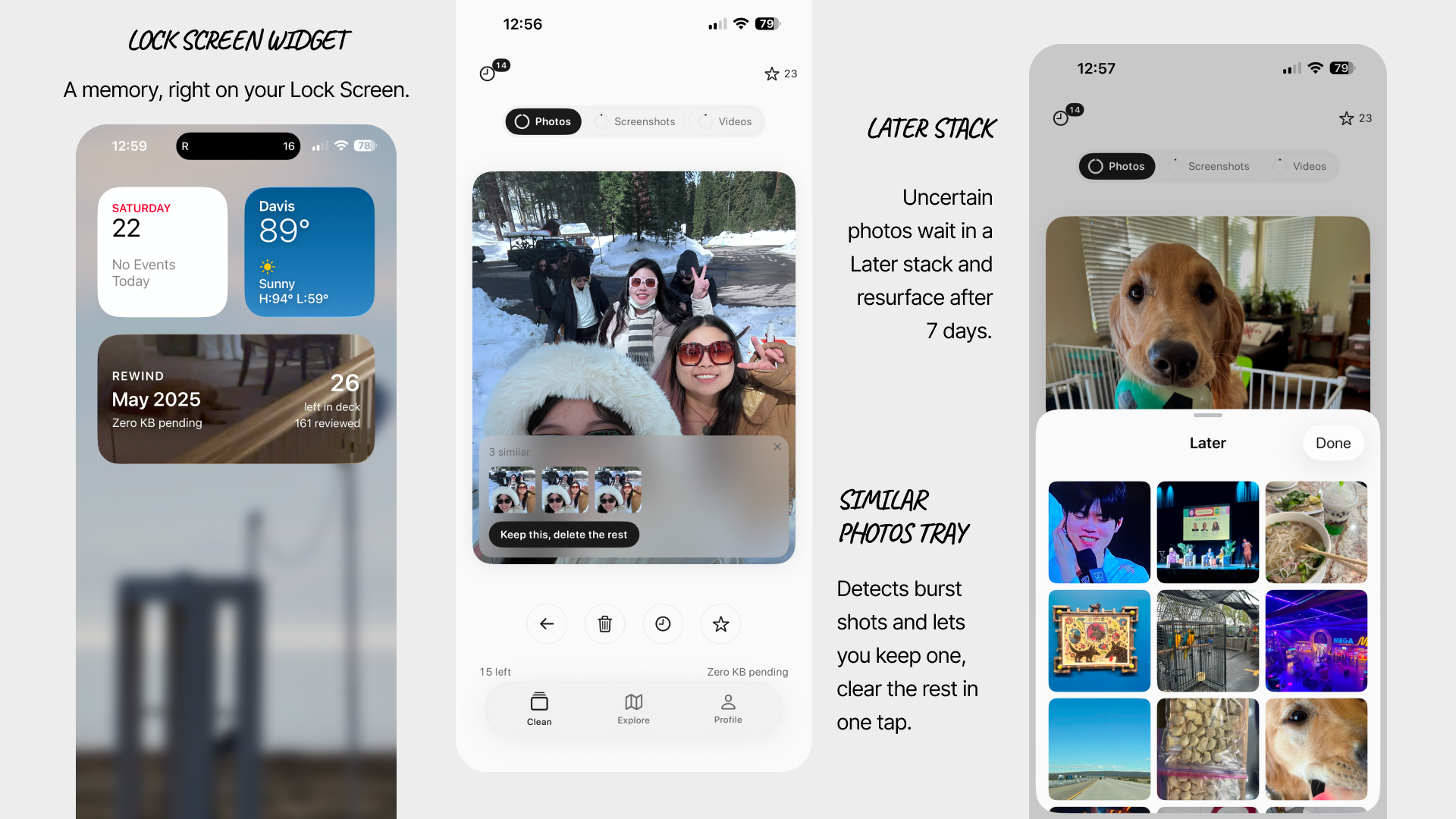
Items in the Later Stack return after a seven-day cool-down, labeled “Seen before.” After three deferrals, Rewind gently suggests keeping the item.
This interaction is based on a simple behavioral idea: the second encounter with an uncertain item often produces a faster and more confident decision than the first.
Deletion is intentionally safe. Photos first enter an in-app staging bin, where the user can inspect selections or undo decisions. Only at the end of a session does Rewind submit one batch deletion request through Apple’s PhotoKit API. The iOS Recently Deleted album remains an additional system-level safety net.
Rewind also brings context into the cleanup experience:
- Similar photos remain inside the deck instead of becoming a separate duplicate-cleaning task.
- On-device OCR helps classify screenshots such as receipts, conversations, webpages, and tickets.
- Videos appear as muted three-second loops, with controls for sound and timeline scrubbing.
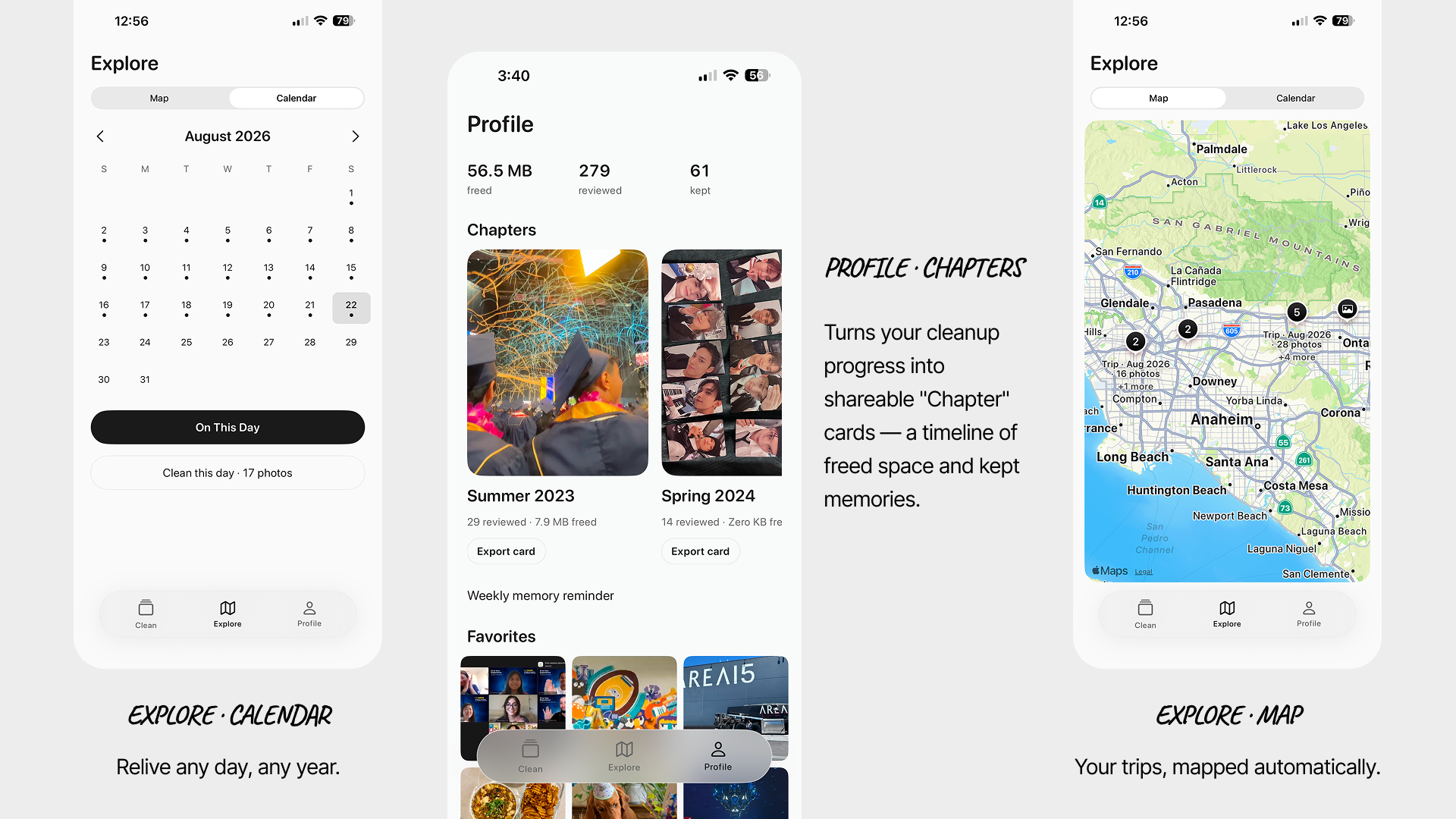
- Explore views organize memories through trips, locations, calendar dates, and On This Day.
- Completed sessions become Chapters, reframing progress as parts of a life rather than a productivity streak.
The interface is intentionally restrained. Most of the app is grayscale, allowing the user’s photos to remain the visual focus. Coral appears for deletion feedback, while mint communicates keeping.
Color is used as meaning, not decoration.
How I Built It
I built Rewind natively for iOS using SwiftUI, with SwiftData maintaining an entirely local ledger of processed assets, favorites, deferred items, staged deletions, chapters, and lifetime statistics.
The app uses:
- PhotoKit for photo-library access and deletion
- AVFoundation for video playback and thumbnail generation
- Vision for on-device screenshot text recognition
- Core Image and media metadata for similarity detection
- MapKit and location metadata for trip-based exploration
- WidgetKit and ActivityKit for widgets and Dynamic Island experiences
- App Intents for Spotlight and Siri entry points
- StoreKit for the premium experience
Rewind has no backend, user account, analytics service, or photo-upload pipeline. Every photo stays on the device.
Age-Weighted Discovery
Purely random selection could overrepresent recent photos because modern camera rolls often contain far more recent media than older media.
To make forgotten memories more likely to return, I designed an age-weighted sampling system. If the age of a media item in days is (d), its sampling weight is:
$$ w(d) = \max(1,d)^{0.55} $$
This gives older media a greater chance of appearing without excluding recent photos.
After sampling, the deck separates assets that share a burst identifier or fall within the same three-second moment window. This prevents users from seeing nearly identical photos back-to-back and keeps every card feeling like a new discovery.
Gesture System
A four-direction gesture system creates more expressive decisions, but it also increases the risk of accidental diagonal input.
To make the gestures predictable, direction locks after approximately 24 points of travel with a 15-degree axis bias from the diagonal. A card commits when it crosses roughly 30% of its travel distance or reaches a flick velocity of approximately 900 points per second.
Card rotation is capped at 12 degrees so the interaction remains physical and responsive without becoming visually chaotic.
Performance
Real photo libraries may contain tens of thousands of high-resolution assets. Loading full-resolution media directly into the card stack would create memory pressure, delayed thumbnails, and dropped frames.
Rewind requests images at display resolution and prefetches only the next five deck items. The app keeps lightweight asset metadata in the deck and relies on controlled caching for smooth transitions.
This keeps the experience responsive while respecting the limitations of an on-device photo library.
Challenges I Faced
Designing for speed without encouraging mistakes
Photo cleanup needs to feel fast, but deletion is a high-trust action.
Instant deletion would make the interface efficient at the cost of user confidence. I solved this by separating the gesture from the destructive action.
Swiping up only stages an item. An Undo control remains available, the staging bin can be reviewed, and the actual deletion occurs once at the end of the session.
Making four directions feel intentional
Early versions of the gesture system could misinterpret diagonal movement. A user intending to skip a photo might accidentally move it into the Later Stack.
I iterated on distance, angle, progress, and velocity thresholds until the gesture felt quick but not unpredictable. I also added visible fallback buttons for accessibility, discoverability, and one-handed use.
Handling large and unpredictable libraries
A simulator cannot accurately reproduce the behavior of a real camera roll containing years of photos, videos, screenshots, bursts, iCloud assets, and incomplete metadata.
I had to design for delayed image requests, large video files, missing location information, and libraries containing tens of thousands of assets. This made caching, prefetching, and graceful empty states essential parts of the product rather than optional polish.
Detecting similarity without compromising privacy
I wanted to surface bursts and related photos without uploading personal media or depending on a cloud-based model.
The current build combines PhotoKit burst identifiers with a tight timestamp window. This approach is lightweight, explainable, and fully on-device.
A future version can add local perceptual feature matching, but the current implementation provides a practical balance among privacy, performance, and usefulness.
Competing through focus
One of the biggest product challenges was deciding what not to build.
Competitors offer contact cleanup, email cleanup, video compression, charging animations, AI enhancement, private vaults, and other utility features. Adding all of them might make Rewind appear more powerful, but it would weaken its identity.
I chose to focus on one experience: helping people revisit and make decisions about their personal media.
That restraint became one of the most important design decisions in the project.
What I Learned
Building Rewind taught me that technical performance and emotional design are deeply connected.
Prefetching affects more than frame rate; it determines whether rediscovery feels immediate.
Gesture thresholds affect more than usability; they determine whether users trust the app with their memories.
Local processing affects more than architecture; it becomes part of the product’s promise.
I also learned that market differentiation does not always come from having a feature competitors lack. Many successful products share similar individual features. What matters is how those features work together, what behavior they encourage, and what emotional experience they create.
By rejecting cloud uploads, infinite feeds, automatic emotional decisions, and guilt-based engagement, I was forced to design a smaller but more intentional product.
Most importantly, I learned that the best cleanup tool may not feel like a cleanup tool at all.
What I Am Proud Of
I am proud that Rewind approaches a familiar problem from a different emotional direction.
As a solo developer, I designed and built the product experience, interaction system, local data architecture, media pipeline, privacy model, and system integrations around one consistent principle:
Memories should remain at the center of the experience, even when the user is deciding which ones to let go.
Rewind combines age-weighted discovery, a four-direction decision model, reversible batch deletion, contextual similarity detection, on-device processing, and calm visual design into one cohesive experience.
Its innovation is not simply swiping through photos.
It is transforming cleanup from a judgment about storage into a conversation with the past.
What’s Next
My next steps for Rewind include:
- Stronger on-device perceptual similarity detection
- Reverse-geocoded trip names
- More expressive Chapter exports
- Expanded VoiceOver and Reduce Motion testing
- Performance testing across larger and more diverse photo libraries
- Private, on-device discovery of recurring places, seasons, and visual themes
I want to continue exploring how technology can help people rediscover meaningful patterns without becoming invasive or taking control away from them.
Rewind began with a storage problem, but it became a project about memory, attention, and letting go.
Sometimes making space does not have to mean losing something.
Sometimes it means seeing it one more time.


Log in or sign up for Devpost to join the conversation.