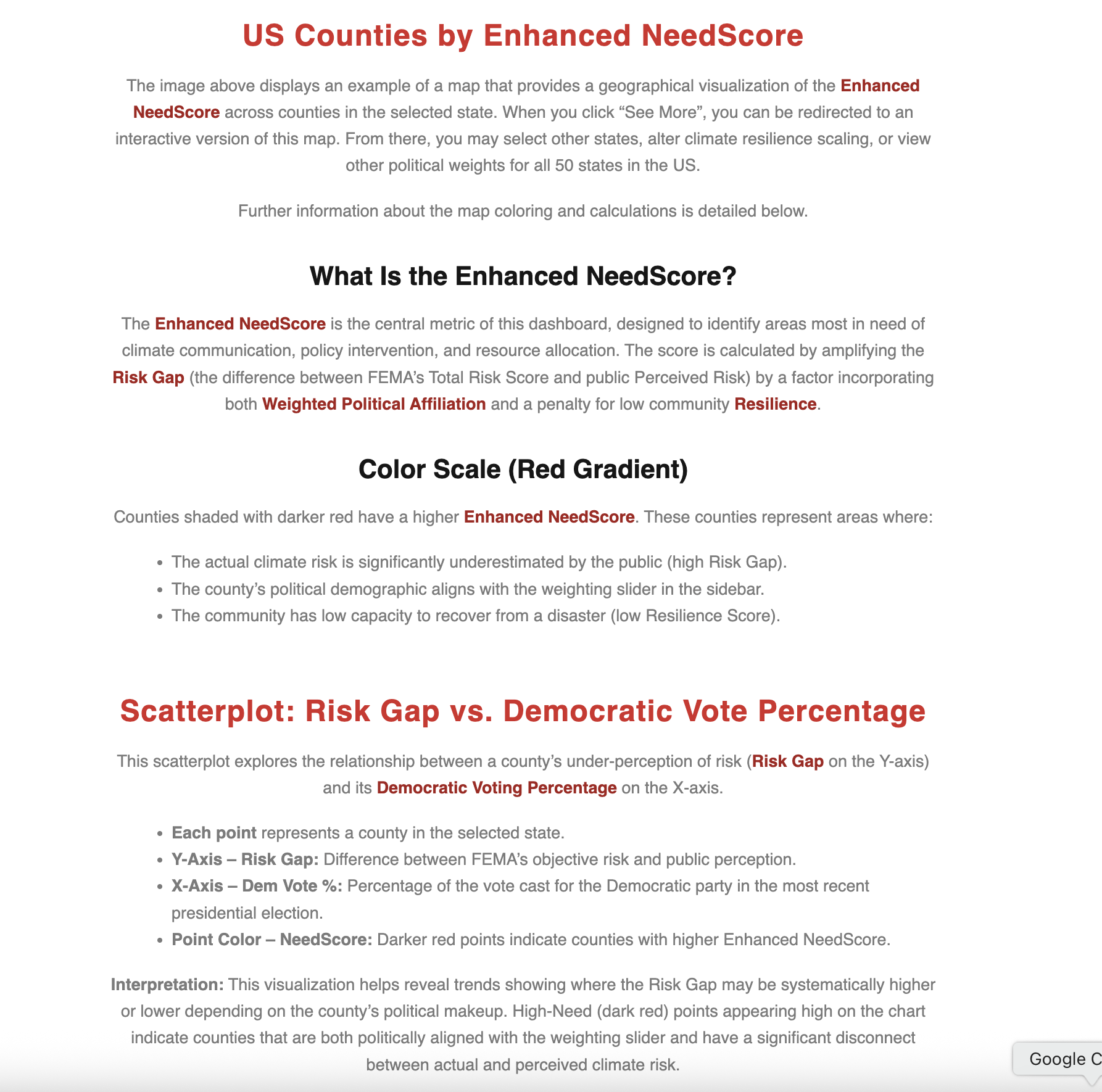
-

Logo
-
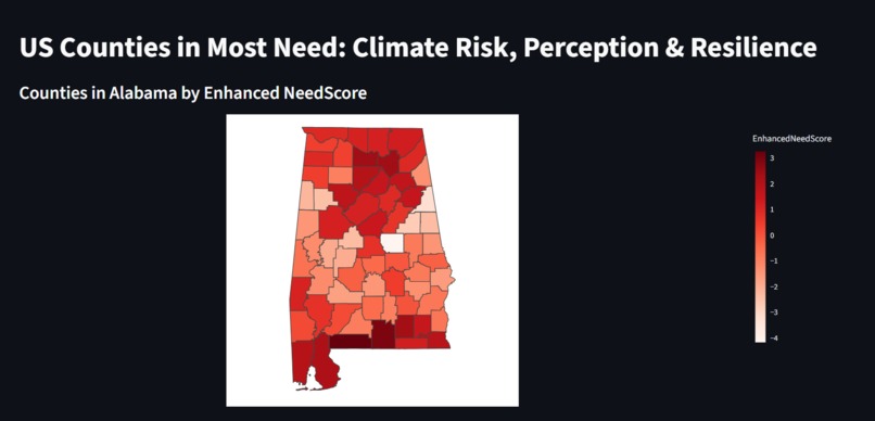
Streamlit Map
-
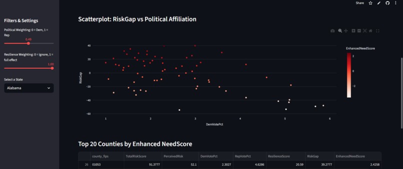
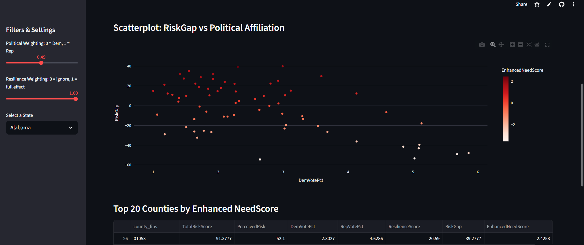
Streamlit Scatterplot Graph
-
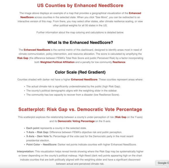
Website Streamlit description


Inspiration
Climate change currently poses a serious threat to society, and in order for us to take action, we first need awareness of this issue. The United States is 65th in the 2026 Climate Change Performance Index and is high in climate impact risk ranking. Despite these alarming national statistics, awareness and preparedness are not uniformly distributed across the country. We face two distinct but related challenges at the local level: Objective Risk vs. Subjective Perception: Federal agencies like FEMA calculate detailed, objective risk scores for every county (e.g., flood, wildfire, heat risk). However, public perception surveys often reveal that citizens in high-risk areas either underestimate or dismiss the danger to their communities. This gap between Actual Risk and Perceived Risk is a massive barrier to adaptation and mitigation efforts. Socio-Political Polarization: Climate issues are deeply polarized in the U.S. Political affiliation often dictates whether a community is receptive to climate information or willing to invest in resilience. Furthermore, communities with low socio-economic resilience are disproportionately vulnerable when a disaster strikes. This dashboard was created to quantify this localized vulnerability and disconnect. We move beyond simple risk scores to create the Enhanced NeedScore, a multi-faceted metric that targets the places where climate intervention will have the greatest impact. Our goal is to provide policymakers, NGOs, and community leaders with a data-driven tool to prioritize resources toward counties that exhibit the worst combination of: High Actual Risk, Low Perceived Risk (High Risk Gap), High Political Receptivity (based on user weighting), Low Community Resilience. By highlighting the U.S. counties in Most Need, we aim to turn broad national awareness into targeted, actionable local intervention.
What it does
Our website displays an example of a map that provides a geographical visualization of the Enhanced NeedScore across counties in the selected state. When you click “See More”, you can be redirected to an interactive version of this map. From there, you may select other states, alter climate resilience scaling, or view other political weights for all 50 states in the US. Further information about the map coloring and calculations is also detailed. On the second page there are resources included with topics such as “Further Information on Climate Change”, “What to Do if You Are Affected”, and “Ways You Can Get Involved”.
How we built it
We collected three different datasets with political affiliation, climate risk index, and climate risk perception for all 50 states in the US at the county level. From there we combined the three datasets into one for data visualization using R. From there we used Python in Streamlit to generate interactive maps and graphs to visualize this data. Afterwards we used HTML and CSS to create our website where we include the Streamlit and also more resources for climate change aid.
Challenges we ran into
The Streamlit was not working for a while and was only displaying an empty map, however after tweaking the Python code, we were able to get it to work. When working with county FIPS codes, the codes were not of uniform length/format in different sources of data, which we found out when we could not merge columns by the FIPS codes.
Accomplishments that we're proud of
Successfully making the website and Streamlit within the allotted time.
What we learned
We learned more about how to create websites using HTML and also how to create cool interactive visualization within a Streamlit app.
What's next for ZGS Climate Risk Assessment Viewer
We would be interested in creating further models that look at this data more deeply and look for further patterns that may indicate areas to improve. We are also interested in creating a national version of this to see the broader implications of this viewer.


Log in or sign up for Devpost to join the conversation.