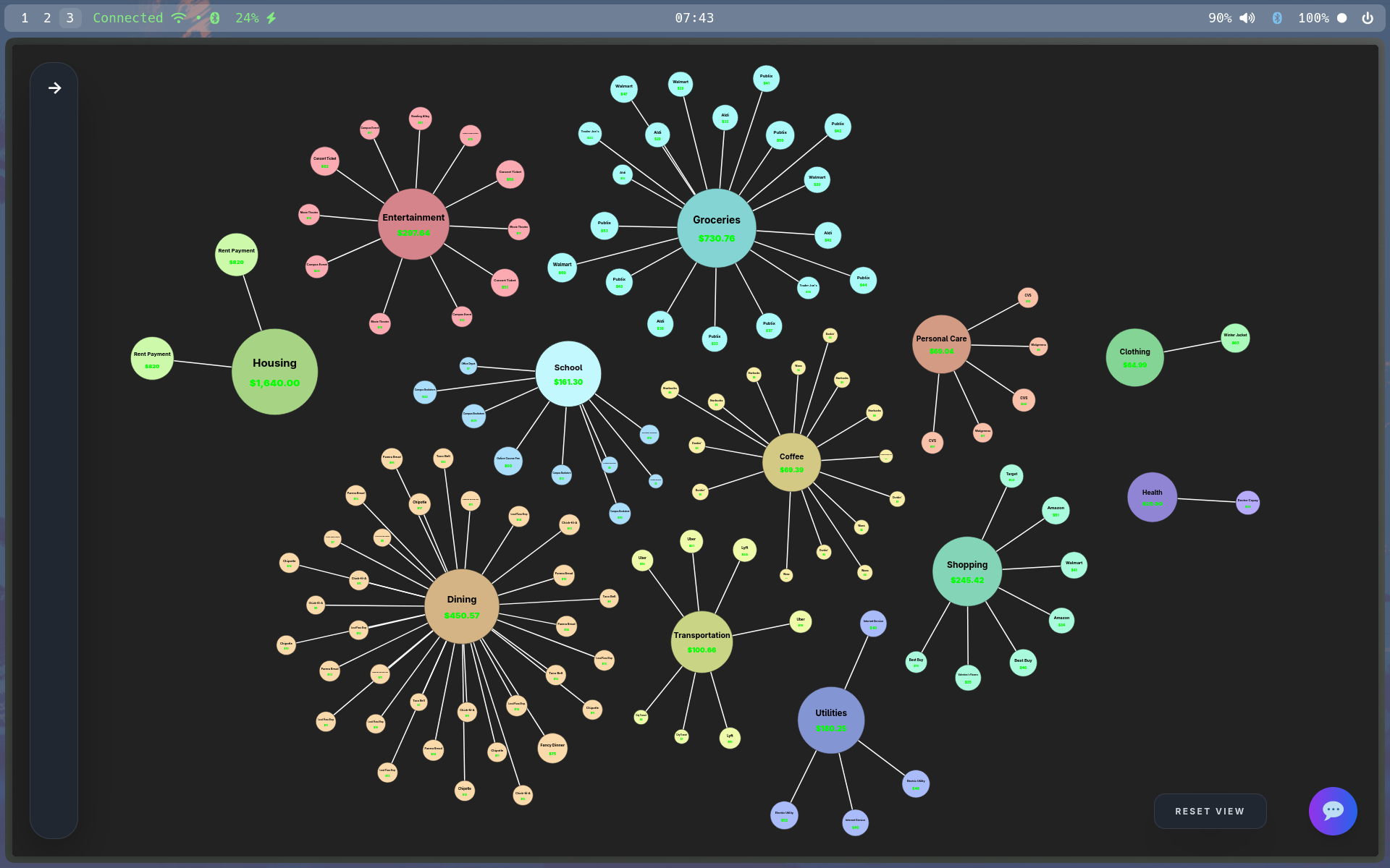
Zettle | "Financial intelligence that thinks like you do."
Inspiration
Our inspiration came from the non-linear thinking tools we love, Obsidian's graph view and Doom Emacs org-mode. We were captivated by how these tools represent information as interconnected nodes rather than rigid hierarchies. We realized financial data deserves the same treatment: money doesn't flow in straight lines, so why should budgeting tools force it to? We wanted to create a living, visual representation of finances that mirrors how our minds actually work.
What it does
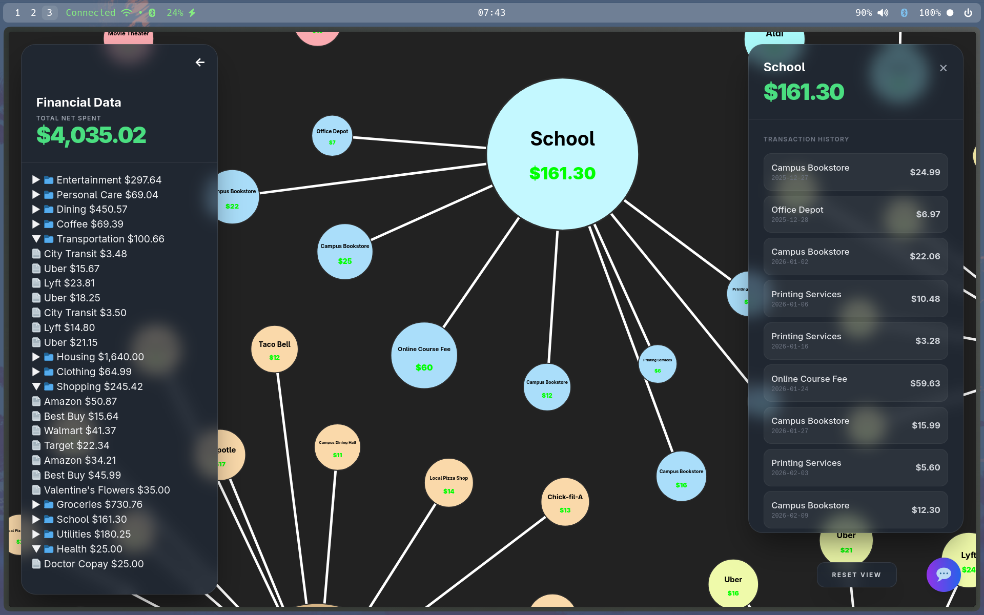
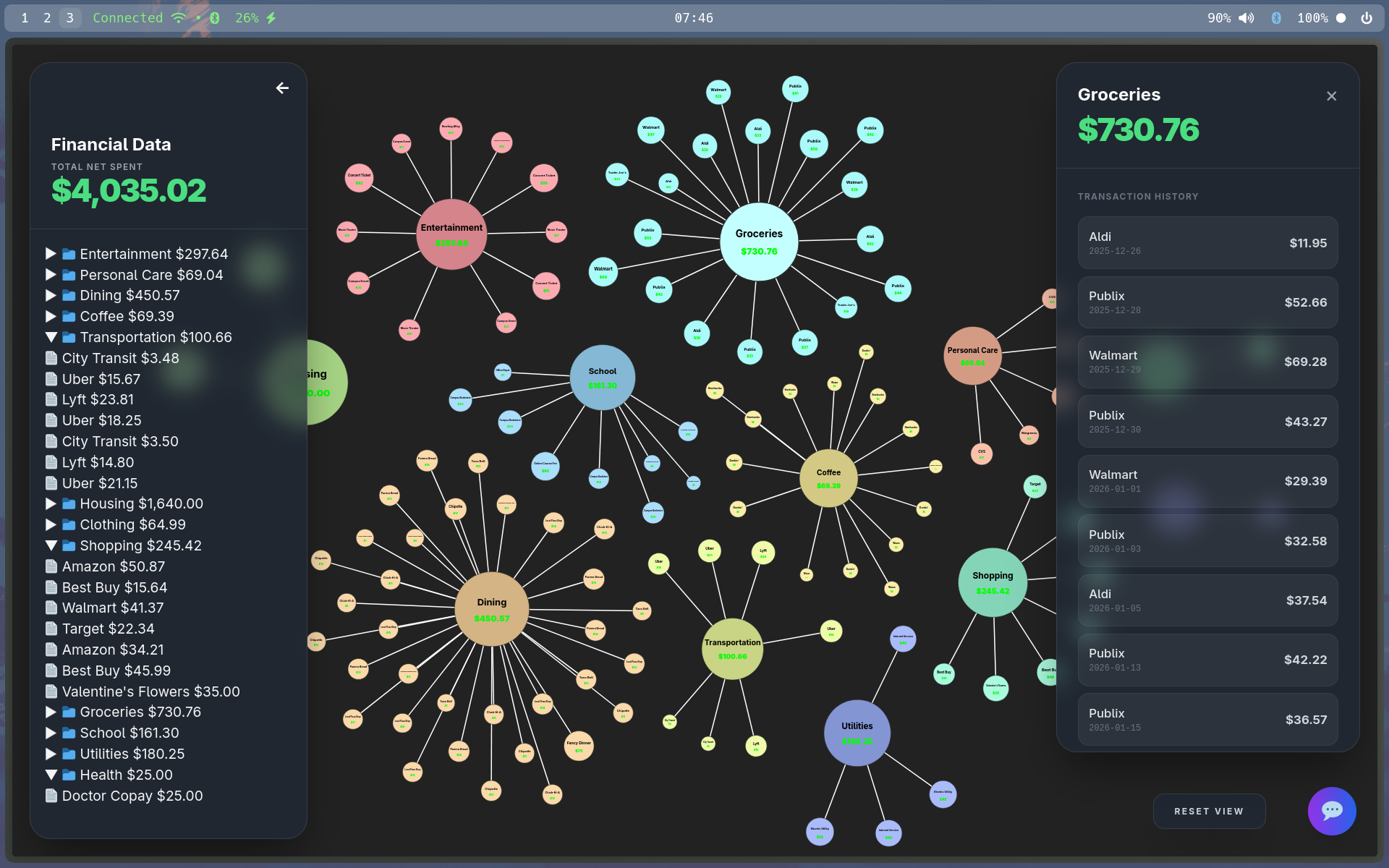
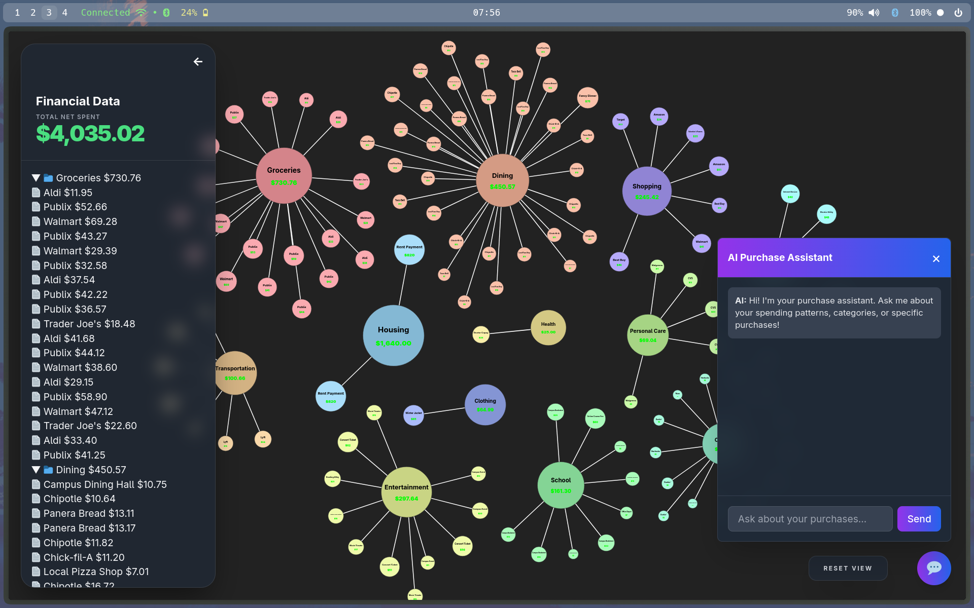
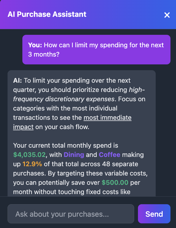
Zettle transforms purchases into an interactive knowledge graph. Each transaction becomes a node, connected under "umbrella" category nodes that grow in size based on spending. Individual purchase nodes scale with their dollar amount, creating an intuitive visual hierarchy. Gemini AI runs continuously in the background, analyzing expense patterns and generating personalized insights based on your graph structure. Every node contains rich metadata, and the entire system connects directly to your bank account—no manual entry required. It's a self-updating mirror of your financial reality.
How we built it
We built the frontend with TypeScript, HTML, and Tailwind CSS, leveraging D3.js for the physics-based node interactions. The backend combines Golang and Python with the Gemini API. Our Go server parses mock CSV bank data and generates structured JSON, which Gemini then analyzes for patterns and insights. The TypeScript frontend consumes this JSON to render the dynamic graph visualization, creating a seamless pipeline from raw transactions to intelligent visual insights.
Challenges we ran into
Our biggest challenge was migrating the backend from Flask to Go mid-development—we made the switch for Go's simplicity and performance, but it required restructuring our entire data pipeline. Properly integrating the Gemini API took significant iteration to get the analysis quality we wanted. But our most fundamental challenge was direction: for the longest time, we had this beautiful graph visualization with no clear purpose. It took hours of brainstorming to realize the power of representing financial identity through connected nodes rather than spreadsheets.
Accomplishments that we're proud of
We're incredibly proud of the graph display—the way nodes pulse with financial energy and category umbrellas expand with spending feels genuinely magical. But we're most excited about the AI analyzer. It's not just working; it's useful. During testing, we found ourselves genuinely wanting this app for our own finances. Building something we'd actually use feels like the ultimate validation.
What we learned
We learned that visual representation fundamentally changes how people understand their spending; seeing money as a living graph creates emotional connection that spreadsheets can't match. We discovered that Go's performance benefits are transformative for real-time data processing, and that sometimes the best features emerge from constraints (our graph physics limitations led us to the umbrella concept). We also learned the importance of finding product-market fit even in a hackathon. Building something cool isn't enough; it needs to solve a real problem in a way people actually want.
What's next for Zettle
We're connecting to real banking APIs and implementing proper database storage for production use. We'll integrate a specialized financial LLM for even deeper insights.
Visual budgeting innovation: Users can set budgets per umbrella category, which will appear as containment rings around each umbrella node. As spending approaches the limit, nodes will shake and highlight in warning colors
Temporal graph evolution: A timeline scrubber that lets you watch your financial graph evolve over time, revealing seasonal patterns and long-term trends.
Goal nodes: Create aspirational nodes (vacation, emergency fund, new car) that pull spending away from other categories, visualizing the opportunity cost of every purchase.
Financial simulator: Drag nodes around to explore scenarios—"What if I spent 20% less on dining?"—and watch the graph reorganize in real-time with AI-generated impact analysis.


Log in or sign up for Devpost to join the conversation.