-
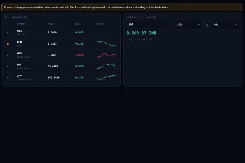
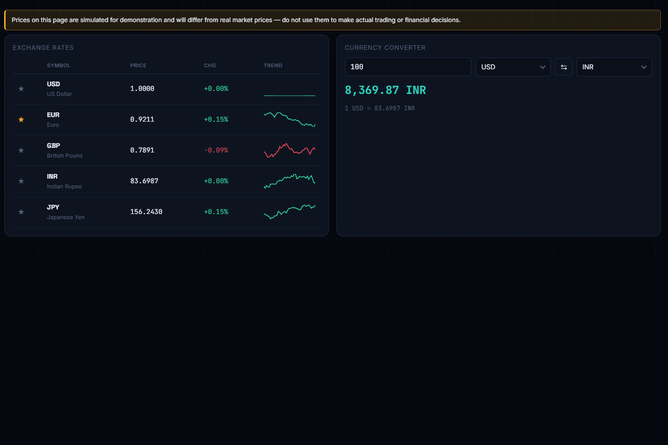
Currency Converter: live exchange rates for 5 currencies plus a two-way amount converter.
-
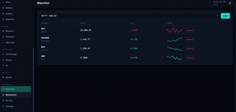
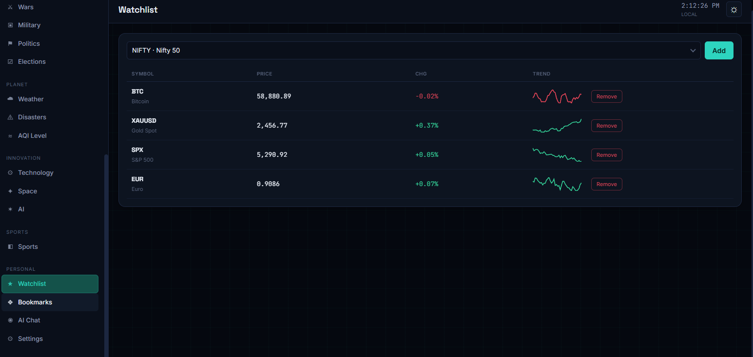
Watchlist: user-tracked assets with live prices, change %, and trend sparklines.
-
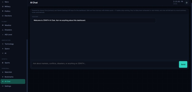
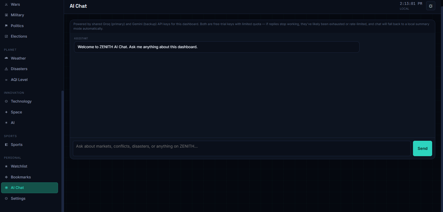
AI Chat: an in-app assistant that answers questions about markets, conflicts, and more.
-
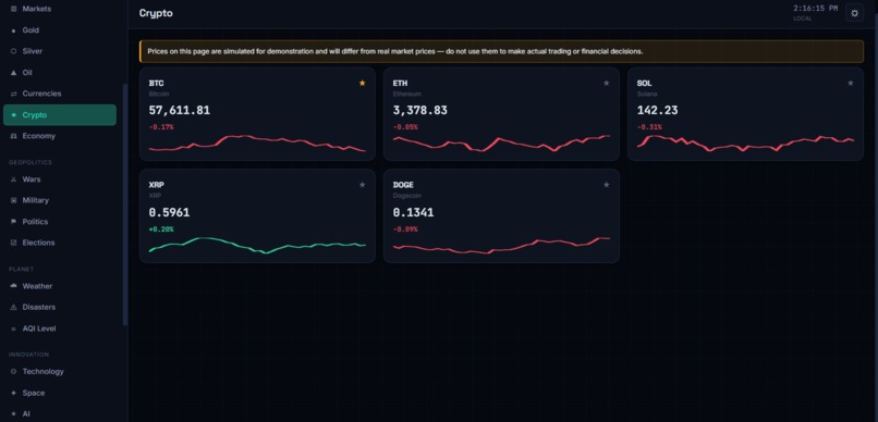
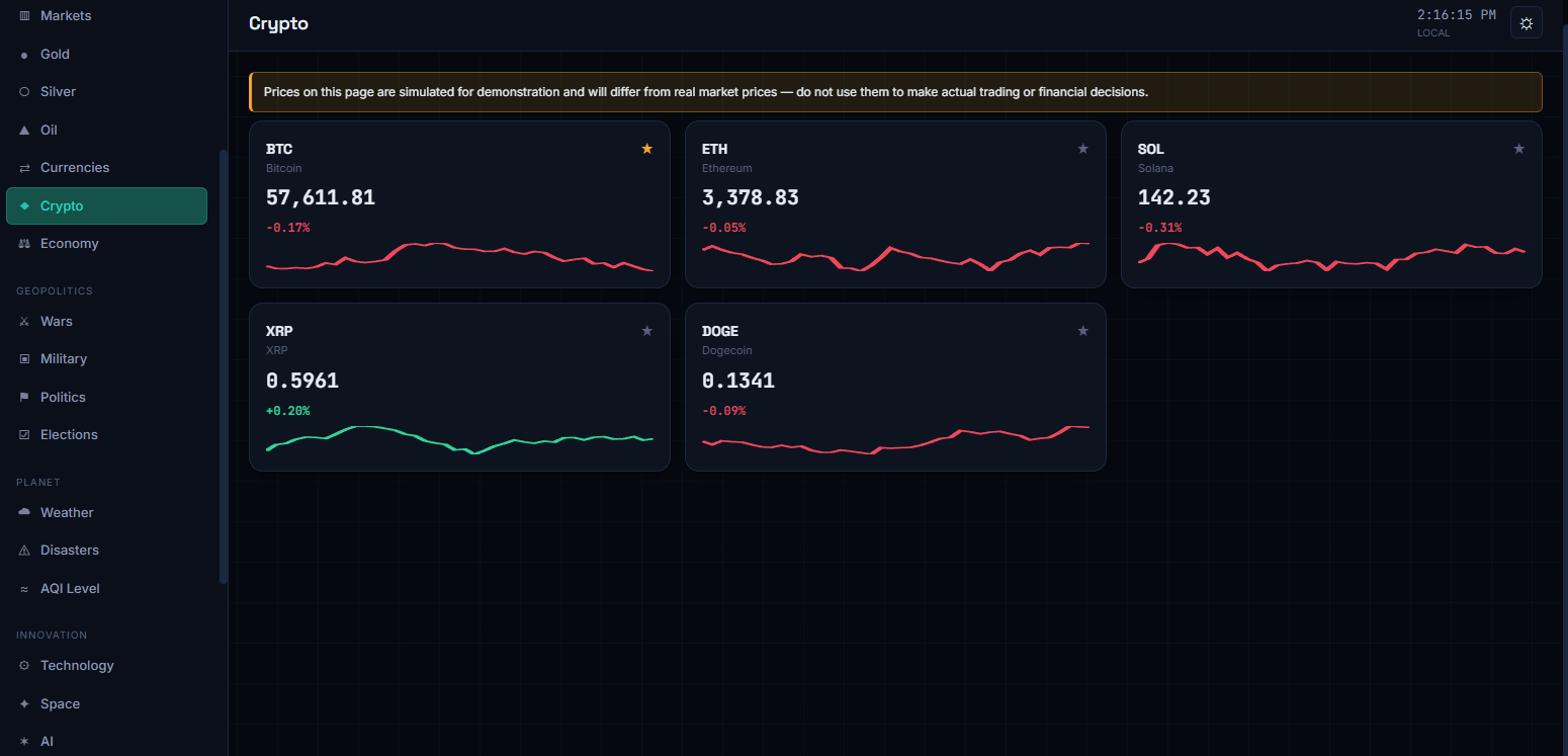
Crypto: BTC, ETH, SOL, XRP, and DOGE prices with live sparkline trend charts.
-
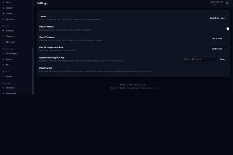
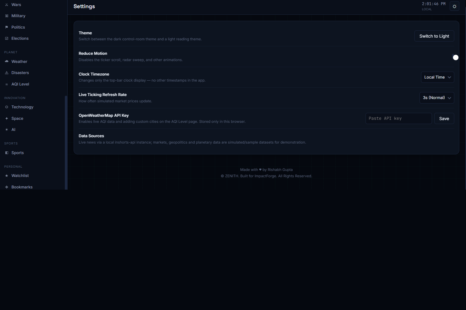
Settings: theme, motion, timezone, refresh rate, and API key controls for live data sources.
-
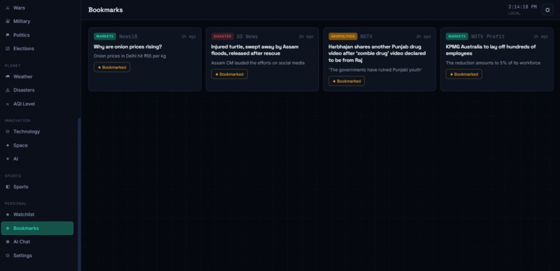
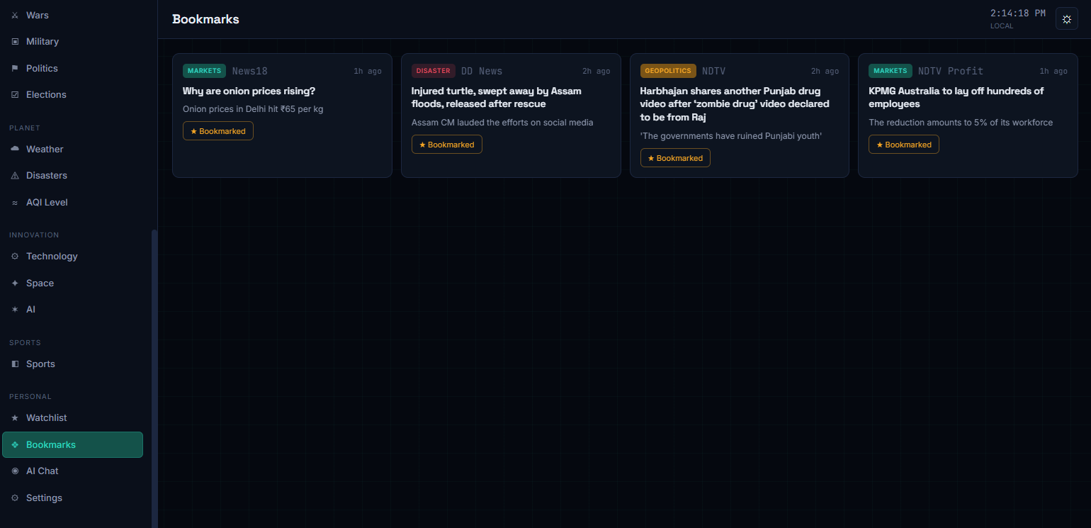
Bookmarks: saved articles from across the dashboard, organized in one place.
-
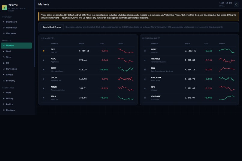
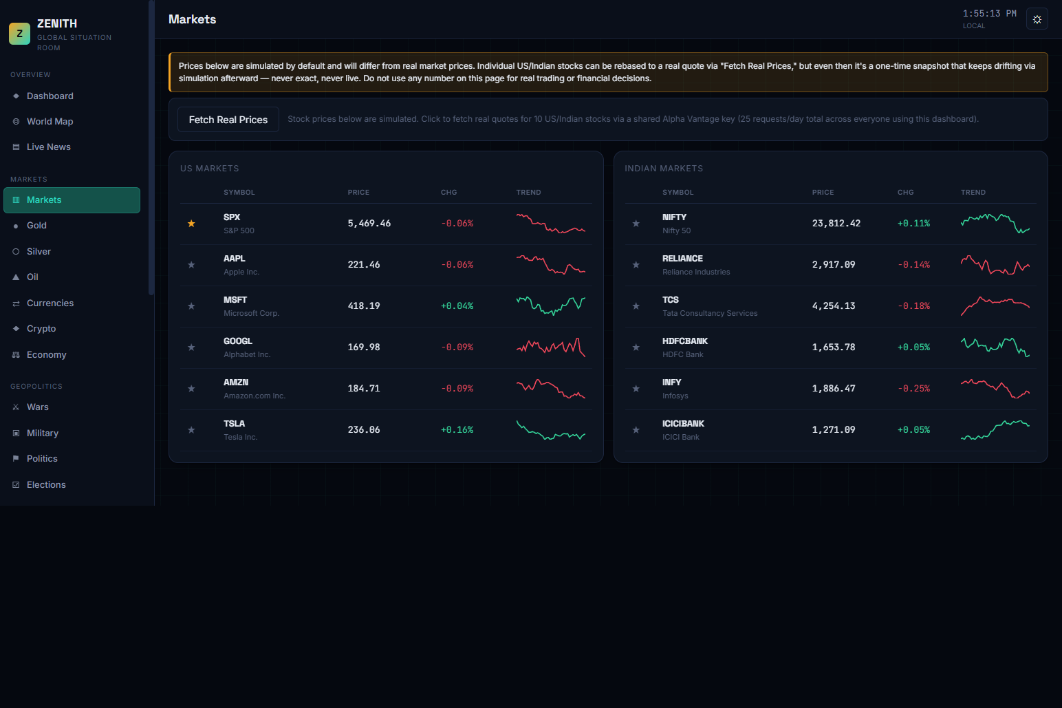
Markets: US and Indian stock tables with live-ticking prices and an optional real-quote fetch.
-
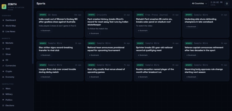
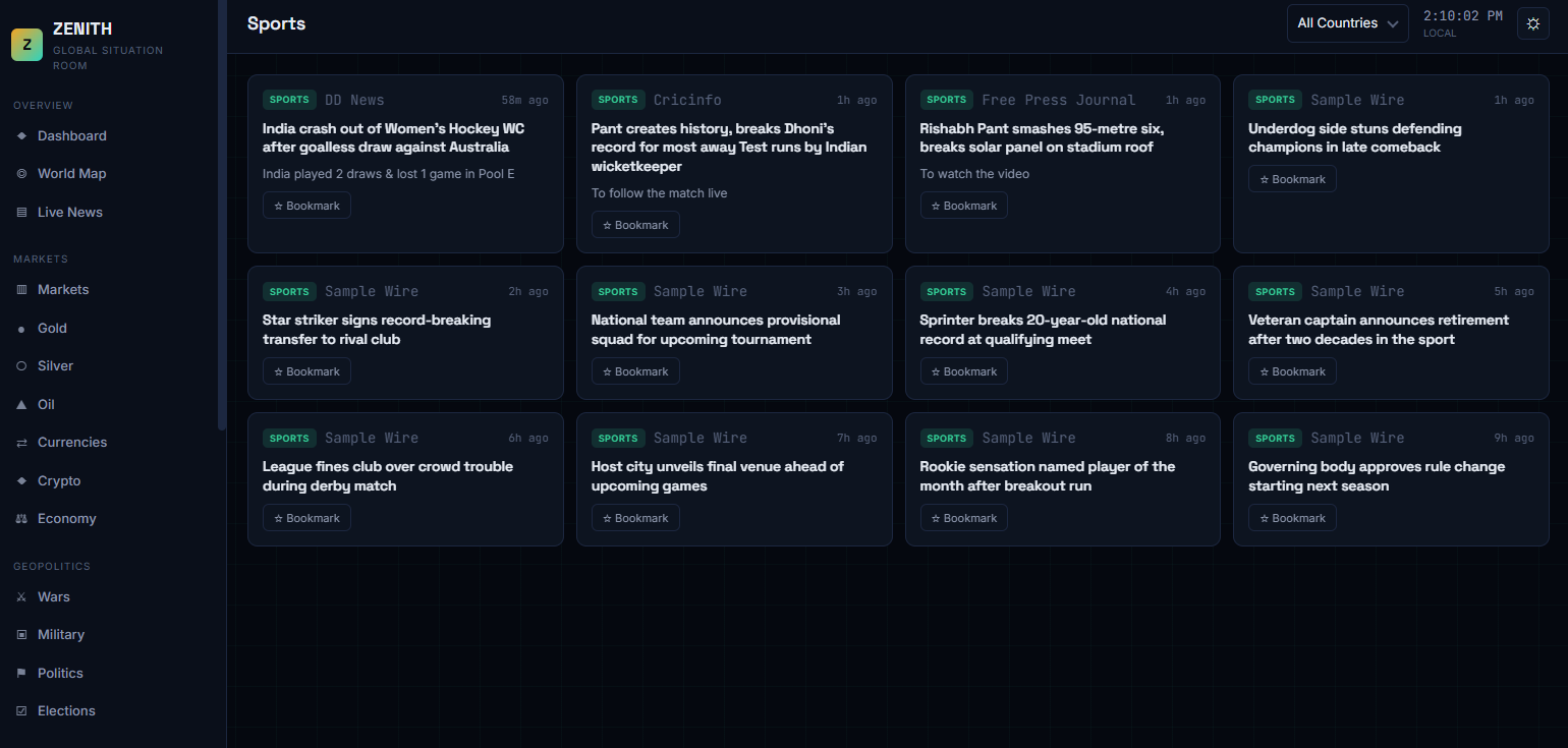
Sports: live sports headlines from around the world, bookmarkable for later reading.
-
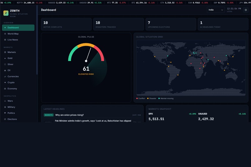
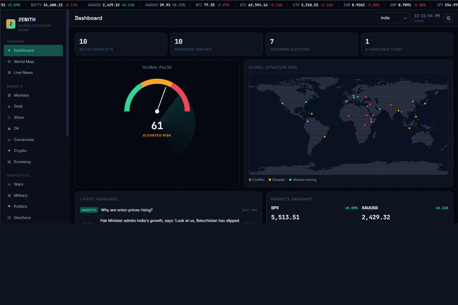
Dashboard: a live risk gauge, world event map, headlines, and markets snapshot in one glance.
-
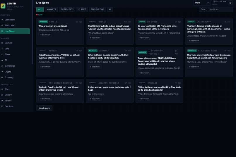
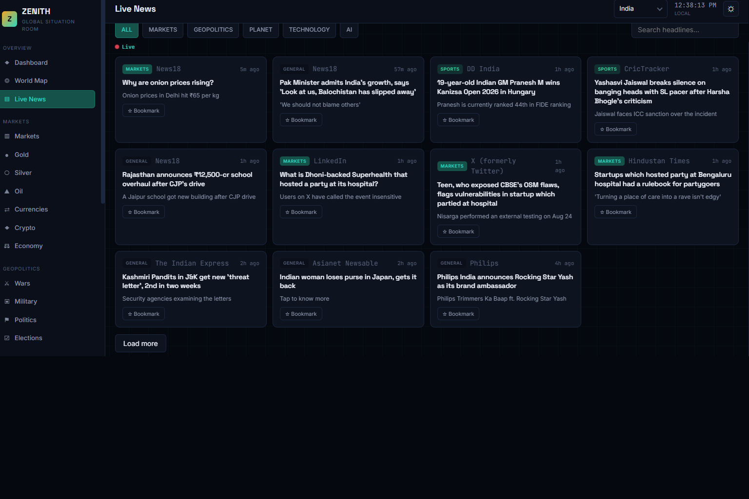
Live News: real headlines pulled from a live news feed, filterable by category, with bookmarking.
-
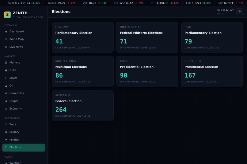
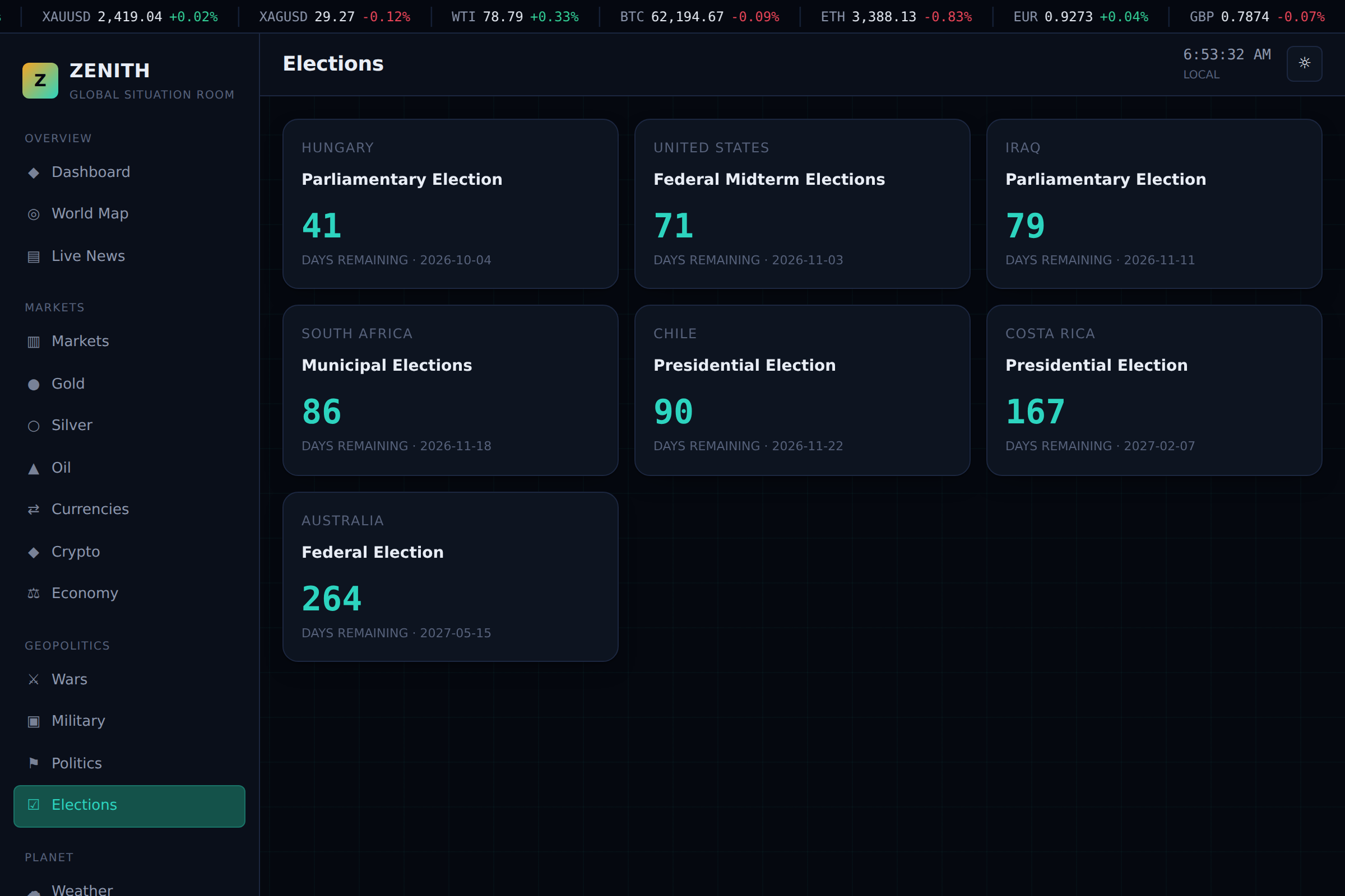
Elections: upcoming elections worldwide with country, type, and days-remaining countdowns.
-
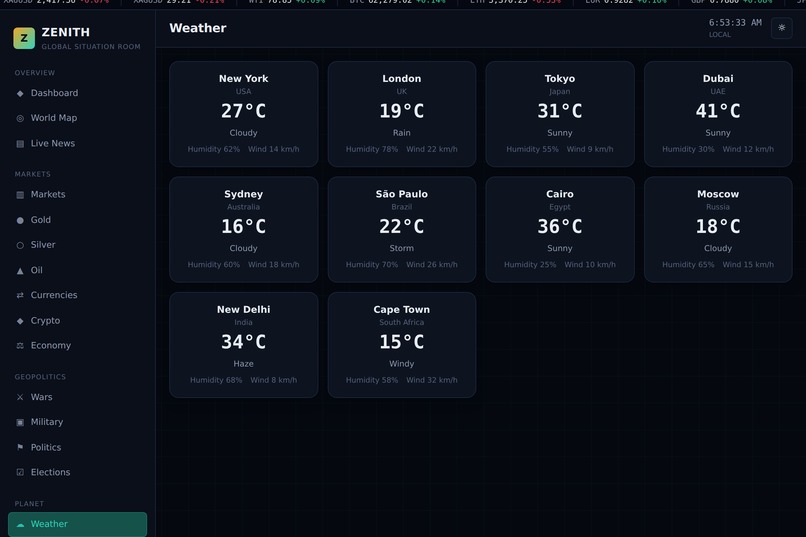
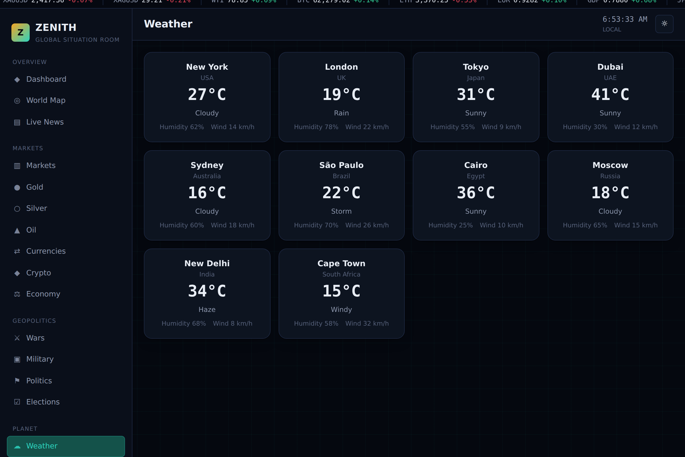
Weather: current conditions for 8 major world cities, including temp, humidity, and wind.
-
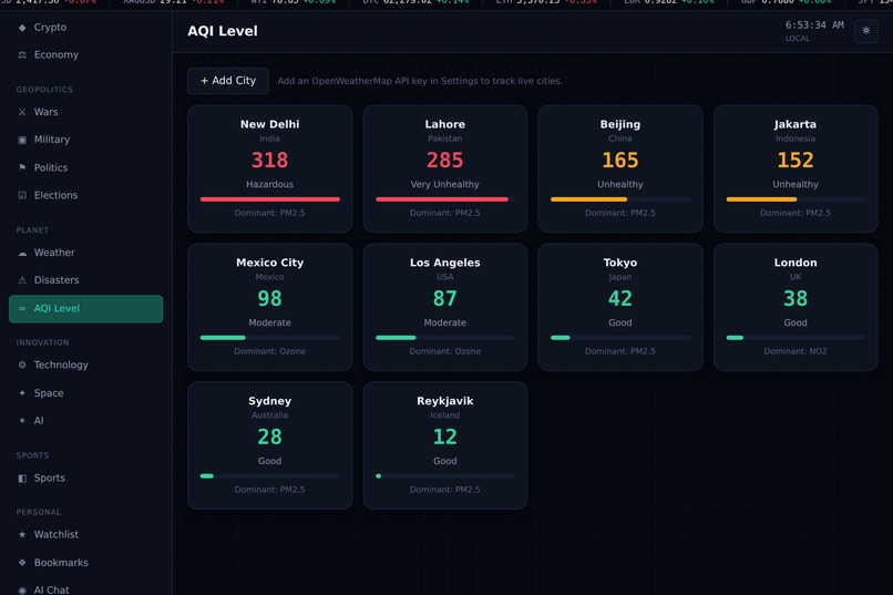
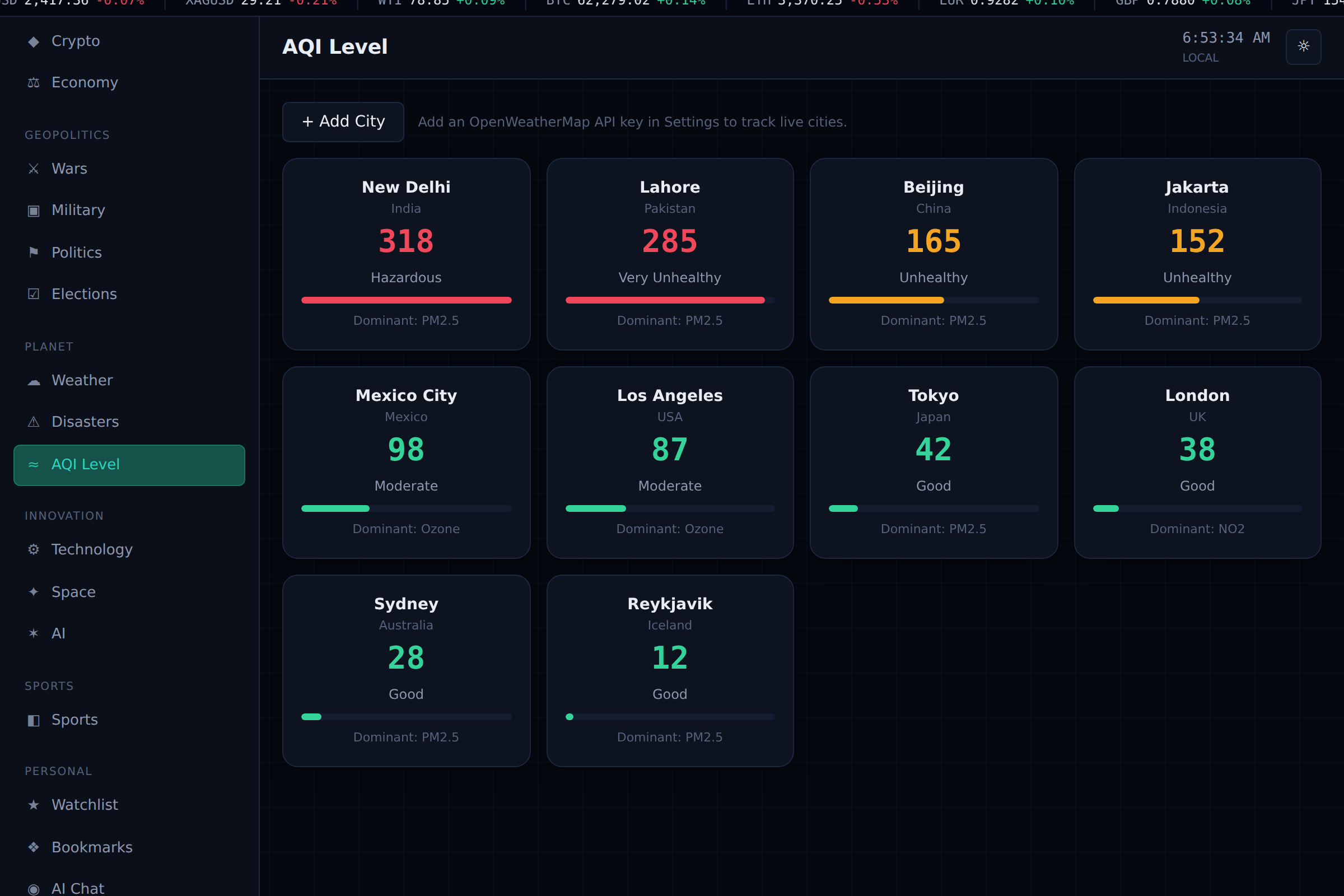
AQI Level: air quality index for major cities, color-coded by health category.
-
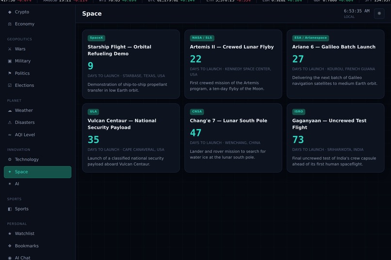
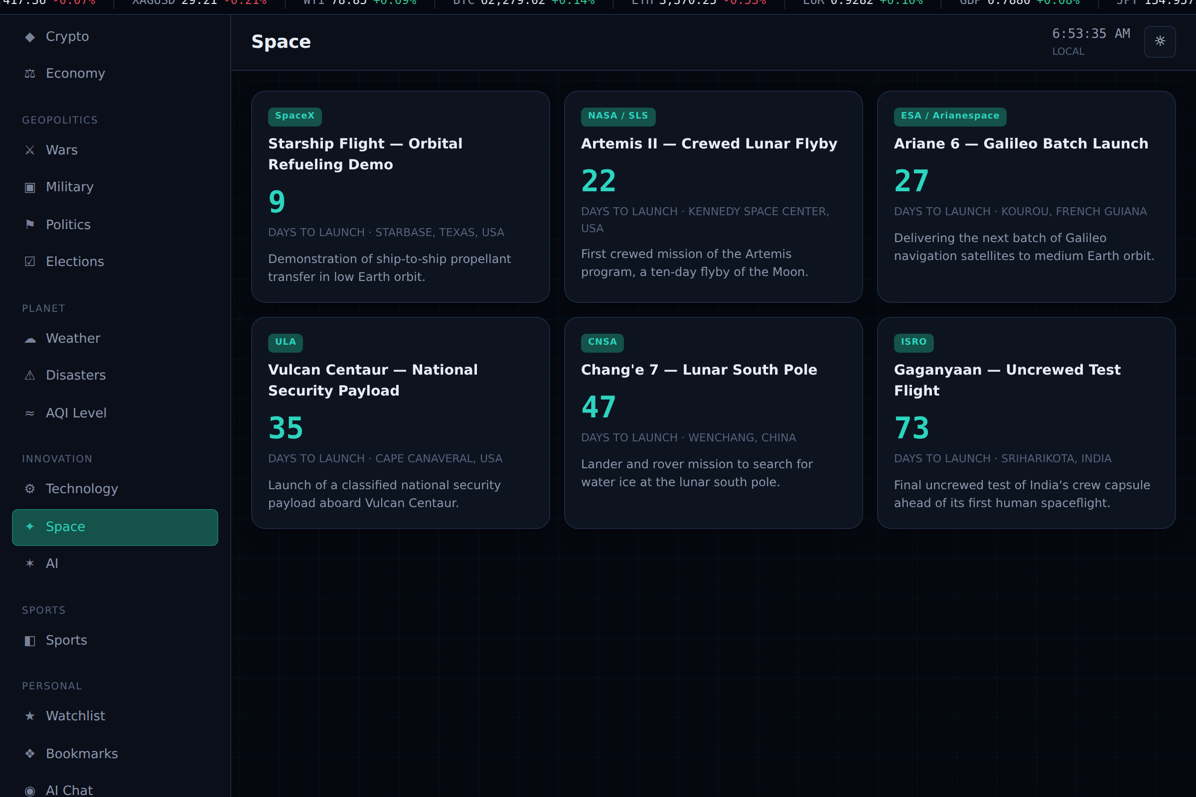
Space: upcoming rocket launches from SpaceX, NASA, ESA, ISRO, and more, with countdowns.
-
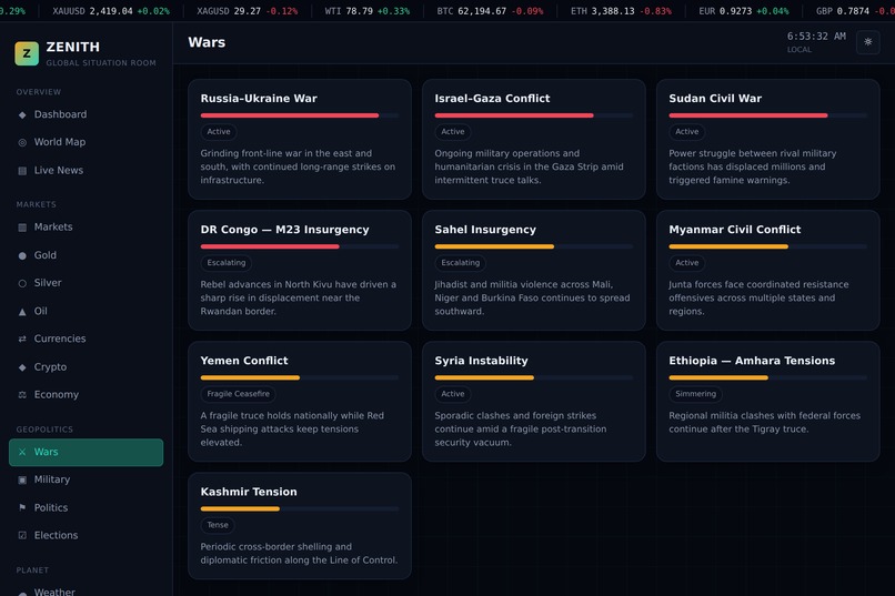
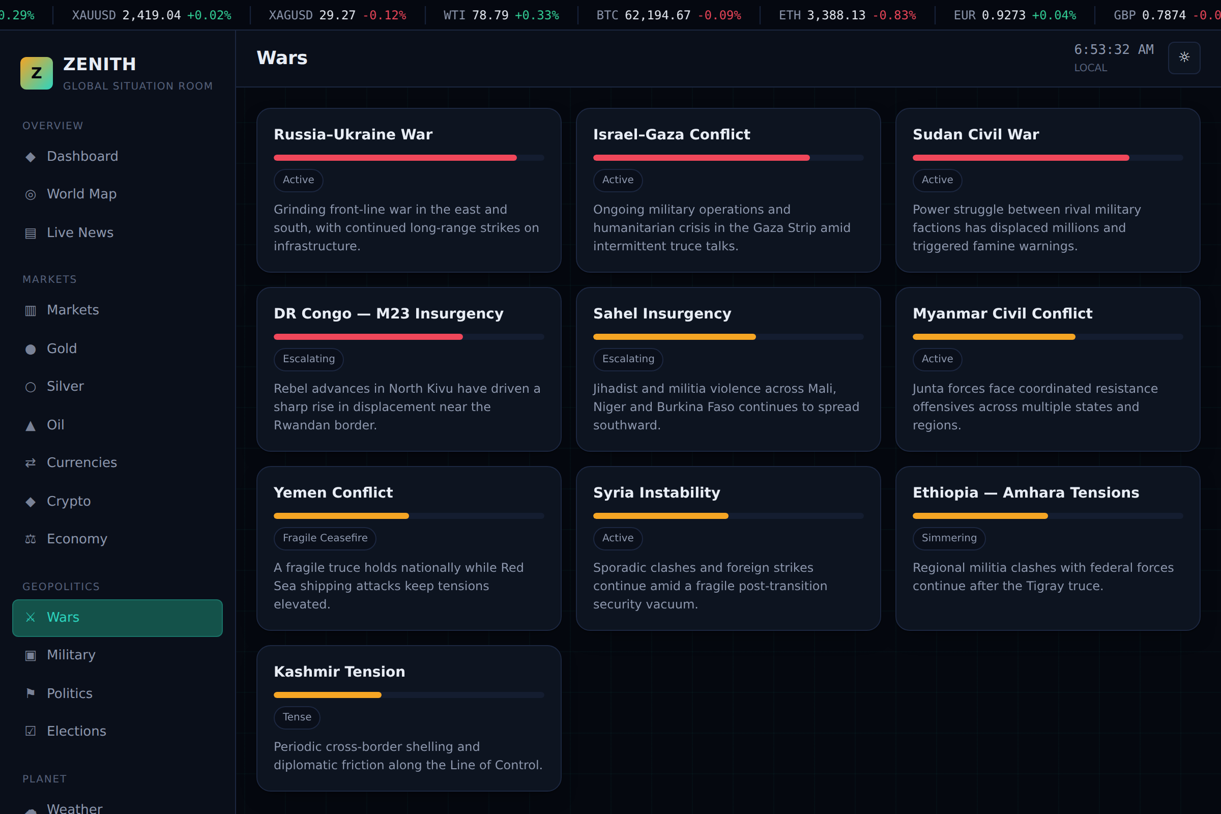
Wars: active global conflicts with severity bars, status tags, and short summaries.
-
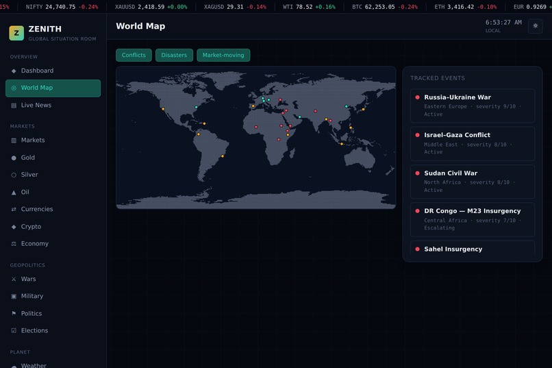
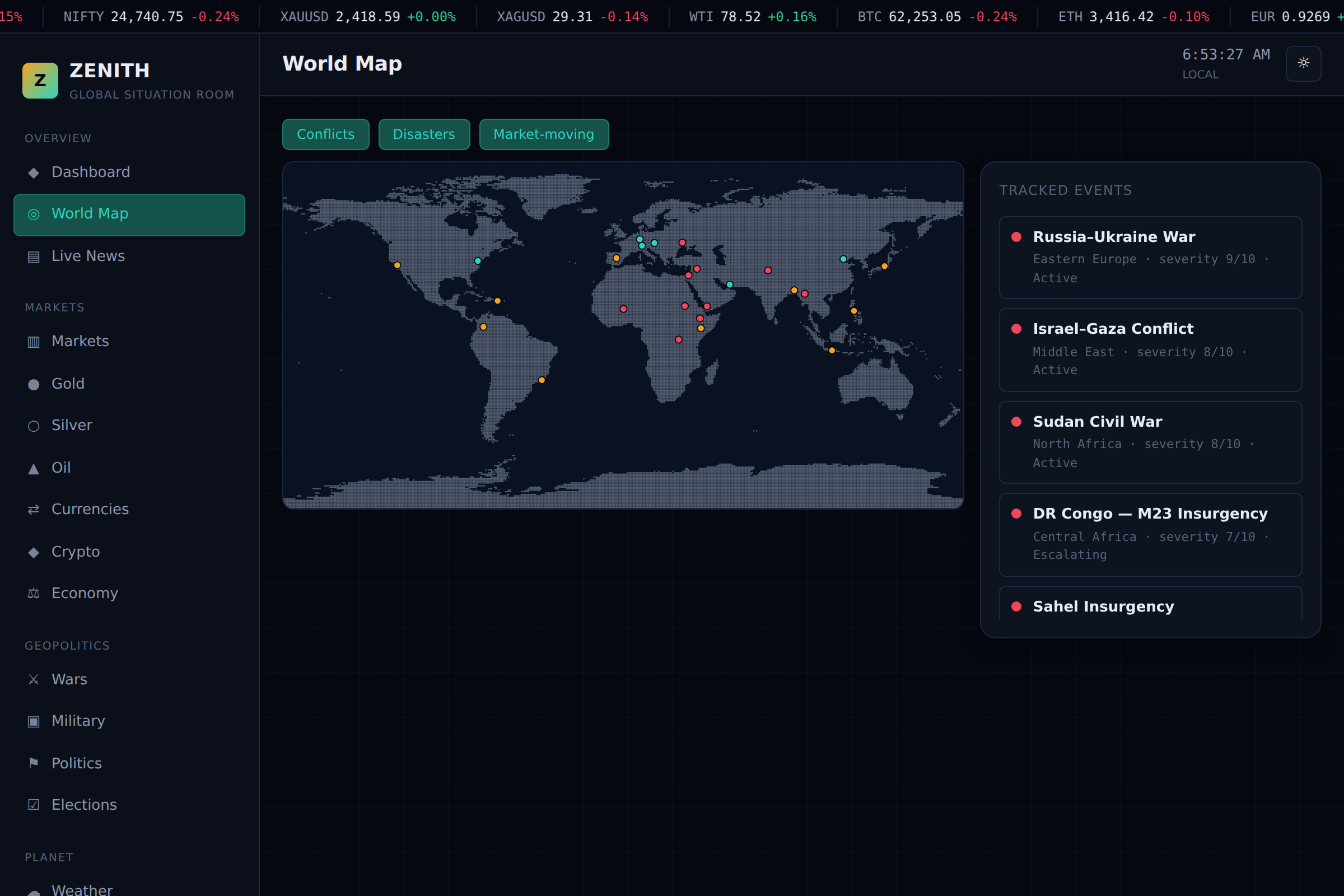
World Map: conflicts, disasters, and market-moving events plotted globally with a tracked events list.
Zenith: Project Story
Inspiration
It started with a screenshot. A friend showed me a dashboard he'd been building: a dark, sidebar-driven "intelligence OS" that pulled together markets, wars, and weather into one screen. I liked the idea of it immediately: a single place to see the state of the world instead of ten open tabs. But the execution felt static, panels that looked good but didn't really do anything. I wanted to build the same concept, but make it actually work: real interactions, real math behind every gauge and chart, and a design language that felt intentional rather than templated.
What it does
Zenith is a single-page "global situation room" dashboard. The Dashboard gives an at-a-glance read on the world through a radial risk gauge (Global Pulse), a live event map, headlines, and a markets snapshot. World Map plots conflicts, disasters, and market-moving events geographically with hover detail. Live News is a filterable, bookmarkable feed. Markets covers gold, silver, oil, currencies, and crypto with live-ticking prices, sparkline charts, and a currency converter that stays mathematically in sync with whichever prices are currently ticking. Geopolitics and Planet break down into wars, elections, weather, disasters, space, and AI news. And Personal holds a watchlist, saved bookmarks, a working AI chat analyst, and settings, including a dark/light theme where the instrument panels (gauge, map, ticker) deliberately stay dark in both modes, like a real gauge cluster that doesn't wash out in daylight.
How we built it
It's a single self-contained HTML/CSS/JS file by design: no framework, no build step, easy to open or hand off. I built a small design system first: a control-room palette (near-black background, amber and teal signature accents), a three-typeface system (a display face for headings, a clean sans for body text, and monospace for every number and timestamp), and a component library (cards, segmented tabs, sparkline charts, a radar-style risk gauge) that everything else was assembled from. The AI Chat panel calls a real LLM API directly from the browser, so it's a genuinely functional assistant, not a scripted mockup. For live data, I went looking for real integrations rather than settling for permanently fake numbers, which turned into its own project.
Challenges we ran into
The gauge was the first real bug: the needle's rotation formula and the arc's fill math used inconsistent angle conventions, so a high-risk score would point the needle toward the green end. I only caught it by writing a small script to check the needle's direction against the arc's colored endpoint at several test values; eyeballing it wasn't enough.
The world map was the bigger fight. My first version used Leaflet.js with real map tiles, which looked great, until it turned out sandboxed preview environments restrict which external hosts a page can load scripts and tiles from, so it broke in exactly the environment it needed to work in. I ended up building a fully self-contained map instead: hand-approximated continent polygons rendered as a dot-matrix, using a point-in-polygon test to place event markers. I validated it against 30+ real city coordinates (Sydney, Cape Town, Buenos Aires, Mumbai) to make sure the shapes were actually right, not just plausible-looking.
The live data integrations taught me the most expensive lesson: I initially wrote integration code against two different Python/Node packages based on how similar libraries are usually structured, and shipped confidently wrong method names, which cascaded into a server that would start but silently fail. The fix wasn't cleverer guessing; it was going and reading the actual source code of both packages line by line, which is what finally made the news feed work against a real, verified API instead of an assumption.
Accomplishments that we're proud of
Getting the AI Chat panel to be a real, working assistant rather than a canned demo. Building a world map with zero external dependencies that still reads as a legitimate, recognizable map. Wiring a currency converter that pulls its exchange rates live from the same ticking price data driving the rest of the dashboard, in two different places on the page, without them stepping on each other. And honestly, treating every bug as something to actually root-cause instead of papering over, even when the fix meant throwing out an approach I'd already spent time on.
What we learned
Verify the math before you ship a gauge: angle formulas are deceptively easy to get subtly wrong. Never assume a third-party library's API from naming conventions; read the source. Sandboxed and embedded environments have real, hard constraints that are worth designing around from the start rather than discovering mid-build. And reusable components need namespaced IDs the moment there's any chance two instances end up on the page at once.
What's next for Zenith
A real live market-data source to replace the simulated ticking prices. Merged multi-source news instead of a single feed. Persistence: accounts and watchlists that survive a refresh. And eventually, historical charting instead of just live sparklines, so the story a chart tells isn't limited to the last few minutes.
Built With
- claude
- css3
- geminiapi
- html5
- inshortsapi
- javascript
- node.js
- weatherapi


Log in or sign up for Devpost to join the conversation.