
Inspiration
As very young students ourselves of disciplines related to computer science, data science and mathematics, we know how hard and how scary can it be when you face a complex chart or a complex data frame. We picked this challenge because we were motivated to make data understandable and easy to visualize to anybody, whether they have a formal mathematics and statistics background or not.
What it does
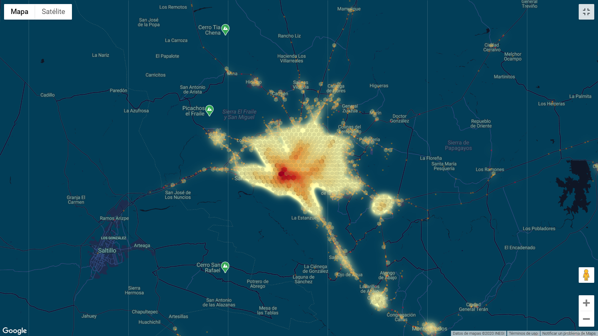
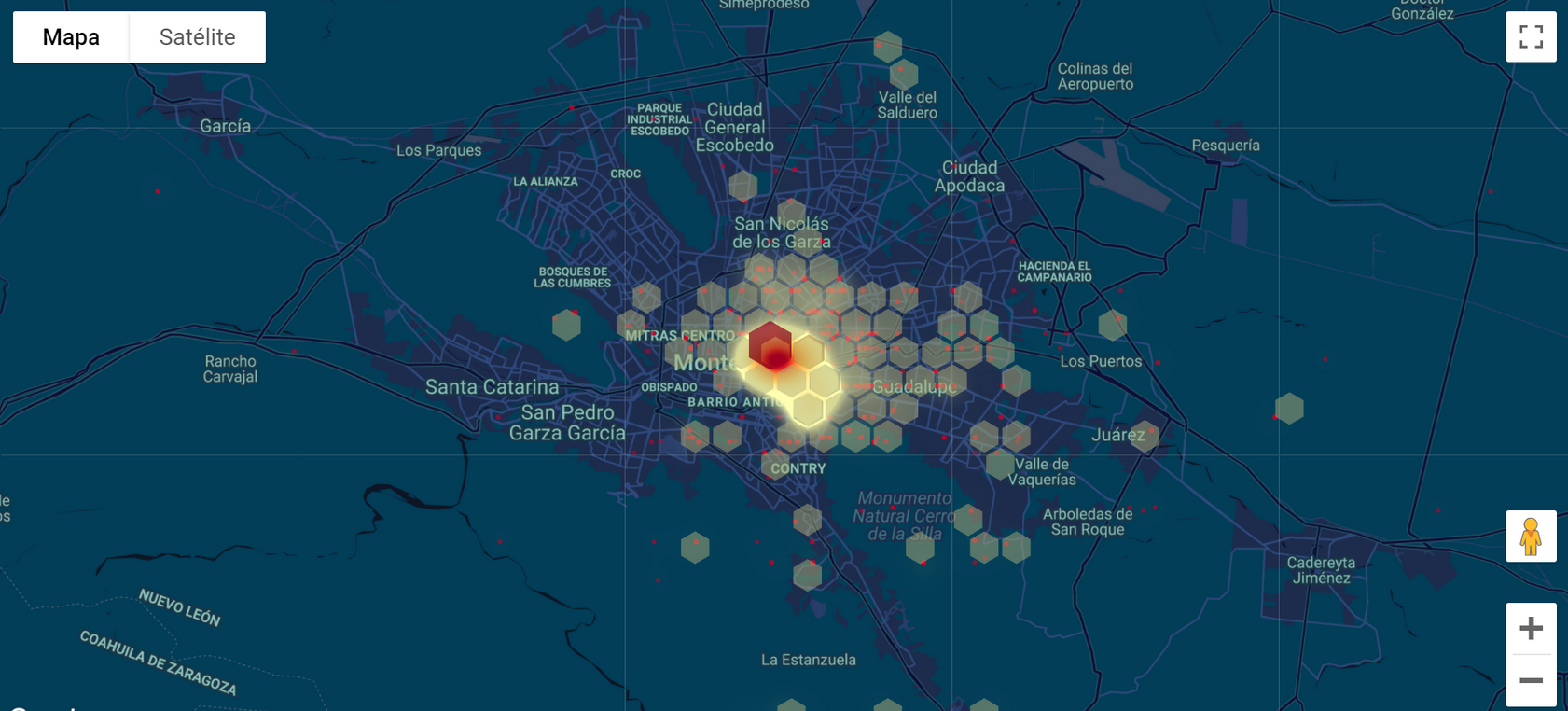
It is a data visualization web app that offers options to display several maps that contain information from different datasets created by us. It shows information that it it's very easy to understand and can lead the visitors to make their own conclusions without having to interpret "weird statistics".
How we built it
It all started from a simple database that we processed using Python, specifically with both the libraries of Pandas and Numpy. Once the database was "clean" and we got rid of all the data that we considered "useless", we used the machine learning module Scikit-Learn to identify patterns and relations between the different categories of data and make predictions of thousands of possible accidents in the state of Nuevo León using 3 different algorithms. Once all the data was generated and processed, we used a front-end java script and a small integration with Google Maps to plot and visualize our data on the screen.
Challenges we ran into
The data processing and predicting gave us difficult times for sure. As we're all novices in the data science field we had to conduct our analysis with caution, since any wrong operation could lead to the whole code breaking or the models predicting nonsense (somehow we managed to get points plotted in Europe). After that, the visualization was also a very though challege, due to the fact that we are not trained to do front end development.
Accomplishments that we are proud of
We are very proud of the fact that we managed to put the application together in such a short amount of time and despite the long quantity of difficulties that we faced. Each and everyone of us keep their temper and we were always willing to help our struggling partners even if we had little to no knowledge about the other's area of work.
What we learned
We learned to simplify statistical analysis and portray it in a visually atractive way. Usually if you can't explain something in a simple way it means that you dont understand it completely yourself. So it was an amazing journey of going through all the concepts used and deeply understanding them.
What's next for Zeif - Datlas Challenge
We have so many ideas that we want to implement into Zeif, such as an integration with other databases like traffic density or even accident mortality to develop artificial inteligence algorithms in navigation systems that look for alternate city routes so the risk of having a car accident is the minimum.


Log in or sign up for Devpost to join the conversation.