
Inspiration
In the past, while I enjoyed front-end development, data visualization was an area of interest but not one I had actively pursued. This changed one weekend when, on a whim, I visited Dev Post and stumbled upon this hackathon, which seemed intriguing.
What it does
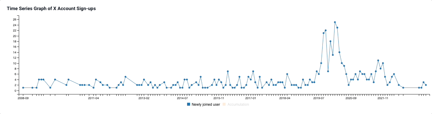
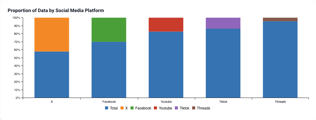
Looking at the given data, I contemplated the relationships and potential insights that could be discovered and presented. I realized that additional data could be linked through the provided SNS accounts, so I decided to crawl for more data and visualize the findings.
How we built it
We started by trying to understand the data. We looked into each SNS account to see who they were and what data could be collected. After deciding what to collect, we used Selenium for crawling, processed the data with Pandas, and visualized it on a dashboard implemented with D3 and Billboard.js in React.
Challenges we ran into
We wanted to use X's data but found that the API was paid. We checked existing open-source solutions for crawling but couldn't find anything suitable, so we ended up writing our own code for simple crawling.
Accomplishments that we're proud of
- We managed to complete the entire process of data collection, processing, and visualization.
- We deliberated on how to present the data to best highlight the differences we wanted to convey.
- We examined trends discovered in the data and made inferences about intentions by correlating them with other data sets.
What we learned
Usually, I had seen data in table formats during development. Participating in this Data Visualization hackathon and visualizing the data myself taught me about the clear trends and anomalies that data can exhibit.
What's next for Yummy Data
We plan to collect feeds and enhance the credibility of my hypothesis that social media was used in response to negative images due to COVID-19, by further grounding the analysis in data.

Log in or sign up for Devpost to join the conversation.