-
-
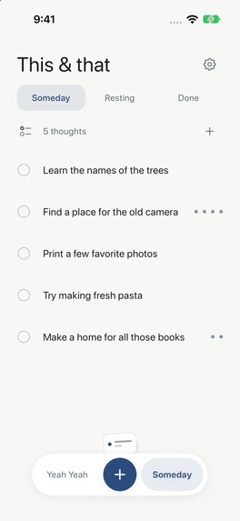
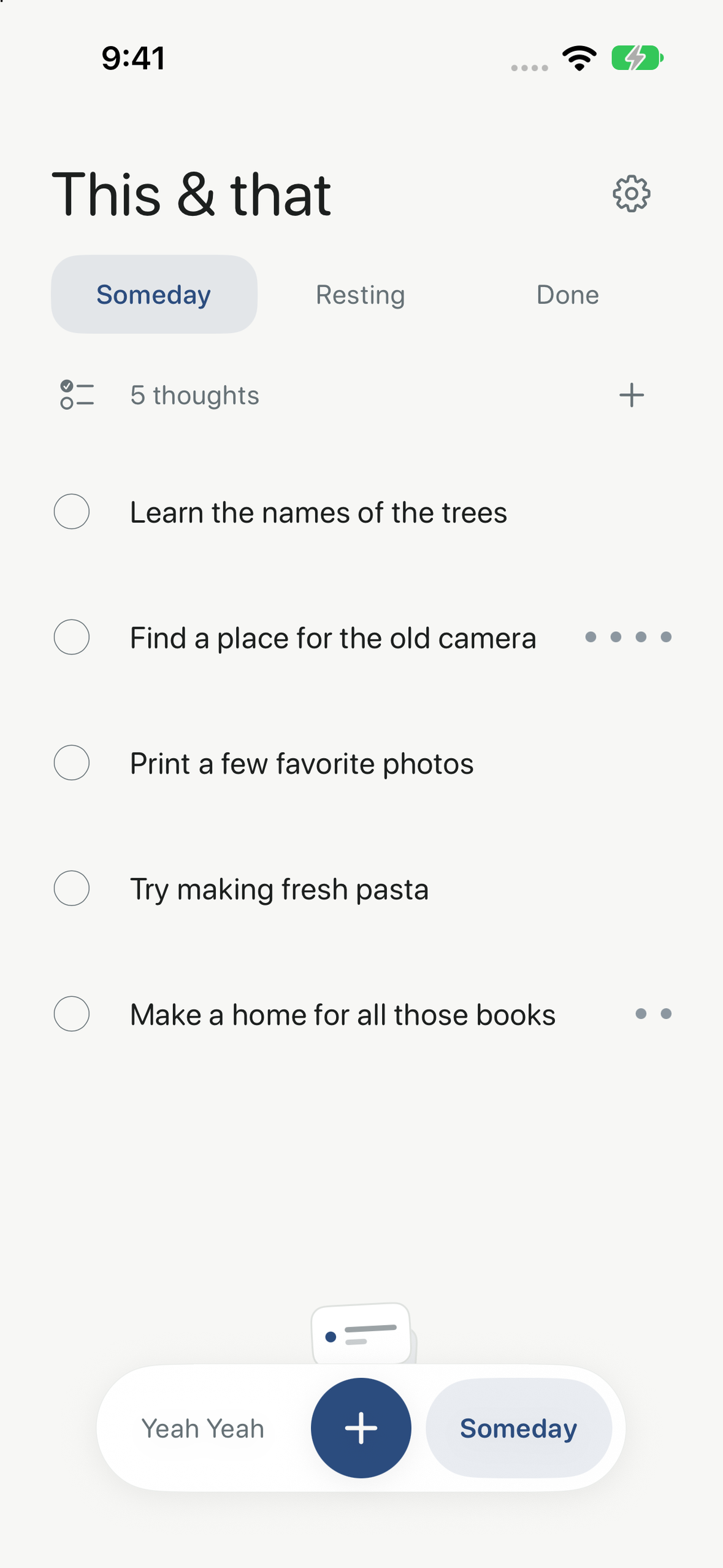
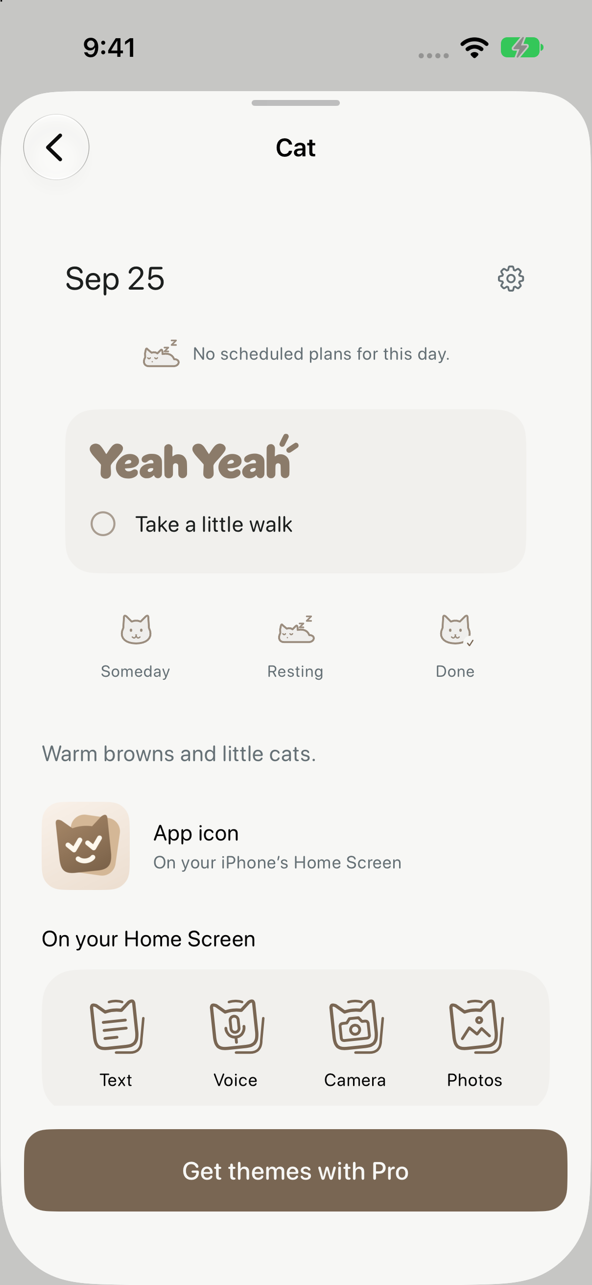
Someday, Resting and Done: thoughts can wait without being lost.
-
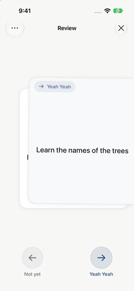
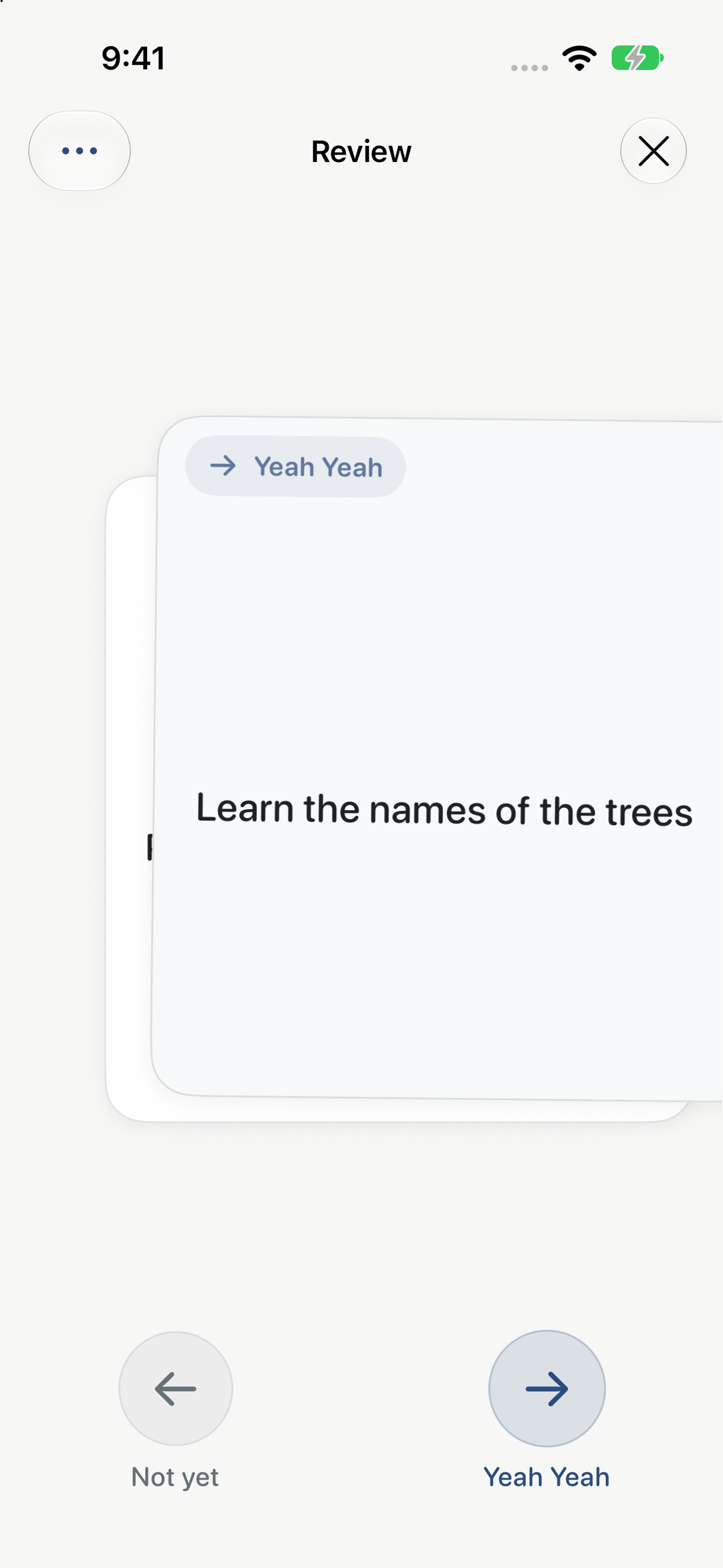
Right for Yeah Yeah, left for Not yet. The next card waits underneath.
-
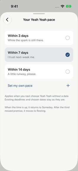
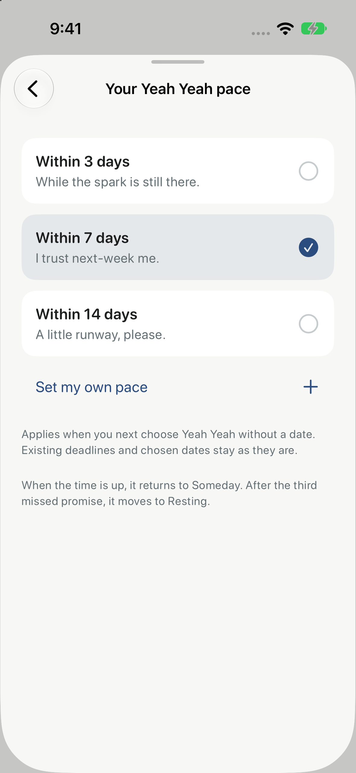
What does “soon” mean to you? Choose 3, 7, 14, or your own 1–30 days.
-
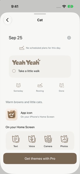
Preview a theme before purchasing Pro. Themes and widgets are a one-time upgrade.
-
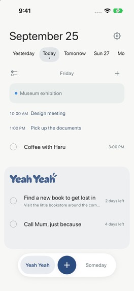
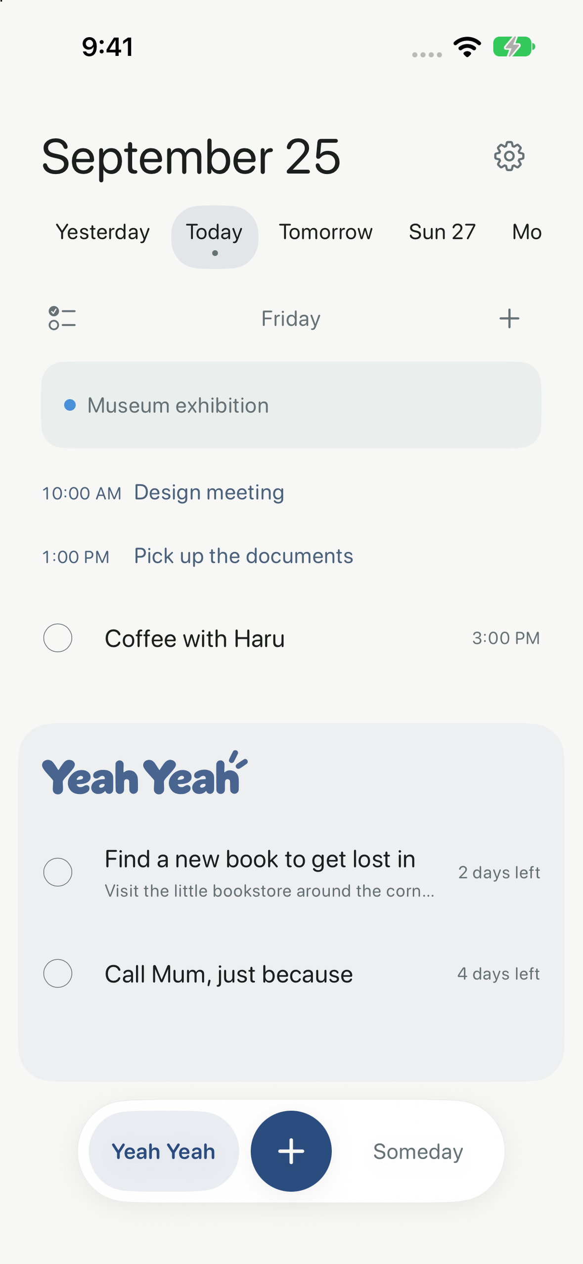
Your day and your undated Yeah Yeah list, together. Actual app screen, without a device frame.
-

Yeah Yeah: two checkmarks, one easygoing promise. Original 1024 × 1024 app icon.

Inspiration
“Yeah, yeah, later” is a decision, too.
A to-do list can become a collection of promises we no longer mean. I wanted an app that could hold a thought without turning it into a demand—and become quieter when we keep saying “not yet.”
What it does
Yeah Yeah is an iPhone app for everyday chores, ideas and things you might get around to.
Capture with text, voice, camera, photos, or the share sheet. Put a thought in Yeah Yeah if you intend to do it soon, or leave it in Someday. On first launch, choose what “soon” means: 3, 7, 14, or any 1–30 days. A task can also have a specific date and an optional timed reminder.
When Someday has thoughts ready to review, a small card deck peeks out above the floating bar. Open it when you want. Swipe right for Yeah Yeah, left for Not yet. The wait after Not yet grows from 2 to 4, 7 and 14 days. The fifth Not yet moves the thought to Resting, where it stays recoverable without reminders. New thoughts wait until the next local midnight before becoming eligible; you never have to dismiss the same fresh thought five times in a row.
Calendar events and dated tasks share one workspace with the undated Yeah Yeah list. You can reorder, move, duplicate, share or delete tasks, individually or in a selection, and undo changes. Full completion history and restoration remain free.
Design: a lighter kind of decision
The Review interaction is the center of the app. Pulling the little deck lifts its actual front card into the Review surface. The card follows your hand, reveals its choice through direction and tint, and leaves the next card waiting underneath. The first-use explanation is a practice swipe using the same interaction, without changing a real task.
The deck appears only when there is something ready. It does not interrupt you with an automatic modal, a count badge or a looping invitation. Resting is a place you can return from, not a punishment.
Elsewhere, the same touch language connects the app: elastic page edges lead between days and into the month calendar; the undated list remains available while dates change; drag previews explain the destination close to your finger; and the floating bar becomes the action area during selection. Round tap alternatives, VoiceOver actions, Dynamic Type and Reduce Motion support make the gestures optional.
There are no streaks, red overdue badges, ads or scores. The aim is a small decision that feels good to make, rather than another productivity dashboard to maintain.
How I built it
The app is built in Swift and SwiftUI, with UIKit integration for the interactions that need precise gesture control. EventKit provides read-only calendar integration; WidgetKit and App Intents provide widgets and Control Center capture; and the share extension imports text, links and ordered photos into the same task model.
Speech recognition and supported title generation use Apple’s on-device Speech and Foundation Models APIs. Typing remains available when permissions, language resources or device capabilities do not support those features. Tasks stay on the device; link previews contact their destination websites, and Apple and RevenueCat handle purchases. No account is required.
RevenueCat manages the verified Pro entitlement, purchase and restore flow. Pro is a one-time purchase for themes and widgets—US$3.00 in the US, with localized prices elsewhere. Capture, unlimited tasks, calendar integration, reminders, sharing and completion history are free. Theme previews let people see what they are buying; purchasing Pro through a widget entry returns them to the action they originally requested.
Challenges and lessons
The hard part was keeping playful motion trustworthy. Horizontal browsing, vertical scrolling, tapping and dragging must have distinct outcomes. Moving a group must preserve its ordering and remain one reversible operation. Dates and review waits must follow the local calendar, rather than treating every day as 24 hours.
Repeated device checks led to many small refinements: nearby drop hints, consistent selection fills, predictable sticky headers, readable English labels, and fewer redundant headings. The lesson was that “less” is a behavior as much as a visual style: fewer interruptions, fewer decisions at capture, and a safe way to change your mind.
What’s next
Yeah Yeah is now published on the App Store in English and Japanese. The next step is listening to real use: whether the review pace feels right, whether Resting is understood, and where capture still gets in the way. It has just launched; this submission makes no claims about conversion, revenue growth or retention results.


Log in or sign up for Devpost to join the conversation.