Inspiration
Over 1100 patrons utilize the Pantry every week, with 150 people ordering from the Pantry every day. 30 of those orders are online, but, according to half the responses on our user research survey, the ordering process is difficult to navigate and it’s hard to find information they need. We wanted to make the ordering process from the Pantry more efficient and accessible to better the experience for the 100+ daily patrons of the ASUCD Pantry.
What it does
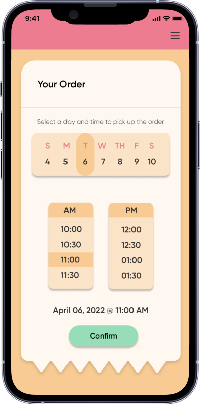
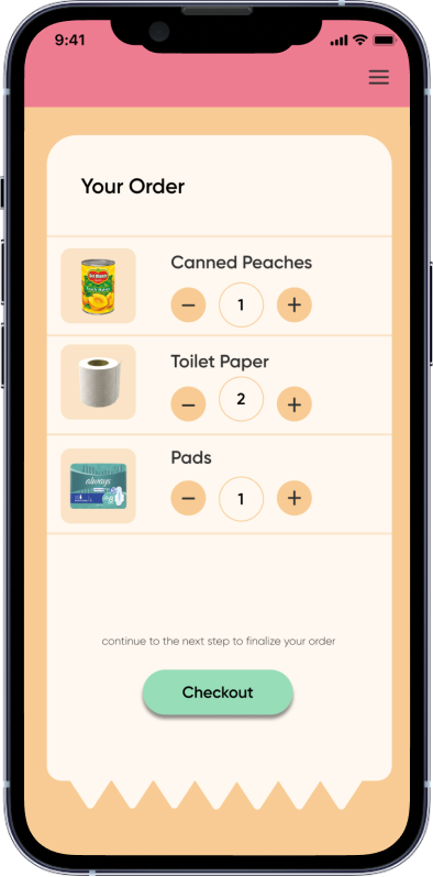
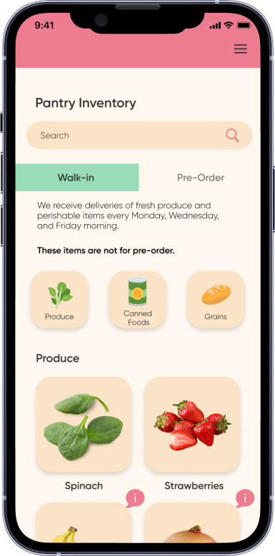
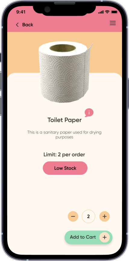
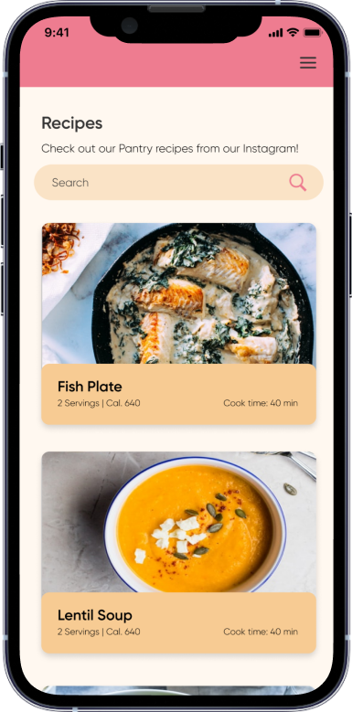
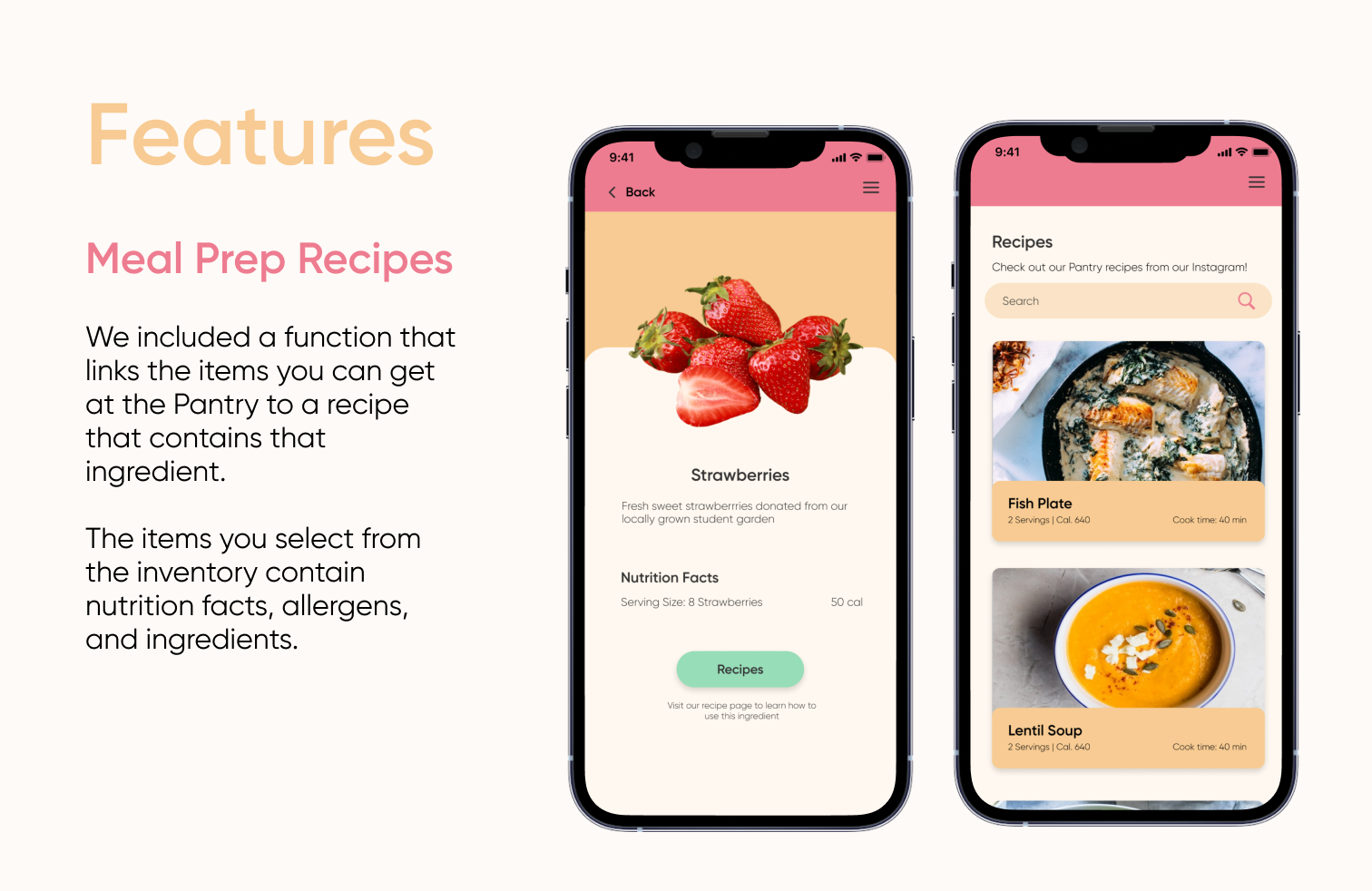
Despite a strong walk-in system, the Pantry’s online pre-order system was confusing, un-detailed, and only available on the web. We created a frictionless application to not only streamline this process, but provide students the nutritional knowledge to successfully prepare meals with food from the pantry.
How we built it
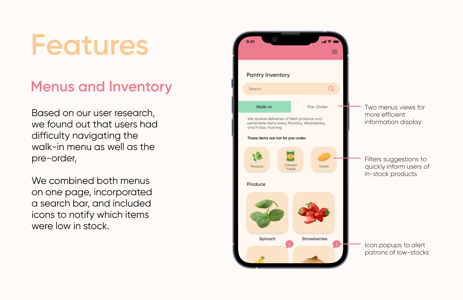
To begin our design process, we looked at the Pantry’s website to look for user pain points and ways to improve the interface. Next, we interviewed 16 students and workers at the Pantry about their overall experience using the website to get an idea of what features we want to prioritize on redesigning. Through our research, we realized that many users didn’t like the website interface because there were many blocks of text with information on the home page, which made it overwhelming to look at. There were also complaints on having to be redirected to different websites to view a live walk-in menu and a pre-order form. Additionally, we found that students were not very informed about nutritional value and meal preparation.
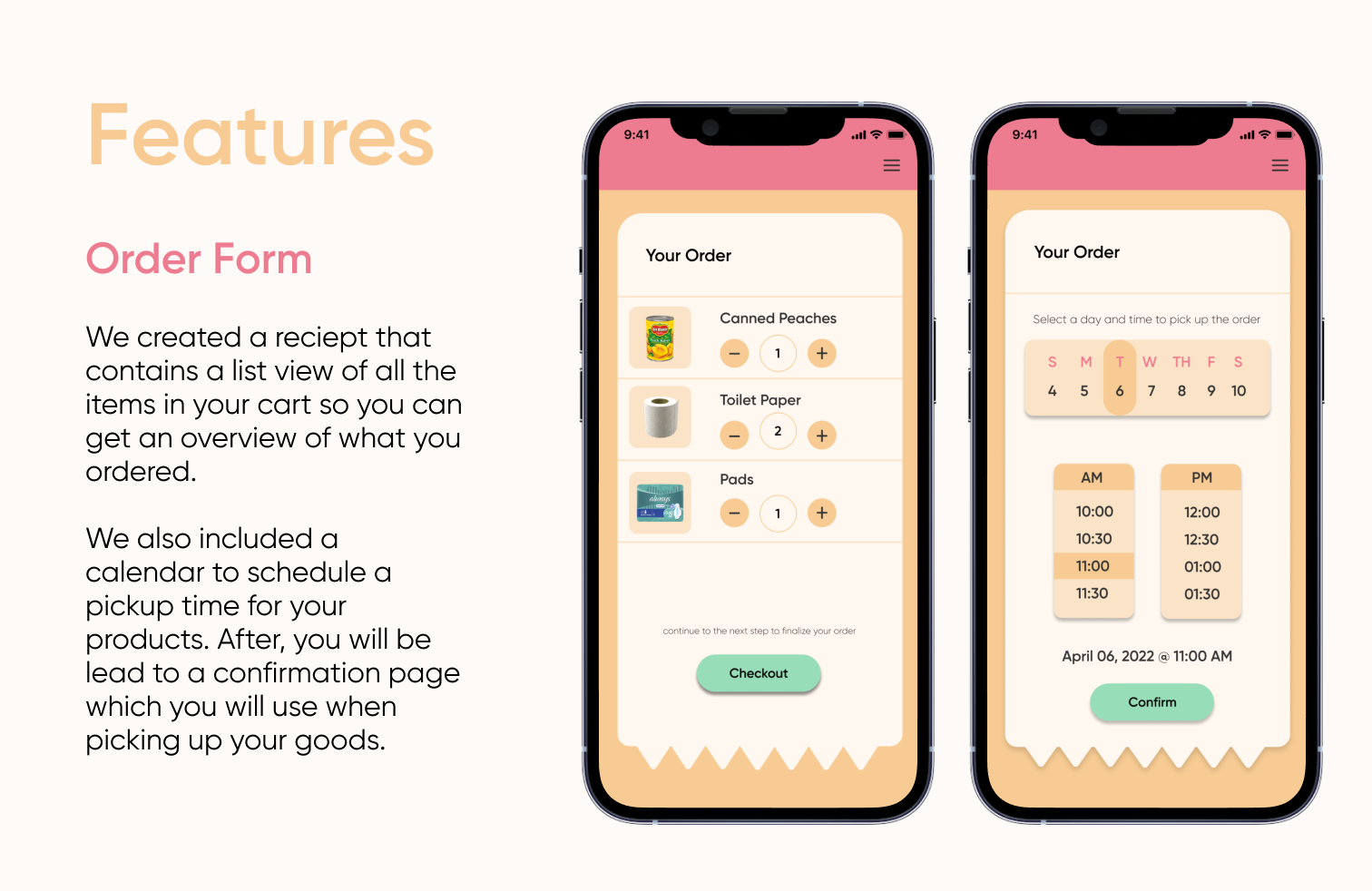
We came up with solution sketches that focused on making the walk-in menu and the pre-order form on one page. This eliminated the original website’s issue of having to click through multiple pages. To prototype and design our app, we primarily used Figma. To develop it into a native application, we used Bravo Studio. This tool is able to read certain tags and structure that we added into Figma to be able to produce a native application that can be run on iOS and Android. Once we converted the Figma files into Bravo, we were able to troubleshoot issues that came up in the applications finished design on Bravo Visual.
Challenges we ran into
Coming up with ways to organize the features of our app was difficult. There were many things that could be improved within the Pantry website and it was overwhelming and finding out what features to focus on. There was also the challenge of finding time to work together because we had differing schedules throughout the day. Additionally, without any coding experience, it was difficult to find ways to create a final product beyond the prototyped design. With creating an app in a short amount of time, we struggled with being able to actually publish it as well.
Accomplishments that we're proud of
Despite it being our first hackathon, we were able to coordinate our differing schedules to fit the hackathon timeline and complete our project within the 24 hour time limit. The structure of the hackathon is also very different from a design sprint, which lasts a week at minimum, but we were still able to incorporate some of the essentials, such as user research, user interviews, and ideation synthesis.
What we learned
We have to consider what our users want to implement designs that can make their user experience smoother. We learned how to effectively collaborate with each other despite having different schedules throughout the day. We were able to realize each other’s strengths and split up the work evenly based on what we were skilled at.
What's next for 6 Dumplings
The current prototype we have doesn't have all of our pages linked to each other. If we had more time, we would like to create each page and make all our buttons clickable. Additionally, we would like to conduct more user tests in order to improve our prototype. In the future, we would also like to have a fully developed app available for students to download.
Built With
- bravo
- figma


Log in or sign up for Devpost to join the conversation.