-
-
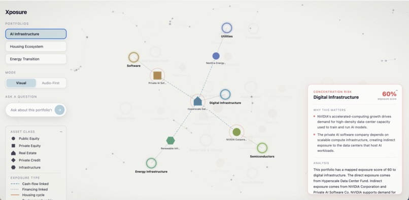
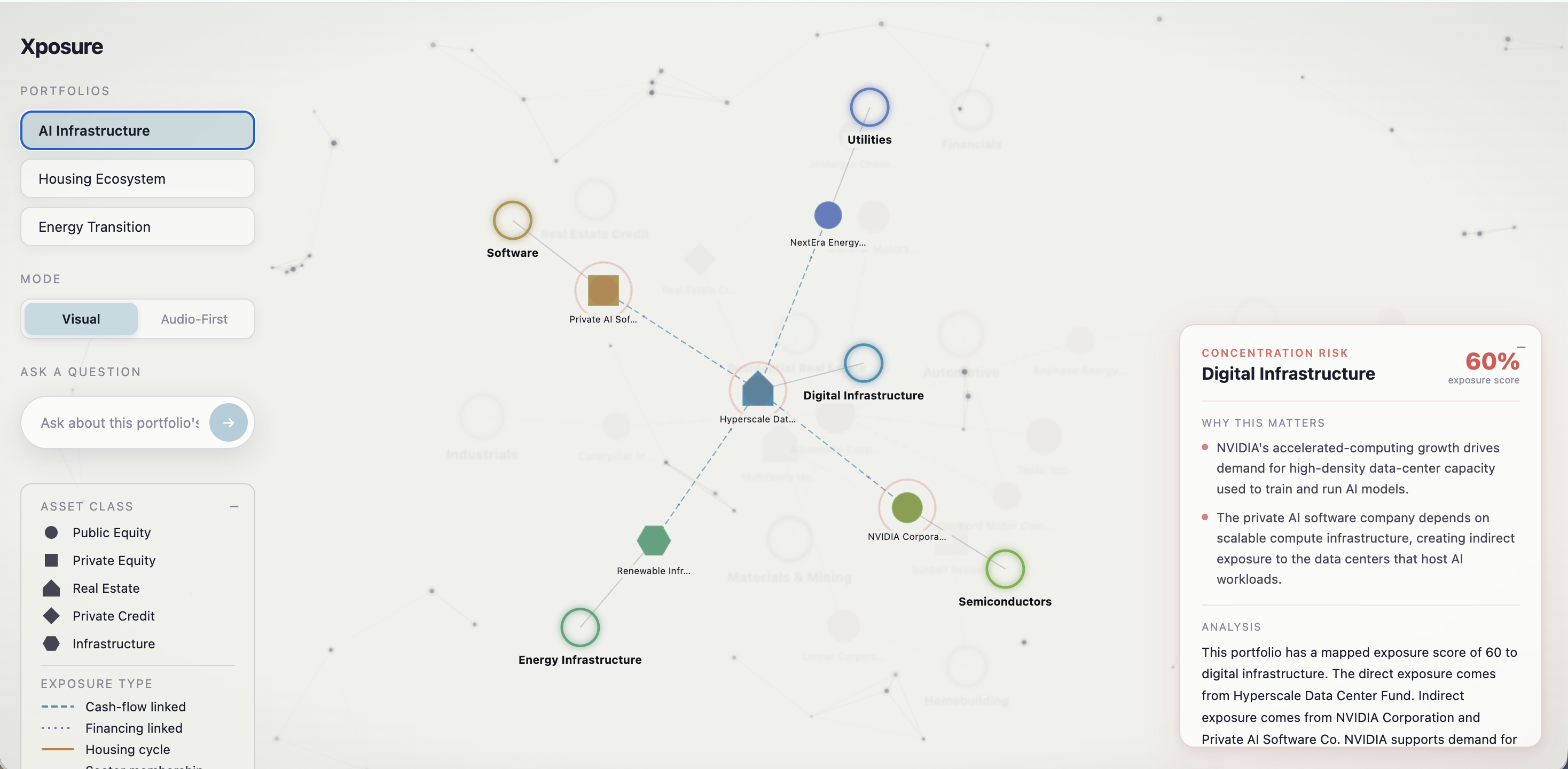
Landing Page, highlighting the immediate concentrated risks
-
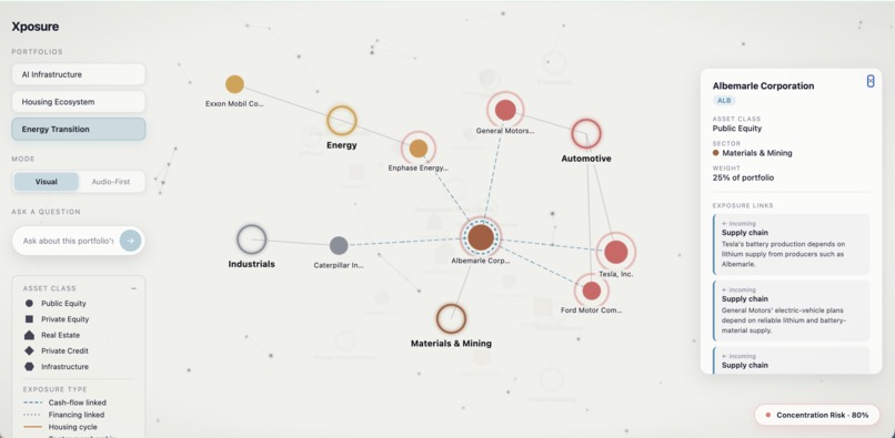
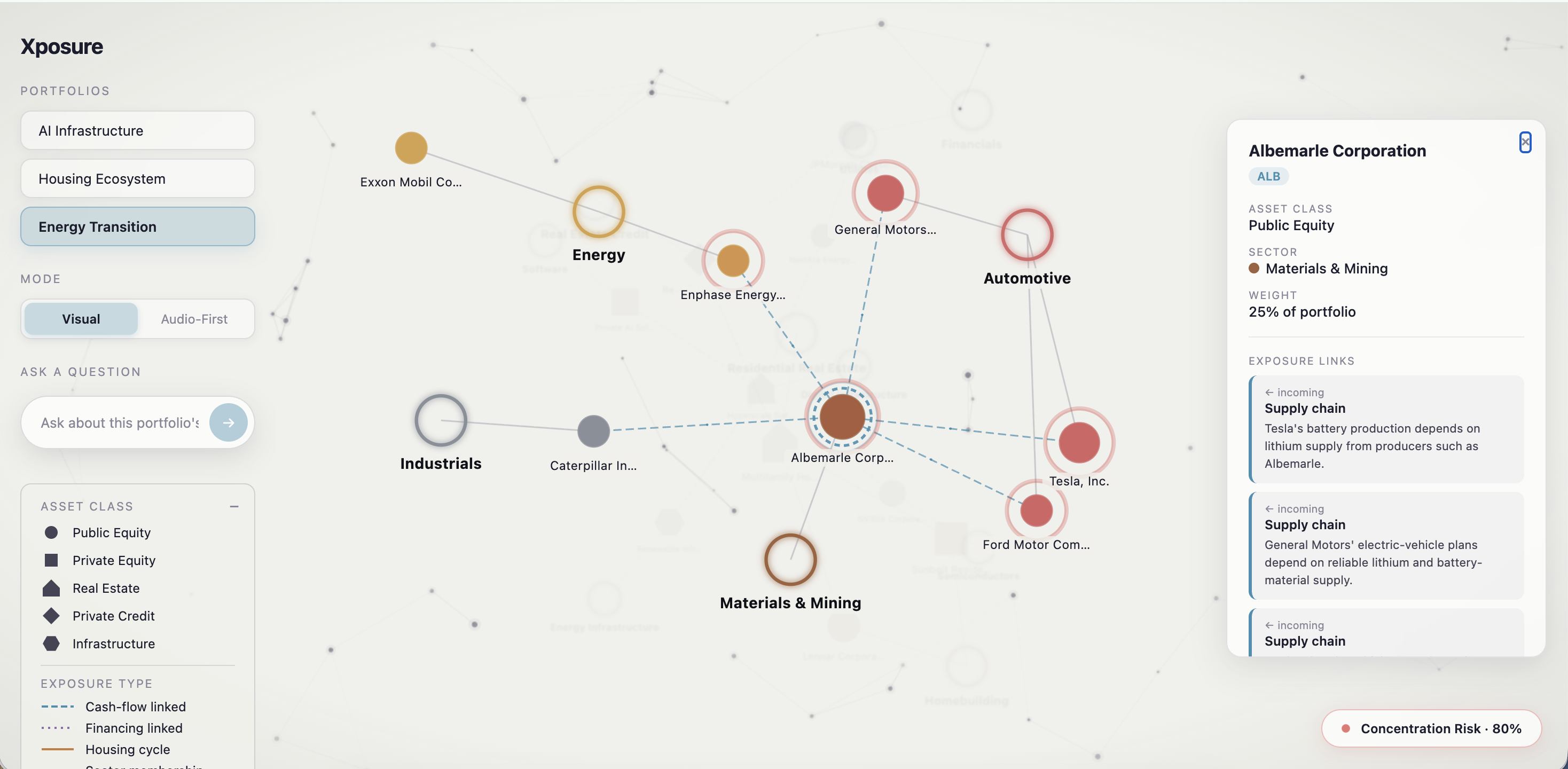
Diving deeper into a chosen holding, and what affects it
-
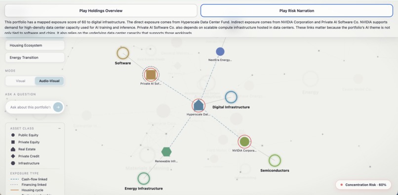
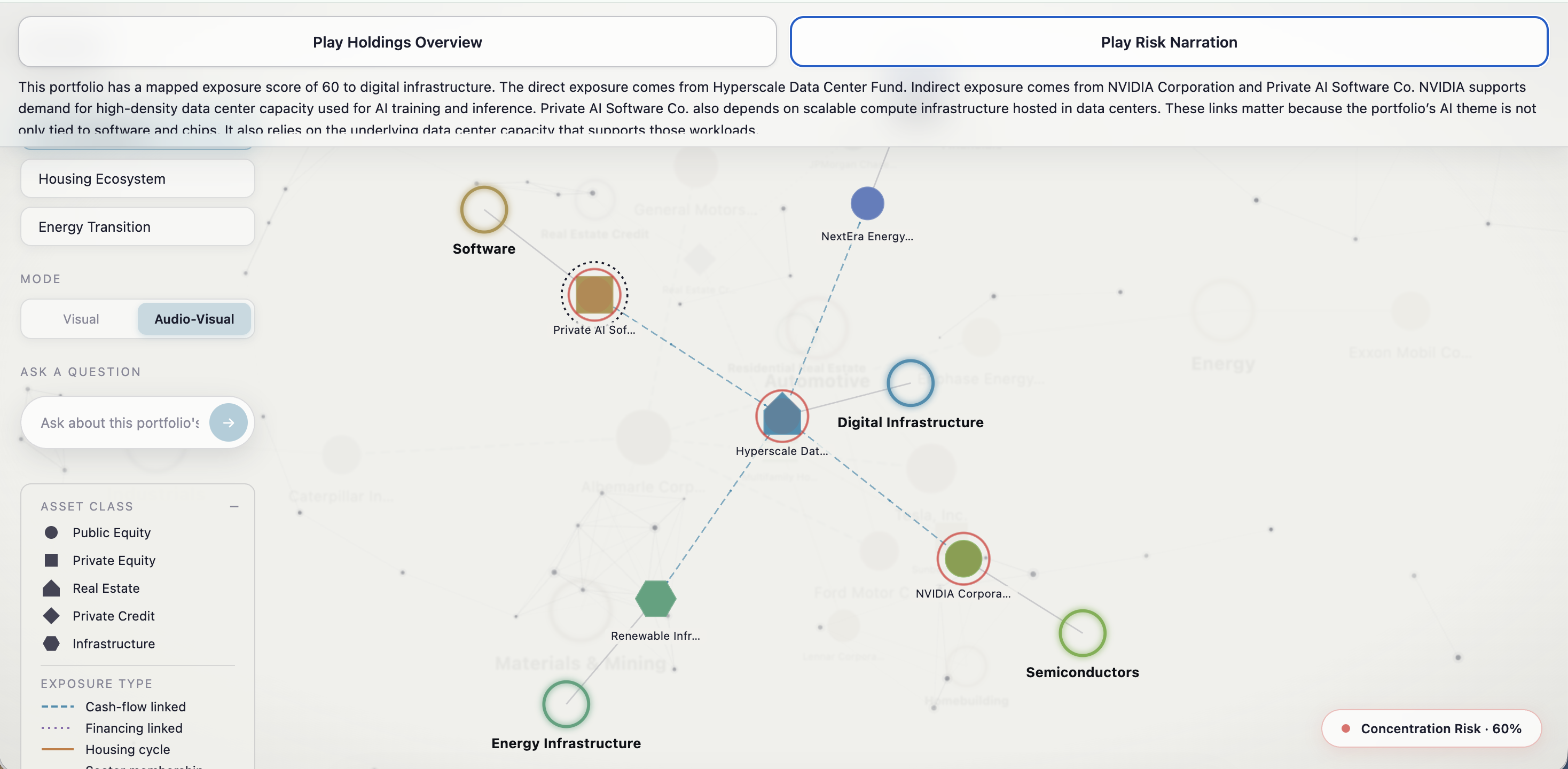
Audio assisted visual mode, where the whole visual can be accessed and understood with just the keyboard
-
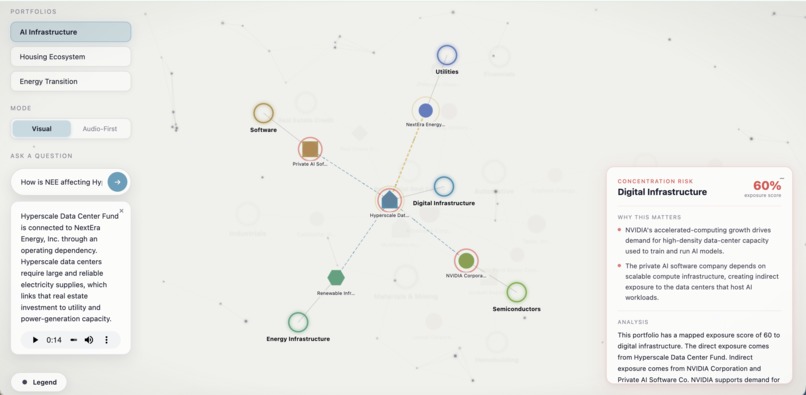
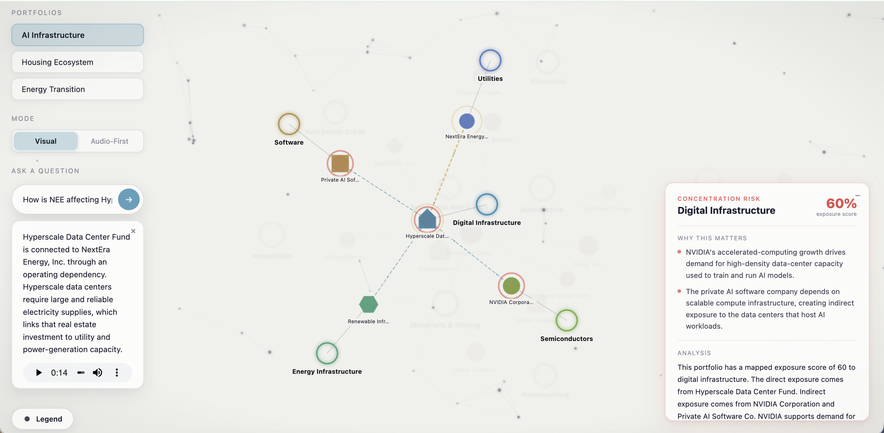
Asking NL queries about the holdings and their relationships
Inspiration
Xposure started from me trying to understand the stock market better for myself.
I started investing with money I had saved from my internships, mainly because I wanted to learn the stock market by actually having something at stake. I have been managing that portfolio since then, and it is worth a little over $14k now, so I spend a lot of time reading about companies and trying to understand why something is moving instead of just looking at the price.
One thing that caught my attention was Caterpillar. The company was growing and breaking expectations even while parts of US manufacturing and mining were down. Digging into it more, I learned about the demand they were getting from data center construction. That was kind of the moment where I got interested in these indirect relationships. A company can look like it belongs to one economic story, while a big part of what is driving it can actually come from somewhere else entirely.
The Blackstone challenge pushed that idea further for me. After talking to people from Blackstone, especially Abigail and Sophie, I started thinking beyond just equities. Even if a portfolio is diversified across public equity, private equity, real estate, private credit, and infrastructure, the assets can still be economically overlapped underneath. And that is where a graph made sense to me.
Most normal people are not staring at portfolio dashboards all day like an investment manager might. A knowledge graph can almost immediately calcify the relationship in your mind: this holding connects here, which connects here, and suddenly these things I thought were separate are exposed to the same underlying risk.
What it does
Xposure is a portfolio explorer built around an audio-visual knowledge graph.
Instead of only showing a portfolio as allocations and percentages, it shows the relationships between the holdings and the indirect exposures around them. One example in the demo is how a utilities holding can affect, and also be influenced by, the semiconductor industry. Those kinds of relationships are not necessarily obvious when the assets are sitting in separate categories on a normal portfolio screen.
The current hackathon version uses three curated portfolios with hand-authored exposure relationships, so the important demo paths are deterministic rather than depending on an LLM to invent financial relationships on the fly. When a concentration risk is detected, the affected company nodes pulsate red and the graph visually shows the path behind the insight. The nodes can be dragged around, zoomed into, and explored so that the user can understand the links rather than just being told that a concentration exists.
I also ended up pushing the accessibility side much further than I originally expected. Instead of making a separate "accessible version" of Xposure, the audio experience is layered onto the same graph. Blind and low-vision users can navigate holdings completely by keyboard, hear portfolio and risk narration, and use sonification to understand the graph - pitch maps to sector and stereo position maps to where the holding sits on screen, so the interface is not relying entirely on visual information.
How I built it
This was actually a solo project. I originally had two possible teammates, but they mainly wanted to come for the sponsor fair rather than really attempt the hackathon. So I decided to just take matters into my own hands and see how much I could finish. To make that manageable, I basically treated myself like two people. I divided the project into a frontend track and a backend track with separate checkpoints.
For the backend, I used Python and FastAPI, with Tiger Data/PostgreSQL storing the portfolios, holdings, sectors, and exposure relationships. The final backend exposes the graph, insight, audio, and natural-language query flows through a small set of APIs.
Snowflake Cortex handles the generative AI side. I use smaller/faster models when I need quick narration about portfolio holdings, and a larger reasoning model for the more complicated concentration explanations.
A big design decision was that the LLM does not decide what the financial relationships are. I tried using GenAI to create some of those links, and that was where I realized even cutting-edge models still have some distance to cover when it comes to finding hidden financial relationships and explaining them concisely without making things up. Those relationships are usually the sort of thing an analyst has to research carefully.
So I wrote the core connections myself and use AI to explain the relationships and insights instead. The natural-language system is intentionally narrow and grounded in the selected portfolio rather than being a general financial chatbot. For audio, I use ElevenLabs for narration and live spoken answers. The main narration can be pre-generated so the demo does not depend on TTS latency, while live portfolio questions still run through Snowflake and then ElevenLabs end-to-end.
For the frontend I used React, TypeScript, Vite, styled-components, react-force-graph-2d, and Tone.js. Asset class is encoded through node shape, sector through color, and different kinds of exposure use different edge styles, so the graph is carrying information visually rather than just looking interesting.
A lot more time than I expected went into the small visual things: pulsating background dots, lines that react to the cursor, transparent sidebars, transitions between portfolio graphs, risk nodes pulsing red, and getting everything to move without the page feeling too busy.
Challenges I ran into
Graph modeling was entirely new to me in practice. I have studied graphs academically and I am much more comfortable in AI engineering and backend/data systems, but actually designing a graph that a person has to look at and understand is a very different problem.
Visualization in general is also not my forte. One surprisingly annoying challenge was that sometimes I knew exactly what I wanted the UI to feel like, but I did not know the frontend vocabulary to describe it. I would know that I wanted some dots to gently move in the background, or that a sidebar should feel like it was floating rather than sitting on top of the page, but describing that precisely to AI coding tools took a lot of iteration.
Connecting it to the real backend also exposed assumptions I had made from the planning doc - fields were different, the graph had sector hubs I wasn't originally expecting, and one insight's sector name did not even match a sector node. I ended up highlighting through contributing tickers instead of trusting names to line up, which was a good reminder to integrate against the real API early.
LLM hallucination was the other big one. At first it is very tempting to say "AI can find the hidden connections." But once I actually tested it, I did not trust that enough for something financial. That changed the role of AI in the project. Instead of asking it to invent the intelligence, I use it to explain intelligence that already exists in the graph.
The move to multiple asset classes also happened after conversations with Blackstone. That meant rethinking some of the original equities-only framing while I was already building, but I think it made the idea much closer to the actual problem I was trying to solve.
Accomplishments that I'm proud of
The moment where I went, "wow okay, I can actually make stuff work," was when the frontend finally connected to the backend and everything moved together smoothly. The graph was animating, the portfolio transitions worked, the visual risk indicators were reacting properly, and the audio sonification was playing with it.
I have normally been the person who builds the backend and then lets somebody else figure out what the user actually sees. So getting that whole end-to-end experience working myself felt very different.
I am also happy that I resisted turning this into just another chatbot. The live query flow goes through deterministic intent routing, portfolio context, Snowflake, ElevenLabs, and then returns the spoken answer along with the graph elements that should be highlighted.
What I learned
The visualization work was honestly pretty mind-opening. I do not think I am suddenly a frontend developer, but I feel like I would be much better now at conveying my ideas to one. That is useful beyond hackathons too. Even at work, being able to say what interaction or visual behavior I have in mind more clearly is valuable.
I also learned that using GenAI well sometimes means deciding what not to give it responsibility for. For Xposure, AI became much more useful once I stopped asking it to discover the financial truth and instead asked it to explain a known graph and make that information easier to consume.
And finally, I learned a lot about turning graph theory into an actual user experience. A graph is not useful just because you have nodes and edges. The question is whether somebody can look at it and understand something they did not understand before.
What's next
The hackathon version is intentionally limited to curated one-hop relationships rather than recursive traversal or a full graph engine. But the reason I wanted to build this as a graph in the first place is because I eventually want multi-hop and temporal relationships.
Exposure is not static. Companies change suppliers, enter new markets, build new facilities, change business models, and become exposed to industries they were not meaningfully connected to before. I would like Xposure to show how those relationships evolve over time rather than treating the portfolio as a snapshot.
The other end goal is scenario testing: swap a holding in or out and immediately see how the underlying exposure graph changes.
That is the version of Xposure I would really like to build past the hackathon: not just showing what assets somebody owns, but helping them understand what those assets are actually connected to.
Built With
- fastapi
- openai
- postgresql
- python
- react
- react-force-graph
- snowflake
- tigerdata
- typescript
- vite


Log in or sign up for Devpost to join the conversation.