Inspiration
Health inequities often remain hidden within fragmented and complex datasets. Policymakers, researchers, and health planners face significant barriers in accessing and analyzing data that reveal disparities in underserved populations. XAM-HEID was born from the need to democratise healthcare data access via AI-powered, privacy-first insights, empowering equitable healthcare decisions through accessible technology.
What it does
XAM-HEID transforms synthetic healthcare data focusing on conditions like diabetes and heart disease into an interactive dashboard featuring customisable maps, trend charts, and policy-ready reports. The platform bridges data access gaps by delivering regionally relevant insights accessible with no technical expertise, providing policymakers and health officials with actionable, exportable documentation.
Current and Future Work
The dashboard currently ingests synthetic data model closely on government datasets, making health disparities visible to non-technical users. We plan to significantly expand disease coverage and integrate richer real-world datasets as funding and data access improve. Core dashboard features will remain consistent, with enhanced impact from broader, more authentic datasets.
Project Mission
The goal of this project is to democratize access to healthcare data. We empower policymakers, researchers, and public health officials to identify, understand, and address health inequities in the United States.
By simplifying complex datasets and leveraging AI to highlight significant, often hidden, patterns, this tool aims to drive data-informed decisions that can lead to more equitable health outcomes for all communities.
Data Source & Privacy
This dashboard utilizes a synthetically generated dataset designed to mimic the structure and complexity of real-world healthcare information, such as that from the Healthcare Cost and Utilization Project (HCUP). This approach allows for robust development and demonstration without compromising real patient privacy.
A core feature of our methodology is strict adherence to the "Rule of 11". To ensure confidentiality, any data point representing fewer than 11 individuals is suppressed and marked as 'Suppressed' on the map. This is a critical privacy-preserving technique used in public health reporting.
Core Features & Methodology
The dashboard quantifies disparities using a Disparity Index, calculated as the percentage difference between the highest and lowest values in the currently filtered dataset. A higher index indicates greater inequality across states.
The ML Pattern Analysis is the heart of the platform. It performs a real-time analysis of the dataset for a selected year to uncover non-obvious correlations and identify key patterns in health disparities.
Users can export both a high-fidelity visual report of the dashboard and a text-based AI Brief in PDF format, making insights portable and actionable for policy discussions.
Technology Stack
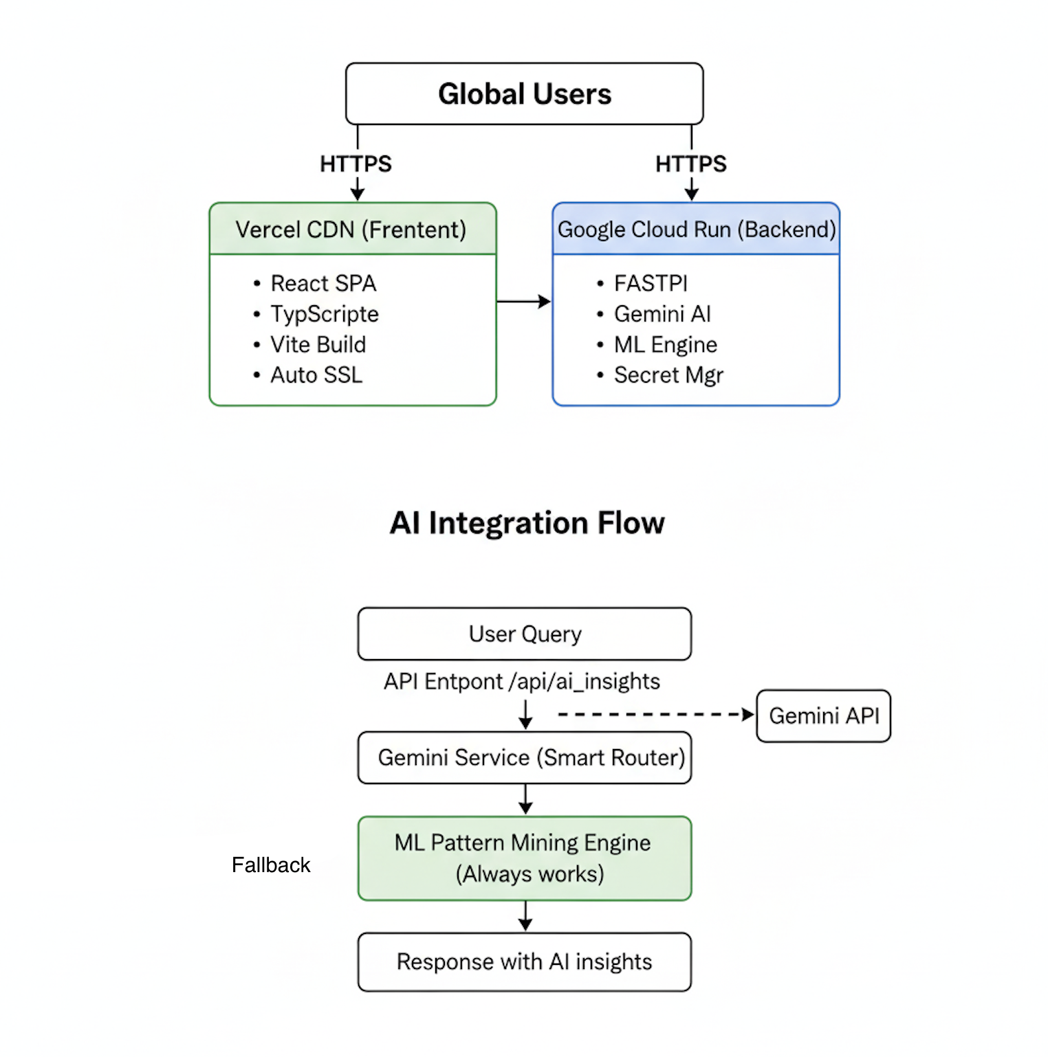
Frontend: Built with React and TypeScript for a robust, modern, and highly interactive user interface. Backend: A Python backend powered by FastAPI performs machine learning analysis to discover patterns in the data. Visualization: Employs Chart.js for dynamic bar charts and react-simple-maps for the interactive choropleth map. Styling: Styled with Tailwind CSS for a responsive, clean, and consistent design system. PDF Export: jsPDF and html2canvas are used to generate high-quality, client-side report exports directly in the browser.
End-User Journey
A user selects a health condition, year, and demographic group from the sidebar filter. They instantly view the updated color-coded US map illustrating disparity levels across states. They read the ML-generated summary and discovered patterns in the analysis panel. They export a report or an AI Brief to share observations with colleagues. Finally, they use these actionable insights to inform policy or prioritize resource allocation toward health equity.
Built With
- chart.js
- fastapi
- mlxtend
- python
- react
- scikit-learn
- tailwind-css
- typescript
- vercel

Log in or sign up for Devpost to join the conversation.