-
-
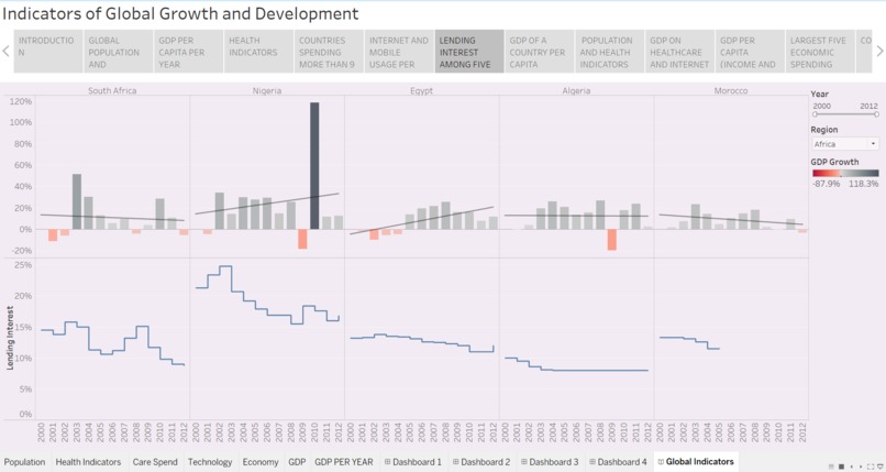
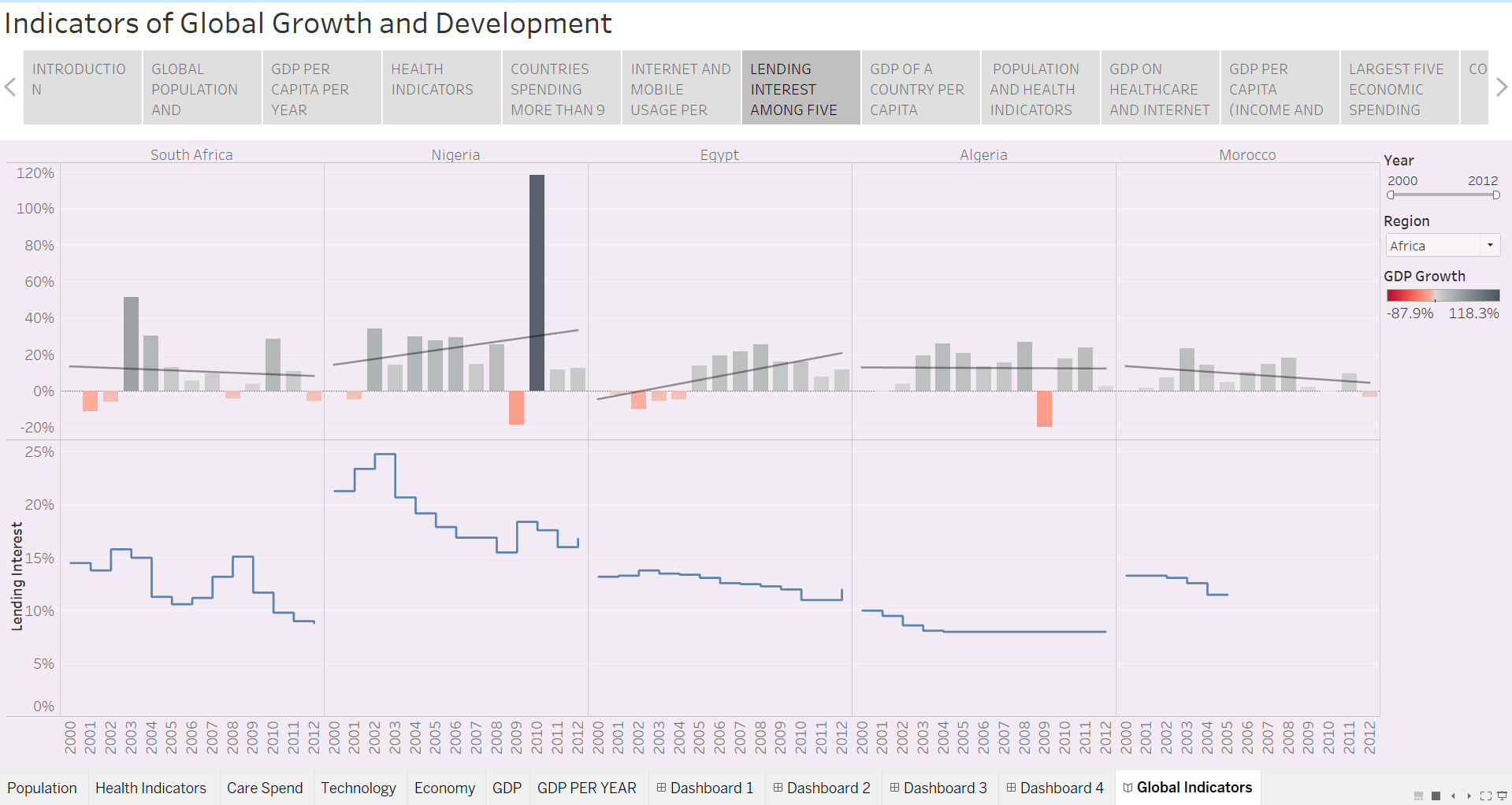
LENDING INTEREST AMONG FIVE LARGEST ECONOMIC COUNTRIES
-
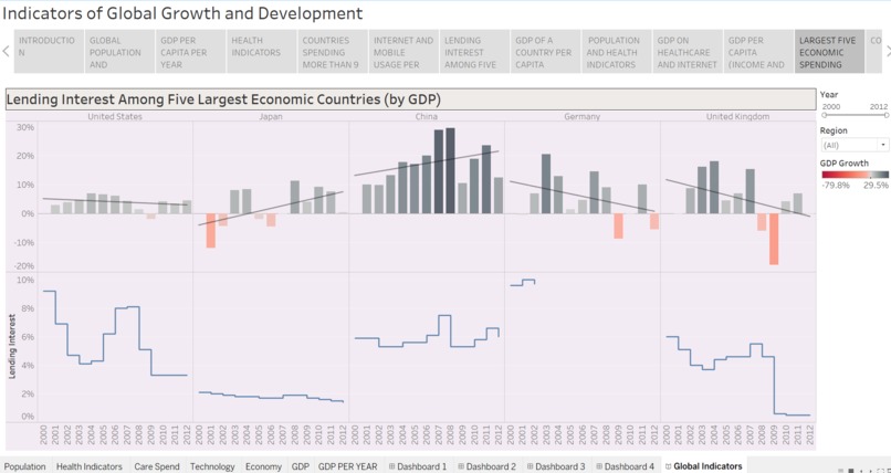
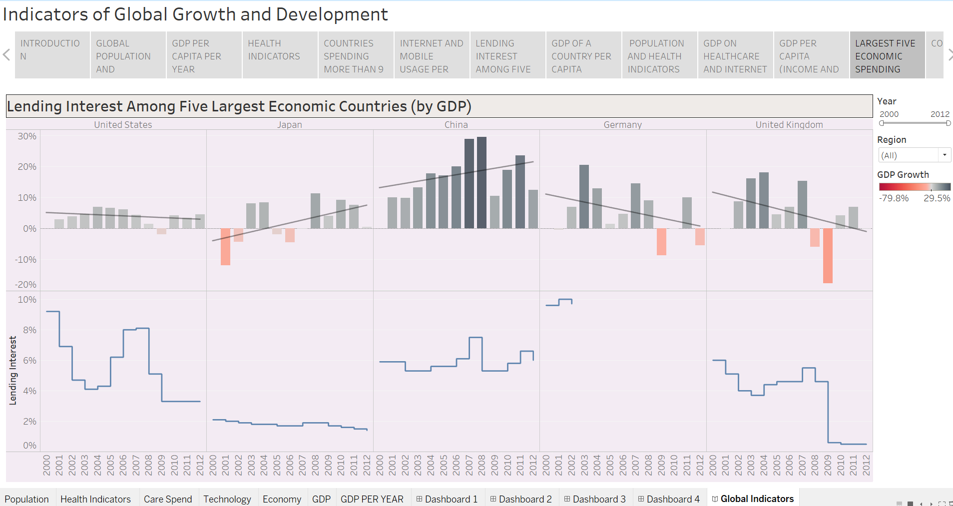
LARGEST FIVE ECONOMIC SPENDING COUNTRIES
-
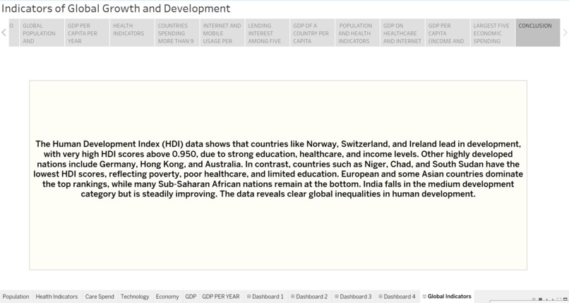
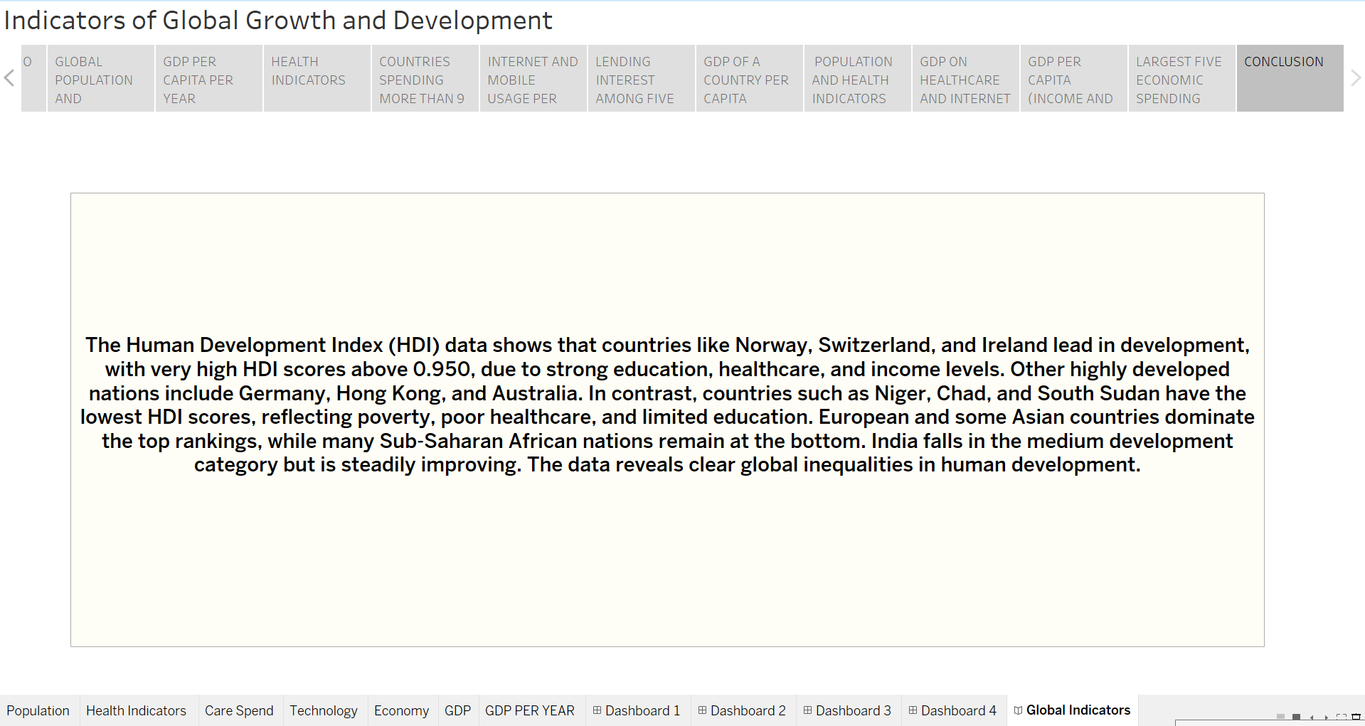
CONCLUSION
-
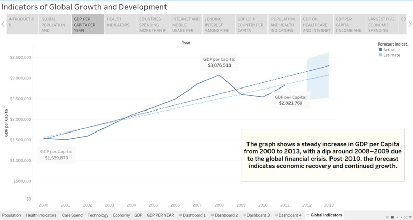
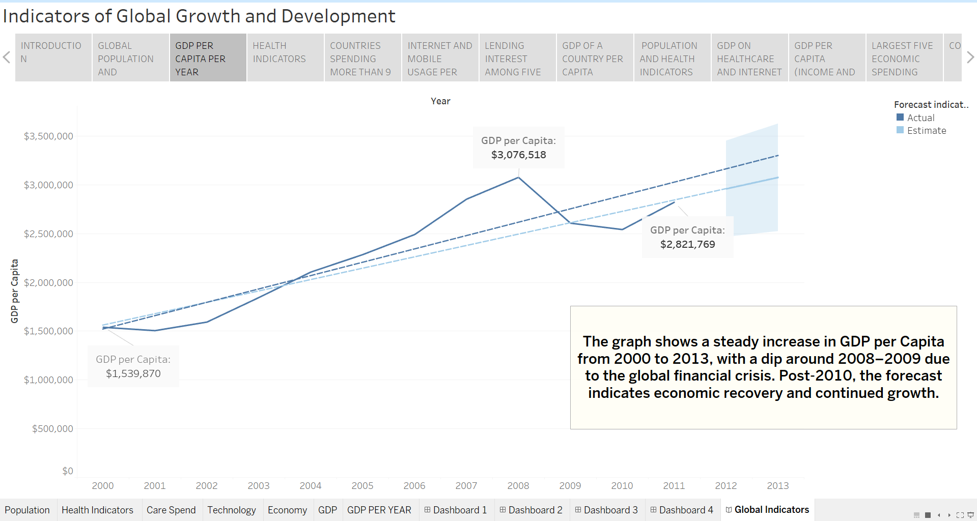
GDP PER CAPITA PER YEAR
-
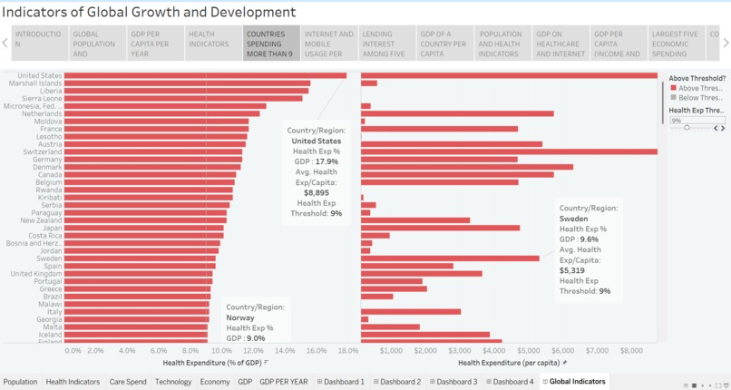
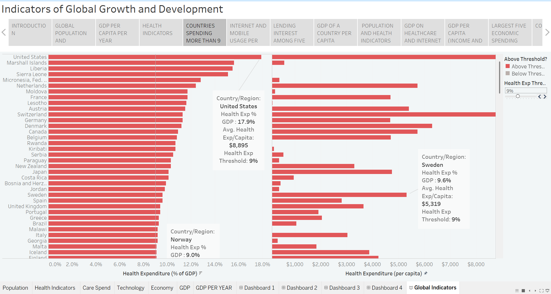
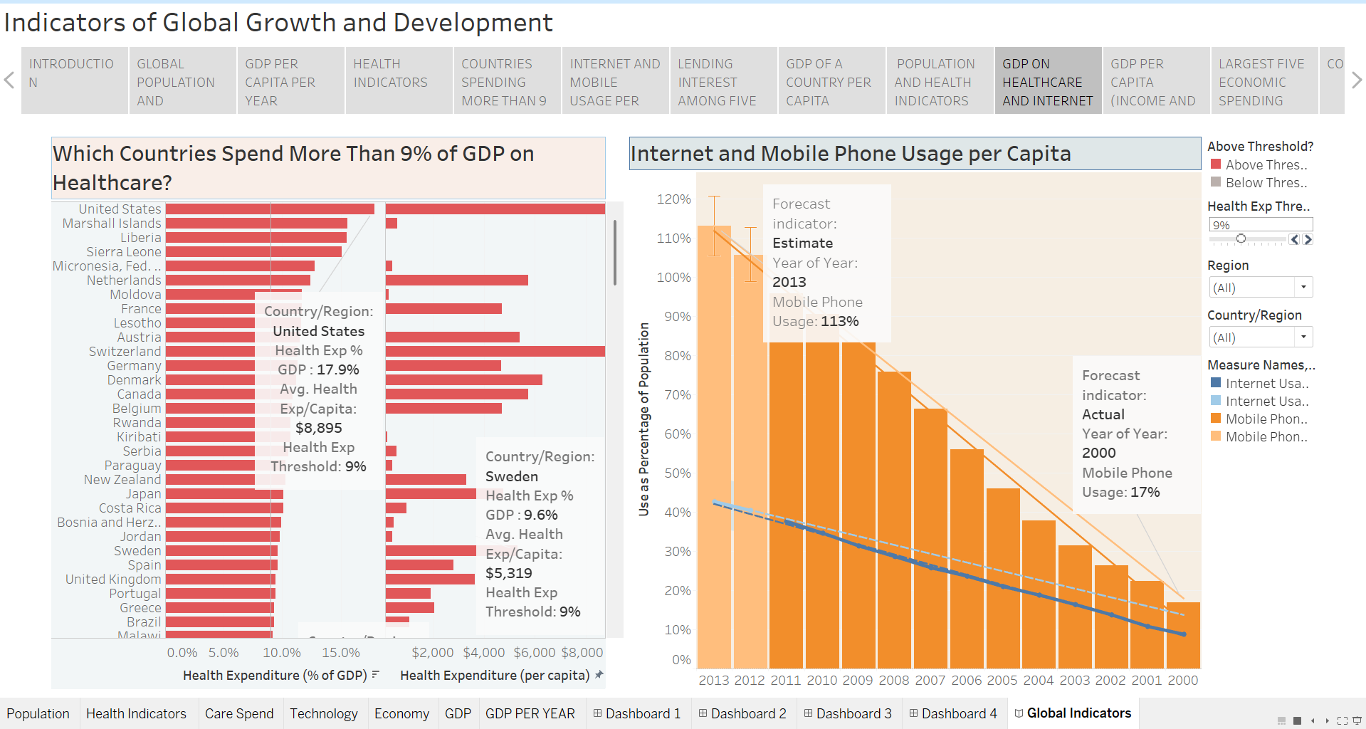
COUNTRIES SPENDING MORE THAN 9% ON HEALTHCARE
-

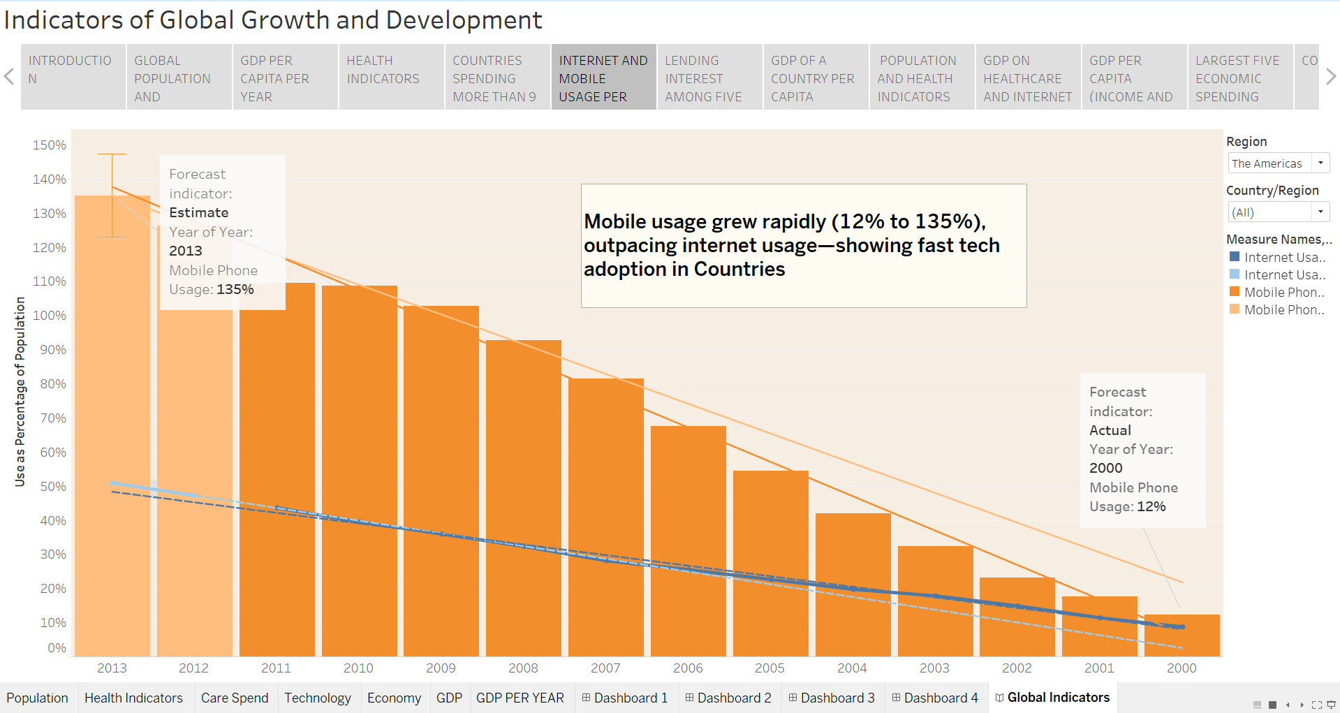
INTERNET AND MOBILE USAGE PER CAPITA
-
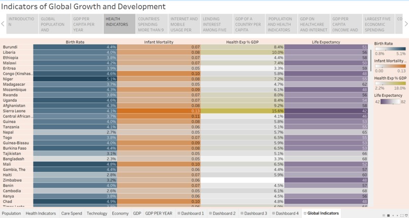
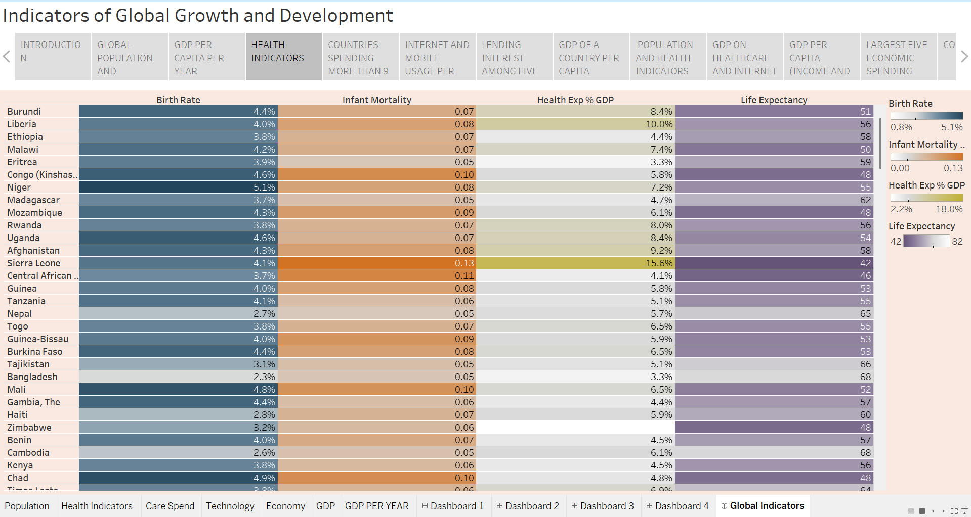
HEALTH INDICATORS
-
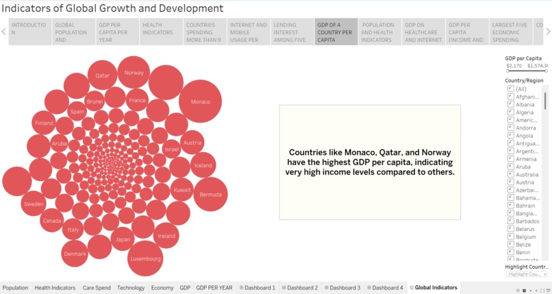
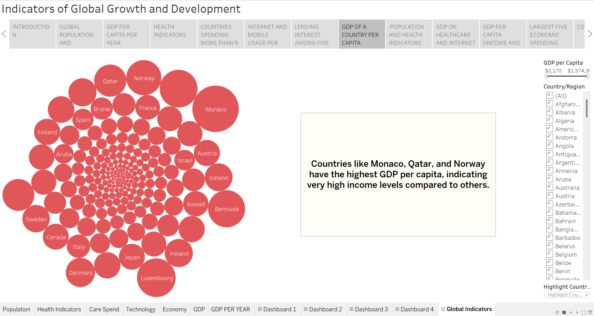
GDP OF A COUNTRY PER CAPITA
-
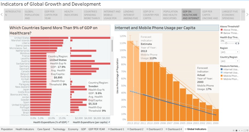
GDP ON HEALTHCARE AND INTERNET AND MOBILE PHONE USAGE
-

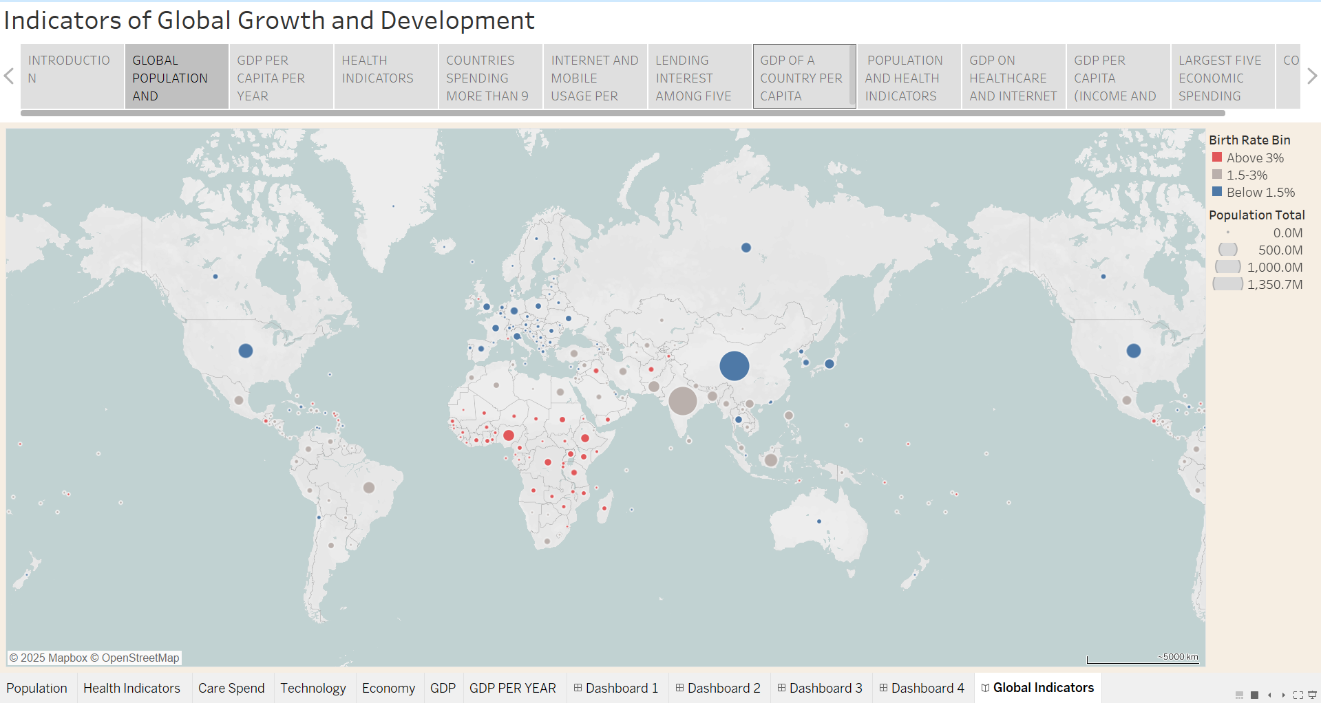
GLOBAL POPULATION AND BIRTHRATE
-
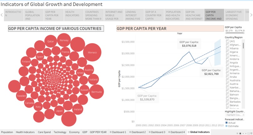
GDP PER CAPITA (INCOME AND PER YEAR)
-
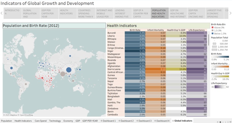
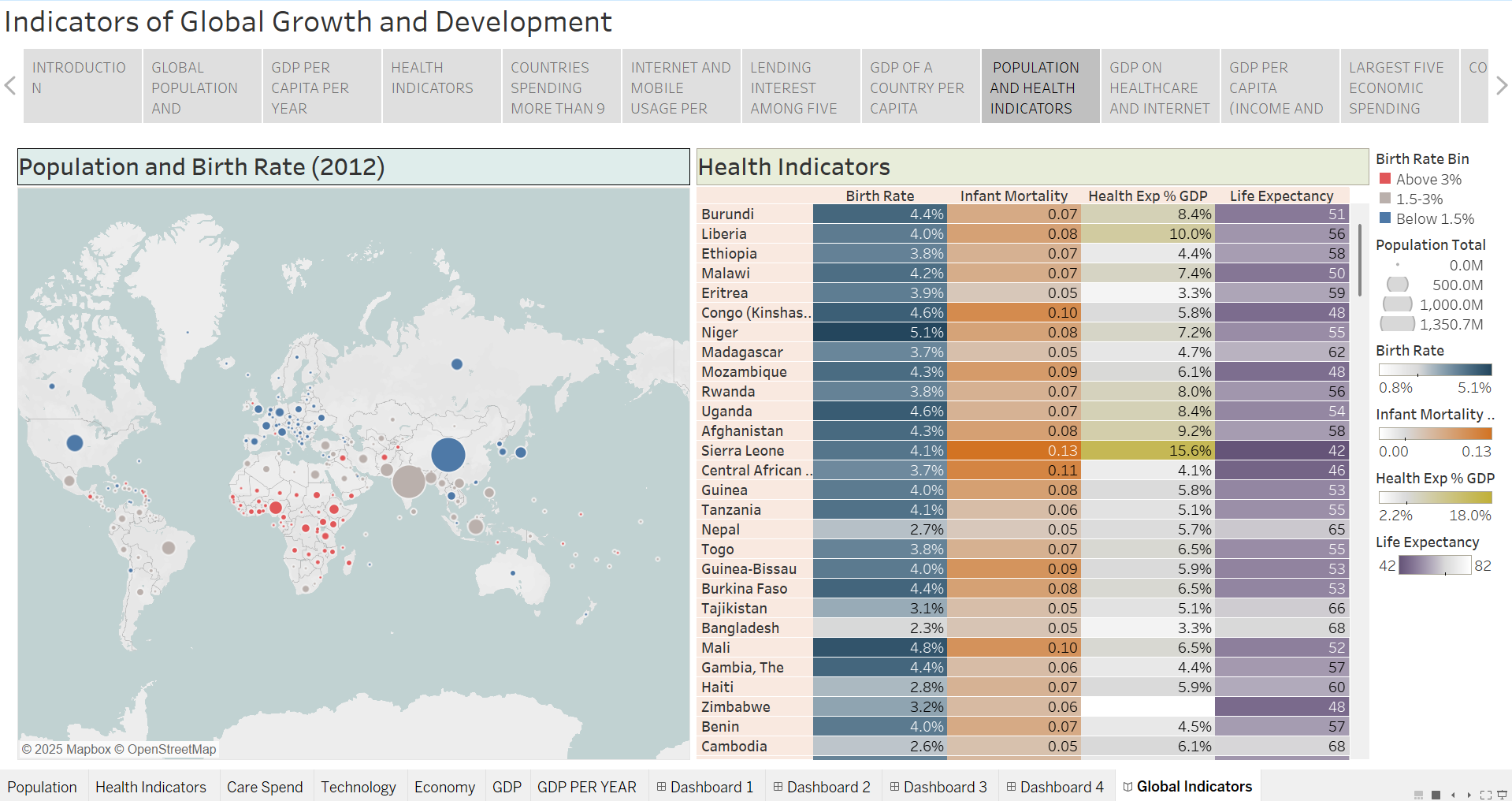
POPULATION AND HEALTH INDICATORS

Inspiration: The project was inspired by the growing availability of global open data and the need to understand how health, population, technology, and economic factors are interconnected. We wanted to go beyond static tables and use interactive visualizations to tell meaningful global stories.
What We Learned: Through this project, we learned: 1) How to clean, integrate, and analyze multi-dimensional global datasets 2) The importance of data visualization in identifying patterns, trends, and inequalities 3) How indicators like GDP per capita, health expenditure, life expectancy, and internet/mobile usage influence development 4) Designing dashboards that are both informative and user-friendly
How We Built the Project: We built World Health Indicators using data visualization tools and global datasets. The process included: 1) Collecting and preprocessing global indicators data 2) Designing multiple dashboards focused on health, economy, population, and technology 3) Applying filters (year, country, region) to enable interactive analysis 4) Using charts such as maps, line graphs, bar charts, and bubble plots to highlight insights For example, GDP growth trends were analyzed using time-series data: GDP Growth Rate = ((Current GDP - Previous GDP)/Previous GDP) x 100
Challenges Faced: Some key challenges included: 1) Handling missing or inconsistent data across countries 2) Choosing the right visualization for complex indicators 3) Maintaining clarity while displaying large amounts of information 4) Ensuring dashboards remained intuitive for non-technical users
Conclusion: World Health Indicators helped us understand how data-driven insights can support global awareness and decision-making. The project strengthened our skills in data analysis, visualization, and storytelling while highlighting real-world global challenges.
Built With
- csv
- tableau

Log in or sign up for Devpost to join the conversation.